This live demo contains only a preview of functionality and styles available for this component. View the full demo on Storybook for additional information such as its version, controls, and API documentation.
Filtering the same content
When toggling between different formats of the same content or filtering the same content, use content switcher instead. Content switcher is often used alongside tabs, but it typically serves at a lower hierarchy to organize related content within the tab's contents.
Indicating progress
When the user needs to work through a step by step linear process, use a progress indicator. Tabs help organize information hierarchically but remain flexible in how content can be designed and consumed.
Variant | Purpose |
|---|---|
A standalone tab that can also be nested within components. It is commonly used within components or for content using the entire page for layout, not connected to any other components. | |
An emphasized tab that is commonly used for defined content areas. | |
A tablist with a vertical orientation to browse through content. |
Examples of line tabs (top), contained tabs (middle), and vertical tabs (bottom)
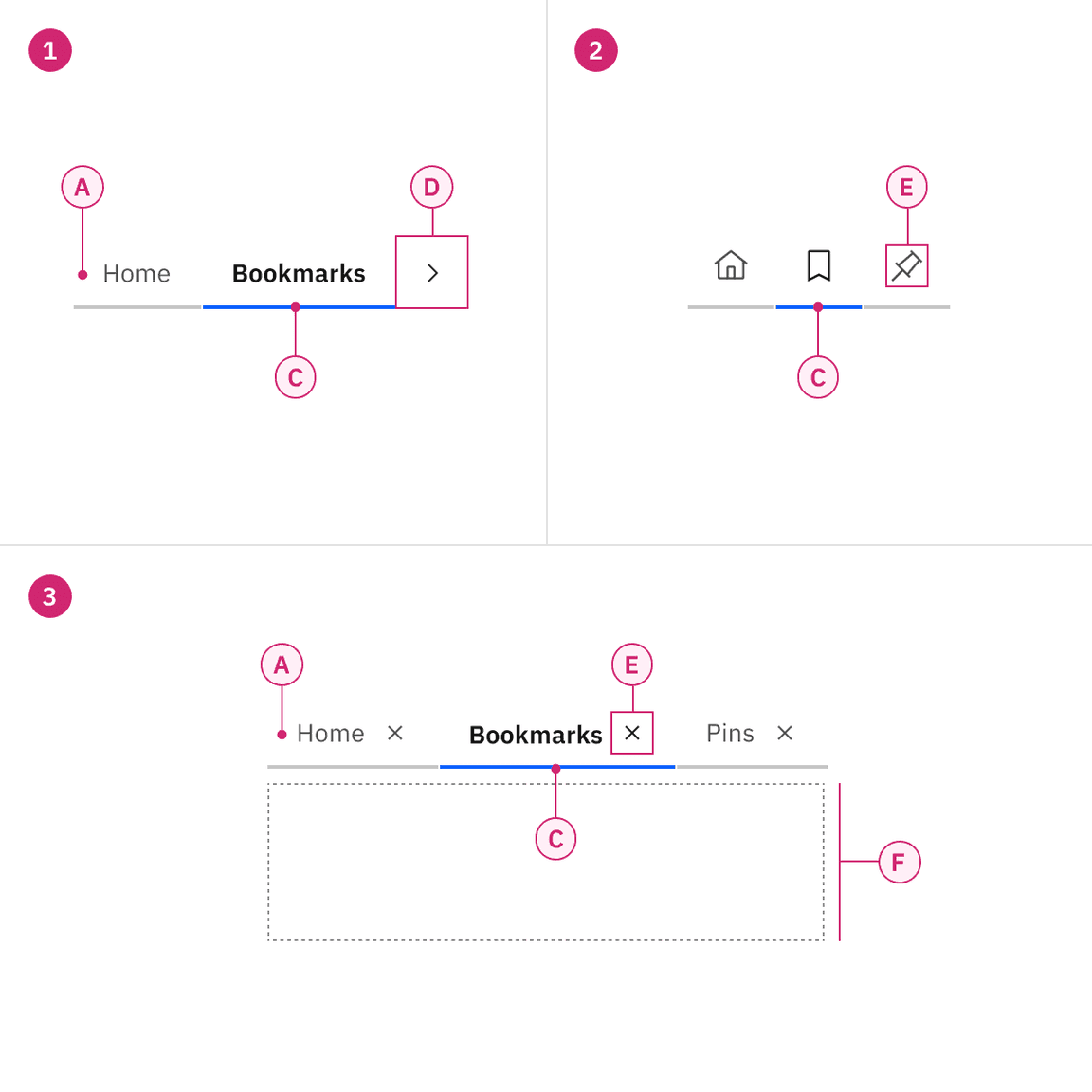
- Line tabs — A. Label C. Indicator D. Scroll button
- Icon-only line tabs — C. Indicator E. Icon
- Line tabs with icon — A. Label C. Indicator E. Icon F. Tab panel
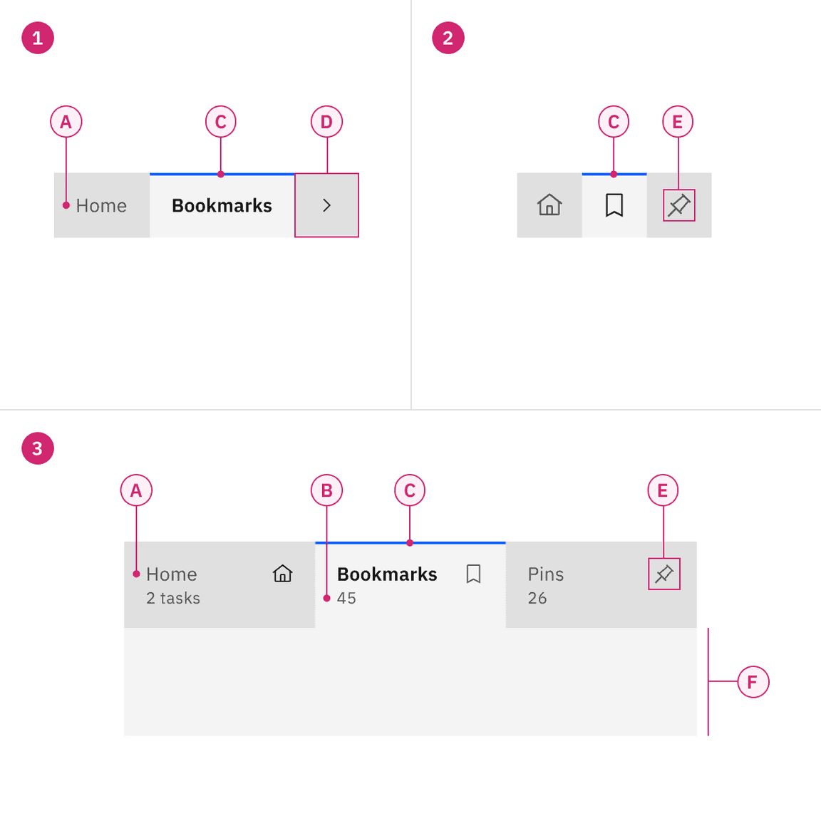
- Contained tabs — A. Label C. Indicator D. Scroll button
- Icon-only contained tabs — C. Indicator E. Icon
- Contained tabs with icon and secondary label — A. Label B. Secondary label (optional) C. Indicator E. Icon (optional) F. Tab panel
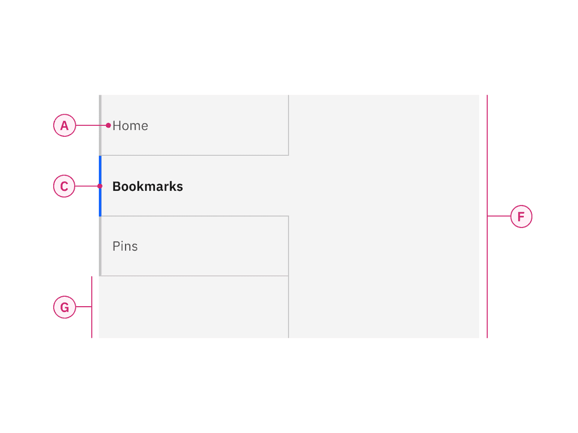
Vertical tabs — A. Label C. Indicator F. Tab panel G. Tablist extended background
Auto-width alignment
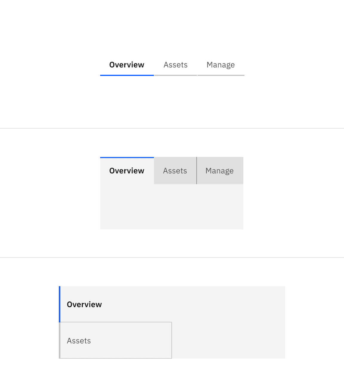
Auto-width alignment is the default behavior for both line tabs and contained tabs. Each tab will be a different size depending on the label's character count but will have consistent padding on each side of the label. The first label, selected by default, should align to the grid. Where the tabs end will vary and may not end on the grid.
Example of line tabs using auto-width alignment
Grid aware width alignment
Instead of using the default auto-width alignment behavior, contained tabs can have grid aware alignment. The tabs span a set of columns as a group, with each tab equal in width. The first tab's label should align with the first column you are using, with the last tab in the group always ending at a column's edge. The tabs in between will flow accordingly and may or may not align with the grid, but they will always be the same width size.
Use the 2x grid to drive visual rhythm by spacing content in multiples of two columns and aligning the beginning and ending of the tab elements with content below the tabs when possible. Depending on breakpoints, vertical tabs align to grid columns spanning 4 or 2 columns of the 16-column grid and connect to a tab panel that can be 8 or 12 columns wide. See vertical tabs for more information on breakpoints and responsiveness.
Use grid aware contained tabs when:
When there are four tabs or less
When the tablist can fit on the 2x grid easily without crowding labels
Labels are short and concise
When other elements on the page can align to the tablist
Example of contained tabs using grid aware alignment
Alignment with tab labels
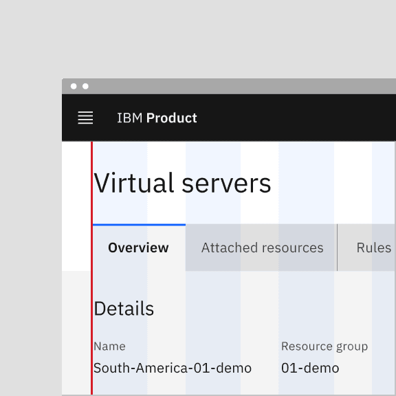
Much like buttons, alignment of tabs depends on where they appear and whether or not they're contained within another component. As a general rule, the first label for both line tabs and contained tabs align with the grid and the text below. If tabs are within another component, such as a card, follow the grid that you are using inside the component and align the label with text in the component. Vertical tab labels also align with the grid, so all labels in a tablist will align on the same grid column.
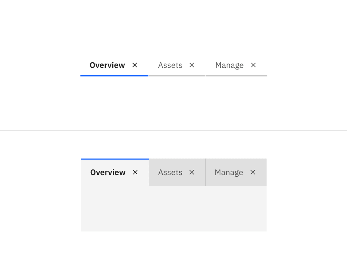
Do align tab labels with the grid
Do not align tab container with the grid
Alignment within a component
When using line tabs within a component (like a modal), the first label should always align to the other content in the space. Do not use contained tabs. The edges of the line tab may also bleed to the edges of the space if needed depending on the container's margins. A trailing rule may be added from the end of the last tab to the edge of the content area to add hierarchical clarity and balance the tabs with the other content.
Aligning tabs within a component
Use short tab labels that are clear and specific. Labels should be one to two words, as these are easier to scan. Vertical tabs allow for more characters within a tab, but stay as concise as possible to avoid truncation and allow space for labels in various languages.
Text labels should clearly communicate the view users will see and the content contained in the view.
Contained tabs can have secondary labels to add clarity or assist the user in choosing the right selection.
Overflow content
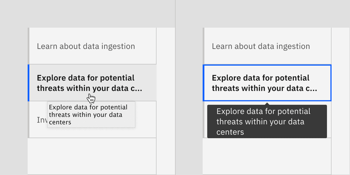
Line and tab labels do not need truncation since these types of tabs allow for horizontal scrolling. The tabs themselves can grow and shrink accordingly. However, when a label is too long within a vertical tab, the label overflows to two lines and then truncates with an ellipsis. By mouse, the full title is disclosed in a browser tooltip on hover. By keyboard, the full title is disclosed on focus in a tooltip.
On hover, full title is disclosed in a browser tooltip (left) and on focus, full title is disclosed in Carbon tooltip (right)
Further guidance
For further content guidance, see Carbon's content guidelines.
States
Tabs have two main states—selected and unselected. Other interactive states are hover, focus, and disabled. The default view is one tab is preselected and is usually the first tab. Only one tab can be selected at a time. When a user chooses a new item, the previous tab is automatically deselected. If a user navigates away from a tab, it remains the selected tab until altered by the user.
For detailed visual information about the various states for this component, see the Specifications tab.
State | When to use |
|---|---|
Selected | When a user clicks or uses the arrows keys to activate the tab. |
Unselected | When the user navigates to another tab and the tab is inactive. |
Hover | When a user is hovering over the tab with the mouse cursor to interact with it. |
Focus | When a user clicks on the tab or navigates using the keyboard with left and right arrows, it becomes focused, indicating the user has successfully navigated to the component. |
Disabled | When a user is not allowed to interact with the tab due to either permissions, dependencies, or pre-requisites. The disabled state completely removes the interactive function from a component. The styling is not subject to WCAG contrast compliance. |
Example of scrolling in line tabs (top) and contained tabs (bottom)
Automatic and manual
Automatic and manual tablists differ in how the tab items are activated.
For automatic tablists, focus and selection are synchronized. When the user arrows to a tab, it becomes selected, and the tab panel under the tab updates automatically. Use automatic tabs when tab panel content can load quickly, allowing for users to scan quickly through information to make a decision without latency.
Manual tablists allow the user to arrow between the tab items without updating the tab panel underneath. When the user navigates using arrows, the selected tab remains selected while focus moves to the next tab. In order to select the focused tab (and update the tabpanel under the tab), the user would press Enter or Space. Use manual tabs when information in the tab panel will take a longer time to load. This will allow a keyboard user or screen reader to navigate through the tablist without having to wait for content to load. Learn more about automatic verses manual tablists in the Keyboard interactions section of the accessibility tab.
For additional information, see the Accessibility tab.
Max, XLG, and LG breakpoints: Use eight grid aware tabs or less.
MD and SM breakpoints: Grid aware tabs will automatically change to auto-width alignment to reduce extra space on smaller screens.
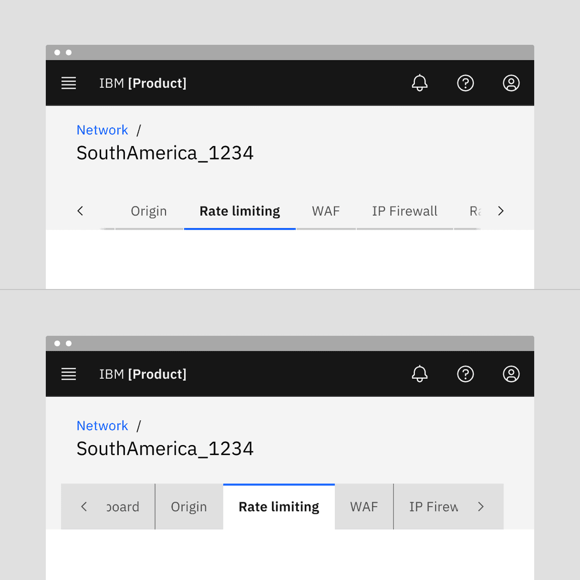
Line tabs
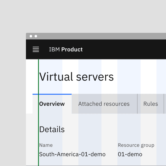
A line tab is standalone tab that can also be nested within components. Although it is commonly used within components, such as a modal or header, line tabs can also be used for large content areas using the entire page for layout, not connected to any other components. Line tabs are highly flexible and can be placed on background or layer tokens, making it easy to use in many different scenarios. To help define the tab panel, which is the content area below the selected tab, a line can be used that extends from the tablist to the end of the panel. This is currently not part of the Carbon line tabs component and must be added by teams if desired.
Line tabs example
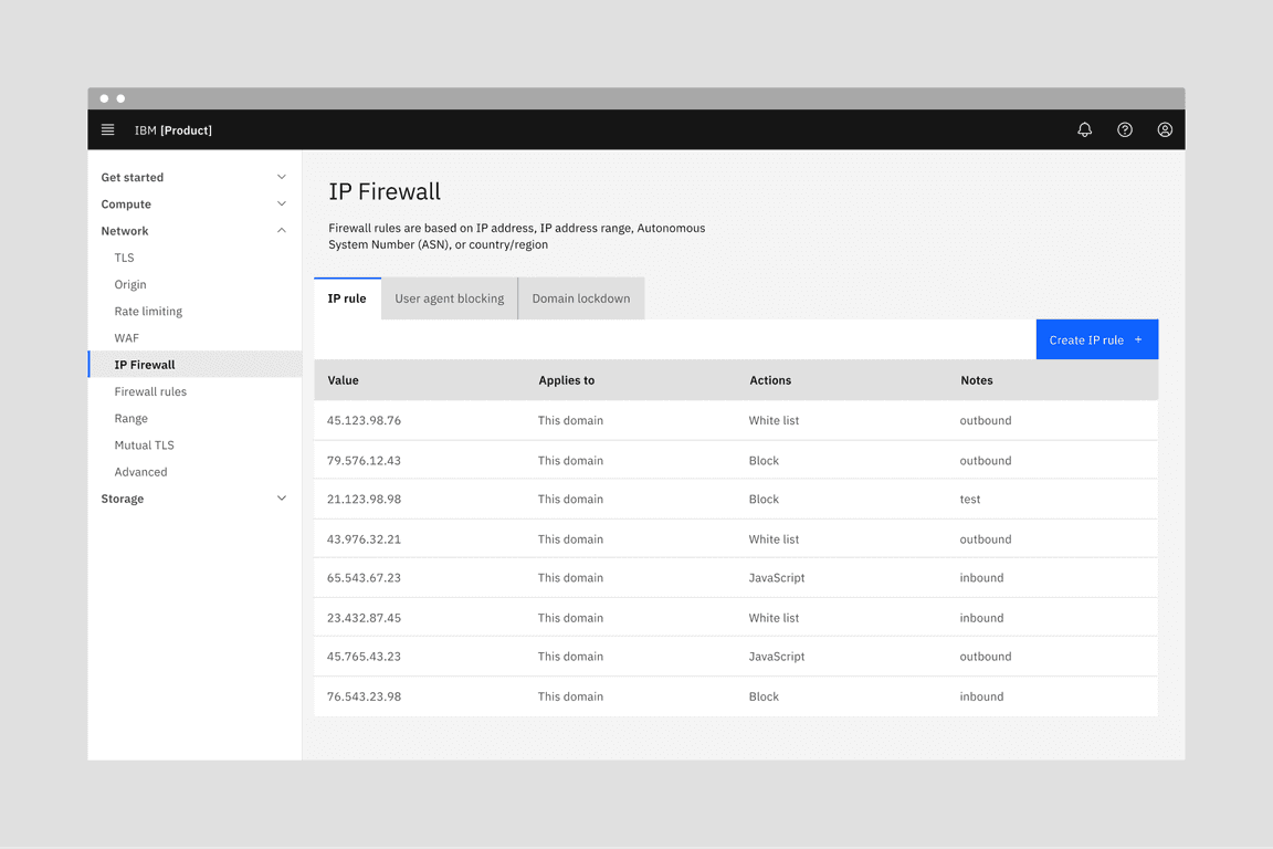
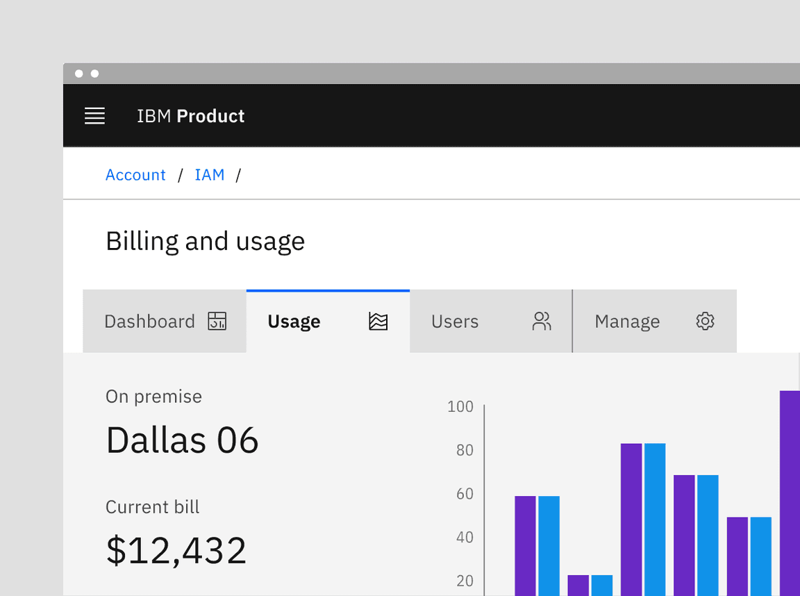
Contained tabs
Contained tabs are an emphasized tab commonly used for defined content areas like sub-pages. Contained tabs are always attached to a tab panel (background container) that uses the same layer token as the selected tab. Since the contained tabs are on layers, the tab content tends to stand out against the background and maintain a high visual hierarchy while line tabs tend to blend into content more easily. Because of the layering model, be mindful of the layers used within the tabs so the content does not get too visually complicated, especially within smaller areas.
Example of Contained tabs
Vertical tabs
Vertical tabs are left and vertically-aligned tabs that allow a user to scan through information from top to bottom. This vertical orientation is good for quickly browsing and accessing information, such as a get started pattern. Do not use vertical tabs in place of navigation.
The tab panel should stay the same height as tabs switch so content outside the tabs stays in a consistent place. The vertical tablist and panel height should be determined by the tab that has the most content. To avoid excessive scrolling within the tab panel, do not overload it with too much content. If more space is needed than the tab panel allows, consider using line or contained tabs that allow for full page layouts. Both the tablist and the tab panels are always on the same layer. At extra large and large breakpoints, vertical tablist spans 4 columns of the 16-column grid. At the medium breakpoint, the vertical tablist spans 2 columns. At the small breakpoint, the vertical tablist uses scrolling contained tabs.
Example of Vertical tabs in a get started pattern
Example of contained tabs with icons.
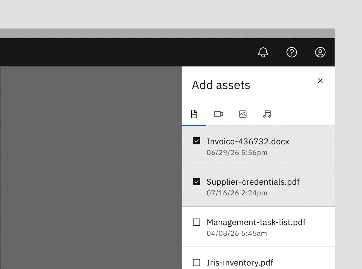
Example of icon-only tabs within a side panel.
Example of contained tabs with a secondary label and icon.
Example of dismissible line tabs (top) and dismissible contained tabs (bottom)
Use dismissible tabs to offer flexibility and scalability in complex interfaces that require users to create multiple sections or modules.
Use dismissible tabs for content created or curated by the user.
Use to focus a specific data set or search results.
Do not use when tabs contain frequently used or critical information.
Do not use as navigation.
Dismissing a tab
When dismissing a tab, an inline warning or modal may be used when information contained in a tab will no longer be accessible or difficult to retrieve. Since warnings, especially modals, are highly disruptive, only use when the dismissal causes errors, unintentional deletions, or unsaved changes.
Triggering a new tab
There are various ways to trigger a new tab. The trigger button can visually change its shape and size depending on the use case. Keep the trigger close enough to the new tab to associate the add action with the new tab item. The order of tabs can be ascending or descending depending on use case but do keep them in a sequential, logical order.
If all tabs are dismissible, make sure a user understands how to trigger new tabs once the tabs are gone. Provide visual cues, such as a container or placeholder tab, so the user clearly understands that the trigger button is creating a new tab in a place they expect.
Example of dismissible tabs within a UI utilizing a button to add a tab
Content switcher versus tabs
Content switchers allow users to compare and toggle between alternate views of similar or related content. Content that is grouped into tabs is part of the same bigger context but the content does not overlap.
Progress indicator versus tabs
Progress indicator content moves in a logical progression, showing next steps to guide the user through the completion of a task. Tabs organize content into groups that the user can navigate through; they do not support progressive tasks.
Jakob Nielson, Tabs, Used Right (Nielsen Norman Group, 2016)
Feedback
Help us improve this component by providing feedback, asking questions, and leaving any other comments on GitHub.