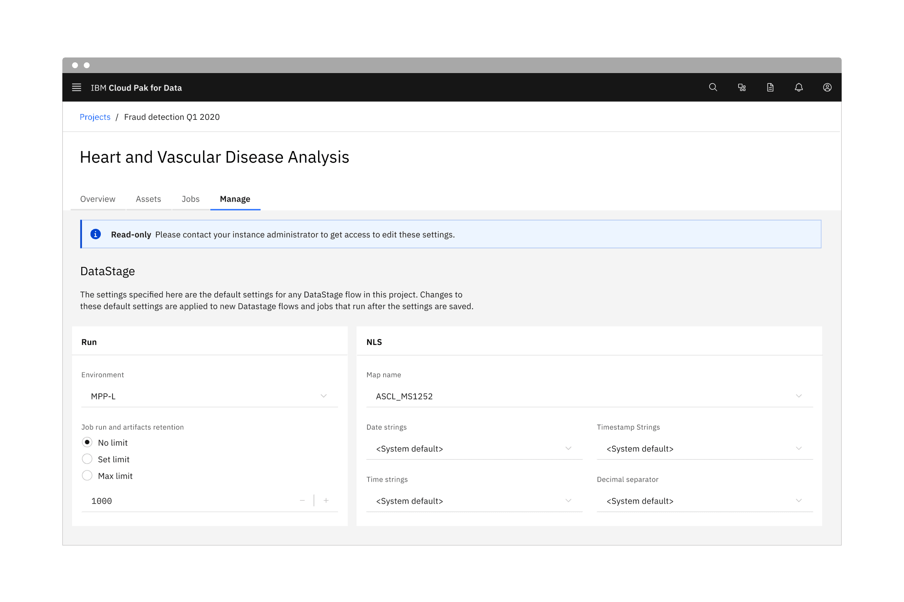
Overview
A read-only state is applied only to components the user can modify when toggled to enabled. Read-only states are considered active, and the data they contain can be used in an application's processes. This state change transforms a component's purpose to be purely informative rather than interactive.
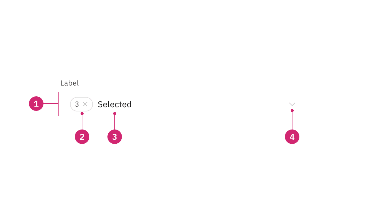
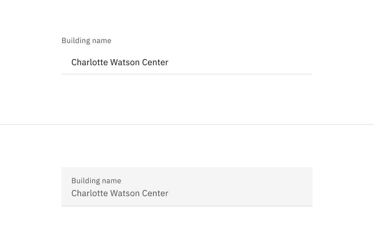
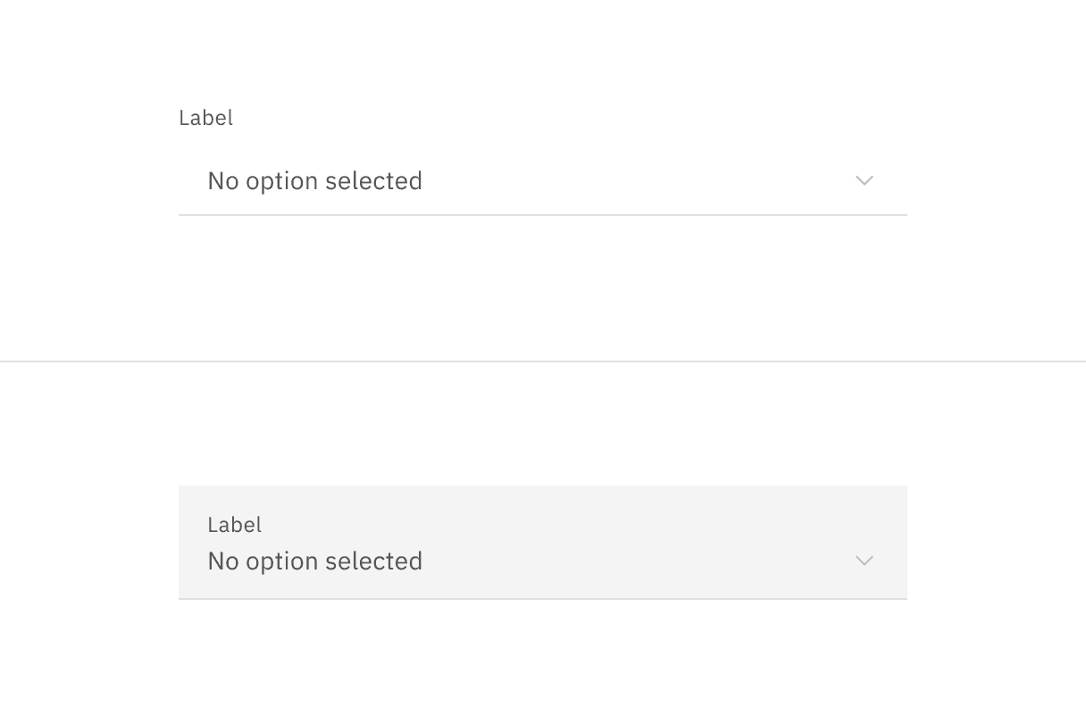
Form component read-only states in context.
When to use
There are three main use cases that initiate a read-only state:
Use case | Description |
|---|---|
Application process | An application’s process temporarily restricts a user from modifying the component until the process completes. |
Locked | An application restricts the number of users that can modify the component at the same time. |
Permissions | A user’s credentials allow them to view the component but not modify it. |
If the component does not have an enabled state, do not use a read-only state to display static information.
As an alternative to a disabled state, read-only and disabled states serve different purposes. For example, when a component is temporarily unavailable pending user actions or decisions (such as completing a form or choosing an option), the component's state should be temporarily disabled, not read-only.
If the component would otherwise be disabled, components in a disabled state should not change to a read-only state.
Read-only state anatomy.
- Background color change: Having a transparent background for fields.
- Border color change: De-emphasizing selection and clickability to make information more readable.
- Text color no change: Text color remains the same as in the enabled state and should still pass 4.5:1 color contrast rules.
- Icon color change: Keeping embedded icons in the component for context but displaying that icons are not interactive with color and cursor changes.
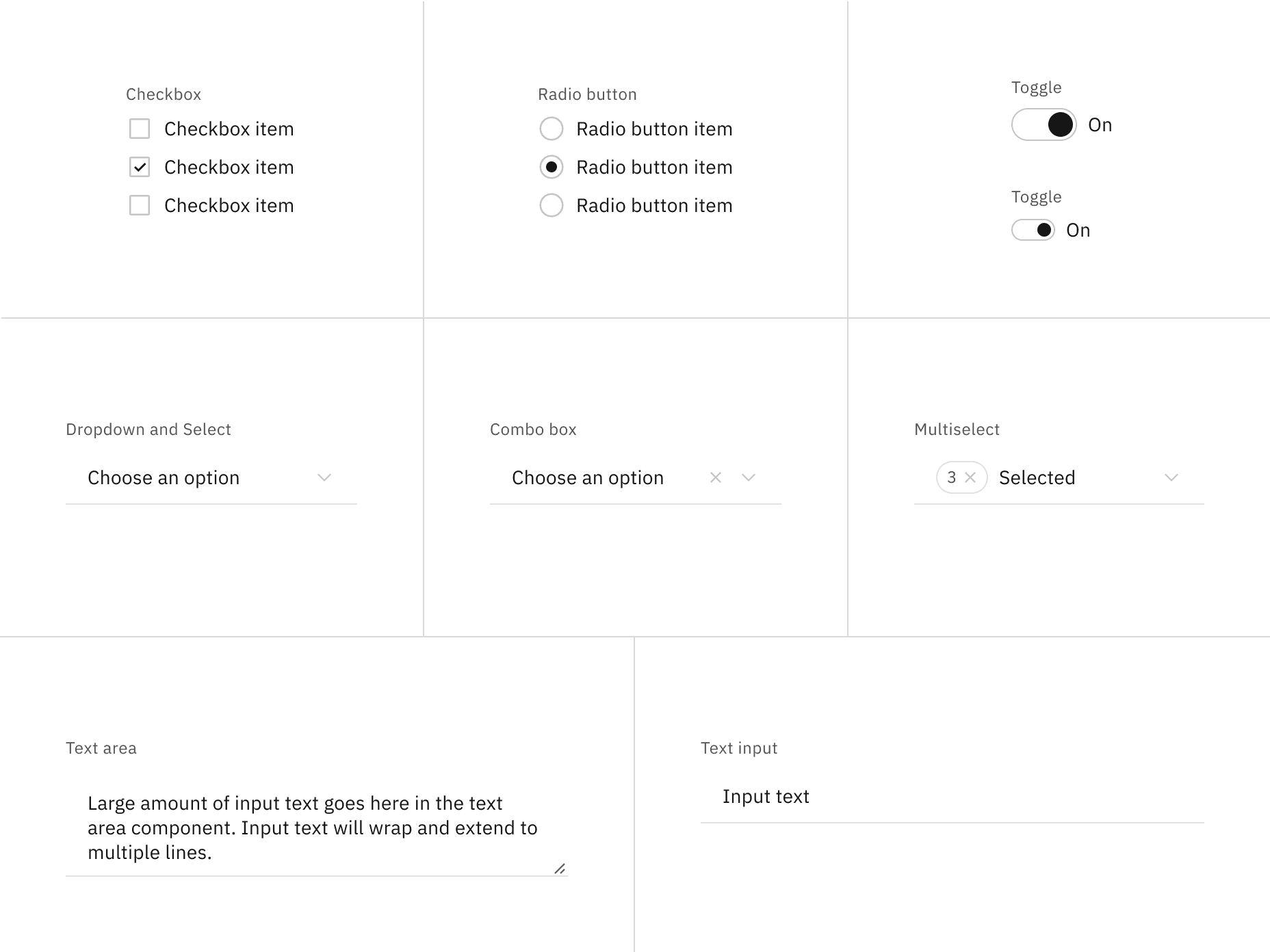
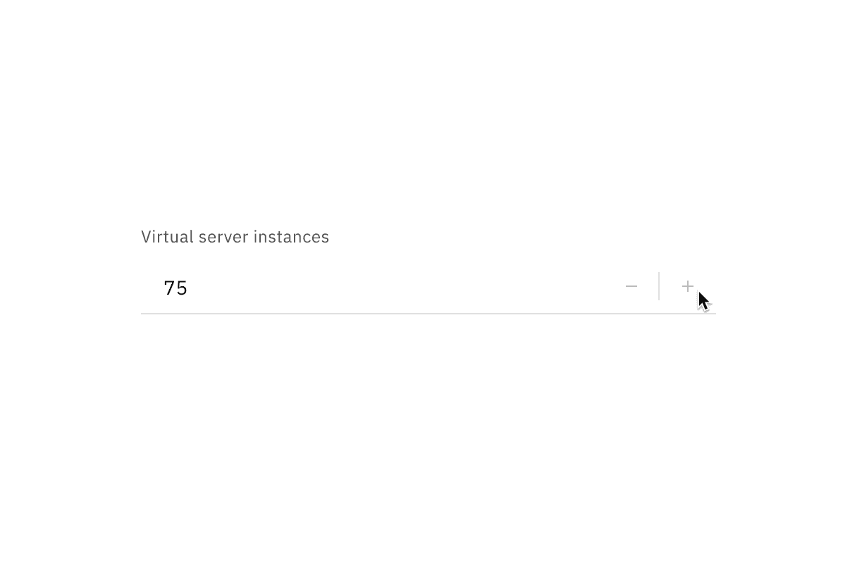
Read-only states for selection controls.
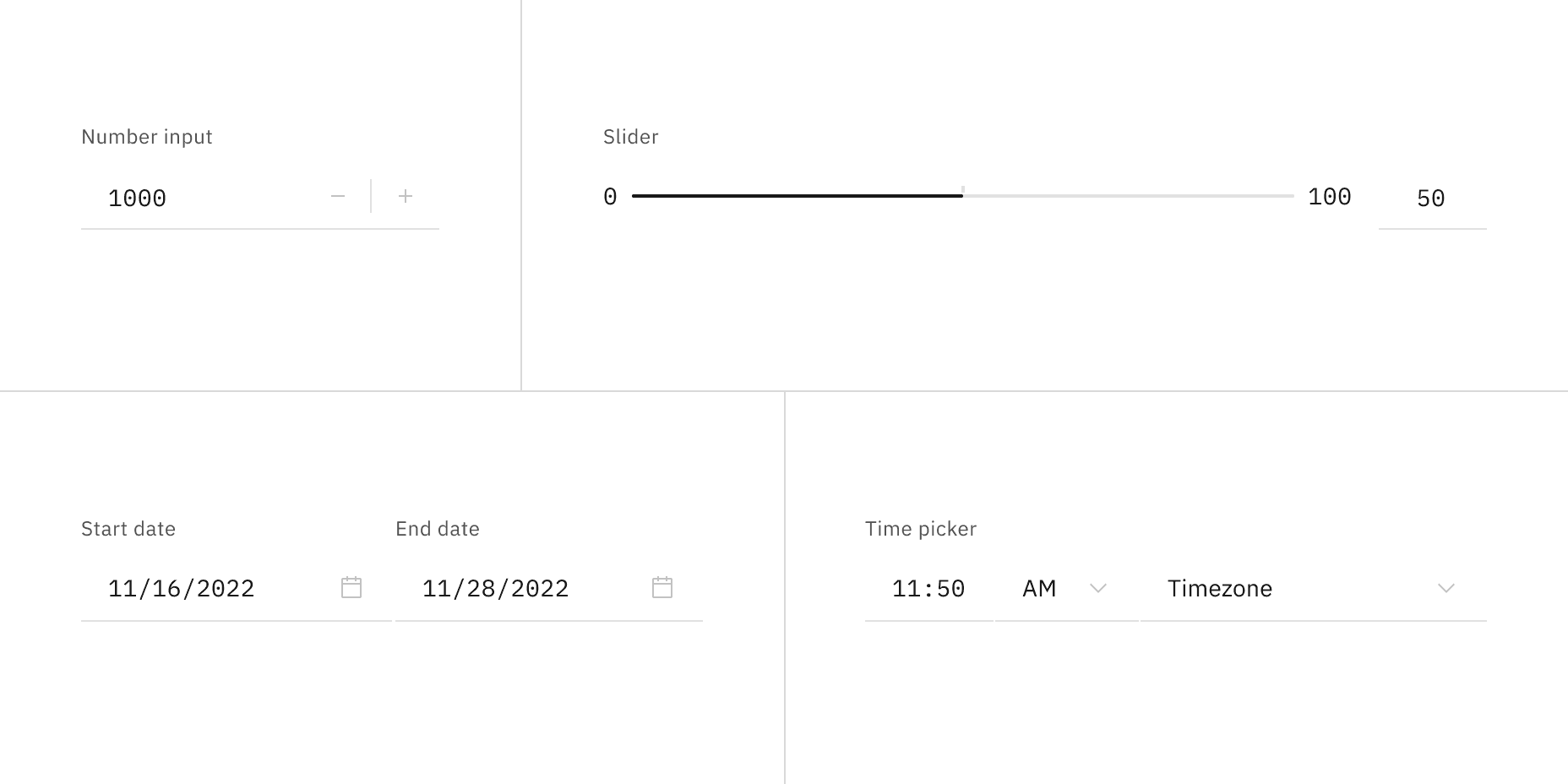
Read-only states for bound entry controls.
Interactive elements
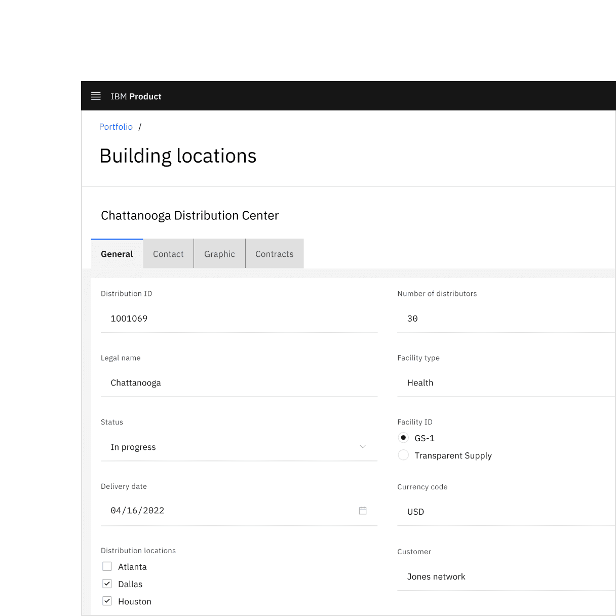
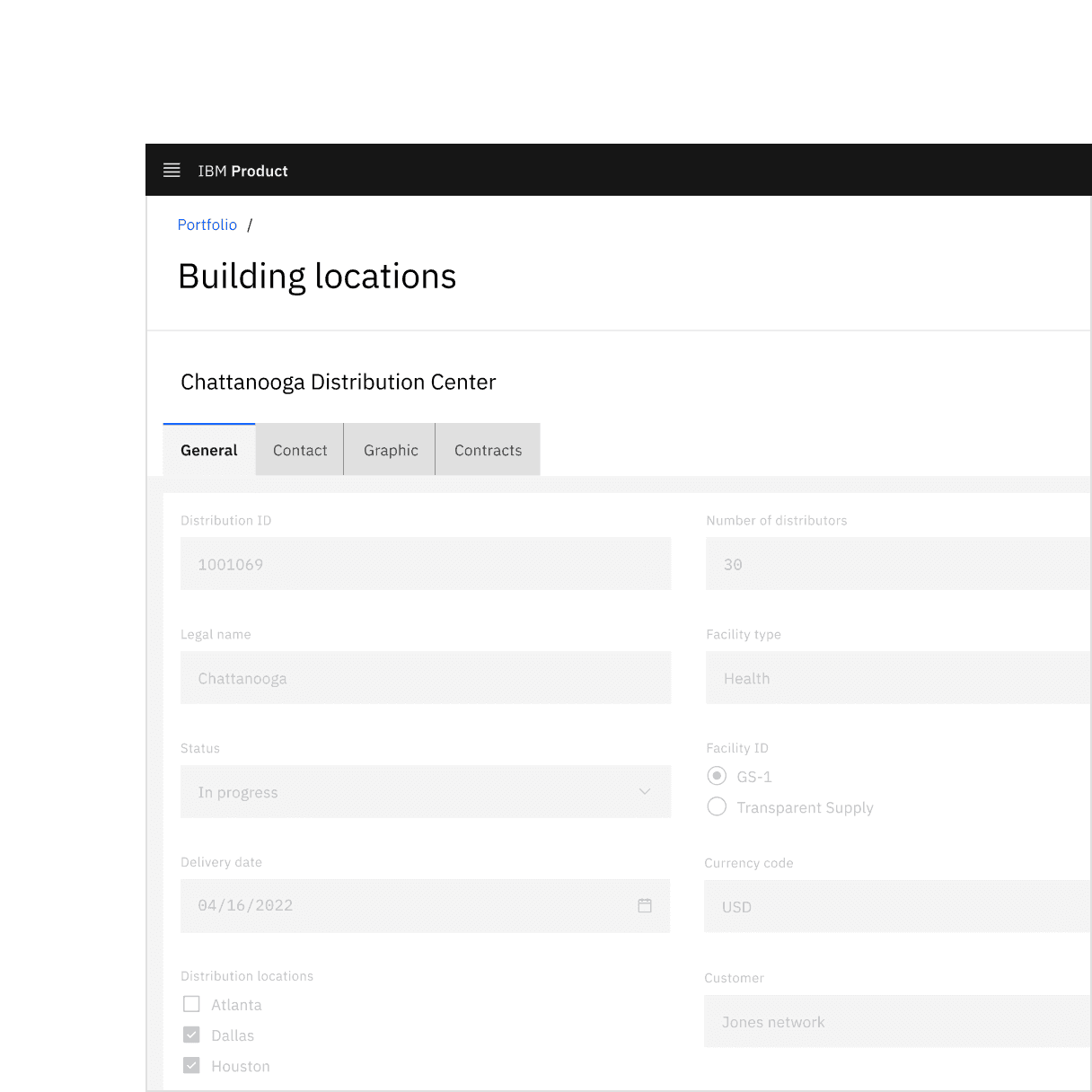
Interactive elements included in a component's enabled state should be removed or modified for its read-only state. Changes to color are used to indicate a modification to interactive elements and a change in their purpose from interactive to informative. Color changes to field backgrounds, interactive elements, and icon signifiers are used to de-emphasize unavailable affordances in a component's read-only state. The color of key informational elements (text, icons, and visualizations) should remain the same as the component's enabled state. Below are a few examples of components comparing their read-only and enabled states.

Do use if the component is not interactive but should be read by the user.
Don’t use disabled states in place of read-only states.
Read-only state arrow cursor.
Accessibility
When considering keyboard accessibility, it can be helpful to distinguish between navigation and operation. A component that can be reached by keyboard is navigable. Read-only components remain navigable so that users can review the information they contain. This contrasts with disabled components, which cannot be reached by a keyboard. However, read-only components are not operable, meaning users can neither manipulate nor alter their values.
MDN contributors, HTML attribute: read-only, (Mozilla Developer, 2022)
Aaron Gustafson, Web Forum Conundrum: disabled or read-only?, (2017)
W3 Schools, HTML Input Attributes, (2022)
Feedback
Help us improve this component by providing feedback, asking questions, and leaving any other comments on GitHub.