This live demo contains only a preview of functionality and styles available for this component. View the full demo on Storybook for additional information such as its version, controls, and API documentation.
Overview
Date pickers allow users to select past, present, or future dates. The kind of date you are requesting from the user will determine which date picker (simple or calendar) is best to use. A time picker helps users select a specific time. You can customize the time picker's format depending on location or need.
When asking the user for an exact, approximate, or memorable date or time.
For scheduling tasks.
Variants
Variant | Purpose |
|---|---|
Use if the date can be remembered by the user easily, such as a date of birth, and they don’t need a calendar to anticipate the dates. It consists only of input fields. | |
Use a calendar picker (single or range) when the user needs to know a date’s relationship to other days or when a date could be variable. The user can view and pick dates from a calendar widget or manually type them in the text field. | |
Use when asking the user to input a specific time. |
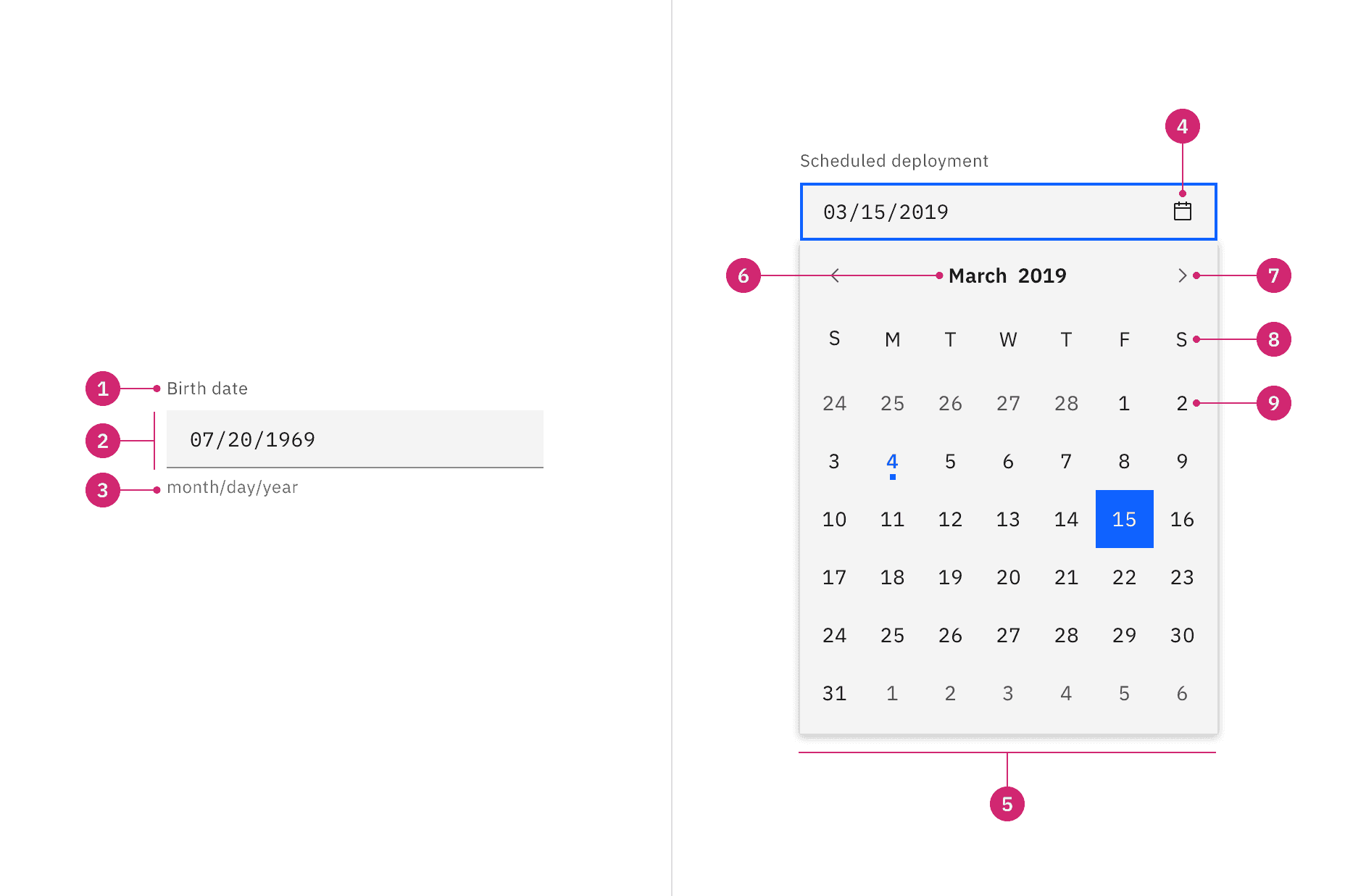
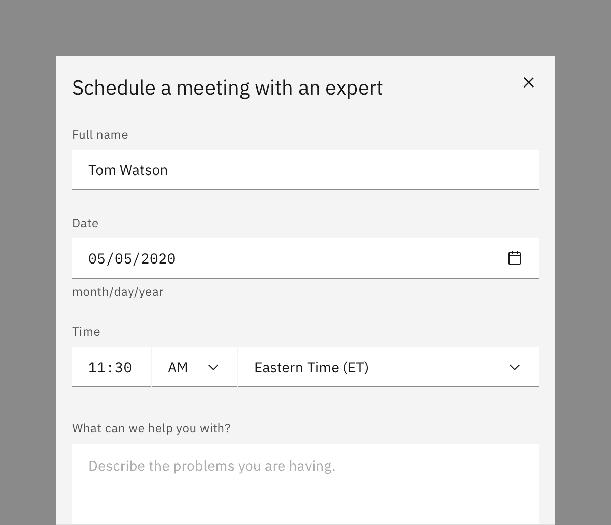
- Label: Instructs the user what to do with the control.
- Date field: A text input field where the user can manually type in the date.
- Date format: Format instructions should appear as helper text below the field or inline with the label.
- Icon:
calendaricon indicates the calendar menu is available. - Calendar: The menu where a date may be selected.
- Month and year controls: Allows the user to navigate through past and future time frames.
- Previous and next month controls: Allows the user to move forward or backward one month at a time.
- Week day: Days of the week.
- Day: Days in the month, see calendar variants for specific day styles.
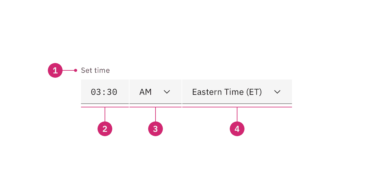
Label: Instructs the user what to do with the control.
Hour and minute field: A text input field where the user types the hours and minutes of the desired time.
AM/PM selector: A select control that allows the user to choose time period.
Timezone selector: A select control that allows the user to set the associated time zone.
Styling
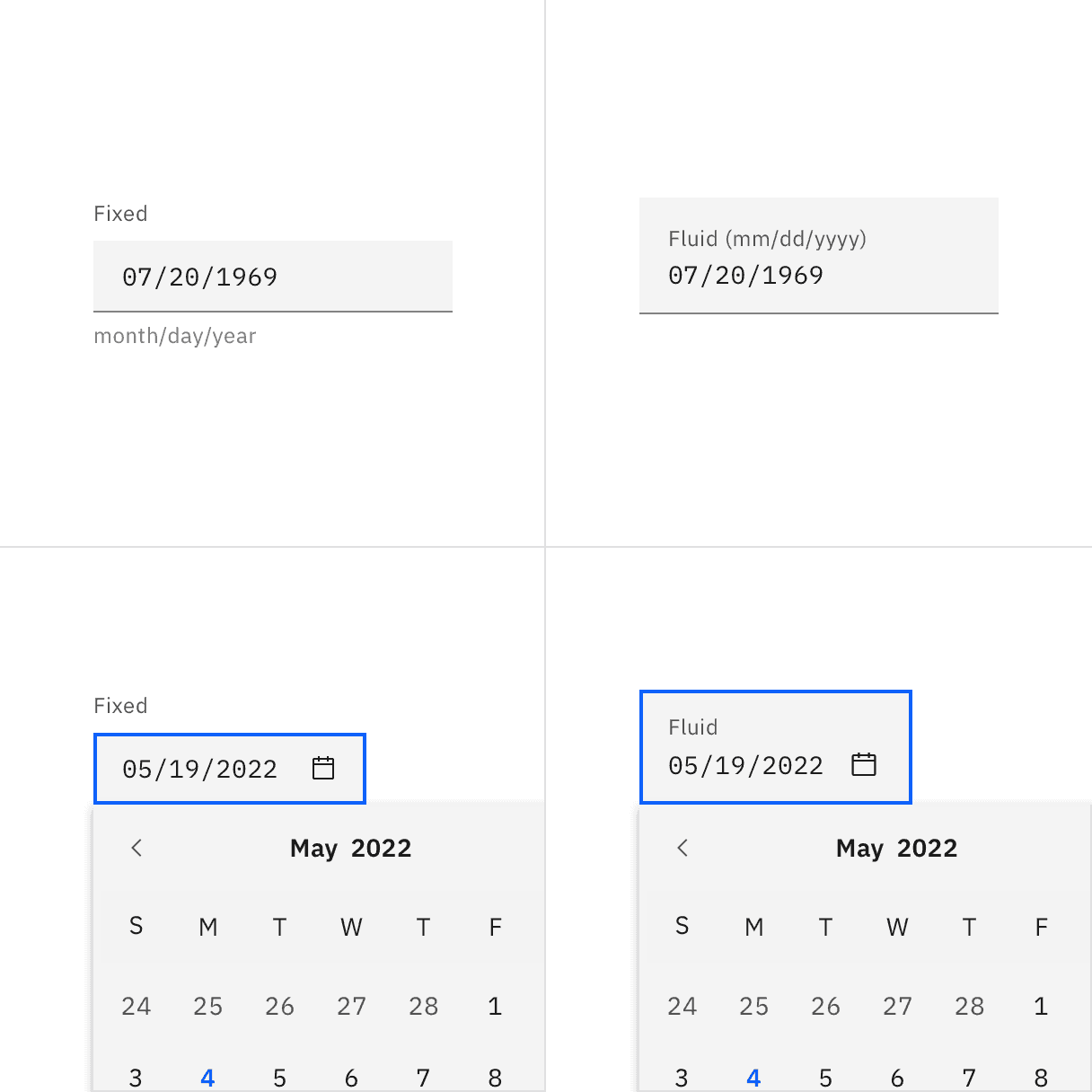
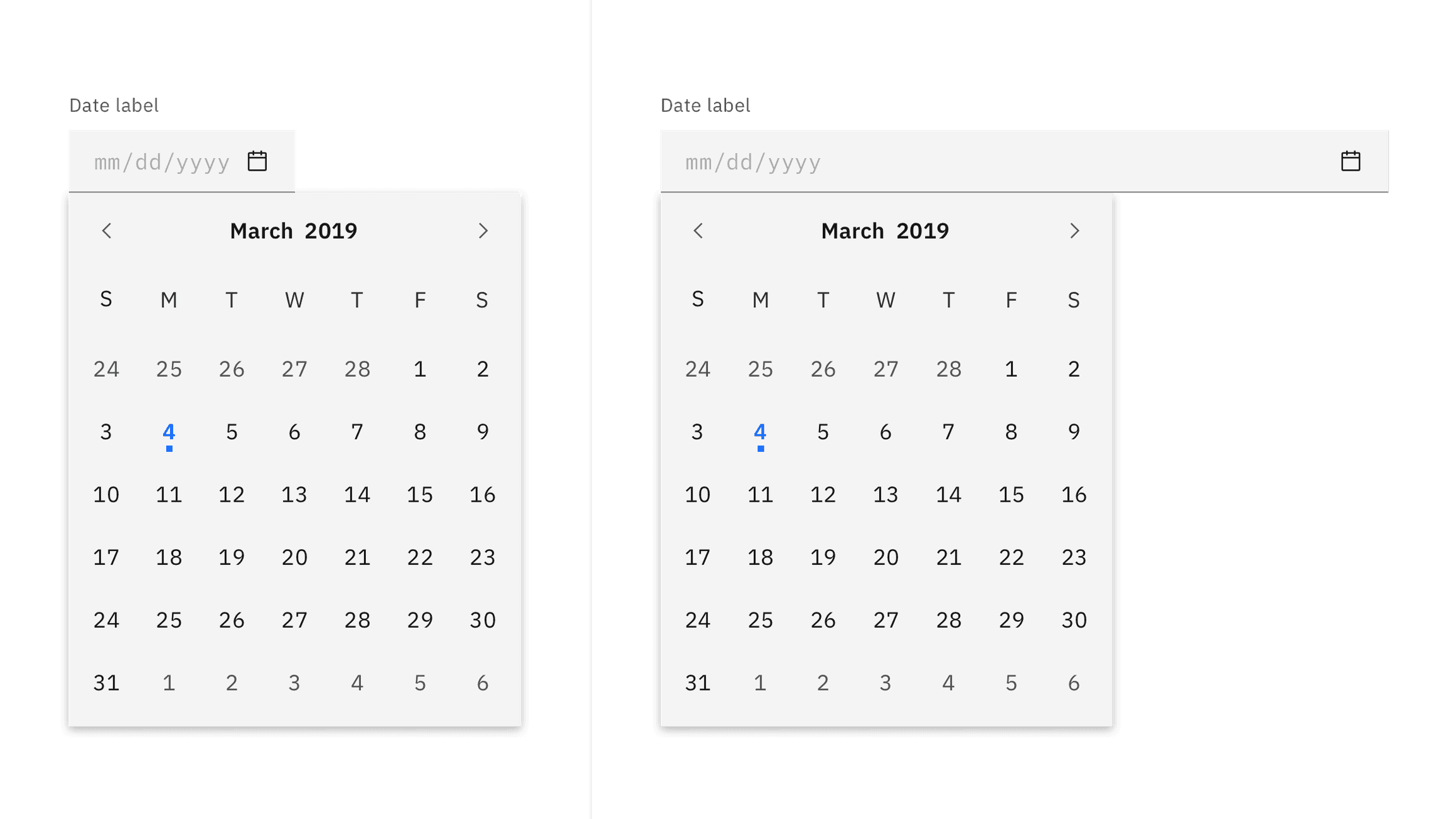
There are two styles of date picker inputs, default and fluid. They share the same functionality but look visually different, influencing where to use them.
Style | Appearance | Use case |
|---|---|---|
Default | A traditional style where the label is positioned outside and above the input field. | Use when white space is needed between input components or in productive moments where space is at a premium, and smaller components are needed. |
Fluid | An alternative style where the label is placed inside of the input field and is stacked inline with the user input text. | Use in expressive moments, fluid forms, contained spaces, or attached to complex components, like a toolbar. |
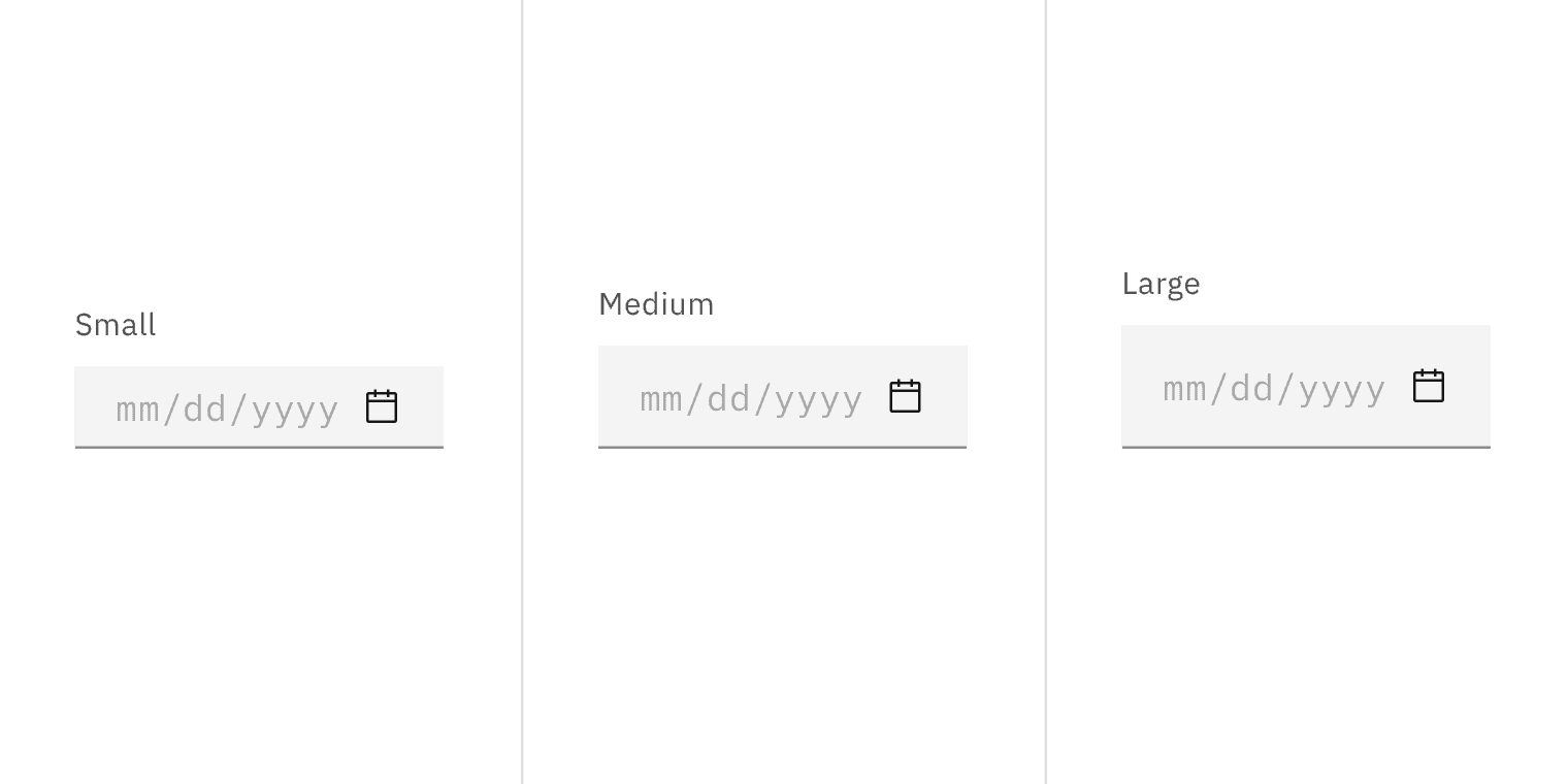
Default input heights
The default input fields for date and time picker come in three height sizes: small (32px), medium (40px), and large (48px). The calendar menu in the date picker is a fixed height and width and does not change with the input size.
Default size | Height (px/rem) | Use case |
|---|---|---|
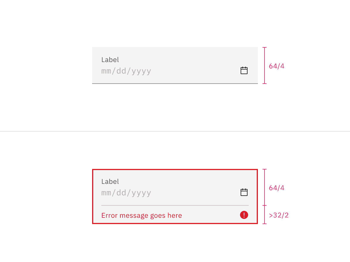
Small (sm) | 32 / 2 | Use when space is constricted or when placing a dropdown in a form that is long and complex. |
Medium (md) | 40 / 2.5 | This is the default size and the most commonly used size. When in doubt, use the medium size. |
Large (lg) | 48 / 3 | Use when there is a lot of space to work with. This size is typically used in simple forms or when a dropdown is placed by itself on a page, for example as a filter. |
Alignment
By default, the pickers have set widths. If you are placing the picker inline with other inputs, such as in a form, then the widths can be adjusted to match the other inputs. The picker can either increase or decrease in width as needed. If you adjust the size, be aware that pickers have minimum widths and the date content should never horizontally scroll or overflow.
Date format
When using a simple date input, include the date format in parentheses inline with the label or as helper text below the label.
When using the calendar picker, the date format will be automated if the user selects from the calendar menu.
Only including the date format as placeholder text inside the field is problematic because it will disappear from view once the user begins typing.
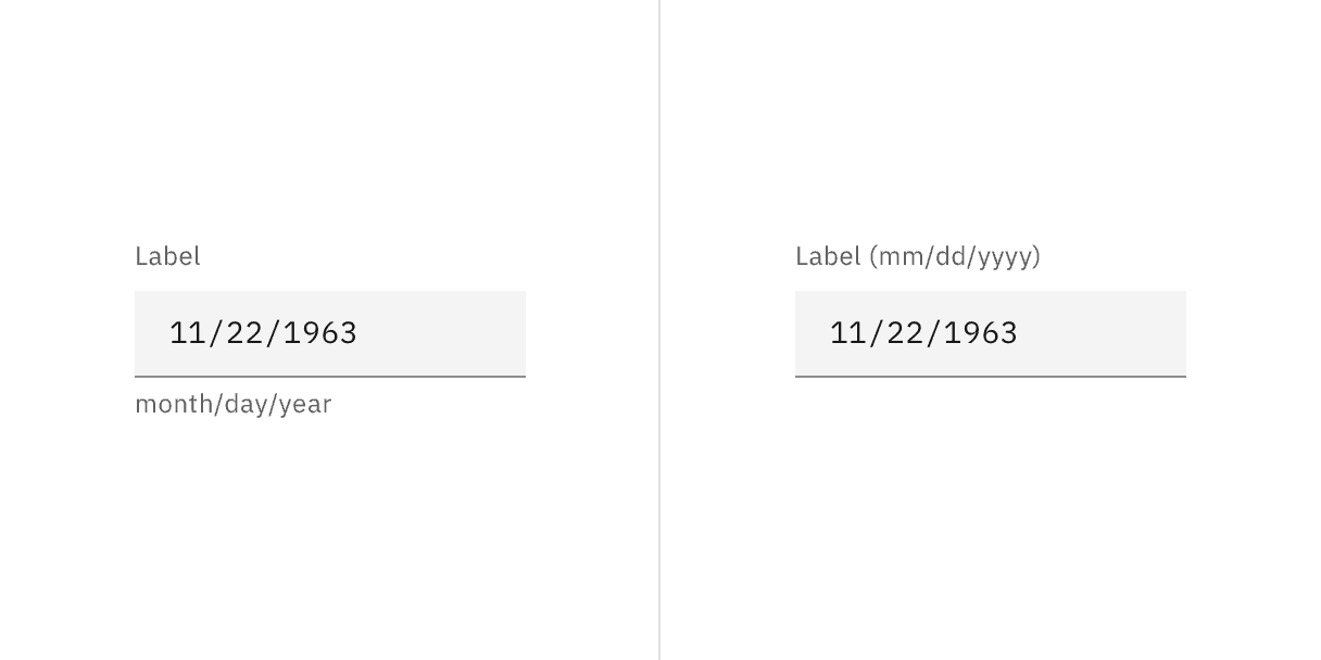
Example suggesting the proper date format in helper text on the left or in a label on the right.
- The date format can be displayed differently depending on your location. For example, some countries use the format month/day/year, while others may change the order to year-month-day and can use dashes instead of slashes. The date picker utilizes flatpickr, which accepts
dateFormatandlocaleprops that allow you to change how the date is displayed and lets you change the language of the calendar. Localizing static dates in the same UI is also recommended if you choose to localize your date entries.
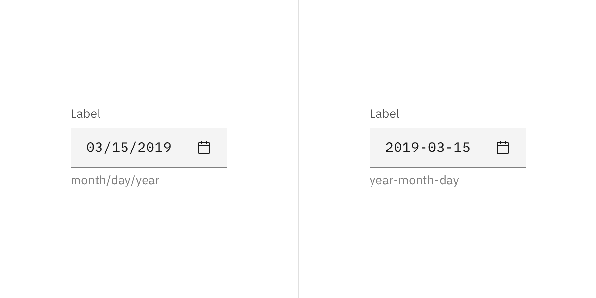
Example of formatting dates with American English format on the left and International Standard format on the right.
Further guidance
For further content guidance, see Carbon's content guidelines.
Date picker and calendar menu
The date picker input is a text input and has the same interactive state and behaviors. Only date pickers with calendars will have the calendar icon present in the right side of the input field. See the specifications tab for more details. For calendar menu states, see the calendar variants section.
Time picker
The time picker is a combination of a text input and select inputs and has the same interactive state and behaviors. See the specifications tab for more details.
State | When to use |
|---|---|
Enabled | When the date or time picker is live, but a user is not directly interacting with it. This is commonly referred to as the default or normal state of the component. |
Hover | When a user’s mouse cursor is hovering over the field. |
Focus | When a user tabs to or clicks into the input, the field becomes focused, indicating the user has successfully navigated to the component. |
Open | The open state is specifically for the calendar menu. When the calendar menu is open, the user can navigate within the menu to select a single date or a range of dates. |
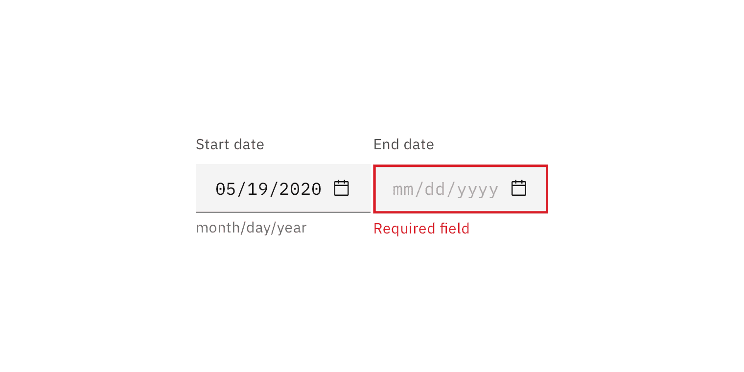
Error | When the required field for a text input in the date or time picker component has not been filled in or when a select in the time picker component does not have a selection. It can also be triggered due to a system error. This state requires a user response before data can be submitted or saved. |
Warning | When you need to call the user’s attention to an exception condition. The condition might not be an error but can cause problems if not resolved. |
Disabled | When the user cannot interact with a component and all interactive functions have been removed. Unlike read-only states, disabled states are not focusable, are not read by screen readers, and do not need to pass visual contrast, making them inaccessible if they need to be interpreted. |
Skeleton | Use on an initial page load to indicate that the date picker or time picker has not yet fully loaded. |
Read-only | When the user can review but not modify the component. This state removes all interactive functions like the disabled state but can still be focusable, accessible by screen readers, and passes visual contrast for readability. |
Internationalization
Internationalization, also referred to as globalization, refers to software adapting to different languages, regional peculiarities, and technical requirements of a target locale without additional code changes. This means that if the location is known, then formatting of a date or time can automatically change to the acceptable local format. You should always try to design for internationalization.
Simple date input
The simple date input provides the user with only a text field in which they can manually input a date. It allows dates to be entered without adding unnecessary interactions that come with the calendar menu or a dropdown.
The simple date input can include month/year or month/day/year. The formatting may be localized and rearranged in sequence of appearance.
Use for approximate dates
Simple date inputs are best for when asking the user for an approximate date instead of an exact date, especially in regards to past dates. For example, when asking a user when a purchase was made they will most likely easily recall the month and year (November 2019) versus the specific date (November 22, 2019).
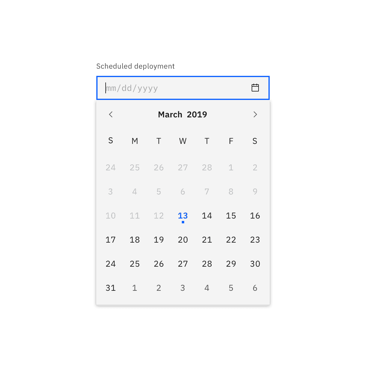
Calendar pickers
Calendar pickers default to showing today's date when opened and only one month is shown at a time. Calendar pickers allow users to navigate through months and years, however they work best when used for recent or near future dates. If a user needs to input a far distant or future date consider having the calendar default open to a more convenient day.
Keep in mind that some users may find calendar pickers difficult to use. There should always be a simple way to enter dates in a text field when using calendar pickers.
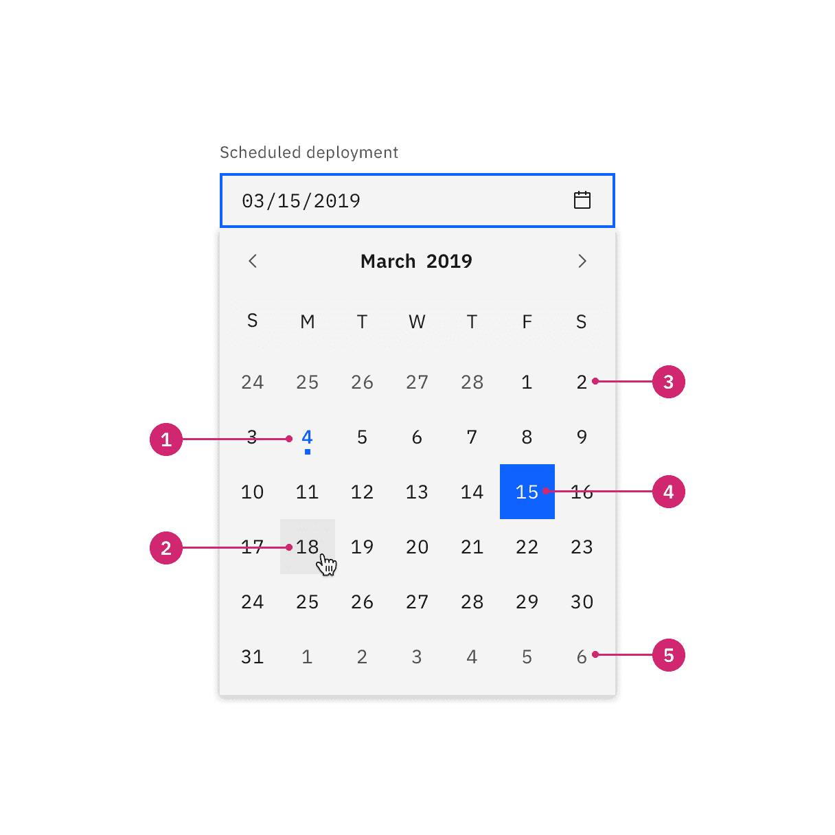
Today's date
Hover
Day in month
Selected day
Day in next/previous month
Date range picker
The date range picker functions much like the single date picker but instead of choosing just one date the user can choose a start and end date. For each date in the range, users have the option to manually enter the date in a text field or select the date in the calendar. Each point requires a day, month, and year to be selected.
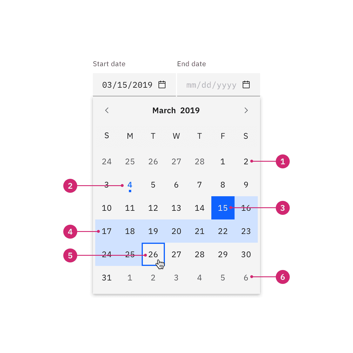
Day in month
Today
Selected start date
Day in range
End date hover and focus
Day in next/previous month
Selecting a year
By default the current date and year appears in the calendar. To navigate to another year the user can do one of the following:
Manually typing the year in the date text field.
Clicking the up and down arrows that appear when you focus or hover on the year input in the calendar.
Selecting then typing into the year input.
Selecting a range
There are several ways in which a range can be selected:
Manually type the start and end dates in the text field.
Once the calendar is open the first date you click becomes the start date and second date you click becomes the end date.
Navigating to the start date by using the
Arrowkeys and pressingEnter. Then continue using theArrowkeys to navigate to a second date and pressEnteragain.
Min and max dates
In order to constrain the possible selectable dates in a calendar, a min and max date may be set. Once set, only the dates that fall within the min/max range will be selectable with the dates outside of the range being disabled.
Use min and max dates to help prevent user error. If a user cannot select dates in the past when scheduling, then set a min date to today.
The dates before today are out of range and disabled.
Time pickers
Time pickers provide the user with a text field in which they can input the hour and minutes. Additionally, they can be accompanied by an AM/PM and a time zone control, both styled as selects.
The time field format should include the hour and minutes, for example 11:30. It may be localized to accommodate the 12-hour or 24-hour format.
AI presence
Date picker has a modification that takes on the AI visual styling when the AI label is present in the input. The AI variant functions the same as the normal version except with the addition of the AI label which is both a visual indicator and the trigger for the explainability popover.
For more information on designing for AI, see the Carbon for AI guidelines.
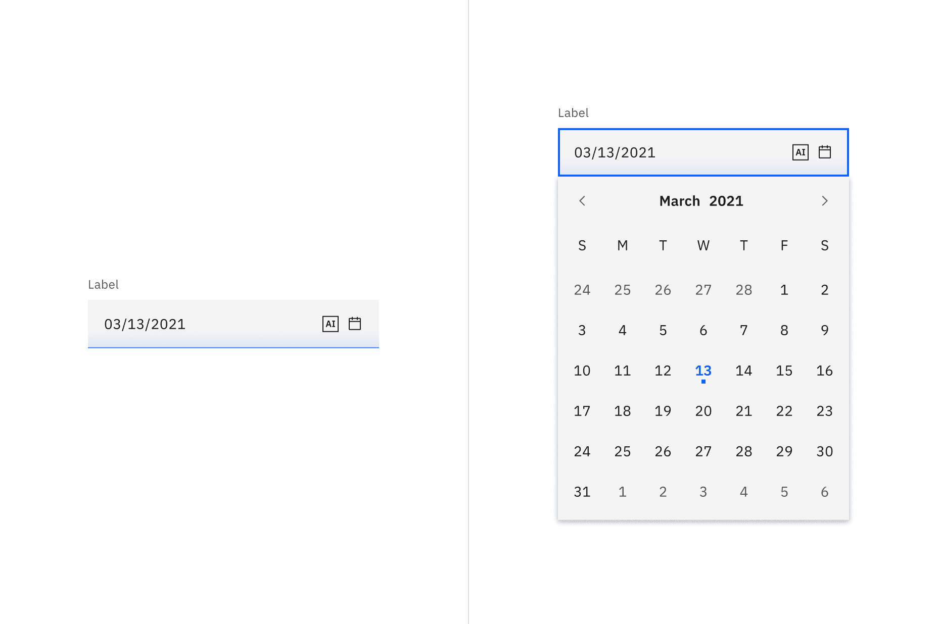
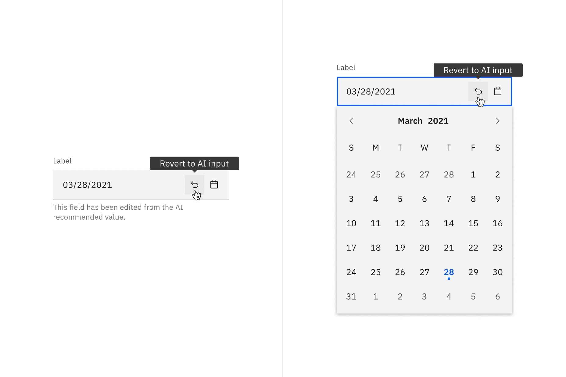
Revert to AI
A date picker can toggle between the AI variant and the non-AI variant depending on the user's interaction. If the user manually overrides the AI-suggested content then the input will change from the AI variant to the non-AI variant. Once edited, the user should still be able to switch back to the initially AI generated content via a revert to AI button.
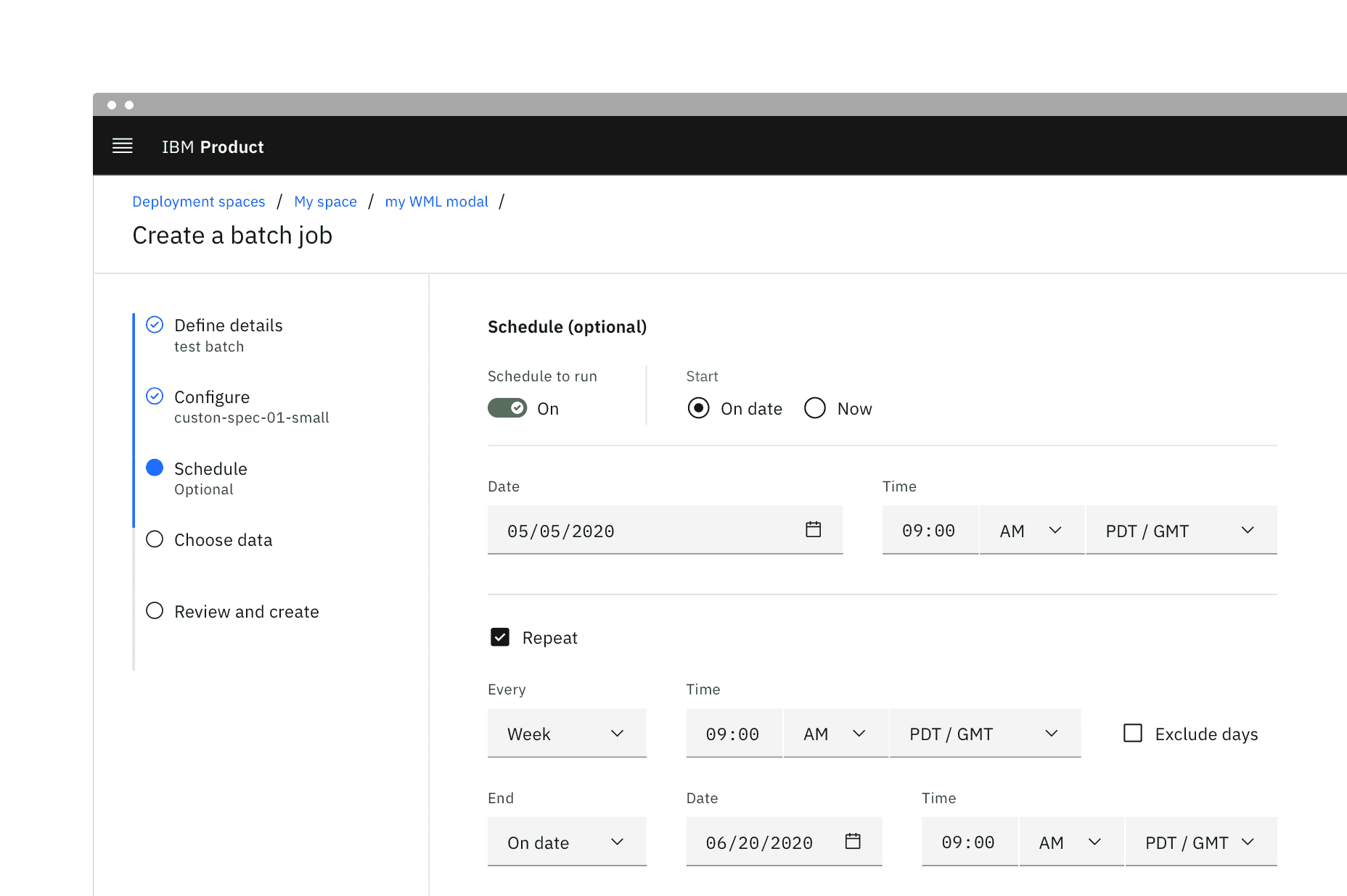
Asking for relative times and dates
Another common use case not accounted for in the above pickers is setting a time or date relative to today or now, such as with a reminder. For example, setting an install to begin now, in one hour, or tonight. This variant of picker can be made by using the standard select component.
Using individual inputs
Another acceptable form of a date experience would be using individual inputs for each factor. Using an individual field for each factor of a date can help reduce formatting errors. This is especially beneficial when localization cannot be used to reformat dates.
Instead of having one input for an exact date (month/day/year), you could have three separate inputs and a clear label for each.
Feedback
Help us improve this component by providing feedback, asking questions, and leaving any other comments on GitHub.