This live demo contains only a preview of functionality and styles available for this component. View the full demo on Storybook for additional information such as its version, controls, and API documentation.
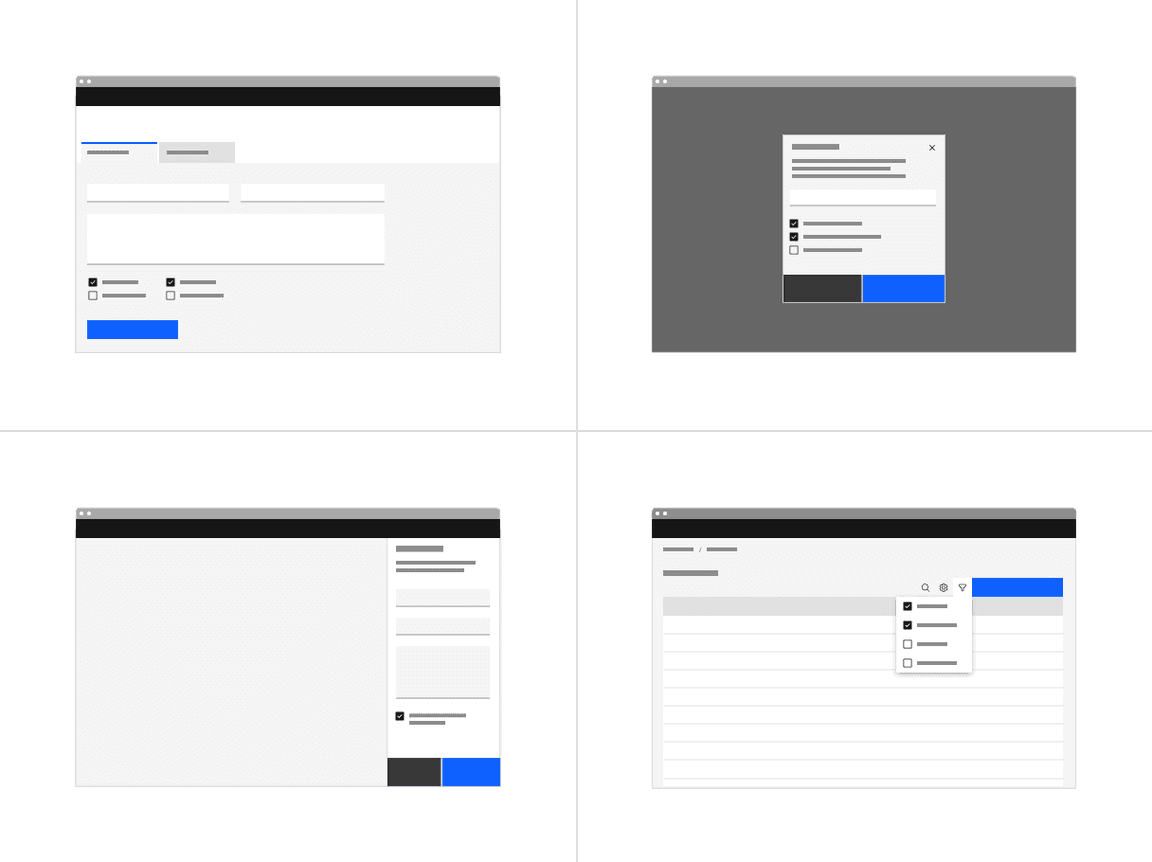
Filtering and batch action
Used to filter data either on a page, in a menu, or within a component. Checkboxes are found in Data table for batch editing purposes.
Lists with sub-selections
Used when there is a parent and child relationship. You can use a parent checkbox to make a bulk selection of all list items. Unchecking the parent deselects all of the list items. Alternatively, you can select children individually when the parent is not selected, which is where the indeterminate state comes in to play.
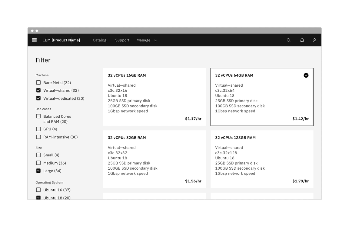
Example of a full page filter list
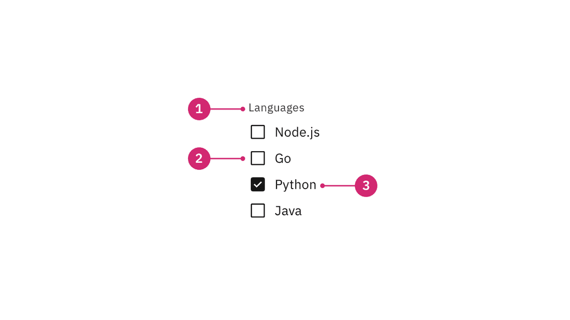
Anatomy of a group of checkboxes.
Group label (optional): Communicates what needs to be selected below.
Checkbox input: A checkbox input indicating the appropriate state. By default it is unselected.
Checkbox label: Describes the information you want to select or unselect.
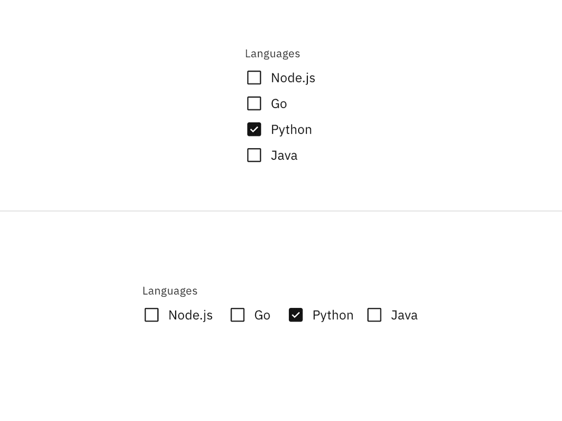
Vertically stacked versus horizontal alignment
Placement of checkboxes in different UI scenarios.
Checkboxes in a form should be placed at least 32px (layout-03) below or before the next component. Spacing of 24px (layout-02) or 16px (layout-01) can also be used when space is more restricted or if the form is more complex.
For more information on spacing in forms, see our form style guidance.
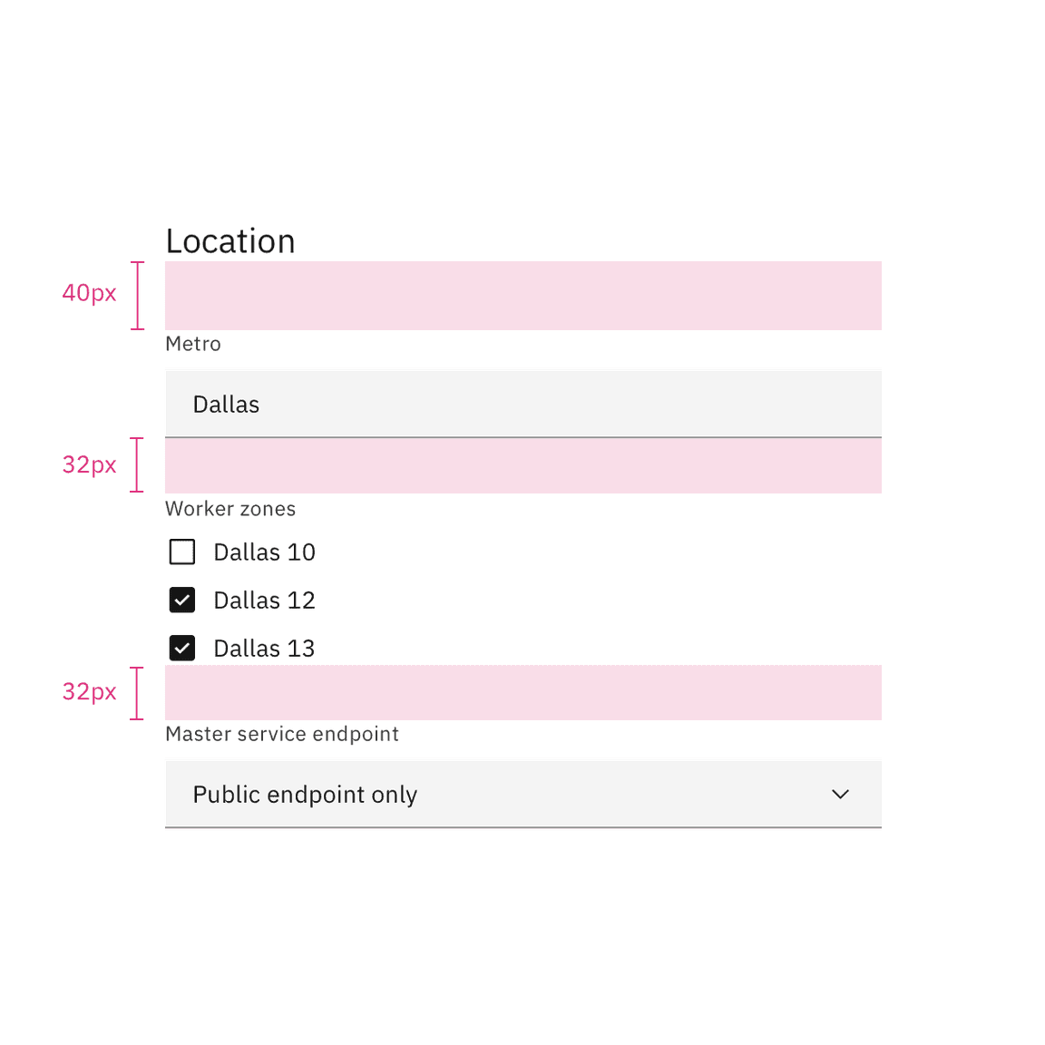
Spacing between a checkbox and other components in a form
For more information about spacing for the checkbox component itself, see the style tab.
In most cases, a set of checkboxes is preceded by a group label to provide further context or clarity.
A group label can either state the category of the grouping or describe what actions to take below.
Use sentence case for group labels.
In some cases, a group of checkboxes may be within a larger group of components that already have a group label. In this case, an additional group label for the checkbox component itself is not needed.
Always use clear and concise labels for checkboxes.
Labels appear to the right of checkbox inputs.
Regardless of whether the label is visible in the interface, a label is always needed in code, whether it's for one checkbox or a group of them. See the checkbox code tab for more information.
We recommend checkbox labels being fewer than three words.
If you are tight on space, consider rewording the label. Do not truncate checkbox label text with an ellipsis.
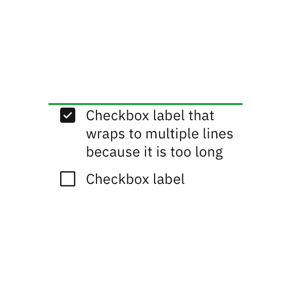
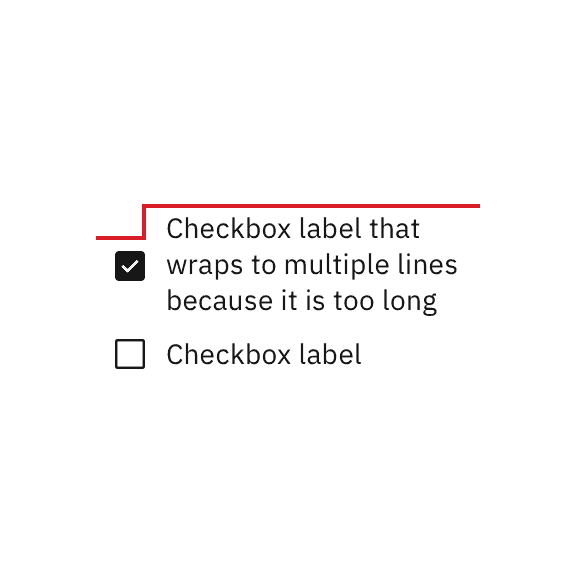
Long labels may wrap to a second line, and this is preferable to truncation.
Text should wrap beneath the checkbox so the control and label are top aligned.

Text wrapping for checkboxes.
Further guidance
For further content guidance, see Carbon's content guidelines.
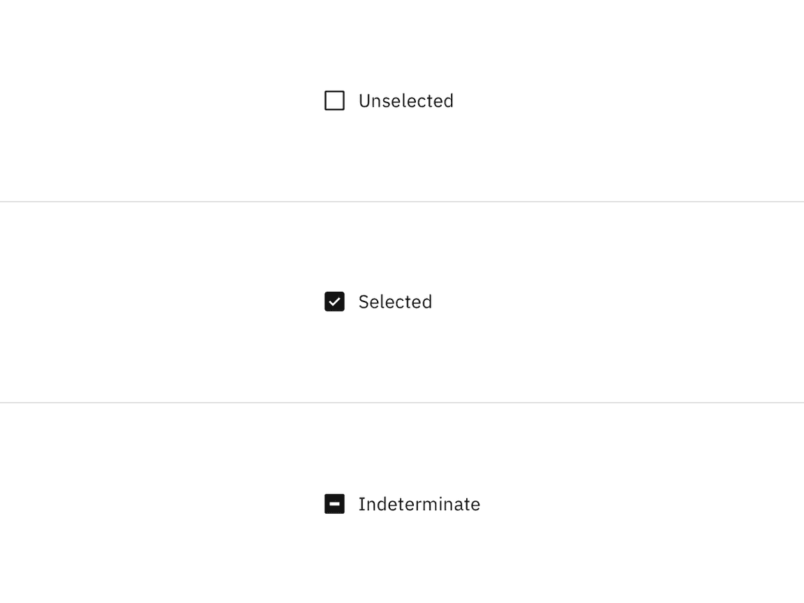
Unselected, selected, and indeterminate states of checkbox.
Use the indeterminate state when the checkbox contains a sublist of selections, some of which are selected, and some unselected. In addition to unselected, selected, and indeterminate states, checkboxes also have states for focus, disabled, read-only, error, and warning. When deciding whether to use a disabled or read-only state for checkboxes, see our Read-only states pattern guidance.
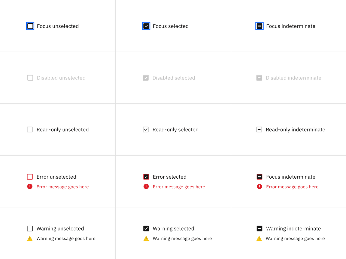
Focus, disabled, read-only, error, and warning states of checkbox
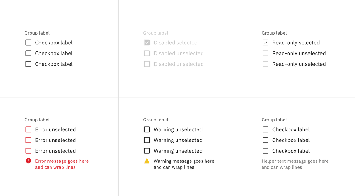
Enabled, disabled, read-only, error, warning and helper text states for checkbox group
Nesting
Checkboxes can be nested when a parent and child relationship is needed. Users can either select an entire set of options or only a subset.
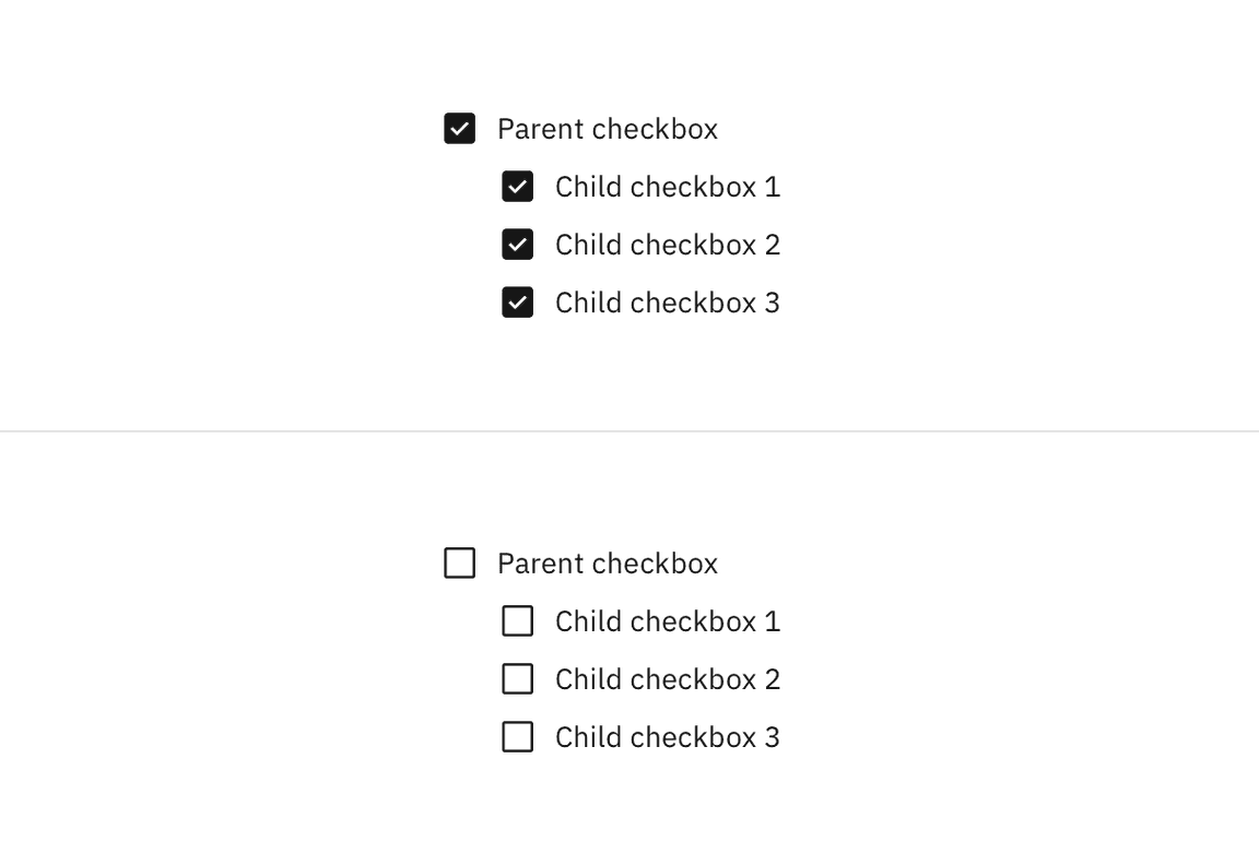
Checking the parent checkbox automatically selects all of the nested children checkboxes. Unchecking the parent checkbox automatically deselects all of the children checkboxes.
Checking and unchecking the parent checkbox.
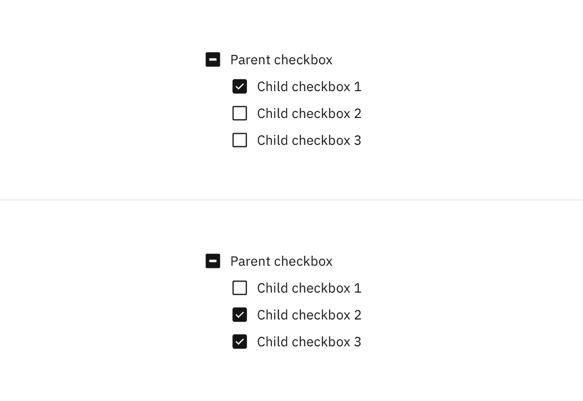
Checking a child checkbox, if at least one other child checkbox is not selected, automatically puts the parent checkbox into the indeterminate state. Unchecking a child checkbox, when all other children checkboxes remain selected, switches the parent checkbox from the default checked state to the indeterminate state.
Checking and unchecking a child checkbox.
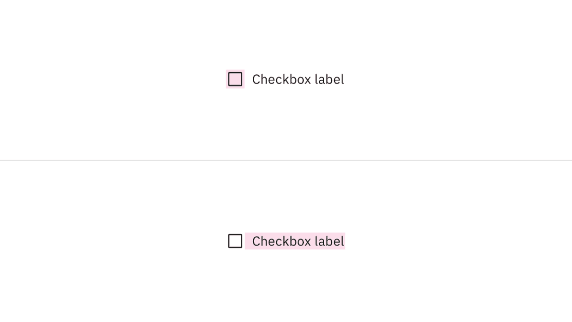
Click targets for checkbox.
Keyboard
Users can navigate to and between checkbox inputs by pressing Tab or Shift-Tab. Users can trigger a state change by pressing Space while the checkbox input has focus. For additional keyboard interactions, see the accessibility tab.
AI presence
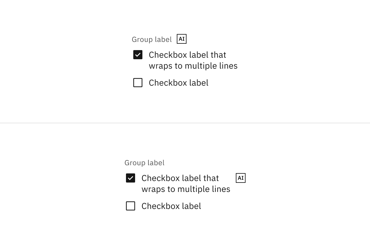
Checkbox has a modification that embeds the AI label when AI is present in the control. The AI variant functions the same as the normal version except with the addition of the AI label which is both a visual indicator and the trigger for the explainability popover. The AI label can be placed on the checkbox group label or on individual checkbox labels.
For more information on designing for AI, see the Carbon for AI guidelines.
Checkbox with AI presence
Feedback
Help us improve this component by providing feedback, asking questions, and leaving any other comments on GitHub.