This live demo contains only a preview of functionality and styles available for this component. View the full demo on Storybook for additional information such as its version, controls, and API documentation.
When not to use
Breadcrumbs are always treated as secondary and should never entirely replace the primary navigation. They shouldn’t be used for products that have single level navigation because they create unnecessary clutter.
If you are taking users through a multistep process use a progress indicator instead.
Variant | Purpose |
|---|---|
Location-based | These illustrate the site’s hierarchy and show the user where they are within that hierarchy. |
Path-based | These show the actual steps the user took to get to the current page, rather than reflecting the site’s information architecture. Path-based breadcrumbs are always dynamically generated. |
Anatomy of a breadcrumb
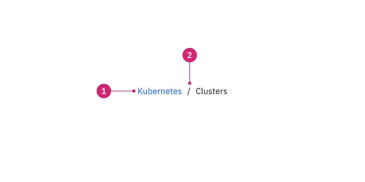
- Page link: Directs users to the parent-level page.
- Separator: Clearly distinguishes between each page.
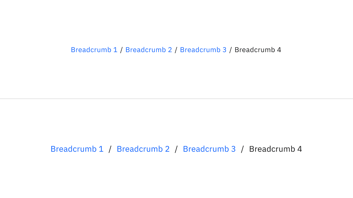
Small and medium sizes of breadcrumb
Example shows the use of small breadcrumbs
Example shows the use of medium default breadcrumbs
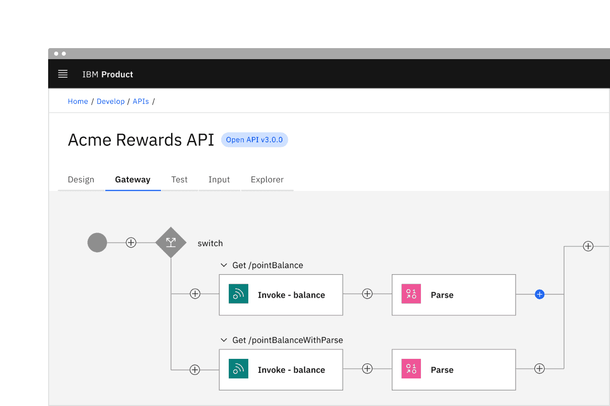
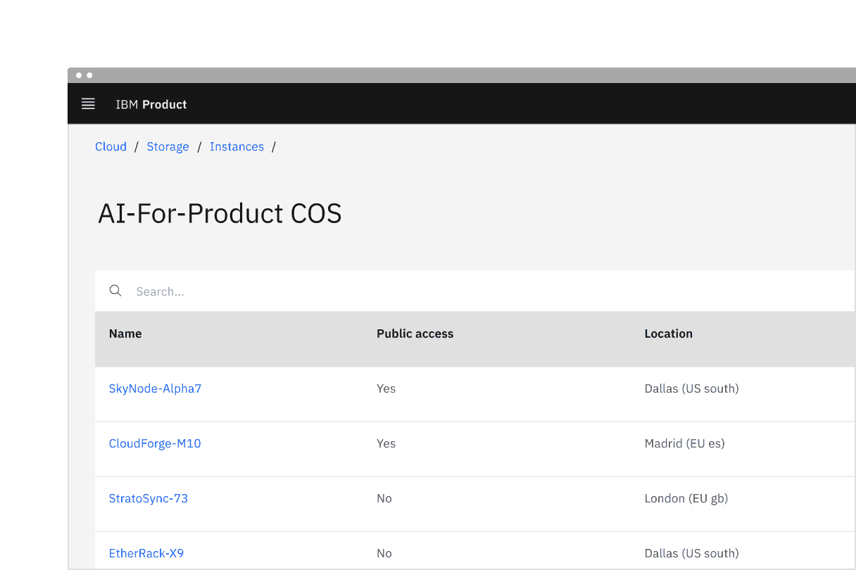
Placement of breadcrumb in a UI
- Each page link should be short and clearly reflect the location or entity it links to.
- Start with the highest level parent page and move deeper into the information architecture as the breadcrumb trail progresses.
- By default, the current page is not listed in the breadcrumb trail. However, if a page doesn’t have a title or the current page is not clear, the current page can be included in the breadcrumb trail if it is more suitable for your products use case. If the current page is included in a breadcrumb trail, it is always the last text listed and is not an interactive link.
Overflow content
When space becomes limited, use an overflow menu to truncate the breadcrumbs. The first and last two page links should be shown, but the remaining breadcrumbs in between are condensed into an overflow menu. Breadcrumbs should never wrap onto a second line.
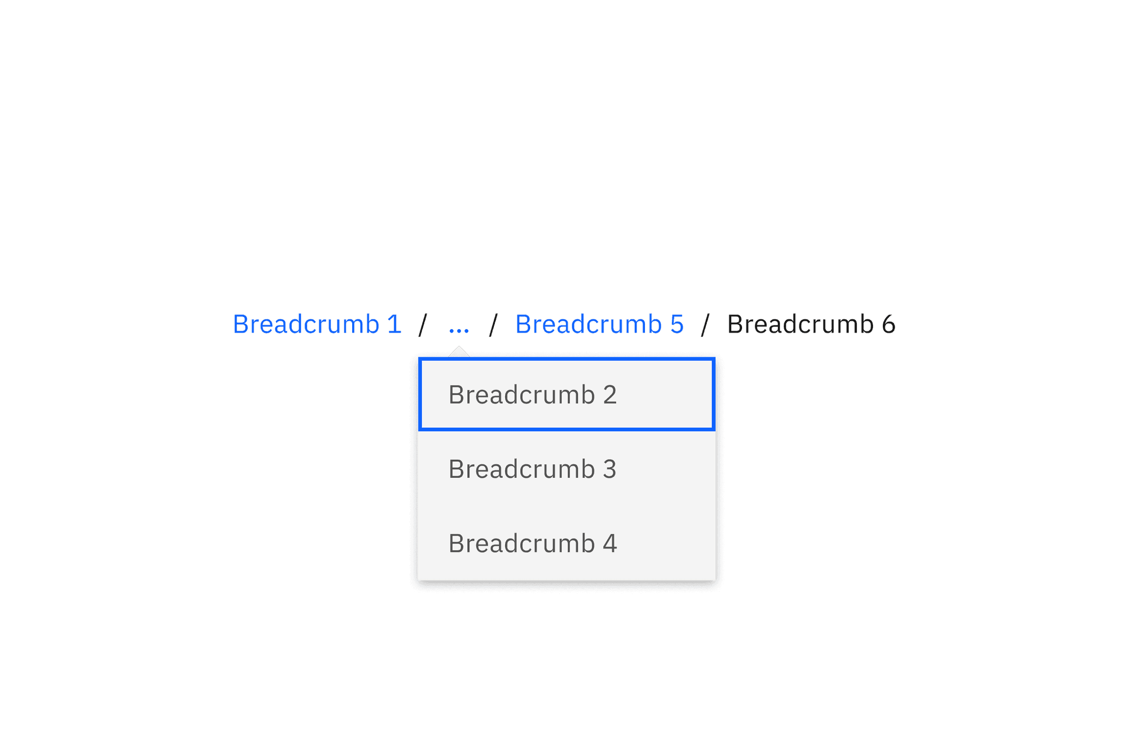
Overflow breadcrumb
Further guidance
For further content guidance, see Carbon’s content guidelines.
Keyboard
Users can navigate between breadcrumb links by pressing Tab and Shift-Tab. Users can trigger a breadcrumb link by pressing Enter while the link has focus. For additional keyboard interactions, see the accessibility tab.
Modifiers
By default, Carbon breadcrumb trails should not include the current page. If a page doesn’t have a title or the current page is not clear, it can be included in the breadcrumb trail. If the current page is included in a breadcrumb trail, it is always the last text listed and is not an interactive link.
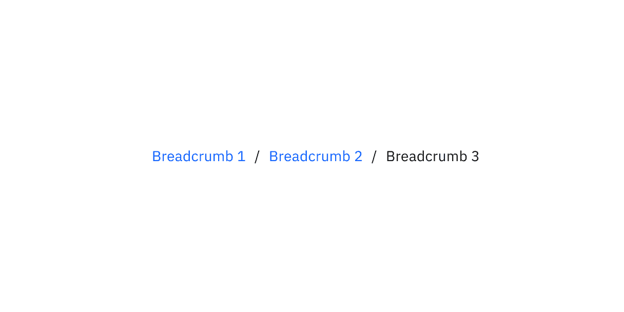
Breadcrumb displaying current page
Feedback
Help us improve this component by providing feedback, asking questions, and leaving any other comments on GitHub.