Variant | Way it works |
|---|---|
Upload one or more files by clicking an action button that prompts a file selection dialog. | |
Drag and drop selected files directly into a drop zone area to upload. |
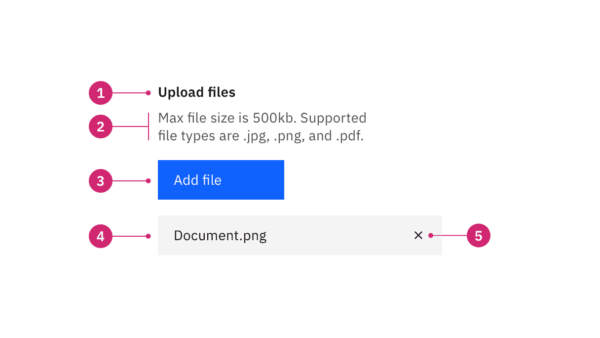
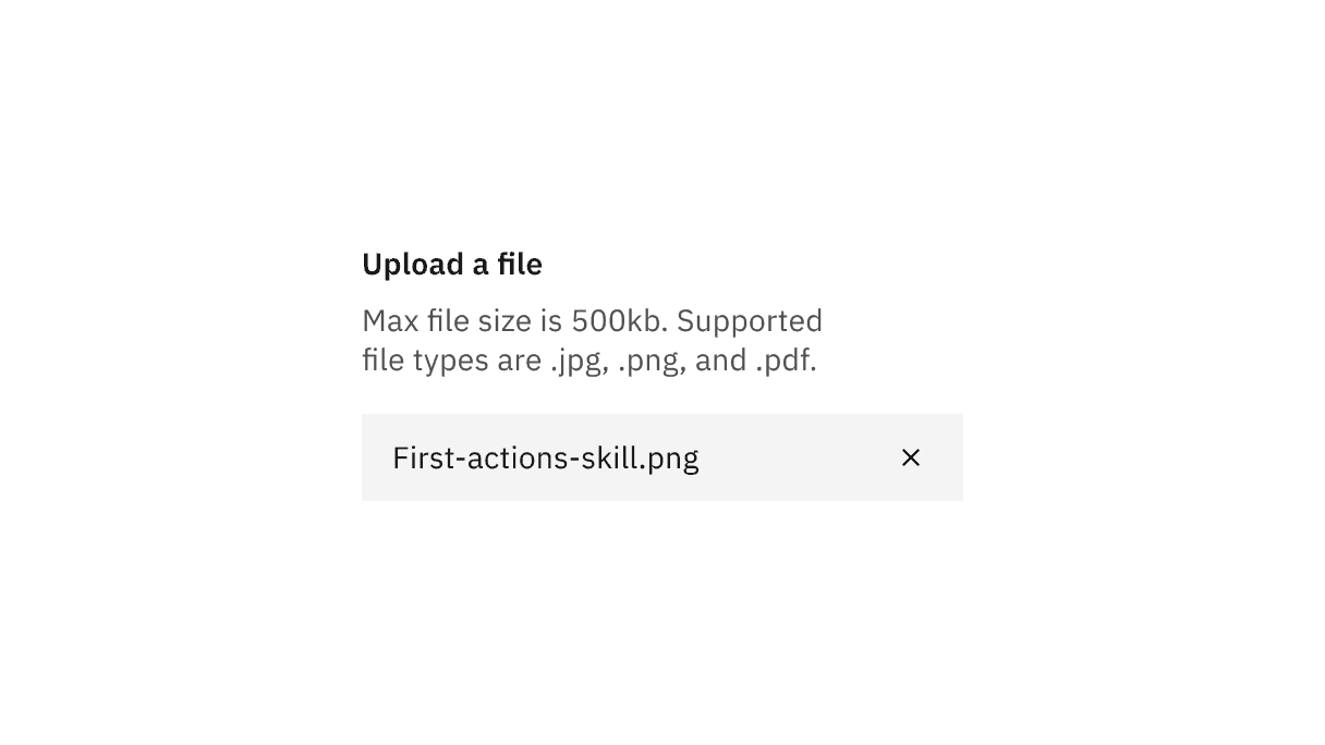
File uploader anatomy
- Heading: Text to describe the upload section.
- Description: Text to help the user make an informed selection.
- Button or drop zone label: The action to select a file to upload.
- Uploaded file: A file that has successfully been uploaded.
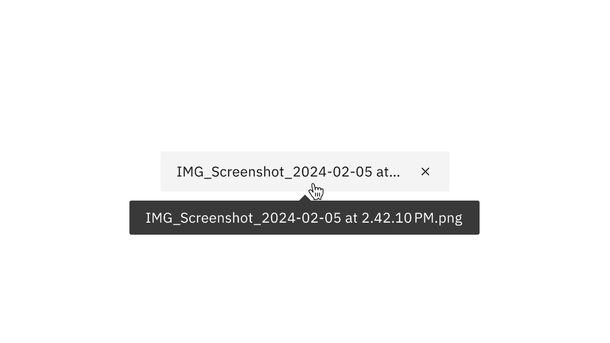
- x: The delete
xicon will remove the uploaded file.
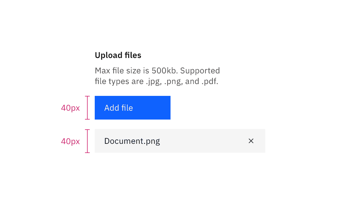
File uploader sizing
File uploader size | Height (px/rem) | Use case |
|---|---|---|
Large | 48/3 | Choose this size when there is a lot of space to work with. |
Medium | 40/2.5 | This is our default size and should be used whenever possible. |
Small | 32/2 | Use when space is constricted or when placing a file uploader in a form that is long and complex. |
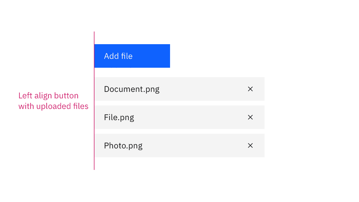
File uploader alignment
File uploader button placement
Button or drop zone label
- Button labels should be concise and describe the action that will be taken upon click. “Add files” is the default text that appears with the file uploader.
- Drop zone area label should describe that you can either drag and drop a file into the drop zone or click on the button to upload a file.
File uploader oveflow text

File uploader button using an icon
Further guidance
For further content guidance, see Carbon’s content guidelines.
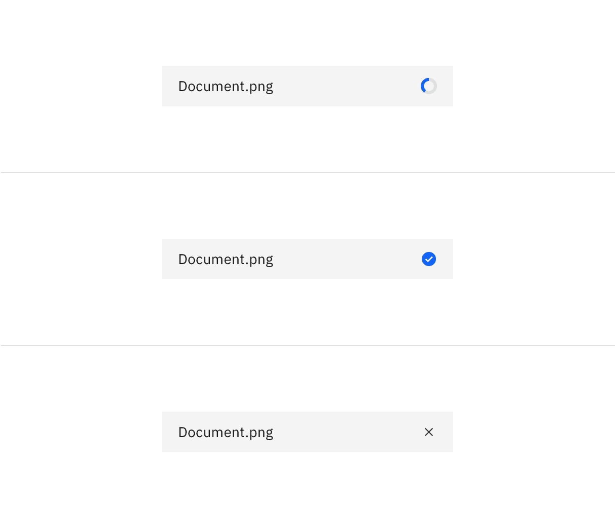
File uploader loading states
File uploader drop zone click target
To remove an uploaded file, click the “x” (or delete) icon.

File uploader uploaded file click target
Keyboard
Upload button or drop zone:
- The file uploader button or drop zone can be activated by pressing
SpaceorEnter. - After the file selection dialog closes, focus should retain the user’s point of regard and return to the element that invoked it.
Uploaded file:
- Pressing
Tabshifts focus to the “x” icon. - Pressing
SpaceorEnterwhile the “x” icon is in focus will delete the file.
For additional keyboard interactions, see the accessibility tab.
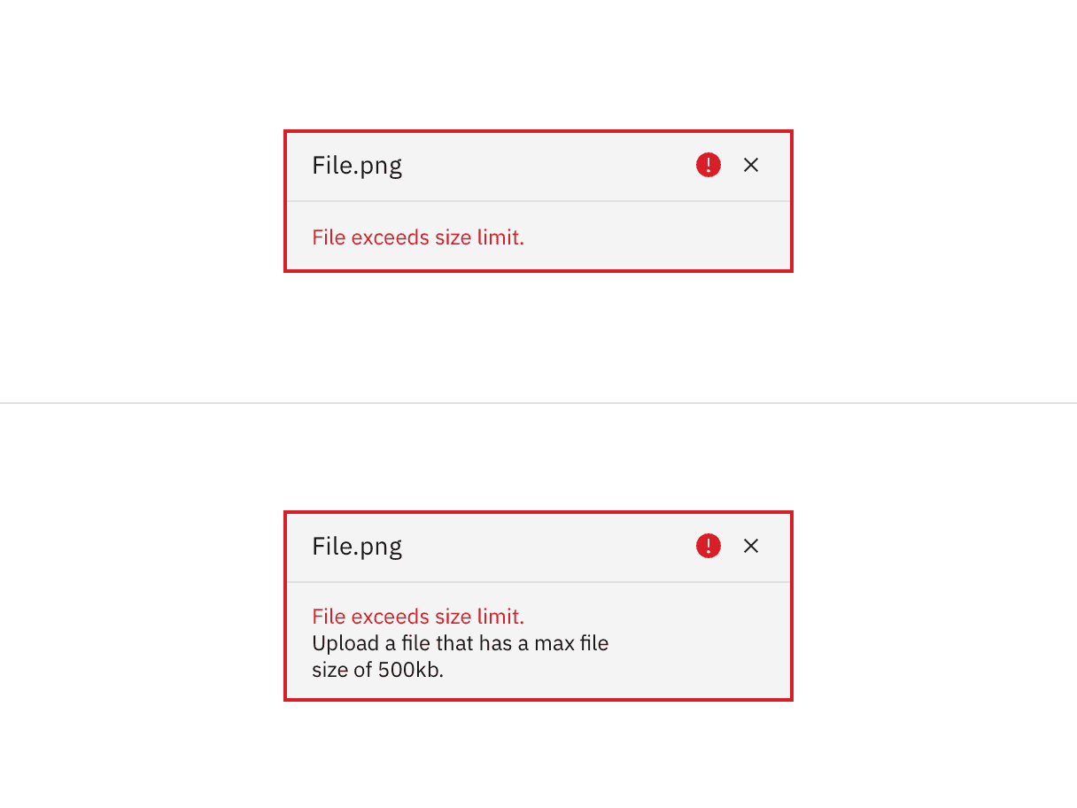
Validation
When a specific file cannot be uploaded successfully it will show an error state. We have an option for a single line or multi-line error state depending on how descriptive the message needs to be. Error messages should provide clear guidance to help the user resolve the error.
If the error relates to the file uploader as a whole instead of an individual file, you can alternatively use an inline error notification.
File uploader invalid states
File uploader
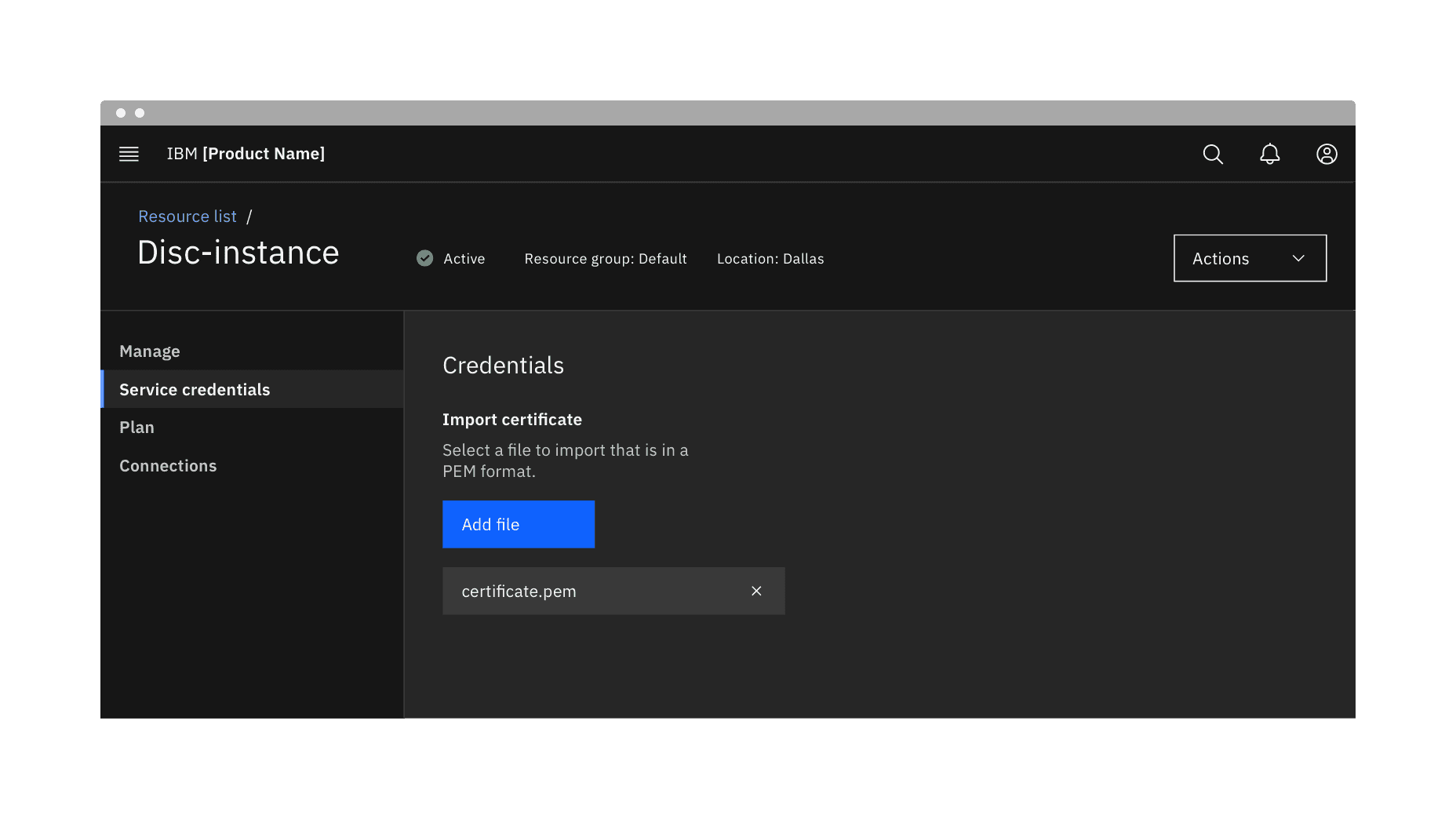
A file uploader traditionally uploads one or more files by clicking an action button that prompts a file selection dialog. Once you have selected one or more files from the dialog, the selected files will populate below the file uploader on the page. Your file may temporarily display a loading state before uploading has been successfully completed.
File uploader in context example
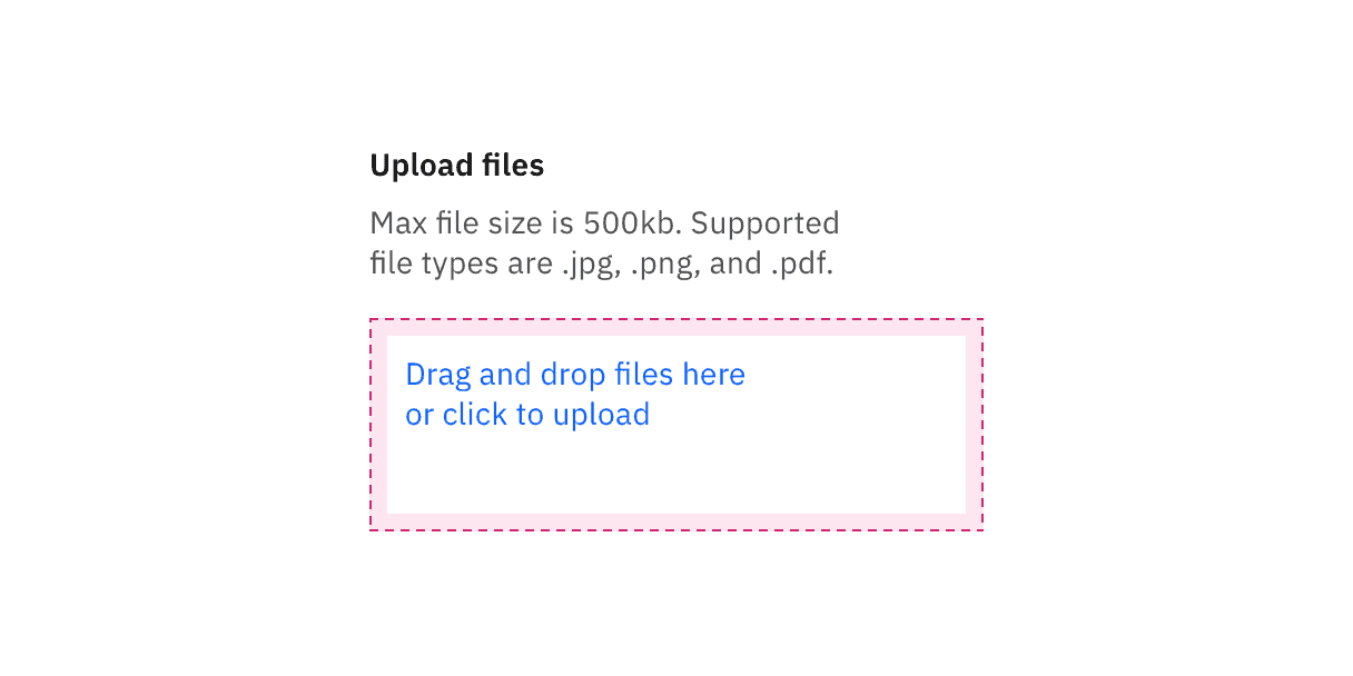
Drag and drop file uploader
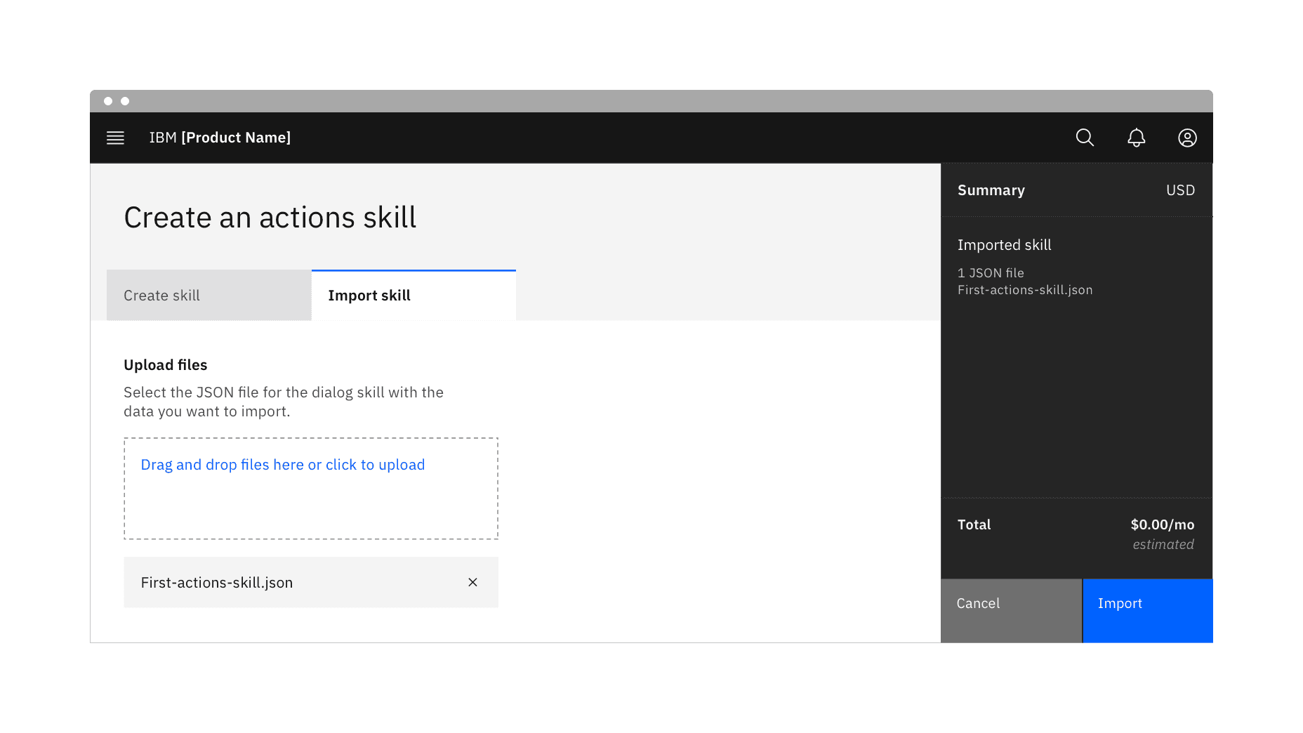
Drag and drop file uploaders are used to directly upload files by dragging and dropping them into a drop zone area. Alternatively, you can open files through a file selection dialog by clicking the text link description inside the drop zone.
The drop zone component lets users upload files by dragging and dropping the files into an area on a page, or activating a button. By default, the drag and drop file uploader allows multiple files to be dropped into the drop zone area. However, we also offer functionality to limit a single file to be uploaded.
Drag and drop file uploader in context example
Uploading multiple files
When dragging files into the drop zone area, the drop zone border changes in color and thickness to indicate the area has been activated and is ready for files. Additionally once the cursor hits the drop zone area it changes with a preview of the file you are about to upload. The style of cursor change is rendered by the browser you use.
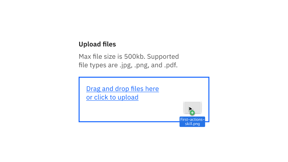
A file being dragged into the drop zone area.
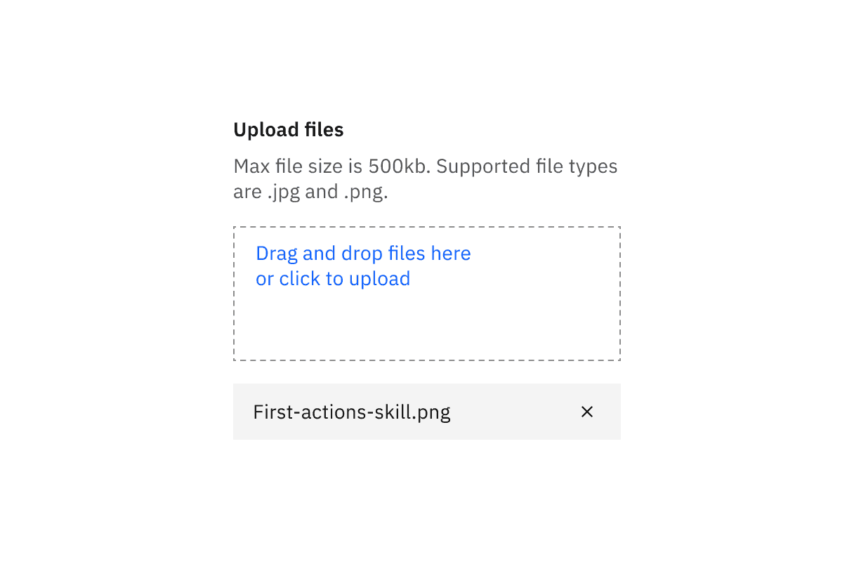
A file successfully uploaded when you can upload multiple files.
Uploading a single file
When using a drag and drop file uploader, if the requirement only allows a single file to be uploaded, drag the single file into the drop zone area to upload it. Once uploaded, the drop zone area will be removed to show that you have successfully uploaded a single file. Click the close icon in the uploaded file to remove it.
A file successfully uploaded when you can only upload a single file.
References
Page Laubheimer, Drag–and–Drop: How to Design for Ease of Use, (Nielsen Norman Group, 2020)
Feedback
Help us improve this component by providing feedback, asking questions, and leaving any other comments on GitHub.