This live demo contains only a preview of functionality and styles available for this component. View the full demo on Storybook for additional information such as its version, controls, and API documentation.
Overview
Structured list displays a simple list with a considerable amount of items in multiple rows. It helps organize and present grouped information into logical and scannable patterns. The content within a structured list can be stacked to create hierarchy within the data. Structured lists can have read-only or selectable rows.
When not to use
- Nesting items is not recommended, as structured lists are used to present simple data. If you have complex content that needs to be shown, consider using a data table, which supports nesting items and presents a larger set of content.
- If needing to use a list of items in a small or confined space rather than on a full page, consider using a contained list instead.
Feature flags
A feature flag has been added to the selectable variant of structured list to improve accessibility and changes its visual appearance, not its functionality. For code-specific feature flag information, refer to the Code tab. The current selectable structured list is not being deprecated, but teams are encouraged to use the feature flag structured list for their products moving forward. Once the next major release (v12) is released in the future, this feature flag will become the default version of the component.
The following are the feature flag changes made to structured list.
- Icons have been changed from checkmark icons to radio button icons and appear in the enabled state instead of only on hover before making a selection.
- Positioning of icons appear on the left of the component instead of on the right.
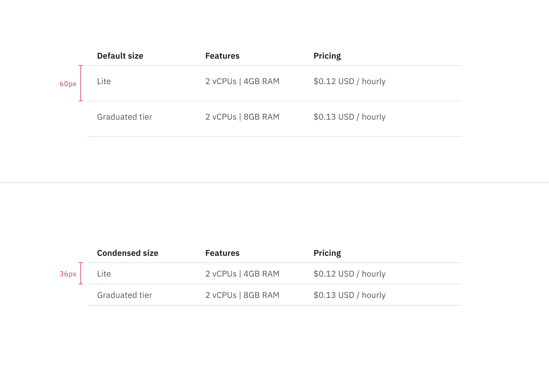
Default and condensed height sizes for structured list
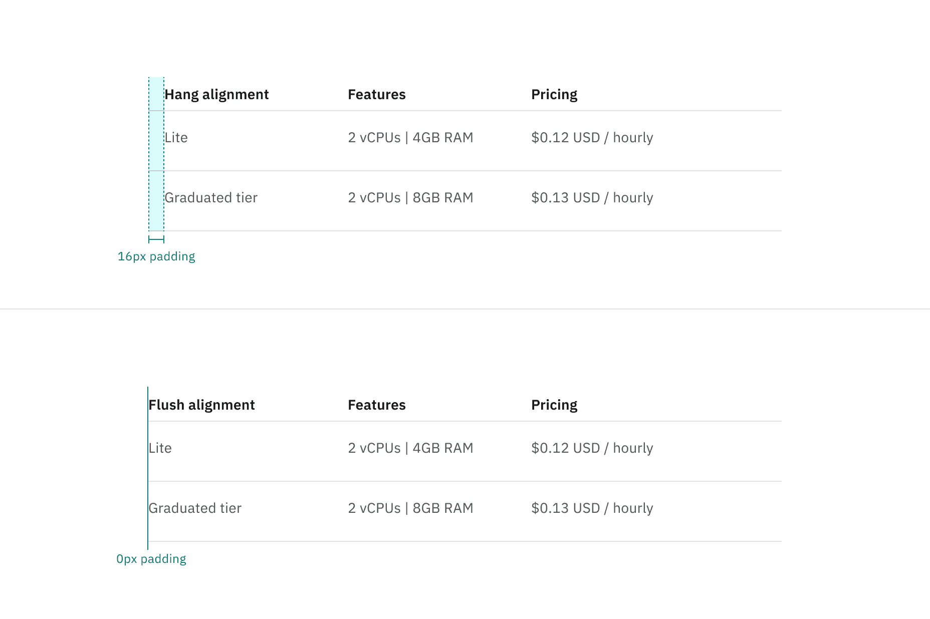
Hang and flush alignment for structured list
Column header titles
- Column header titles should be short and clear, sticking to one or two words that describe the data in that column.
- In cases where a column header title is too long, wrap the text to two lines and truncate the remaining text. The full text should be shown on hover.
- Column header titles should use sentence-case capitalization.
Further guidance
For further content guidance, see Carbon’s content guidelines.
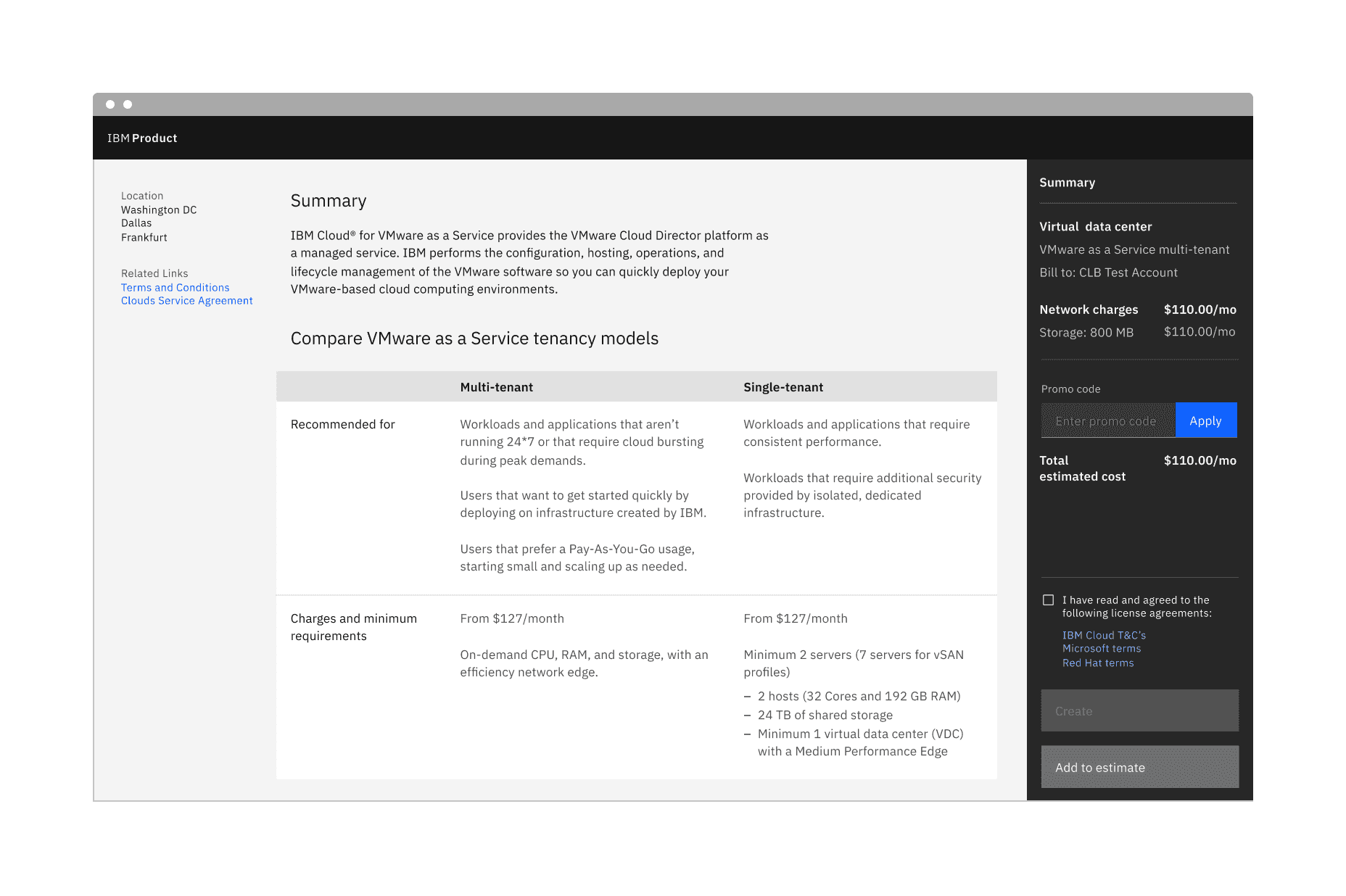
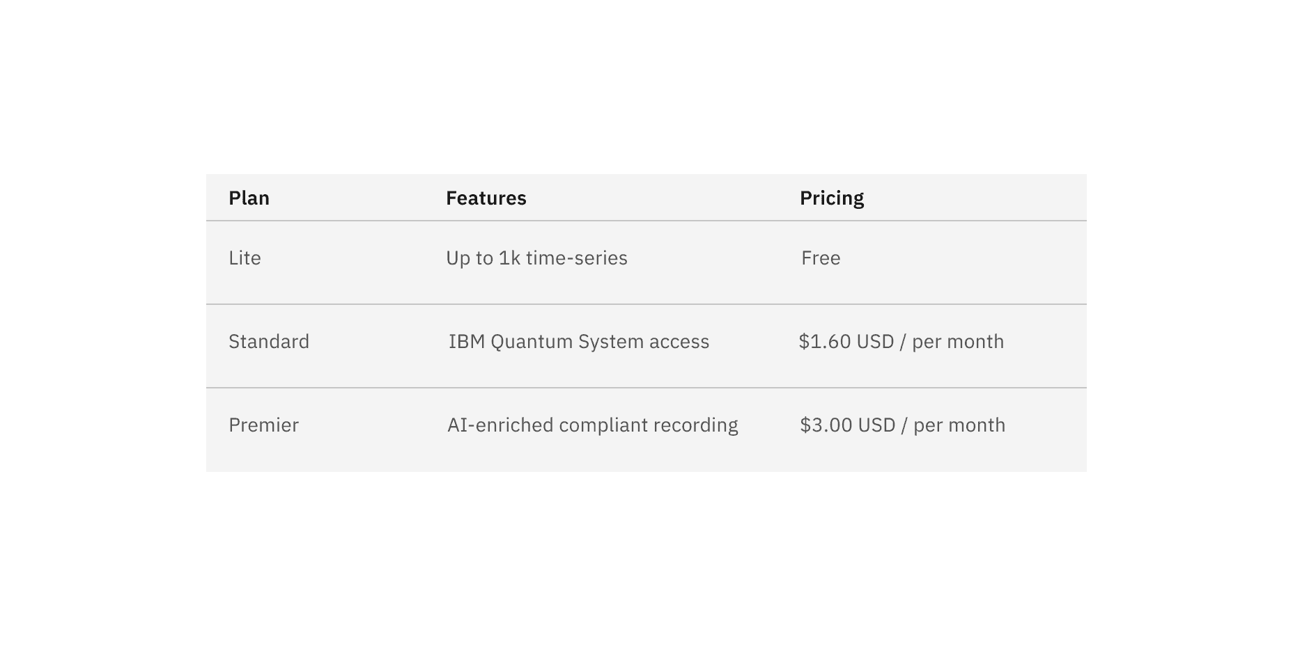
Example of default structured list in a UI
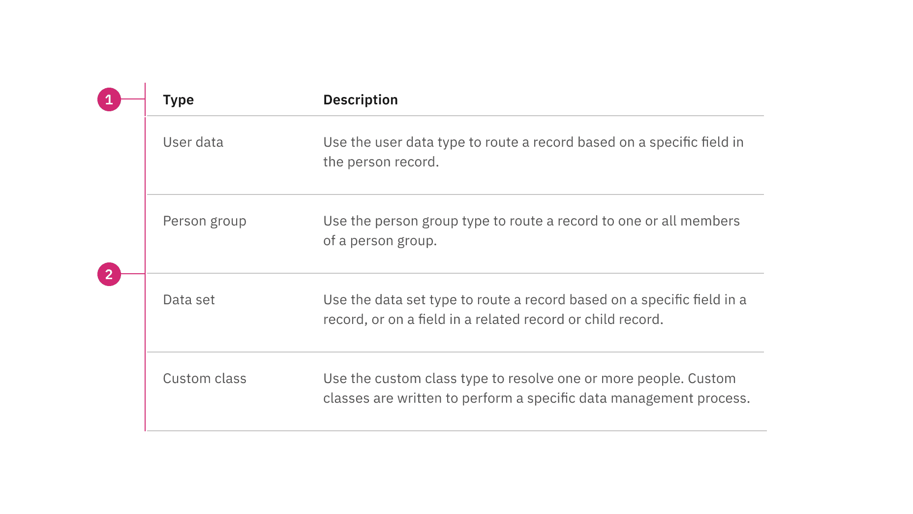
Anatomy of default structured list
- Column header: Displays title text in each column header
- Data row: Contains different types of data in each row. Rows can be modified to have an optional background color
States
The default structured list has an enabled and skeleton state and no interactive states because it is not operable by a mouse or keyboard. For more information on default structured list states, see the Style tab.
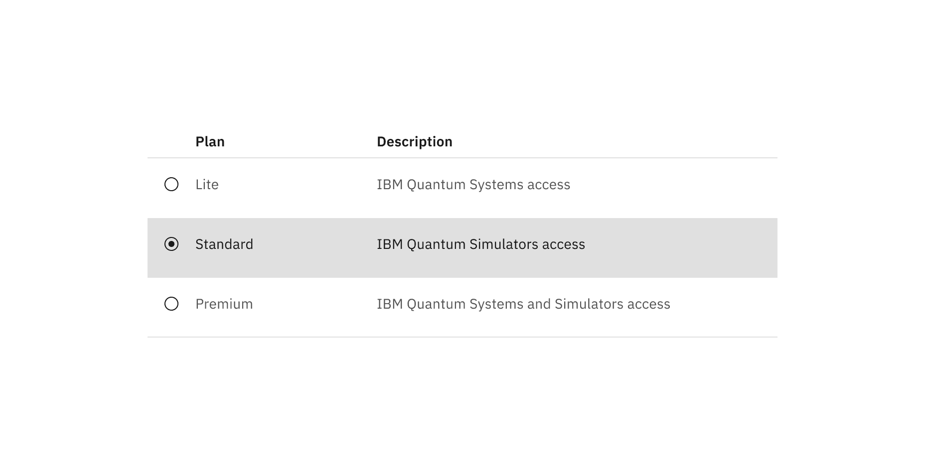
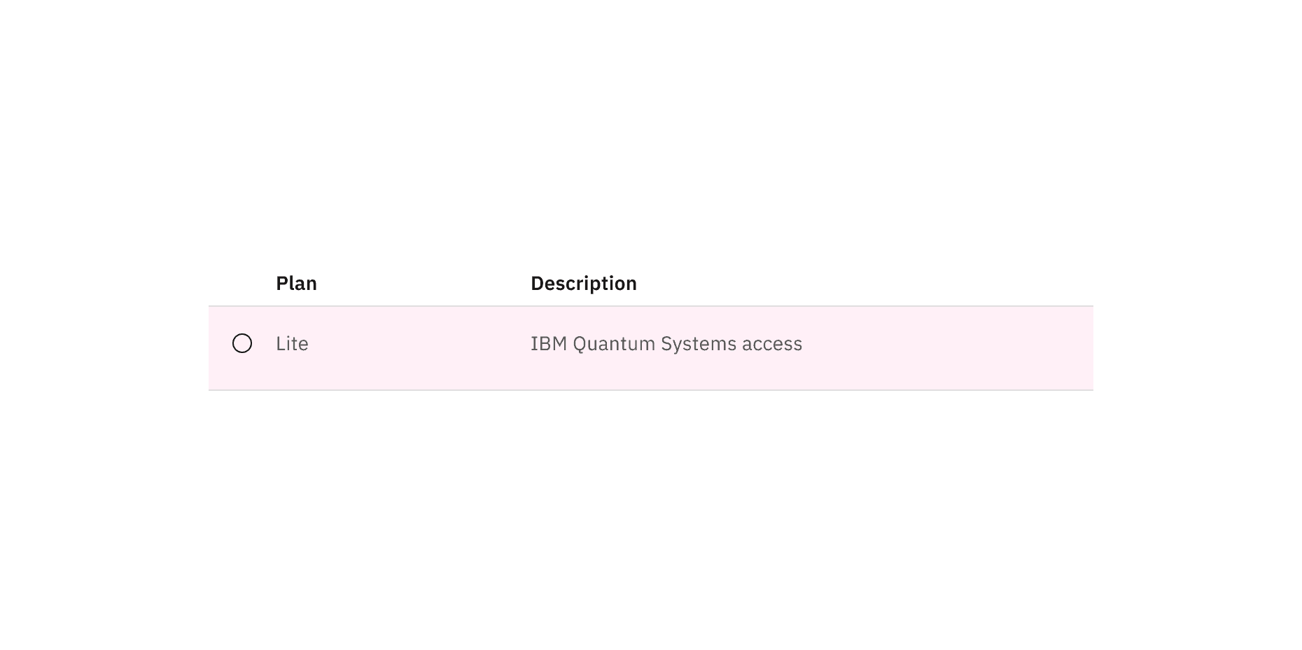
Selectable
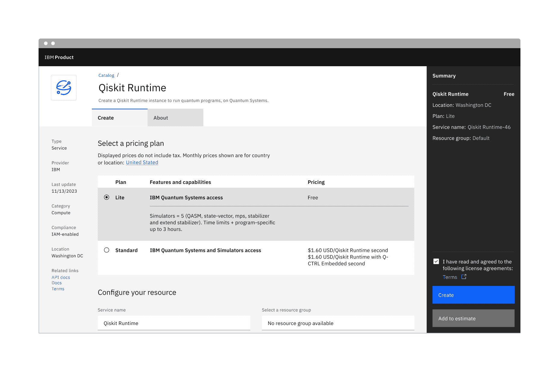
Selectable structured lists work well for presenting options to a user in an ordered manner to make a selection, such as a set of pricing plans.
Selectable structured list has an available feature flag.
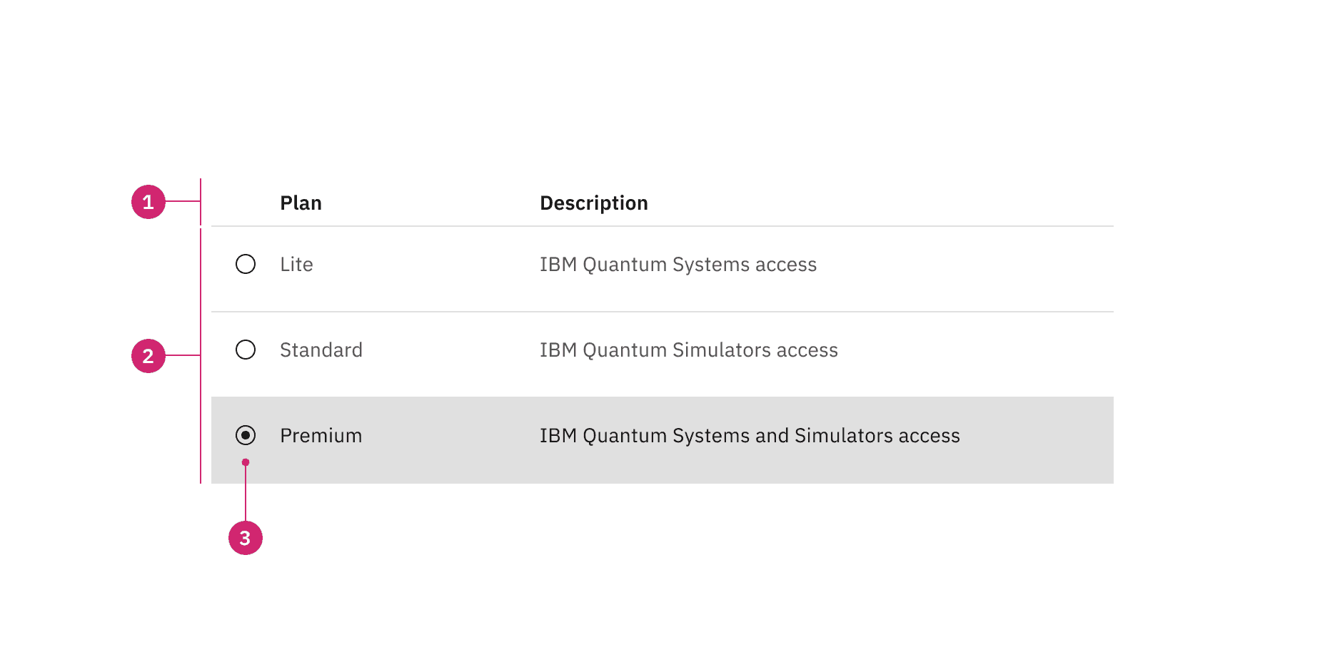
Anatomy of selectable structured list with a feature flag
- Column header: Displays title text in each column header
- Data row: Contains different types of data in each row. Rows can be modified to have a background color
- Icon: An icon to indicate that the row is selectable
States
The selectable structured list have enabled, hover, focus, selected, disabled, and skeleton states. For more information on selectable structured list states, see the Style tab.
Mouse
- The selectable structured list can be operated by a mouse by clicking on an individual row to select or deselect it.
- Rows are unselected by default, and only one row can be selected at a time.
- Product teams can build in logic to provide preselection of a row based on the use case. If multiple row selection is needed, use a data table instead.
Clickable areas of selectable structured list with a feature flag