This live demo contains only a preview of functionality and styles available for this component. View the full demo on Storybook for additional information such as its version, controls, and API documentation.
Do use checkboxes when multiple items can be selected.
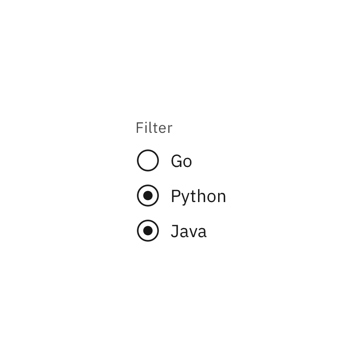
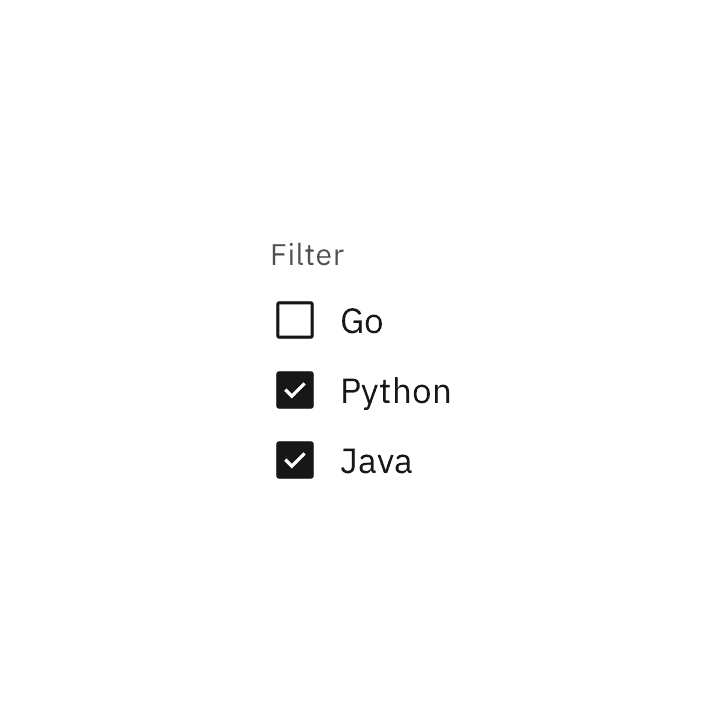
Don't use radio buttons when multiple items can be selected.
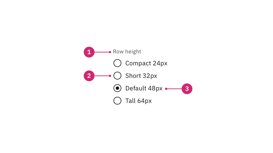
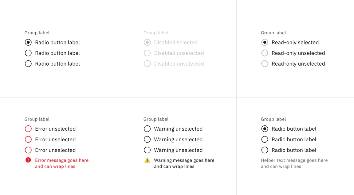
- Group label (optional): Describes the group of options or provides guidance for making a selection.
- Radio button input: Indicates the state of a radio button. By default, no option will be preselected.
- Radio button label: Describes the information you want to select or unselect.
Alignment
Radio button labels are positioned to the right of their inputs in languages that read left to right. If there is a radio button grouping, they can be laid out vertically or horizontally depending on the use case and the structure of the UI. When possible, arrange the radio button and checkbox groups vertically for easier reading.
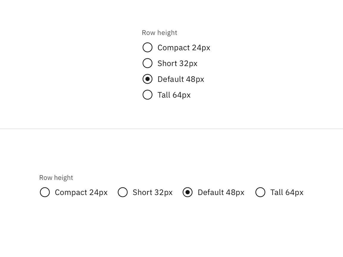
Vertically stacked versus horizontal alignment
For languages that read right to left, it’s acceptable to place labels to the left of the inputs.
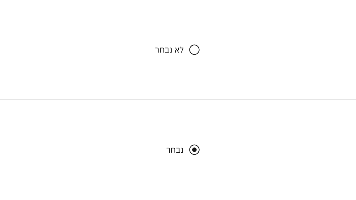
Example of radio buttons for languages that read right to left instead of left to right
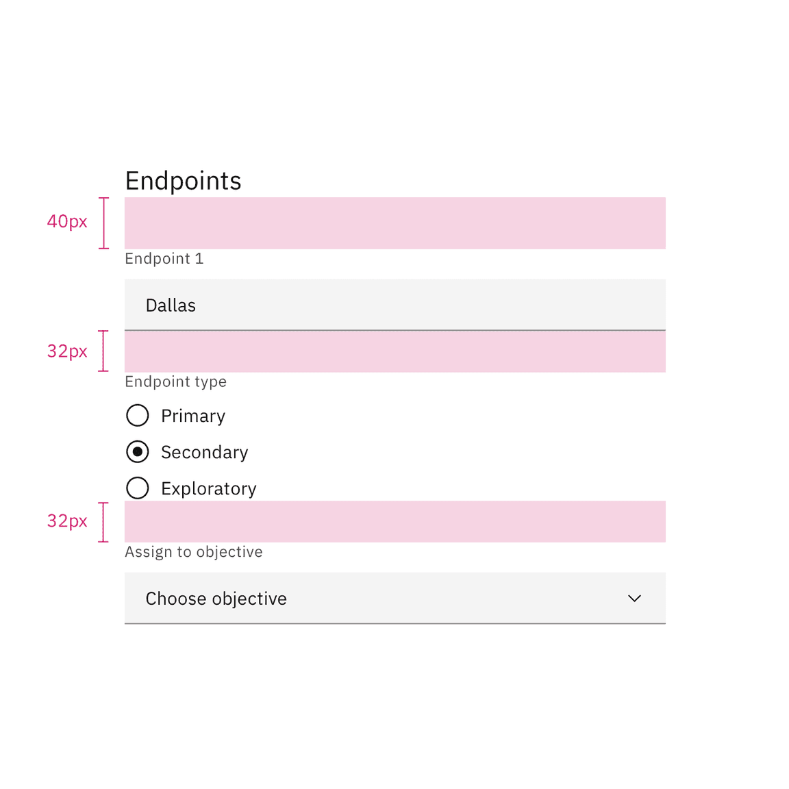
Radio buttons in a form should be placed at least 32px (layout-03) below or before the next component. Spacing of 24px (layout-02) or 16px (layout-01) can also be used when space is more restricted or if the form is more complex.
For more information on spacing in forms, see our form style guidance.
Spacing between a radio button and other components in a form
Group labels (optional)
A heading can accompany a set of radio buttons to provide further context or clarity. In some cases, a group of radio buttons may be within a larger group of components that already have a group label. In this case, an additional group label for the radio button component itself is not needed.
- A group label can either state the category of the grouping or concisely instruct what actions to take below depending on the context.
- Use sentence case for group labels.
Overflow content
- We recommend radio button labels being fewer than three words.
- If you are tight on space, consider rewording the label. Do not truncate radio button label text with an ellipsis.
- Long labels may wrap to a second line, and this is preferable to truncation.
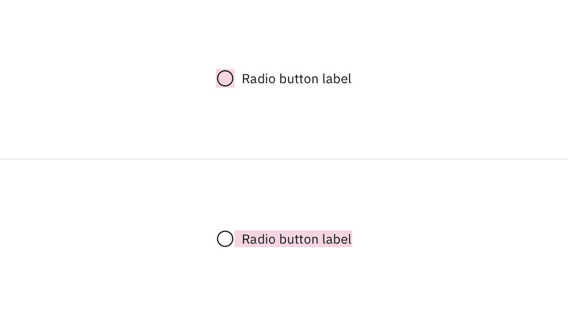
- Text should wrap beneath the radio button so the control and label are top aligned.
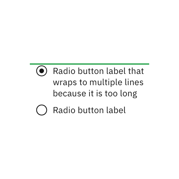
Do let text wrap beneath the radio button so the control and label are top aligned.
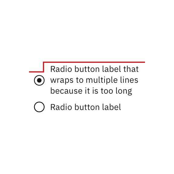
Do not vertically center wrapped text with the radio button.
Further guidance
For further content guidance, see Carbon’s content guidelines.
States
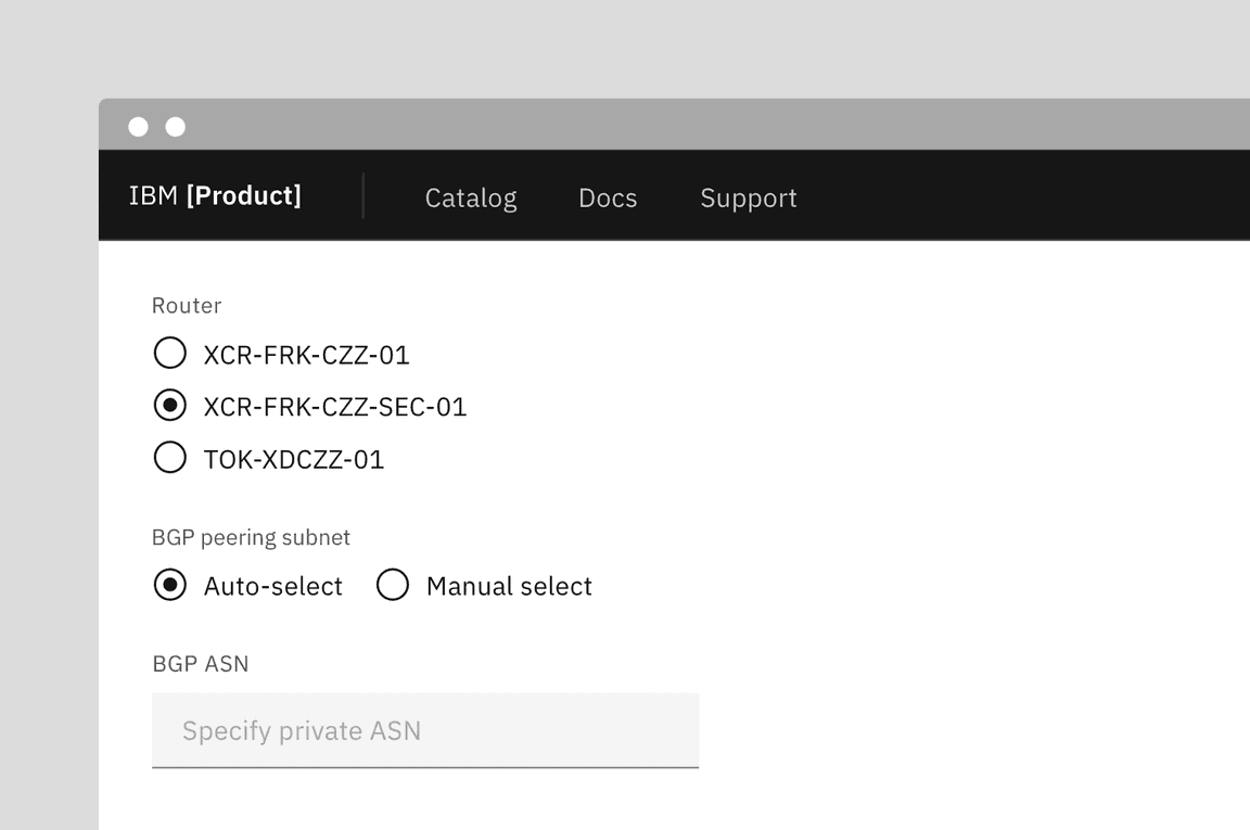
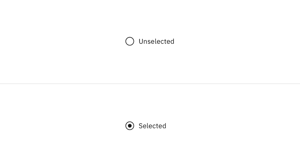
The radio button input allows for two states: unselected and selected. The default view of a radio button is having no radio button preselected. Only one radio button should be selected at a time. When a user chooses a new item, the previous choice is automatically deselected. If the user has already selected an item but wants to deselect it, consider adding alternatives such as an “other” or “none” option.
In addition to unselected and selected states, radio buttons also have states for focus, disabled, read-only, error, and warning. When deciding whether to use a disabled or read-only state for radio buttons, see our Read-only states pattern guidance.
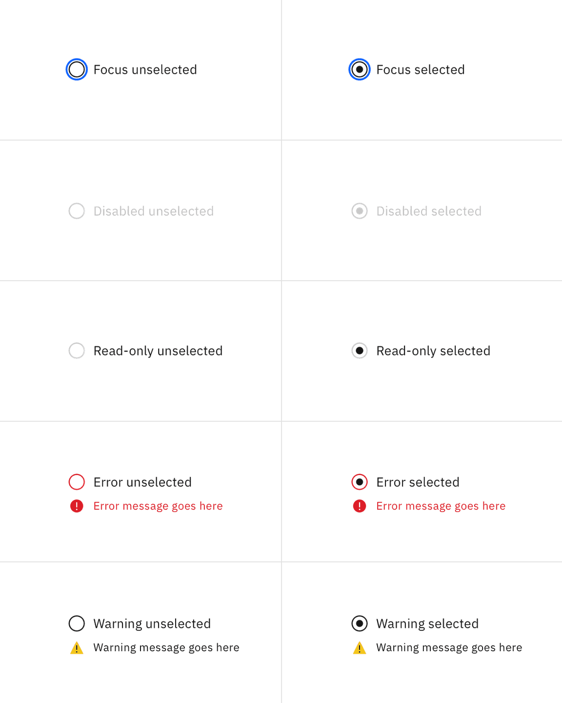
Keyboard
By default, no option will be preselected. Users can navigate between radio button inputs by pressing Up or Down arrow keys. If a user lands on a radio button set without a default indicator, they can press Space to select the radio button or they can press an arrow key to select the next radio button. For additional keyboard interactions, see the accessibility tab.
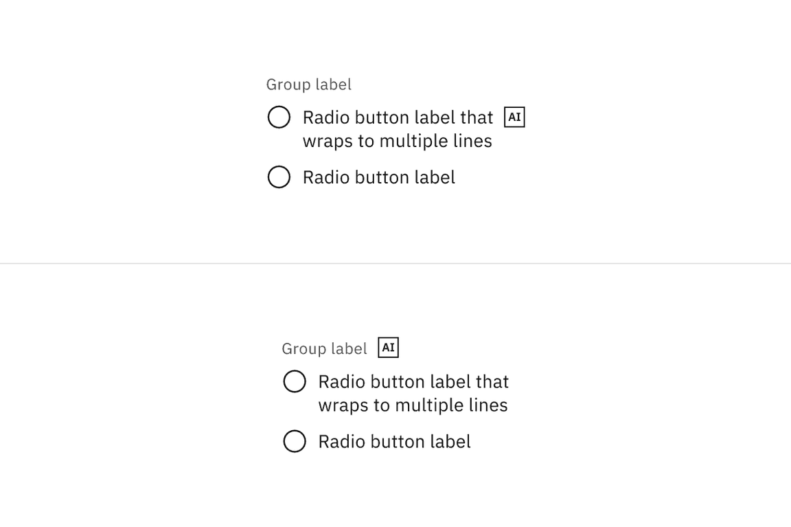
AI presence
Radio button has a modification that embeds the AI label when AI present in the control. The AI variant functions the same as the normal version except with the addition of the AI label which is both a visual indicator and the trigger for the explainability popover. The AI label can be placed on the radio button group label or on individual radio button labels.
For more information on designing for AI, see the Carbon for AI guidelines.
Radio buttons versus checkboxes
Radio buttons allow users to select one option from a group of mutually exclusive choices, while checkboxes allow for a selection of one of more options from a group. In the use cases where multiple selections are allowed, use the checkbox component instead of the radio button.
Radio button verses selectable tile
Radio buttons should have concise, easy to compare options. If more information is required to make a choice, like pricing plans or additional links, consider using a selectable tile.
Radio button verses toggle switch
Toggle switches are preferred when the user options are limited to two choices—on and off or true and false. By comparison, radio buttons, radio buttons can have many other options.
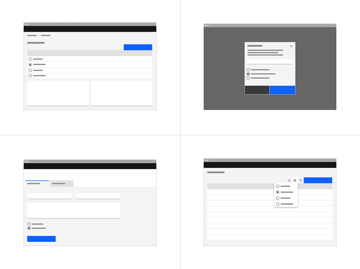
Structured list
If a user needs to choose a singular item from a list that has simple data and multiple columns, a selectable structured list can be used.
Tables
See the data table component for guidance on how to use radio buttons within a table.
References
Jakob Nielson, Checkboxes vs. Radio Buttons (Nielsen Norman Group, 2004)
Kara Pernice, Radio Buttons: Select One by Default or Leave All Unselected? (Nielsen Norman Group, 2014)
Feedback
Help us improve this component by providing feedback, asking questions, and leaving any other comments on GitHub.