This live demo contains only a preview of functionality and styles available for this component. View the full demo on Storybook for additional information such as its version, controls, and API documentation.
Overview
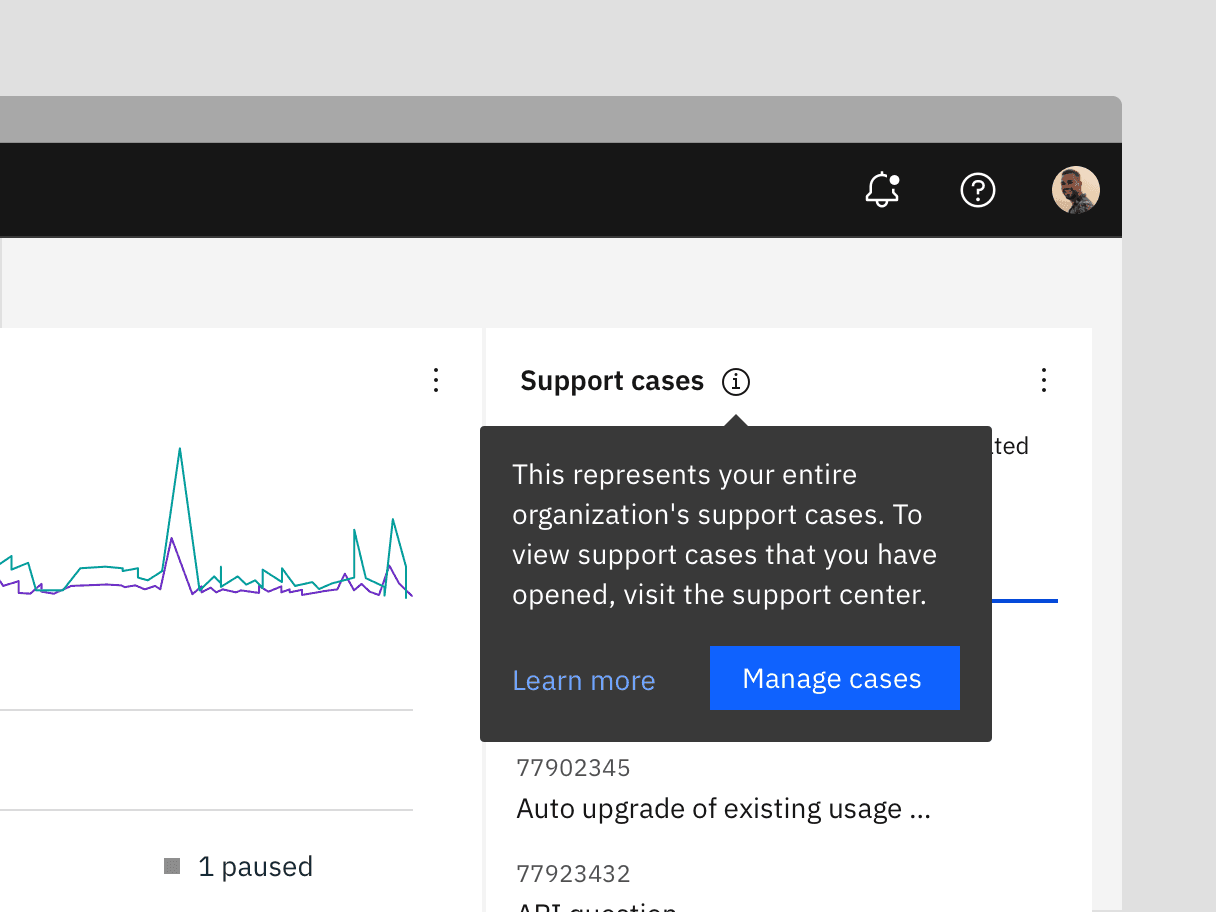
Toggletips reveal supplemental content when a user clicks a button and remains actively open until a user dismisses it. A toggletip is comprised of a UI trigger and toggletip content (based on the popover component). Toggletips can include a wide variety of information and interactive elements as long as accessibility requirements are maintained, including focus order and ensuring all functionality is operable through a keyboard interface.
Toggletips versus tooltips
Tooltips and toggletips look similar and both have interactive triggers, but they differ in how they are activated and what they can contain. A tooltip is exposed on hover or focus when you need to disclose brief, supplemental information that is not interactive. A toggletip is used on click or enter when you must expose interactive elements, such as a button, that a user needs to interact with.
When to not use
Don’t use to present critical information or request required input needed to complete a workflow. Use the modal component instead.
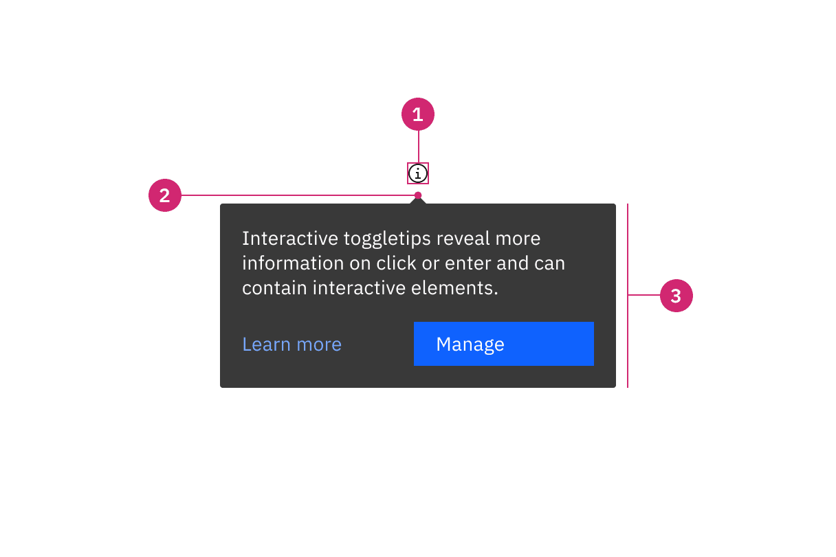
- UI trigger: UI elements that trigger a toggletip on click or enter
- Caret tip: Visually connects the content container to its trigger, indicating where the content originates
- Container Contains text and interactive elements
Sizing
The toggletip container has a maximum width of 288px, and its height varies depending on the content inside. We recommend keeping the width within four columns. See more details on the Specifications tab.
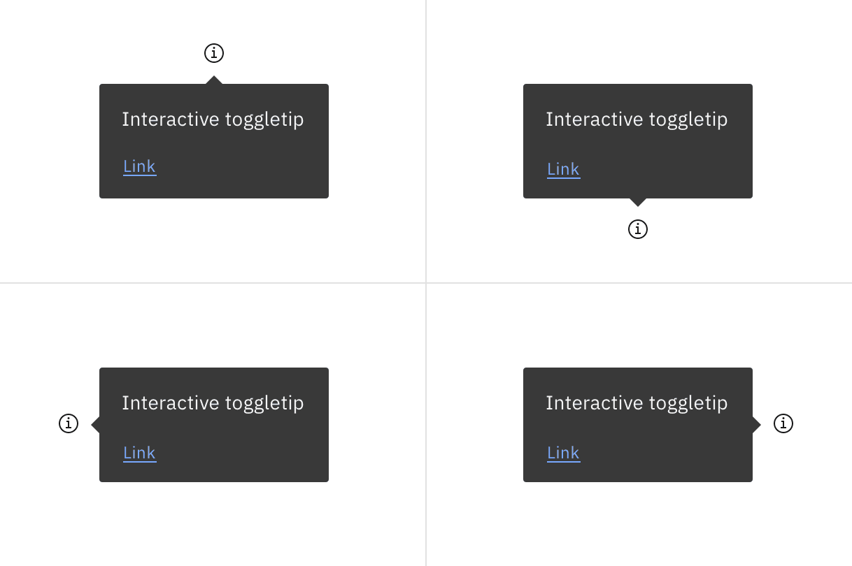
Placement of a popover in relation to the trigger depends on the type of popover used.
Main elements
Heading, body, and footer content can vary based on your use case. To see examples of content used within toggletips, visit the disclosure pattern.
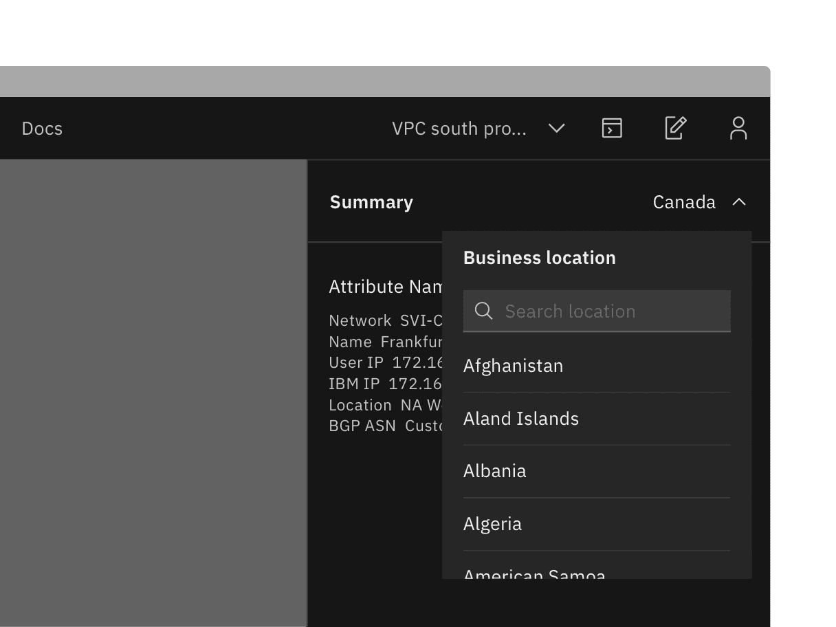
Overflow content
Since the toggletip uses the flexible popover component and disclosure pattern, scrolling is usually not needed. If scrolling is needed, in a dropdown like situation for instance, then the body section should scroll vertically with the header and footer remaining fixed in place if those elements are present. Do not scroll horizontally or let content bleed off the page.
Example of when to scroll within a toggletip. This example is a pattern and is currently not offered as a component.
Further guidance
For further content guidance, see Carbon’s content guidelines.
States
The toggletip component has two states: open (click or enter) and closed. By default, the toggletip is hidden and inactive. For more details on toggletip states, see the Specifications tab.
Keyboard
Toggletips are triggered by pressing Enter or Space while the trigger element has focus. Users can dismiss a toggletip by pressing Escape. For additional keyboard interactions, see the Accessibility tab.
Popover
Popovers are used as a base layer in some of our components like tooltips, overflow menus, and dropdown menus. For further guidance, see Carbon’s popover component.
Disclosure
Disclosures use popovers as a base layer. Disclosures are comprised of a popover container, text, and interactive elements. Interactive elements are kept in the tab order of the page.
Tooltip
Tooltips display additional information upon hover or focus. The information included should be contextual, helpful, and nonessential while providing that extra ability to communicate and give clarity to a user.
Feedback
Help us improve this component by providing feedback, asking questions, and leaving any other comments on GitHub.