This live demo contains only a preview of functionality and styles available for this component. View the full demo on Storybook for additional information such as its version, controls, and API documentation.
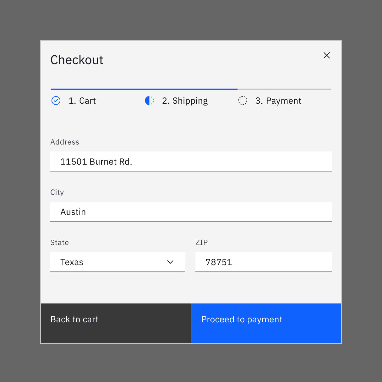
Example of a progress indicator used in a payment UI.
When to use
- When the user is working through a linear process that can be organized into three or more steps.
- When the user could benefit from understanding their progress on long forms such as eCommerce checkouts, onboarding, or visa applications.
- When user inputs should be validated before progressing to the next step.
- To complement standard back/next navigation in a linear sequence.
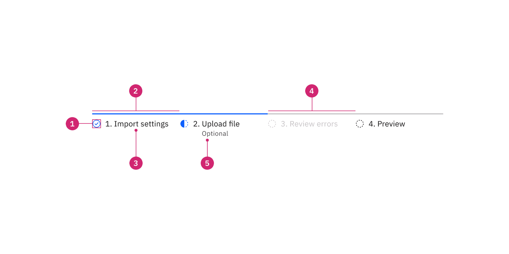
- Status indicator: Communicates if a step is completed, current, not started, disabled or has an error. See the status indicator pattern for guidance.
- Active step line: Indicates completed steps and the step the user is currently on.
- Label: Communicates what the user will accomplish in each step. Numbering each step also makes the progression more obvious.
- Inactive step line: Indicates steps that are not started as well as steps that are in an error, disabled, or skeleton state.
- Helper text: Labels a step as optional or in an error state.
Placement
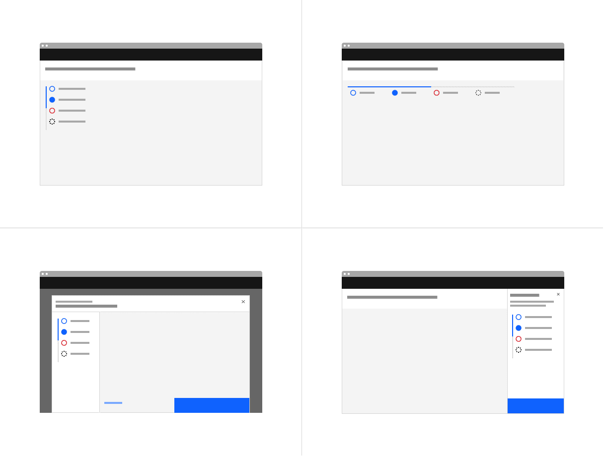
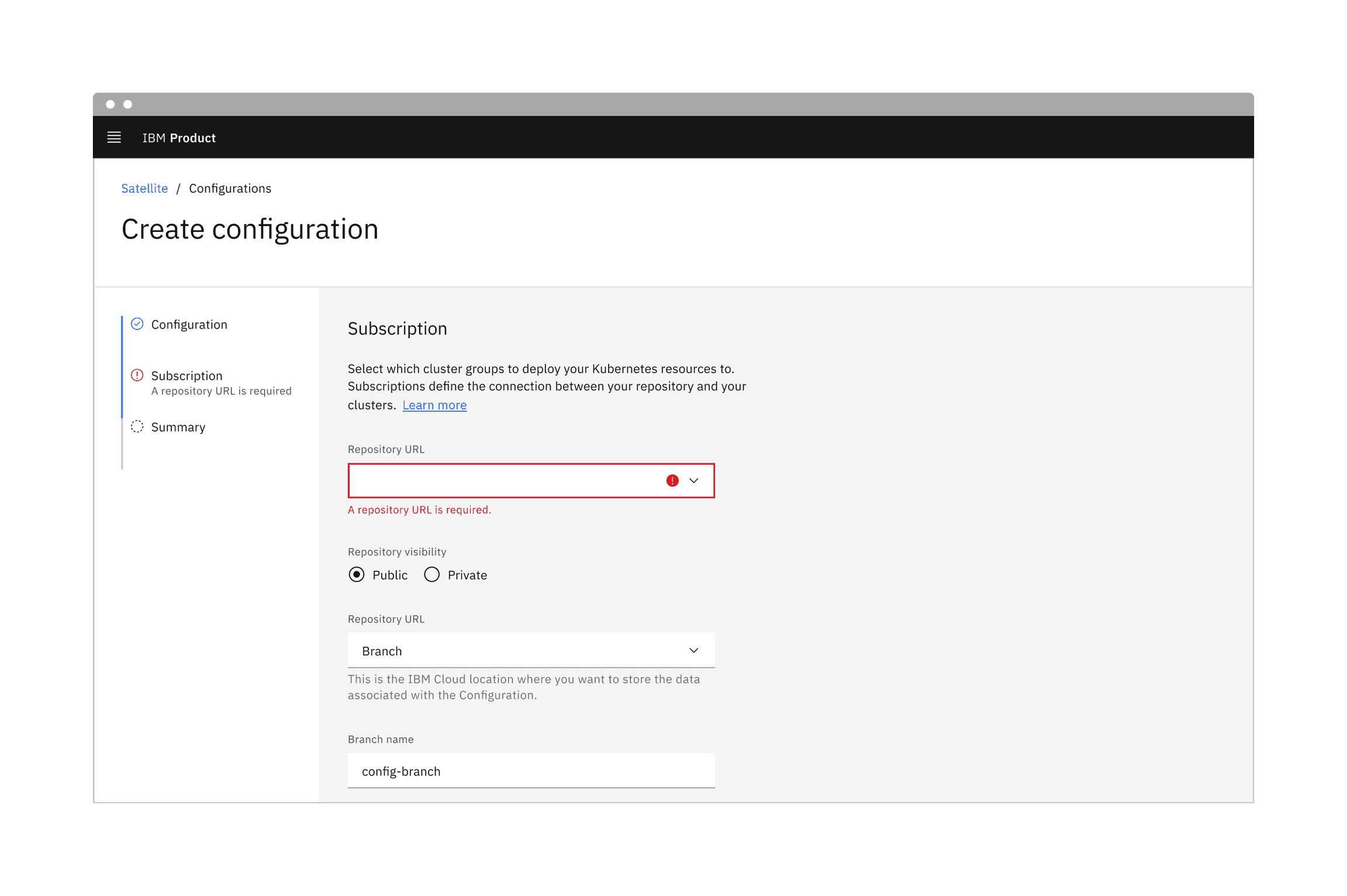
The progress indicator component can be placed on a full page, in a modal, or in a side panel. It is also common to use the progress indicator in a tearsheet, a component provided by Carbon for IBM Products.
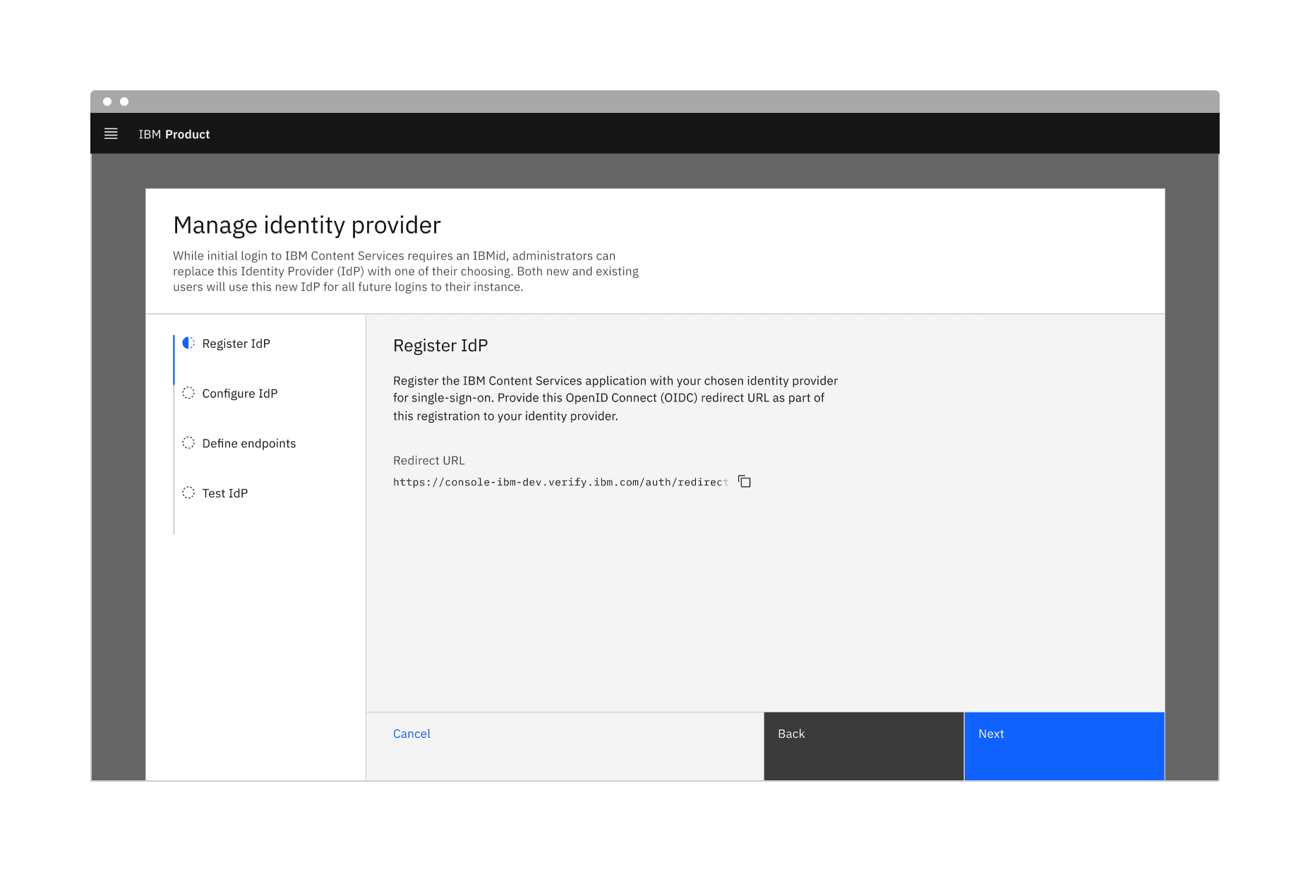
Example of a progress indicator using vertical alignment.
Label
The label should communicate what the user will accomplish in each step in one or two words. One option is to clearly indicate the action of the step by using the {verb} + {noun} content formula. For example, “Configure IdP” or “Define endpoints.” A label may use one word if it is universally understood, such as “Cart,” “Shipping,” or “Payment.” Avoid vague terms like “Processing.” You may also number each step to make the progression more obvious.
Example of a helper text that wraps to the second line and maintains left alignment with the label.
Further guidance
For further content guidance, see Carbon’s content guidelines.
States
The progress indicator has seven states: completed, current, not started, error, disabled, hover, and focus. View the Specifications tab for visual specs of each state and see the status indicator pattern for additional guidance.
State | Description |
|---|---|
Completed | A step is complete when a user has filled out the required information within a step and progressed to the following step. When possible, use validation to confirm that a step has been completed before the user continues. All steps that have been completed are indicated by an outlined circle with a checkmark and a blue active line. |
Current | A step is current when a user is interacting with the information within that step. The current step the user is on is indicated by a half-filled circle and a blue active line. |
Not started | A step is not started when a user has not yet interacted with that step. Steps the user has not encountered yet, or future steps, are indicated by an outlined circle and a gray active line. |
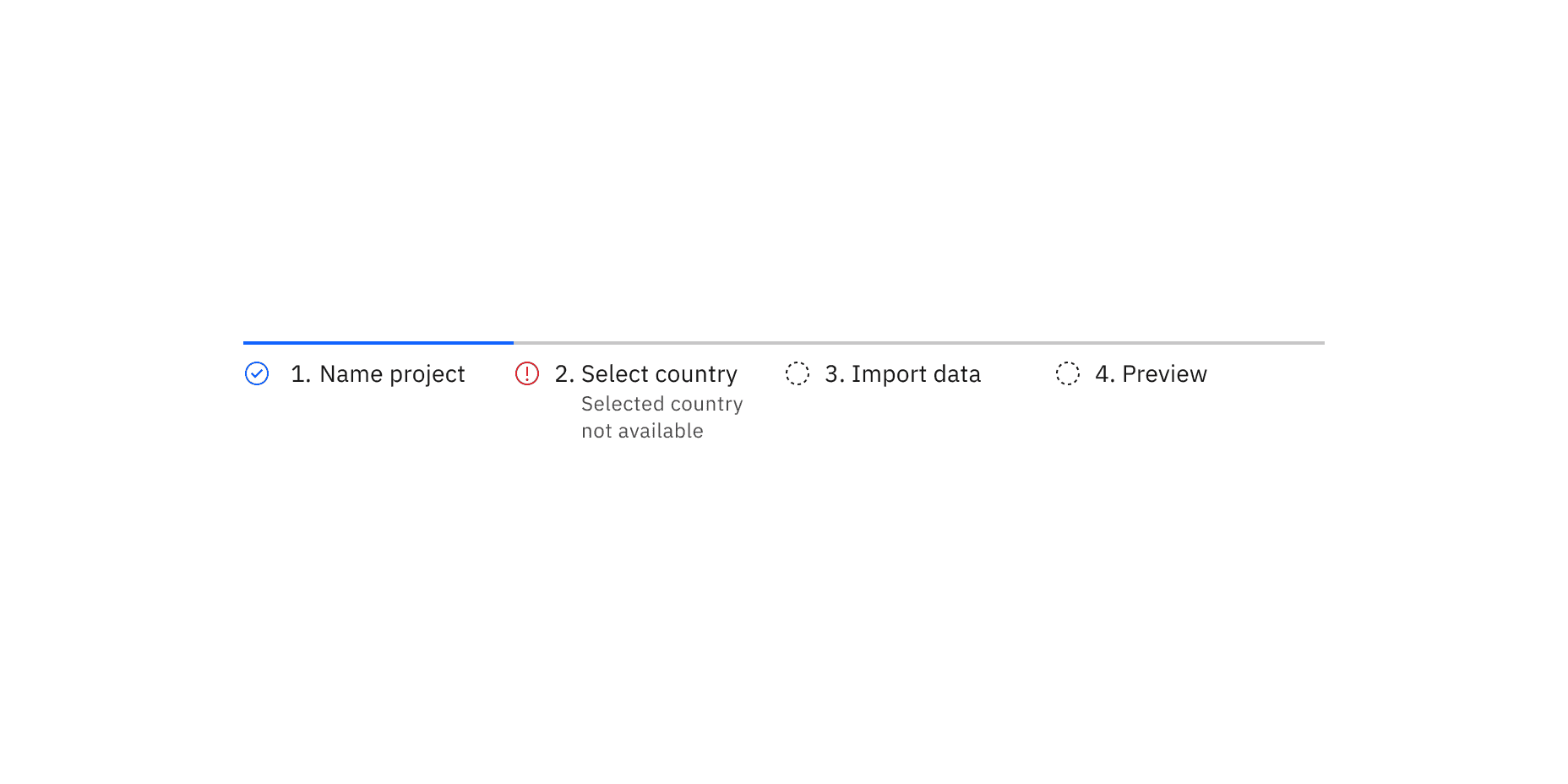
Error | A step may be in error when a user has entered invalid or incomplete information. There could also be a server-side error. Provide clear information about the error and guidance on how to resolve the issue. |
Disabled | A step is disabled when all interactive functions have been removed. Unlike read-only states, disabled states are not focusable, are not read by screen readers, and do not need to pass visual contrast, making them inaccessible if they need to be interpreted. |
Hover | Use the hover state when a user’s mouse cursor is hovering over the progress indicator’s step. |
Focus | When a user tabs to or clicks on the progress indicator’s step, the step becomes focused, indicating the user has successfully navigated to the component. |
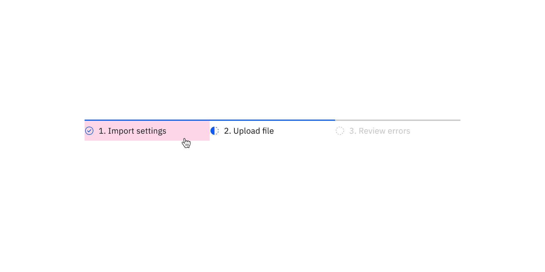
Example of the mouse hovering over the first step in the progress indicator showing that it is clickable
Keyboard
The first step should be selected by default. Users can navigate between steps by pressing Right or Left arrow keys. For additional keyboard interactions, see the Accessibility tab.
Validation
When possible, use validation to confirm that a step has been completed before the user continues. If any entry is invalid, the progress indicator should show an error state. Additionally, the invalid entry should be marked with an error state and include an inline error message that helps the user understand the problem and how to fix it. This kind of inline validation (or client-side validation) should happen as soon as the field loses focus.
If the user cannot proceed due to a server-side issue, then an inline notification should appear.
Feedback
Help us improve this component by providing feedback, asking questions, and leaving any other comments on GitHub.