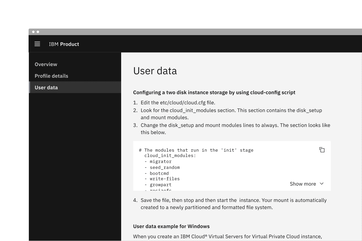
Overview
The list component displays related content in a structured and scannable format. It helps users easily navigate and understand grouped information. Lists can be styled as unordered (bulleted) or ordered (numbered) based on their content hierarchy and importance. They are commonly used for navigation menus, data presentations, and form-related elements.
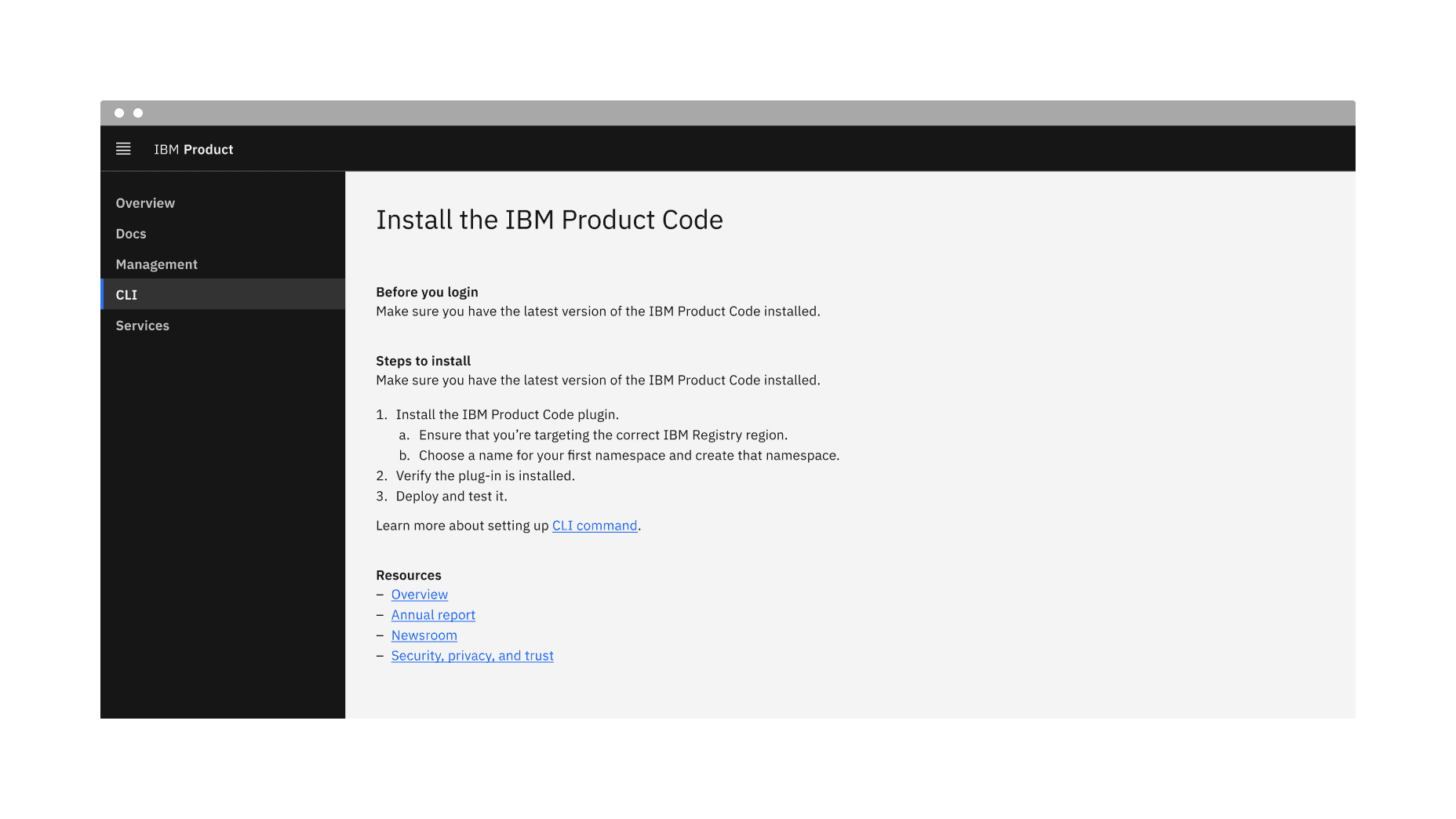
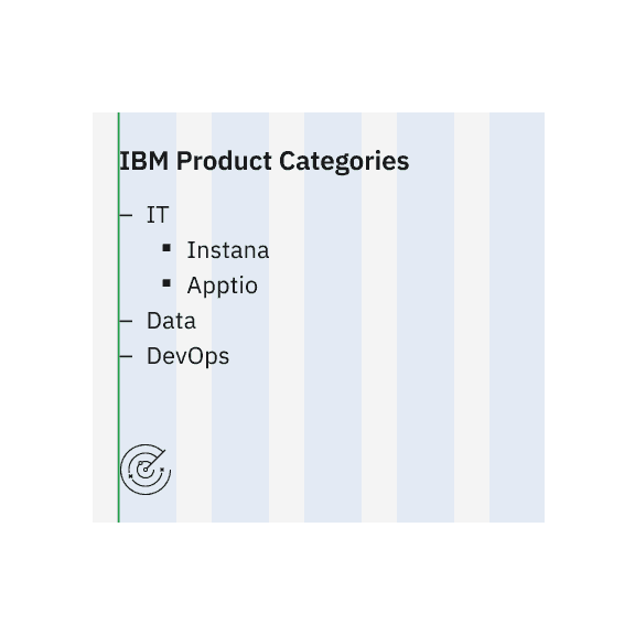
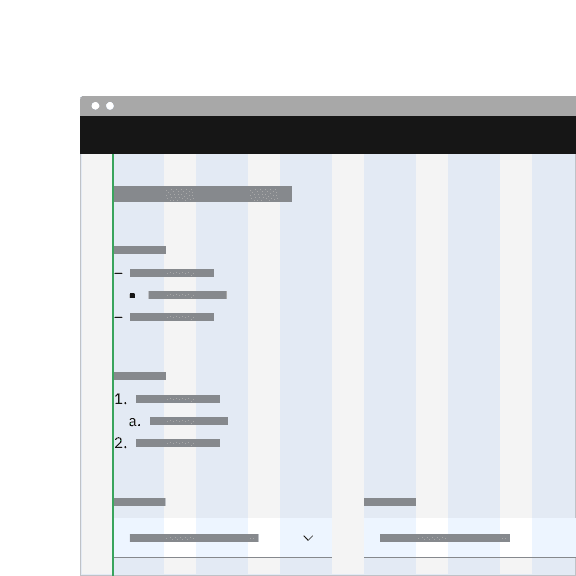
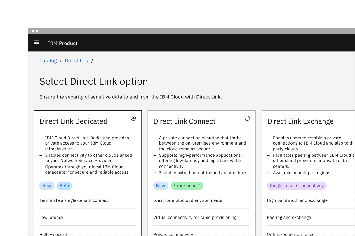
Example of the list component in a UI
When not to use
- Avoid using a list for complex data or when advanced features like sorting, filtering, or selection are required. If the content requires multiple columns and rows within a component, consider using a data table instead.
- If a basic hierarchy with tables or dividers is required, use the structured list or contained list components instead.
Variant | Purpose |
|---|---|
Used to display items of equal importance without a specific order. | |
Use to indicate a clear sequence or hierarchy, often used for instructions. |
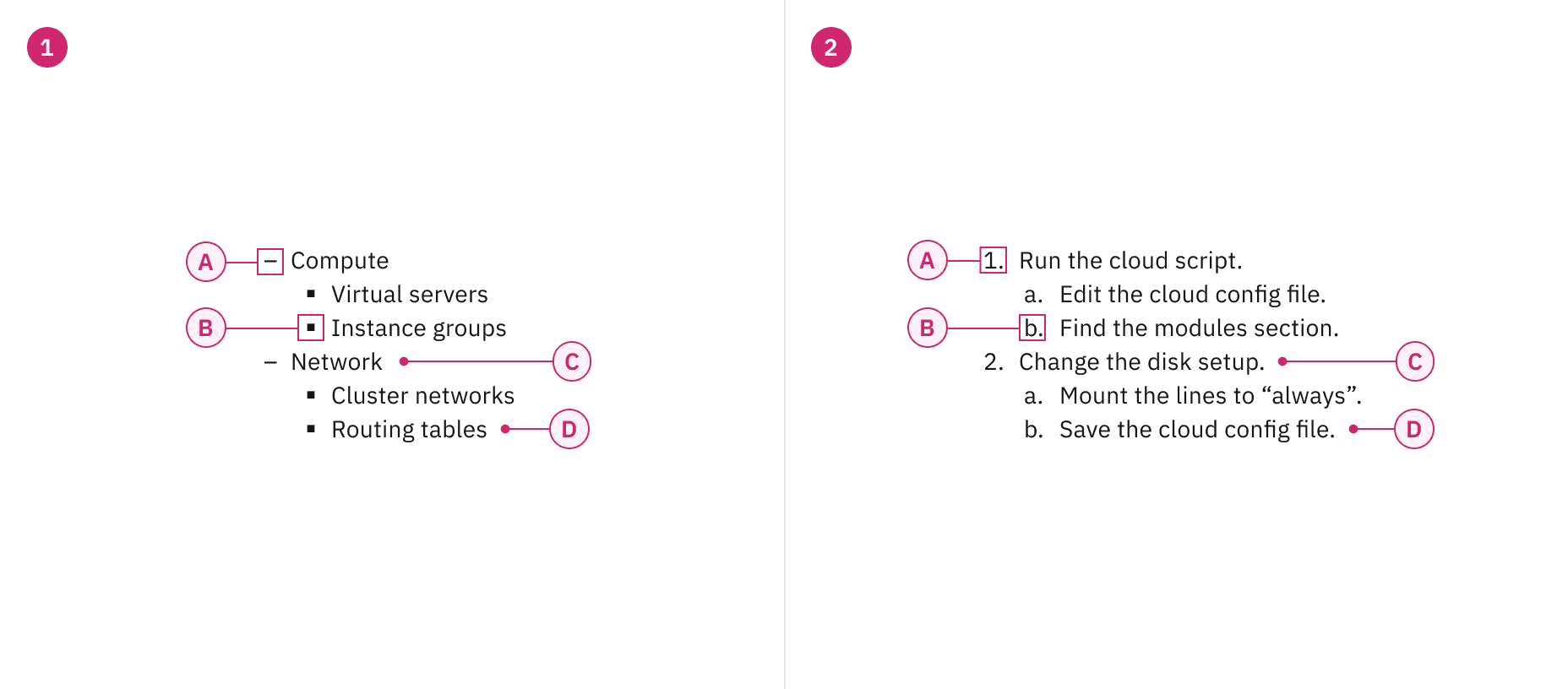
Anatomy of unordered and ordered list variants
Sizing
The list is available in two type sizes: productive and expressive. The productive list utilizes $body-01, while the expressive list uses $body-02. The productive list is best suited for functional, task-oriented experiences, whereas the expressive list is designed for more visual, engaging experiences. In most product designs, the productive list will likely be the preferred choice.
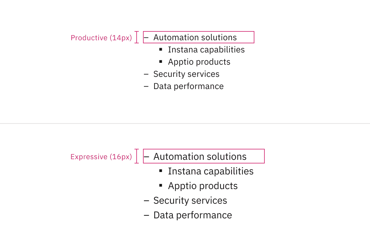
Productive and expressive type sizes for list
Example shows the list with a large number of list items
Do align the list vertically for clarity.
Do not align the list horizontally, as it disrupts readability.
For ordered lists with two-digit (10+) or more digit items, align numbers either left or right to maintain a clear structure without misalignment. By default, numbers are left-aligned, but there is an option to switch between the two.
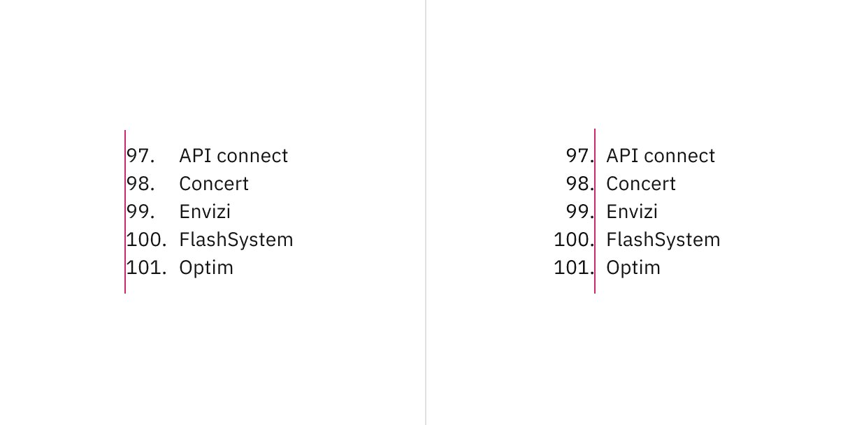
Number alignment in ordered lists for two or more digit items.
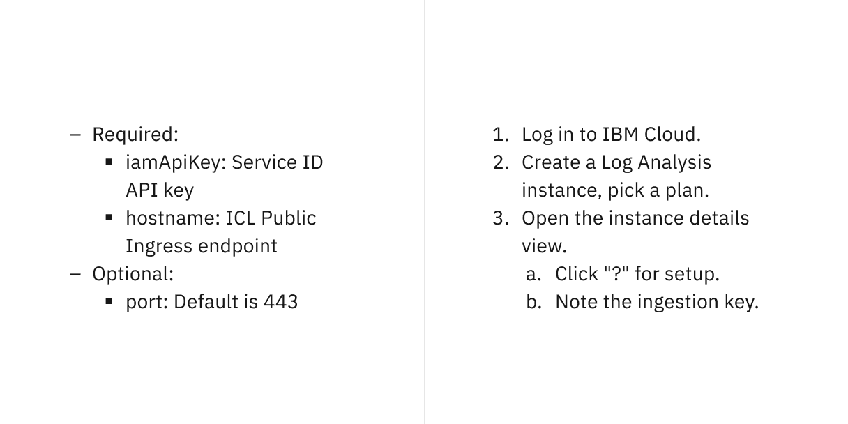
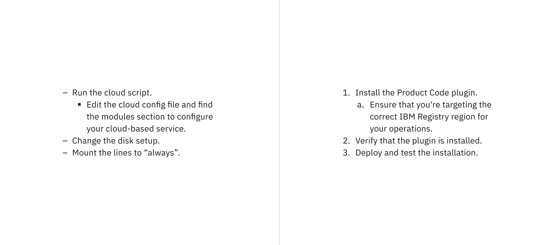
Unordered and ordered lists with nested items.
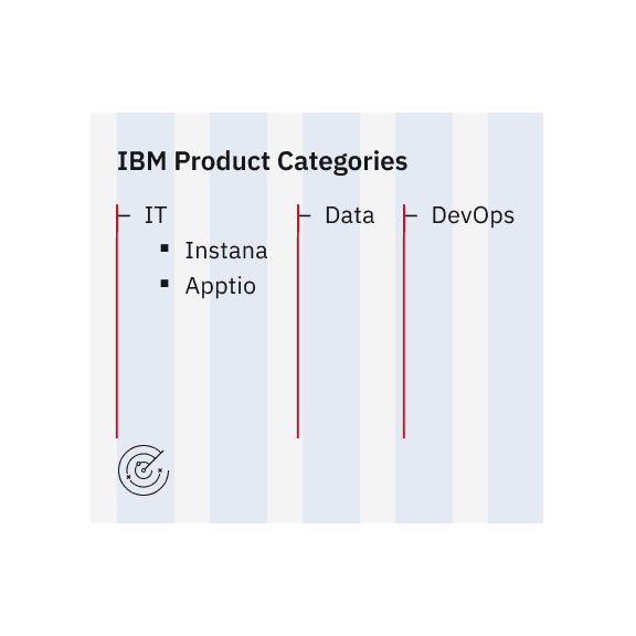
Do align list markers flush with the grid.
Do not let list markers hang into the grid gutters.
List item
- Represents an individual entry within a list.
- Can contain text, links, or other inline elements.
- Supports multi-line wrapping for longer content while maintaining alignment.
- Lists should present simple pieces of information; for complex data, consider using a data table instead.
- Level 1 list items define the main structure, while Level 2 (nested) list items provide hierarchy or subcategories.
- Arrange ordered list items logically, such as ranking by importance, highest to lowest values, or in alphabetical/numeric order.
- Ensure list items are grammatically parallel by maintaining consistent sentence structures (e.g., avoid mixing passive and active voice).
Text wrapping for unordered and ordered lists
Further guidance
For further content guidance, see Carbon’s content guidelines.
Feedback
Help us improve this component by providing feedback, asking questions, and leaving any other comments on GitHub.