This live demo contains only a preview of functionality and styles available for this component. View the full demo on Storybook for additional information such as its version, controls, and API documentation.
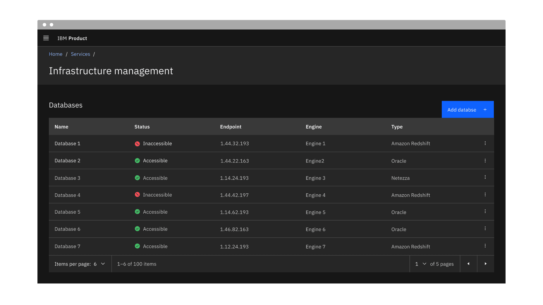
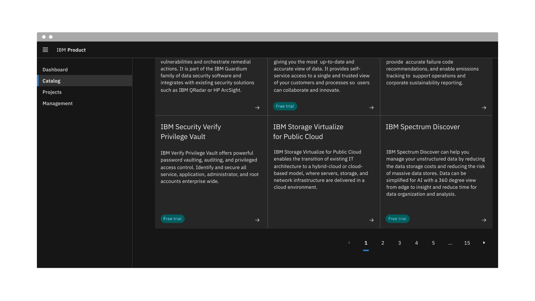
Example of the pagination component in a UI
When it could take a considerable amount of time to load the available data at once or in a scrolling view
When there is too much data to display on one page or within one view of a component
To make large amounts of data more accessible to consume by users
To optimize on-page real estate
To give users more control over how they view large amounts of information
- Do not use it to display linear journeys, for example, in a form progression. Instead, use the progress bar or button components to navigate forward and backward.
- Do not use pagination superfluously, and aim to use it to improve usability or performance.
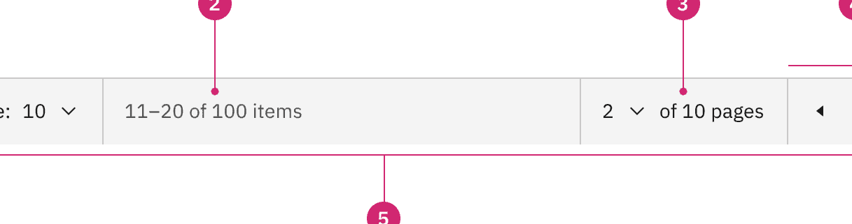
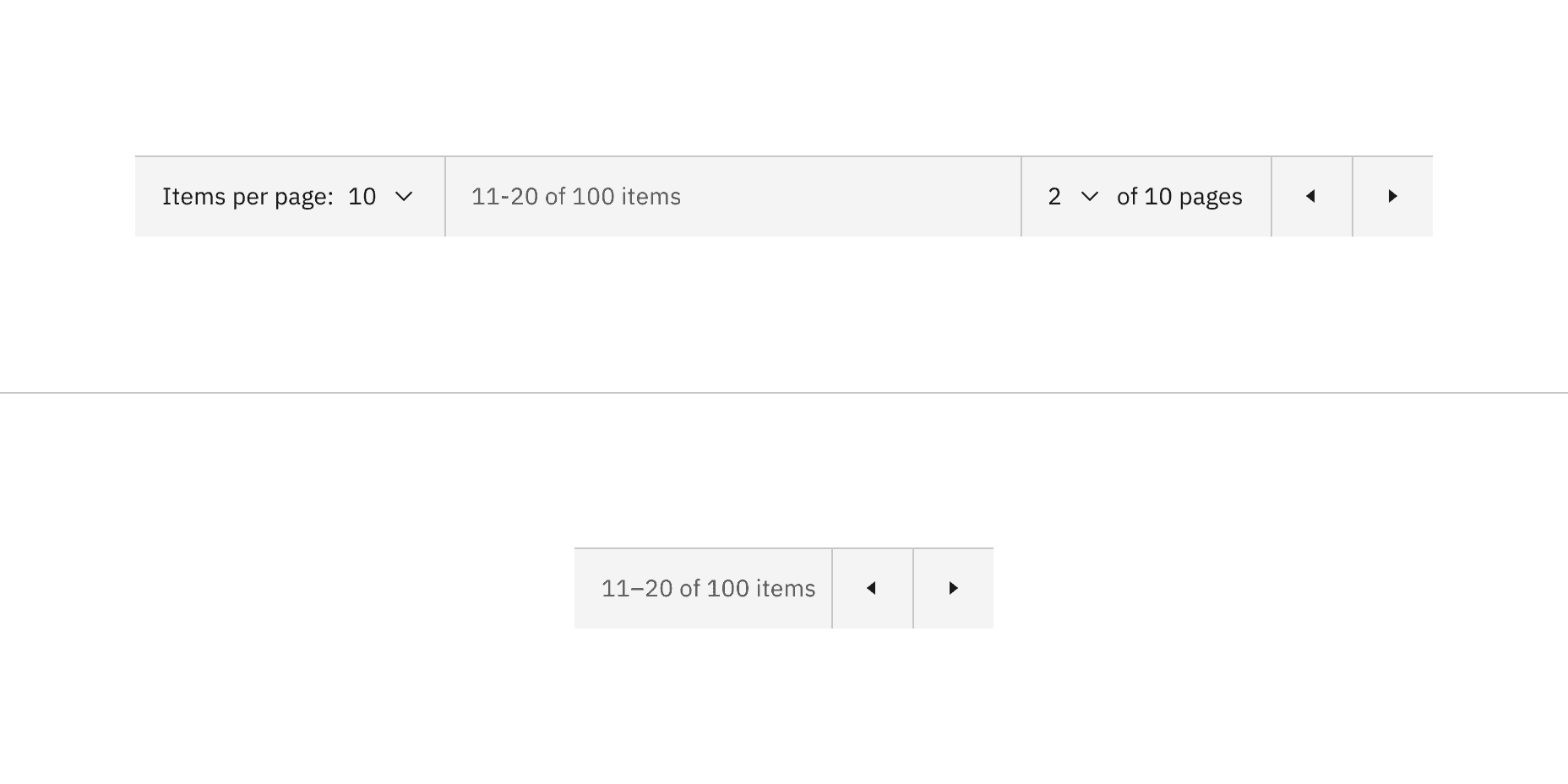
Anatomy of the pagination variant
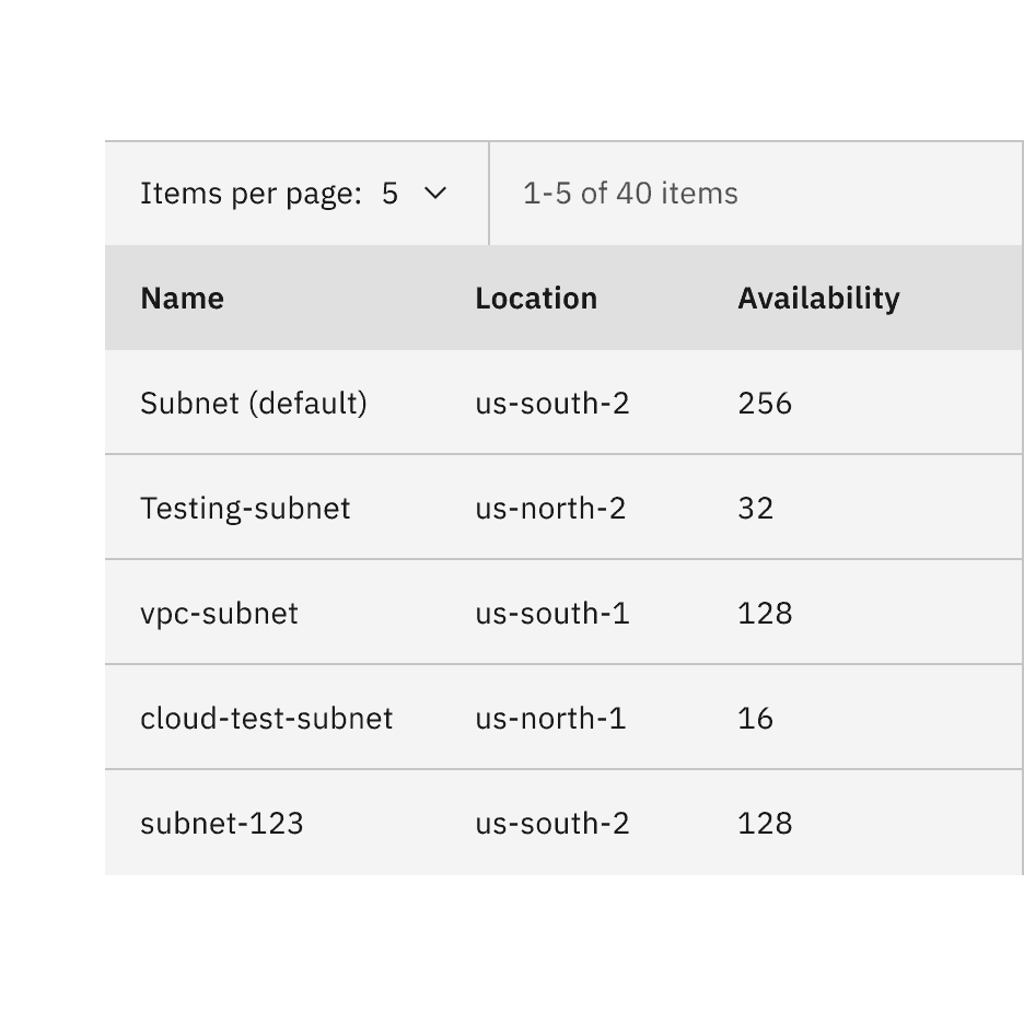
Items per page: Shows the current number of items that appear per page.
Range of items: Shows the current range of items and lists the total amount of items.
Current page: Shows the current page the user is on and lists the total amount of pages.
Previous and next buttons: Buttons that take you to the previous or next page.
Container: The container bar of the whole pagination component.
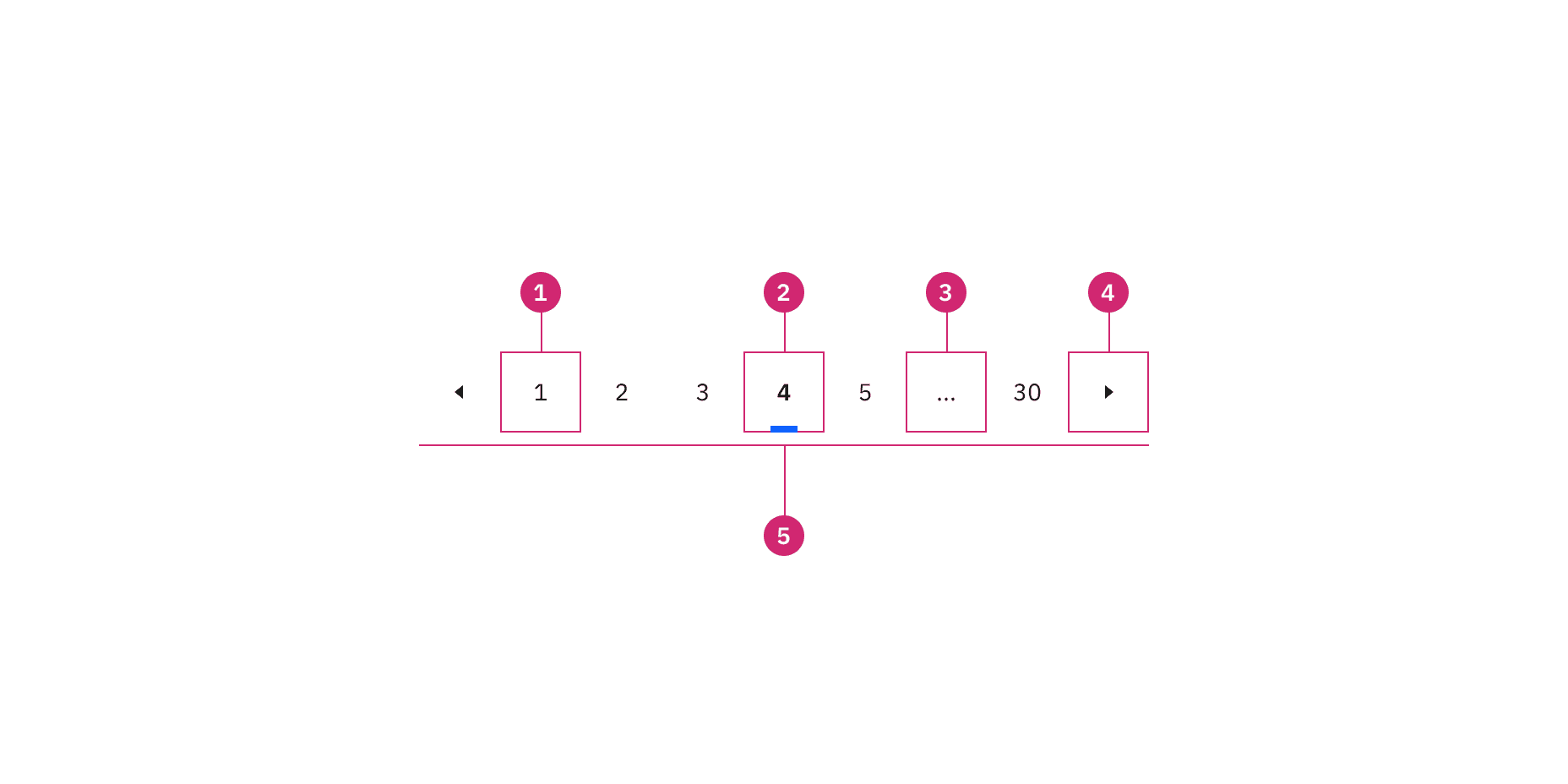
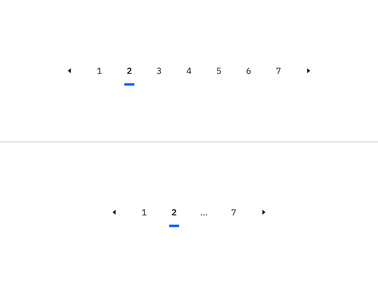
Anatomy of the pagination nav variant
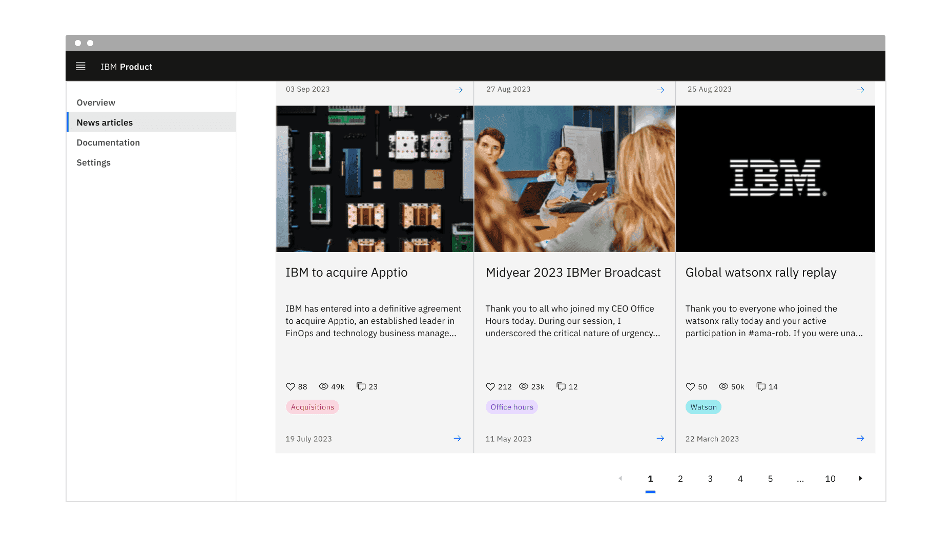
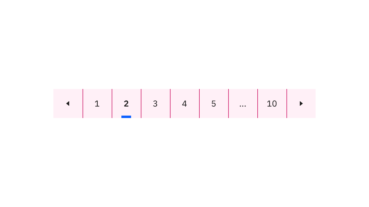
Unselected page button: A page the user could select and view.
Selected page button: The current page the user is viewing.
Overflow button: Contains available pages that can be navigated to but cannot be shown upfront in the component because of the current viewport.
Previous and next buttons: Buttons that take you to the previous or next page.
Container: The container of the whole pagination component.
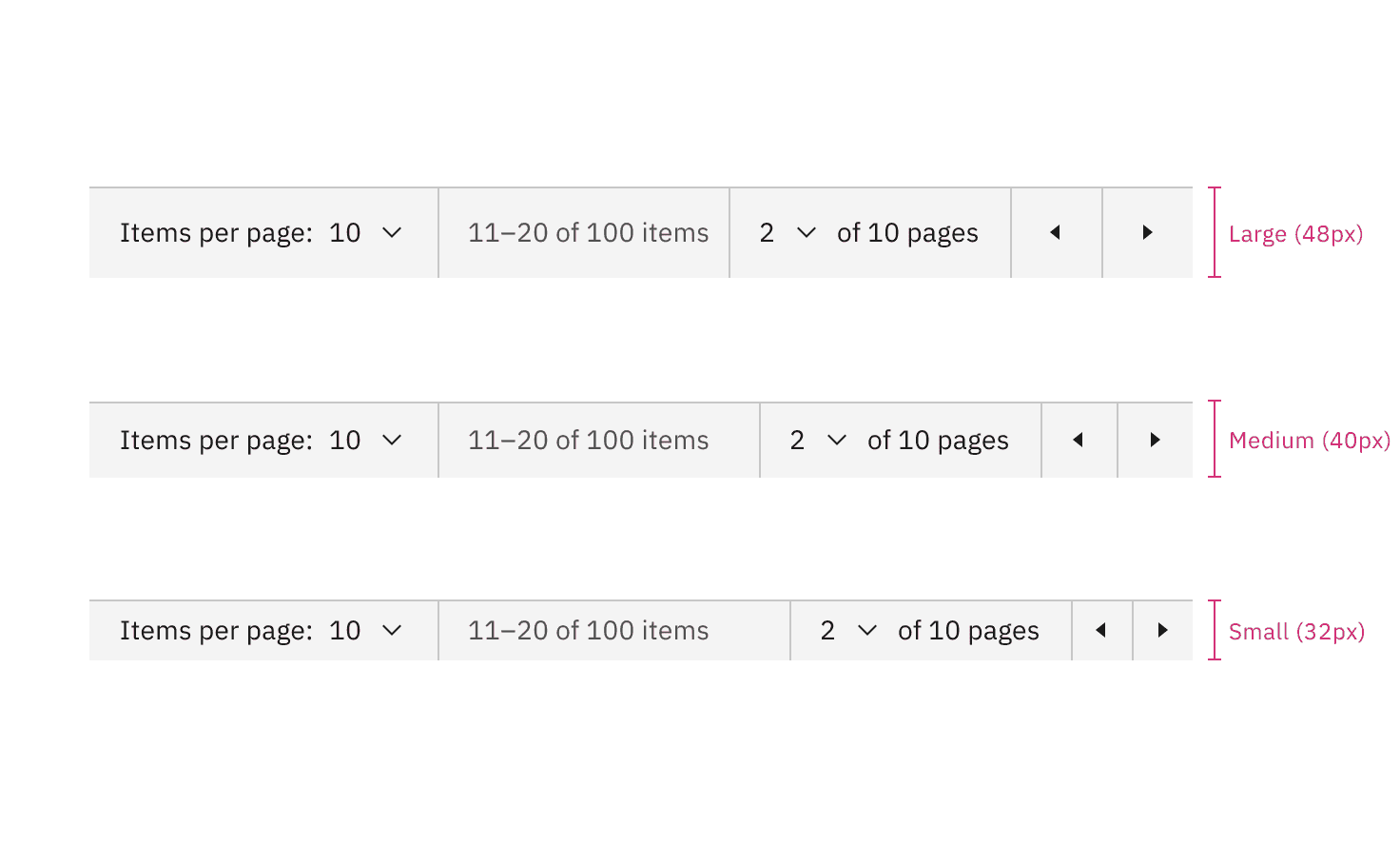
Sizes of pagination
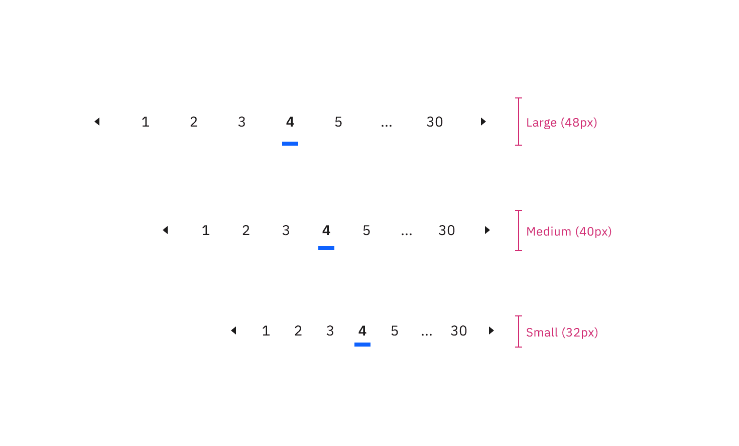
Sizes of pagination nav
Data table size pairings
We recommend using the same height pagination as you do for the data table component rows to which it is connected. In some cases, the height sizes of these two components will not be the same because we do not offer extra small and extra large sizes for pagination. When using the extra large data table row height, use the large pagination. When using the extra small data table row height, use the small pagination.
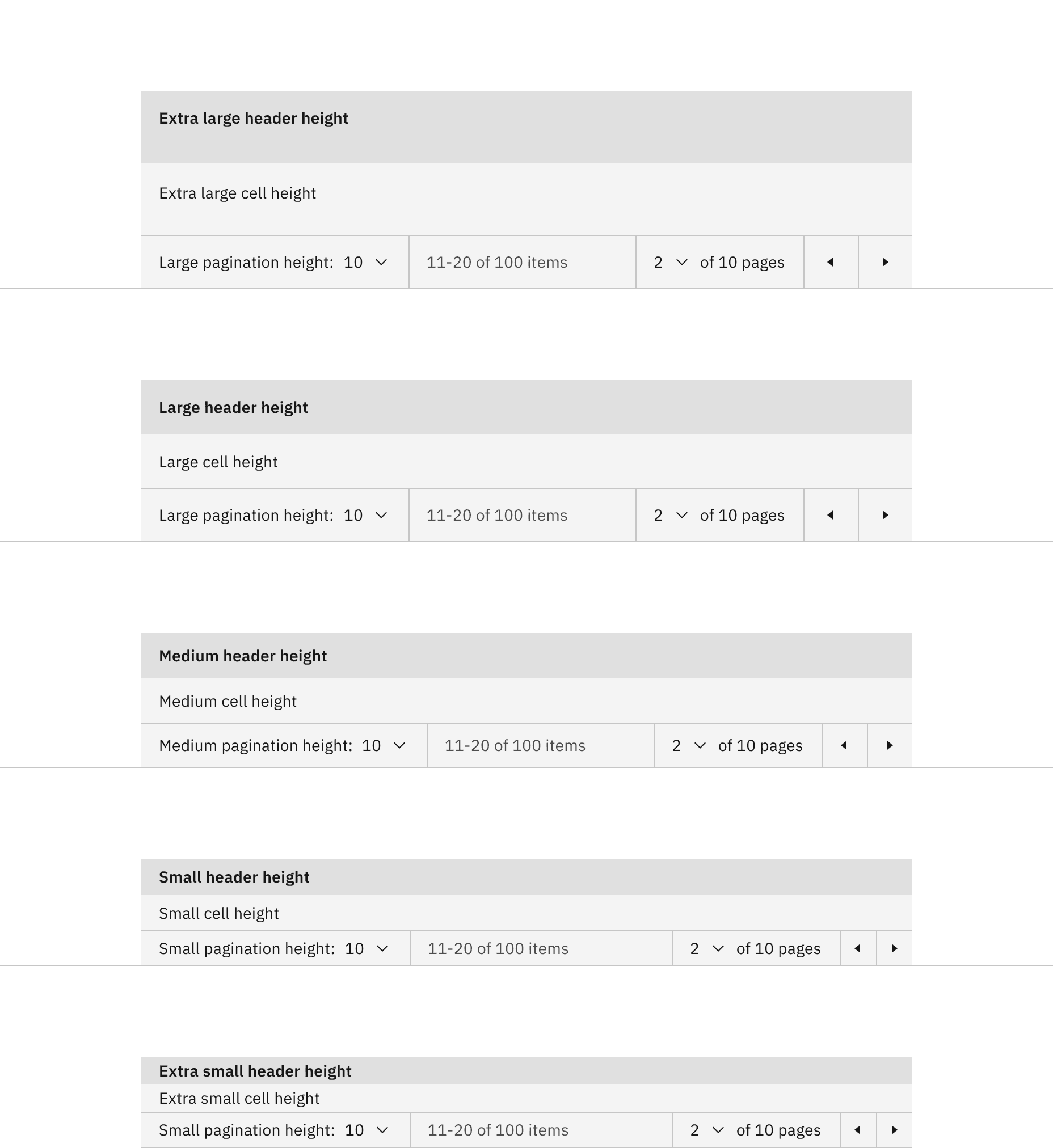
Size pairings of the pagination and data table components
Placement of the pagination variant
Do stack the pagination component below the data table.
Do not stack the pagination component above the data table.
Placement of the pagination nav variant
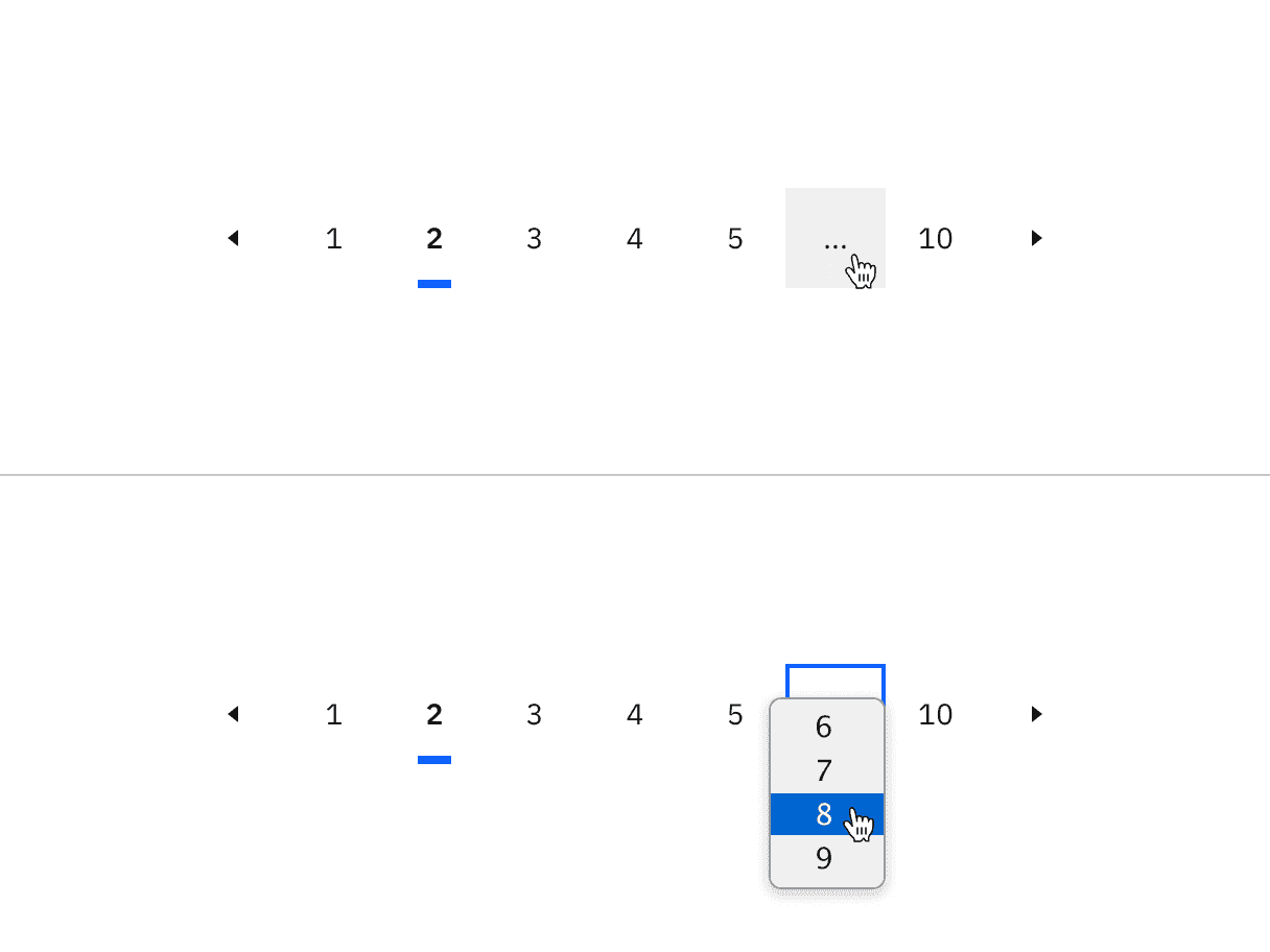
Example of the ellipsis button for overflow content in the pagination nav variant
Further guidance
For further content guidance, see Carbon's content guidelines.
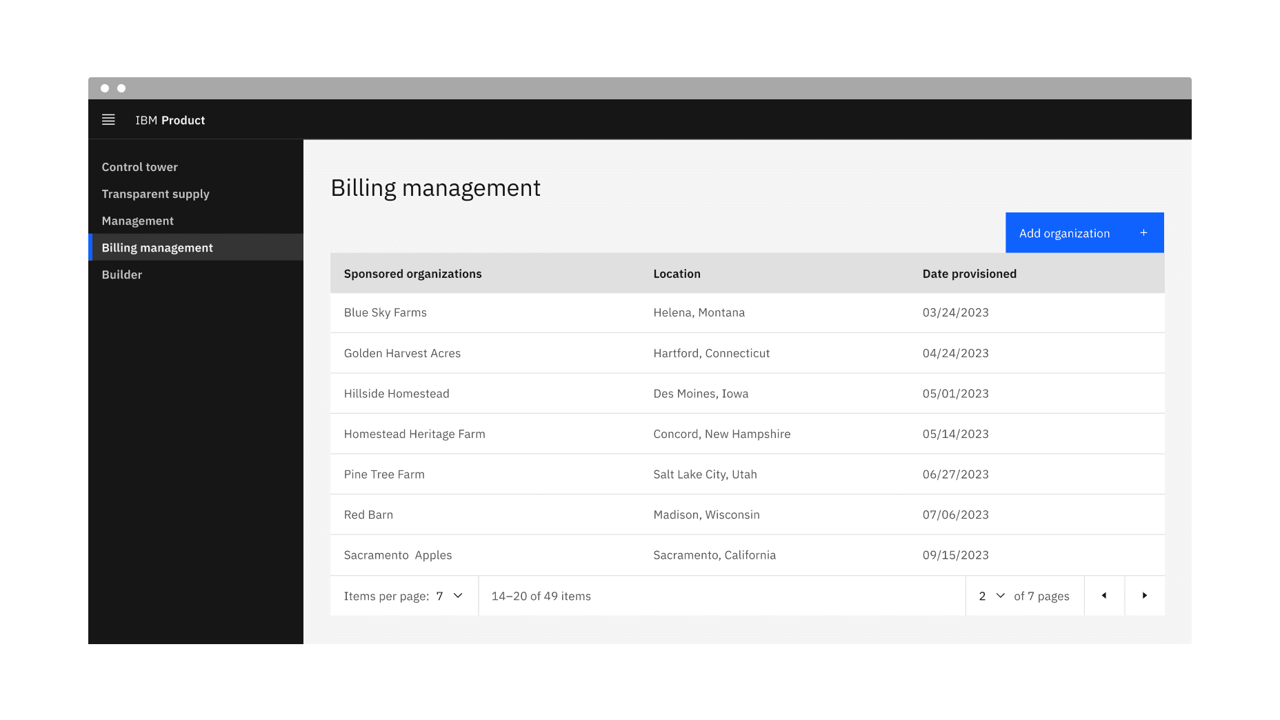
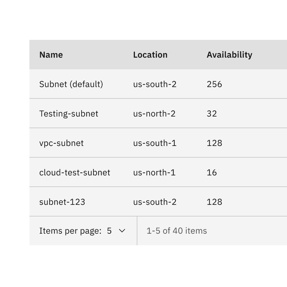
Example of the pagination variant in a UI
States
The pagination variant has the select component and ghost icon button component nested within it and inherits their component states. For more information on these states, refer to the select and ghost icon button style tab guidance.
Clicking on the select component will open the menu and reveal options.
To close the menu, choose a different option or click outside the menu area.
Clicking on a previous or next button will navigate you to the previous or next page.
On focus, the select component menu is opened with pressing
Spaceor withUporDownarrows which also cycle through the values.Pressing
SpaceorEnterselects a value and closes the menu.The menu can be closed by pressing
Esc.The previous and next ghost icon buttons are activated by pressing
SpaceorEnter.
Responsive behavior
The pagination variant retains all its content and nested components at every breakpoint except for the small breakpoint. The select components have been removed at the small breakpoint, but information on the total number of items, items being displayed, and previous and next buttons remain.
Pagination variant responsive behavior in all breakpoints versus the small breakpoint
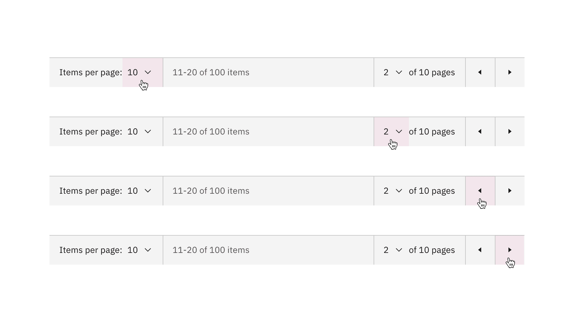
Pagination variant clickable areas
Example of the pagination nav variant in a UI
States
The pagination nav variant has the ghost icon button component and the breadcrumb overflow button component nested within it that inherits their component states. For more information on these states, refer to the select and breadcrumb overflow button style tab guidance.
Clicking on a button number will navigate you to that page.
Clicking on a previous or next caret button will navigate you to the previous and next pages of the one you are currently viewing.
Clicking on an overflow ellipsis button will open a select menu to choose a page to navigate to. Upon clicking on a page option from the menu, you will navigate to that page.
The icon button receives focus and you can move between buttons by pressing the
UporDownarrows.The page number buttons are activated by pressing
SpaceorEnter.The previous and next buttons are activated by pressing
SpaceorEnter.
Pagination nav variant responsive behavior in large versus small breakpoints
Clickable areas within the pagination nav variant
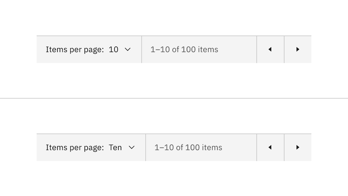
Select components content alternative of numbers versus words
Feedback
Help us improve this component by providing feedback, asking questions, and leaving any other comments on GitHub.