This live demo contains only a preview of functionality and styles available for this component. View the full demo on Storybook for additional information such as its version, controls, and API documentation.
- To help users find data more efficiently within a complex or large data set.
- Use at a global level when searching an entire site.
- Use at a page level when searching through content on one page specifically.
- Use at a component level when searching data in a component, like a data table.
- Do not use when there is small or limited amounts of data.
- Do not use when the information is simple and can be found easily within one view.
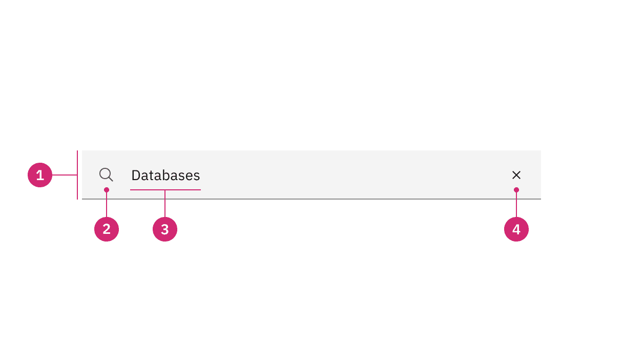
Field: The place where a user enters their search query.
Search icon: Signifies a search field. The magnifying glass icon is a universal way to indicate search.
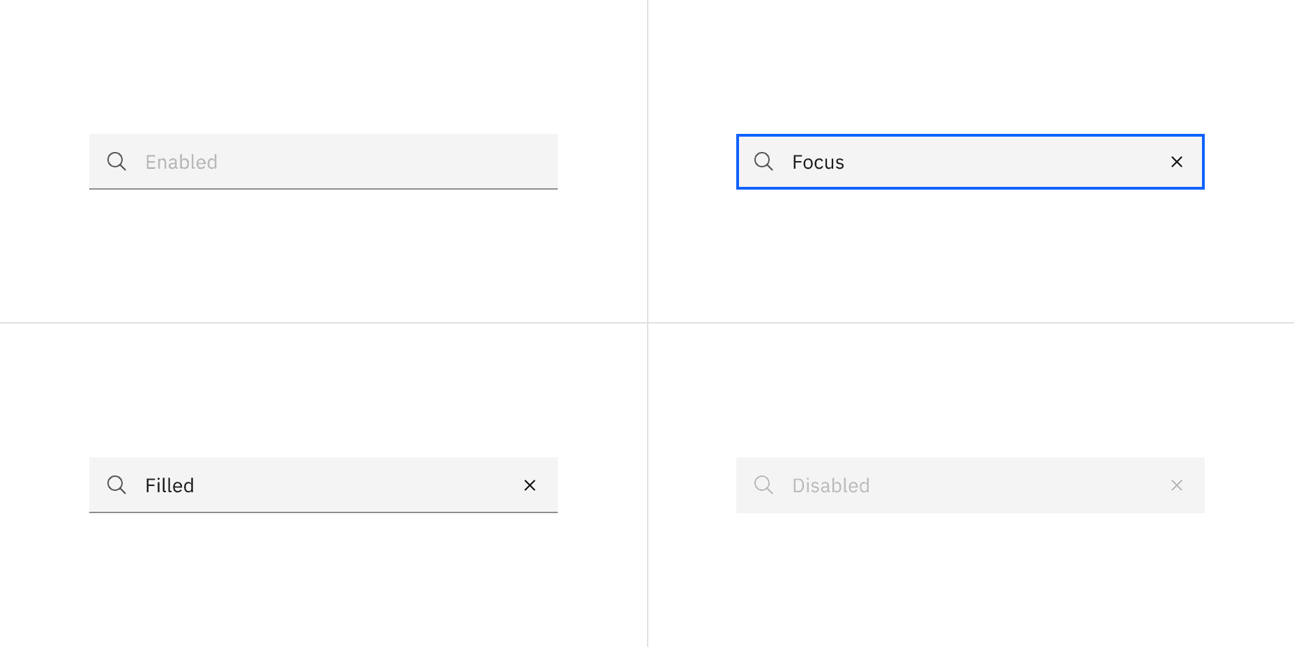
Field text: Inputted search text by the user. Placeholder text is visible before the user types into the field.
Close icon: Appears after the user has actively typed into the search field. Acts as a function to clear the search field.
Style | Appearance | Use case |
|---|---|---|
Default | A traditional style where there is no label indicated. | Use when white space is needed between components. For example, a default search style is typically used at a global or page level. |
Fluid | An alternative style where a label is placed inside of the search field and is stacked inline with the user input field text. | Use in expressive moments, fluid forms, and contained spaces. |
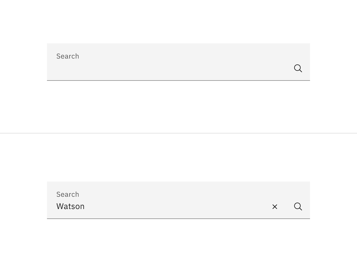
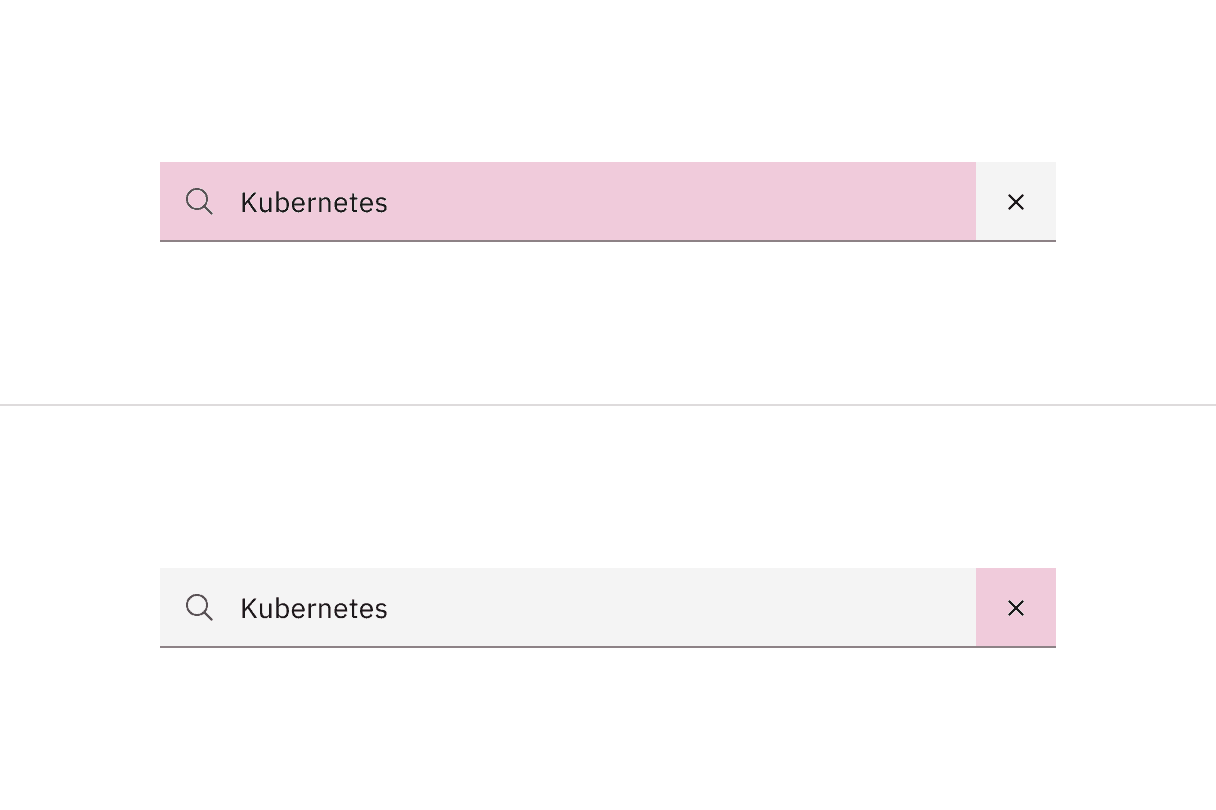
A default style input is shown on the top and fluid style is on the bottom.
Size | Height (px/rem) | Use case |
|---|---|---|
Extra small (xs) | 24/ 1.5 | Use for highly dense layouts where maximizing information within limited space is a priority. |
Small (sm) | 32 / 2 | Use for compact interfaces that require reduced component height while maintaining comfortable readability and interaction. |
Medium (md) | 40 / 2.5 | Use as the default and most commonly used size. Use when no specific density or spacing requirements exist. |
Large (lg) | 48 / 3 | Use in spacious layouts where increased emphasis and easier interaction are important. The large size is typically at a global level when the user is searching content within a page view. |
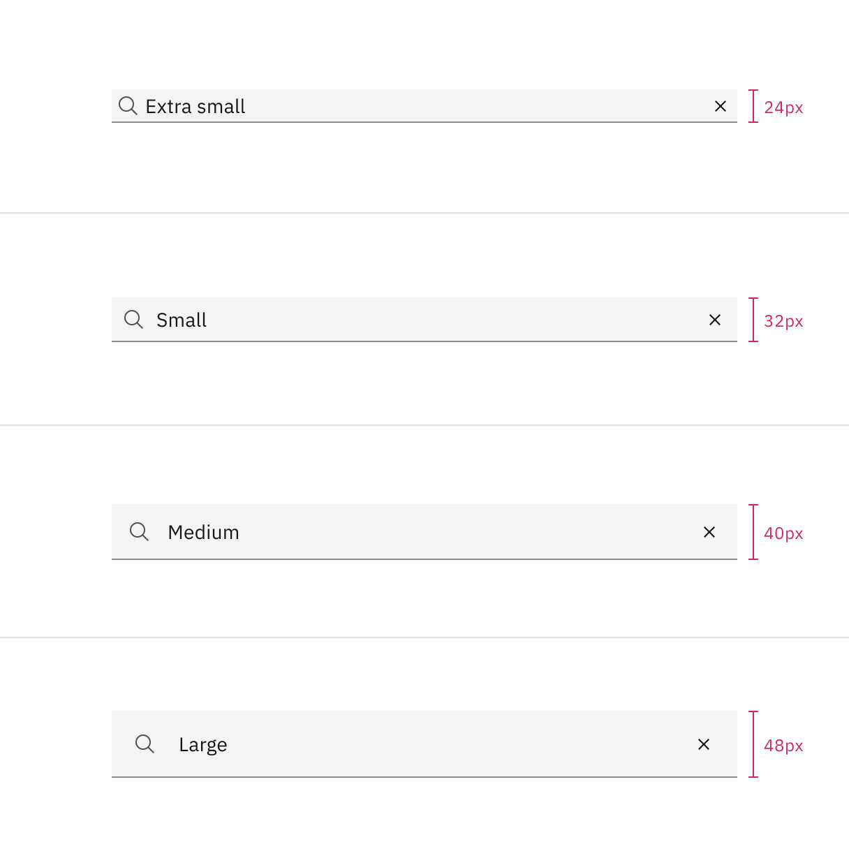
Sizes for select: extra small, small, medium, and large
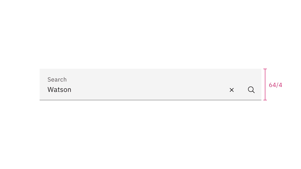
Fluid input height size for search
Placement
Place the search component within a user interface where users expect to find it and where it is appropriate for how it is being used in context, whether at a global level, page-specific level, or within a component.
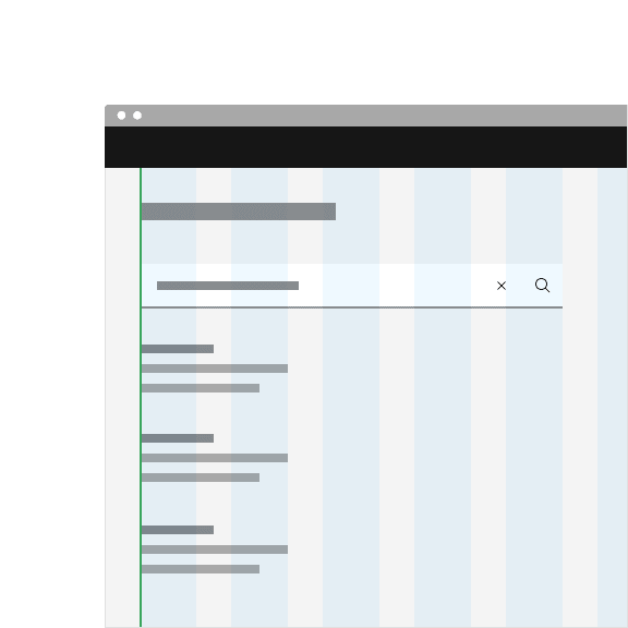
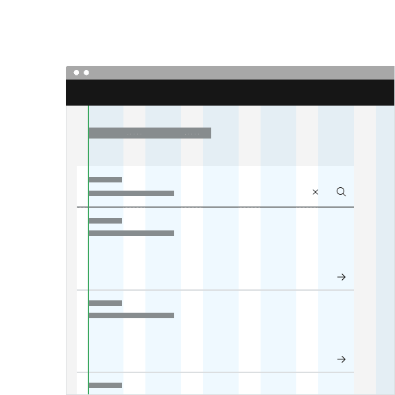
The default search can be arranged on the grid to align the container with other components containers. Search can also hang to align with other hanging component containers on the same page, depending on the use case.
Key words entered by the user to find a search result.
Keep the field text concise and relate the field text as closely to the result you want to find.
Further guidance
For further content guidance, see Carbon's content guidelines.
Feedback
Help us improve by providing feedback, asking questions, requesting features, or leaving any other comments on GitHub.