This live demo contains only a preview of functionality and styles available for this component. View the full demo on Storybook for additional information such as its version, controls, and API documentation.
Overview
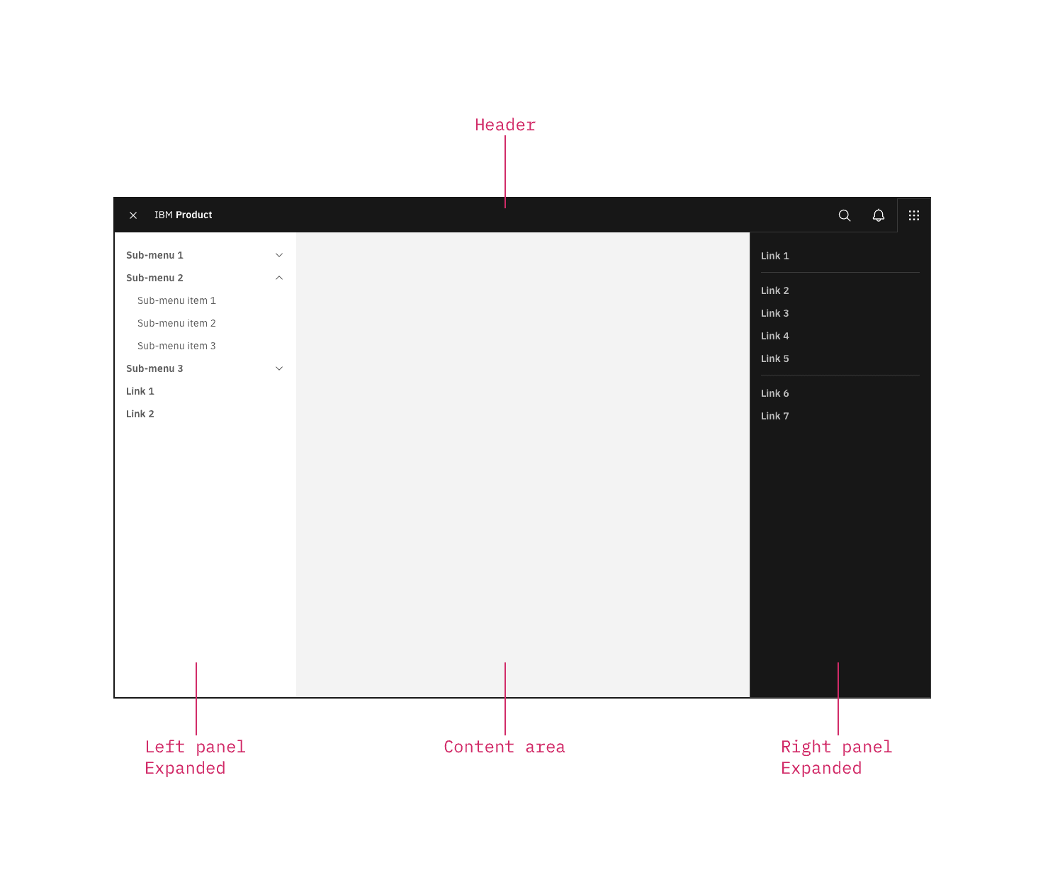
The UI shell is made up of three components: The header, the left panel, and the right panel. All three can be used independently, but the components were designed to work together.
Shell UI component | |
|---|---|
Header | The highest level of navigation. The header can be used on its own for simple products or be used to trigger the left and right panels. |
Left panel | An optional panel that is used for a product’s navigation. |
Right panel | An optional panel that shows additional system level actions or content associated with a system icon in the header. |
UI shell components
Behavior
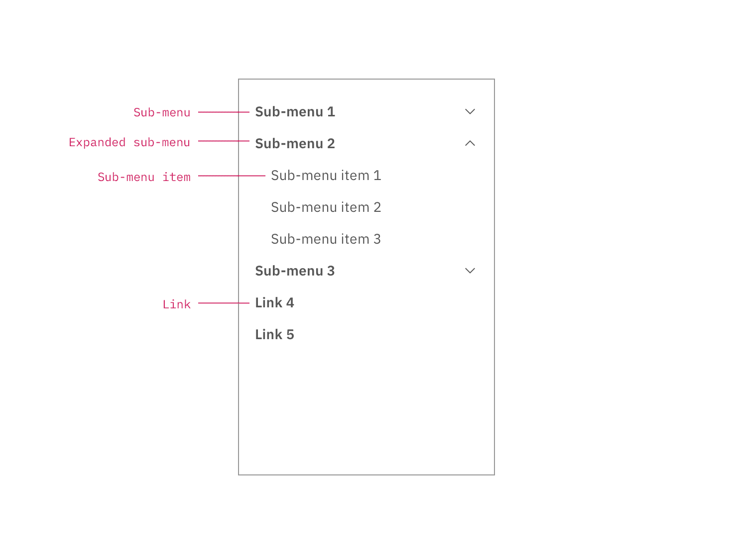
Use the left panel if there are more than five secondary navigation items, or if you expect a user to switch between secondary items frequently. Sub-menus are denoted with a chevron and expand when clicked, pushing the other items down in the panel. To collapse the sub-menu, the user must again click the menu header in the left panel.
The left panel does not support three tiers of navigation. If you have additional content to display beneath a sub-menu, use tabs within the page.
Feedback
Help us improve this component by providing feedback, asking questions, and leaving any other comments on GitHub.