Keyboard interactions
Tabs take at least two tabstops, one for the tablist and one for the tabpanel. When tabbing away from the tablist, focus will either go to the first operable element in the tabpanel or, where there are no operable elements, the entire tabpanel will take focus to support scrolling of its content.
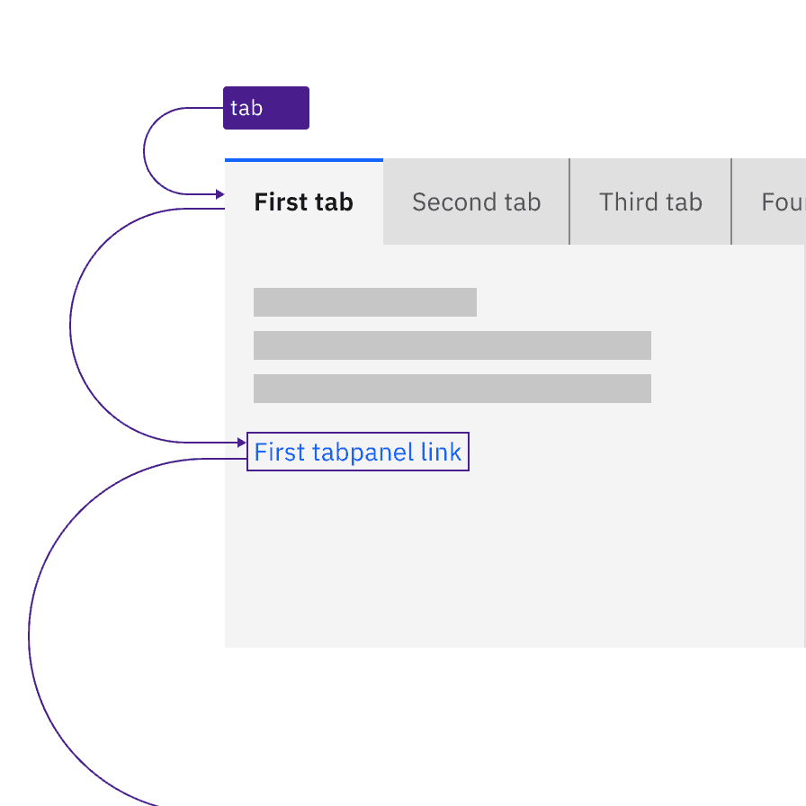
The tablist takes a single tabstop then focus moves to the first item in the tabpanel.
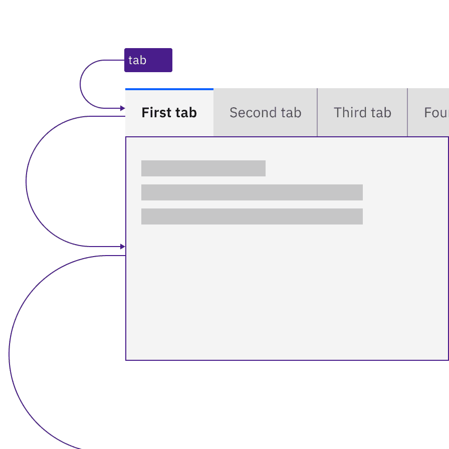
Where a tabpanel has no interactive items, the focus moves from the tablist to the entire tabpanel.
Arrow keys are used to navigate between individual tab items in the tablist. When the end of the tablist is reached, the focus wraps to the opposite end of the list. For scrollable tablists, where the number of tabs exceeds the horizontal space, the keyboard navigation does not change. The user presses the Left or Right arrow key, which moves the focus to the next tab item and, where necessary, scrolls the tablist to keep the selected item visible. For mouse users, clickable arrows appear at the end of the tablist to provide the same scrolling, but these are not needed for keyboard users and they are not in the focus order.
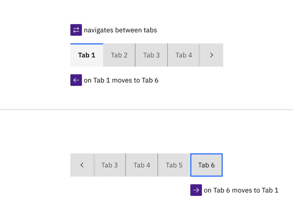
Arrow keys move between tabs in the tablist (wrapping from last back to first) and scroll automatically to keep the focused tab visible.
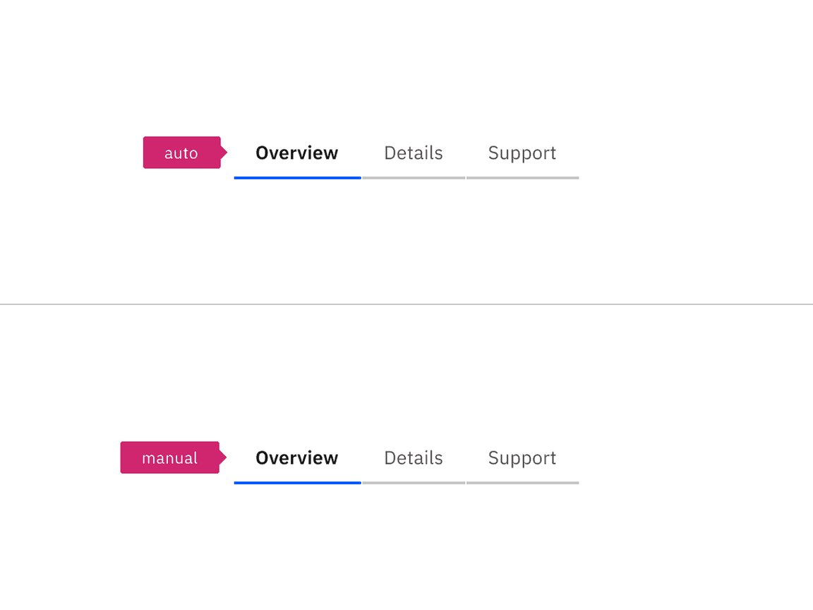
Automatic and manual tablists differ in how the tab items are activated. The following illustration shows what will happen for each variant when a right arrow key is pressed with the Overview tab selected and focused.
For automatic tablists, focus and selection are synchronized. When the user arrows to a tab, it is selected, and the tabpanel under the tab is updated in real time.
Manual tablists allow the user to arrow between the tab items without updating the tabpanel underneath. When the user right arrows, the Overview tab remains selected while focus moves to the Details tab. In order to select the Details tab (and update the tabpanel under the tab), the user would press Enter or Space.
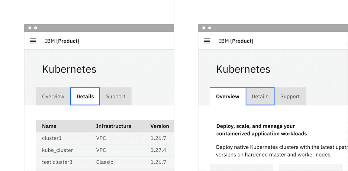
After pressing the Right Arrow key, the second tab is selected in an automatic tablist. For the manual tablist, Details has focus but Overview is still selected. Pressing the Space or Enter key will select Details.
Indicate which variant to implement
The automatic and manual tablists are visually indistinguishable in a wireframe, so designers should annotate which variant the team has decided to implement. Since the choice primarily concerns technical considerations about potential latency when updating the tabpanel's information, architects or developers should be involved in the discussion.
Annotate whether the tabs should be implemented as automatic or manual.
Tabs are implemented as a
tablist, with each tab item implemented as a<button>with a role oftab.The selected tab has attributes
aria-selected="true"andtabindex="0". All other tabs have these attribute values set to"false"and"-1".Each tab is associated with its tabpanel through
aria-controls.See the ARIA authoring practices guidance for tabs for more considerations.
For accessibility considerations for manual tabs, see Deciding when to make selection automatically follow focus.
Accessibility testing status
Latest version: 1.109.0 | Framework: React (@carbon/react)
| Component | Accessibility test | Status | Link to source code |
|---|---|---|---|
| Tabs | Test(s) that ensure the initial render state of a component is accessible. | Automated or manual testing has been temporarily deferred. | GitHub link |
| Tests that ensure additional states of the component are accessible. This could be interactive states of a component or its multiple variants. | Automated or manual testing has been temporarily deferred. | ||
| Tests that ensure focus is properly managed, and all interactive functions of a component have a proper keyboard-accessible equivalent. | Test data is either not available or not applicable for this component state. | ||
| This manual testing ensures that the visual information on the screen is properly conveyed and read correctly by screen readers such as JAWS, VoiceOver, and NVDA. | Test data is either not available or not applicable for this component state. |
Feedback
Help us improve this component by providing feedback, asking questions, and leaving any other comments on GitHub.