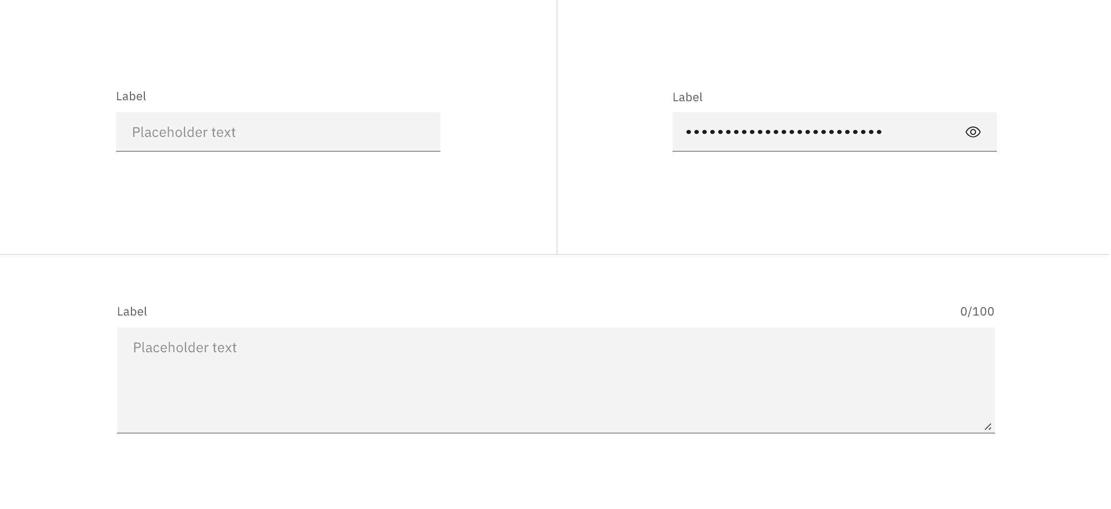
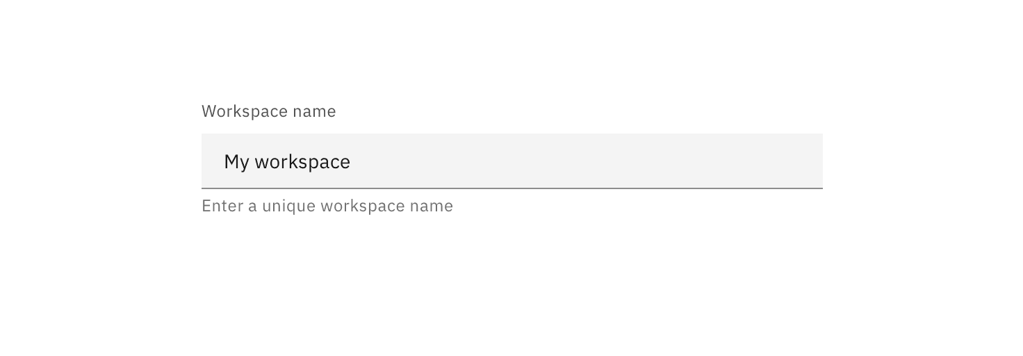
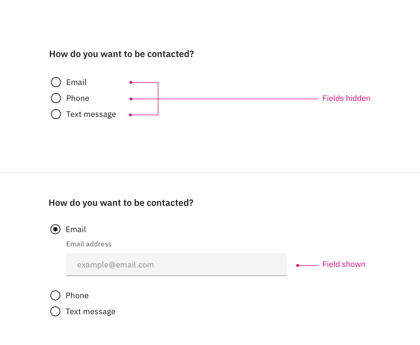
Example of a short user sign-up form using the optional pattern
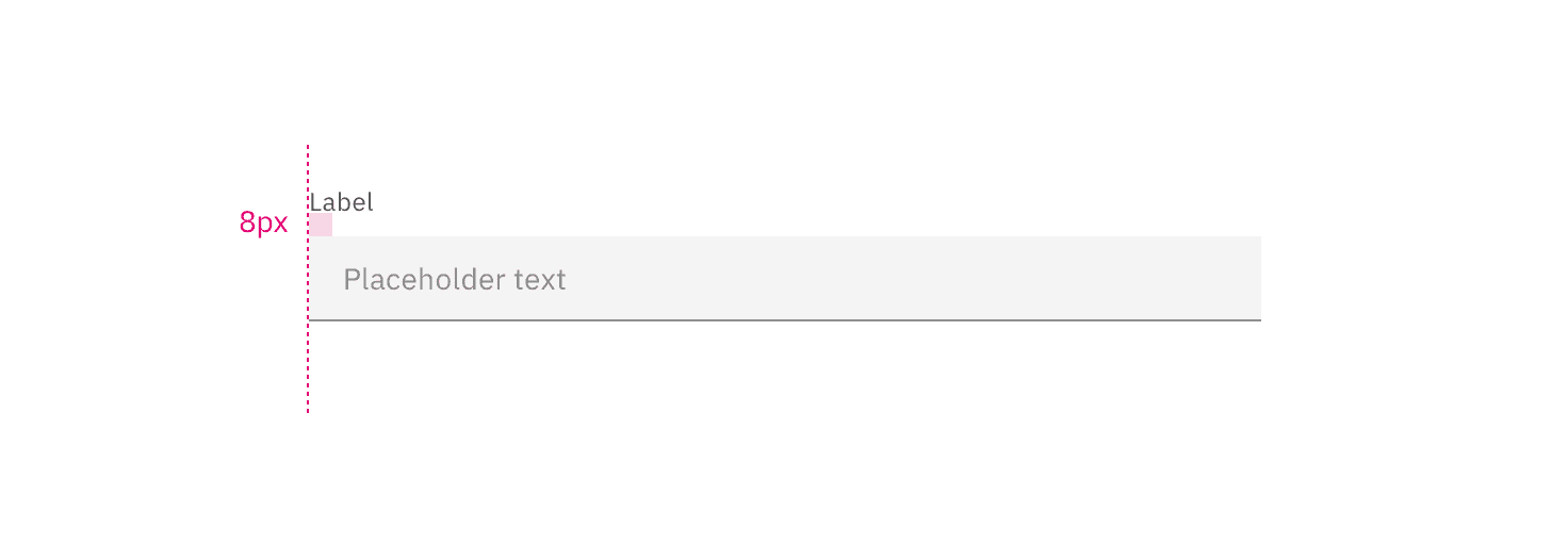
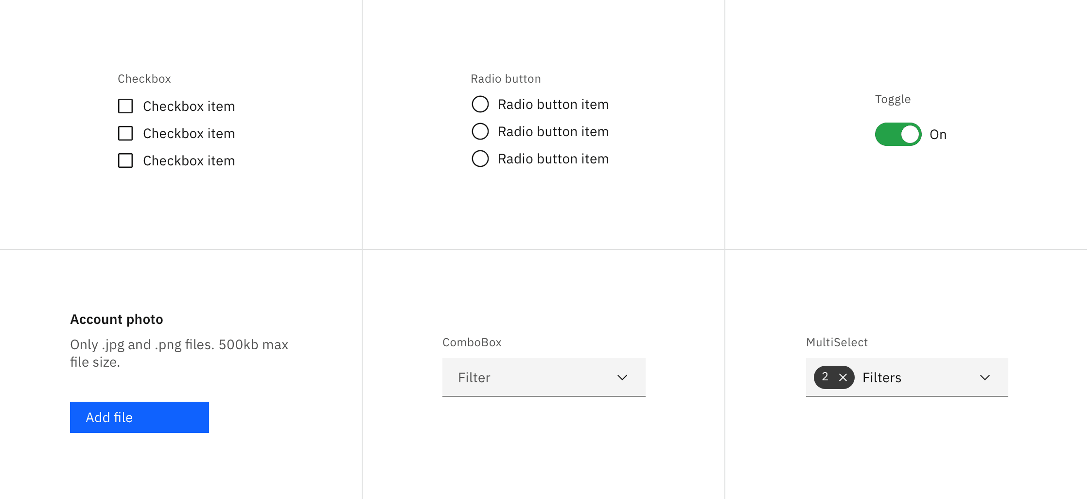
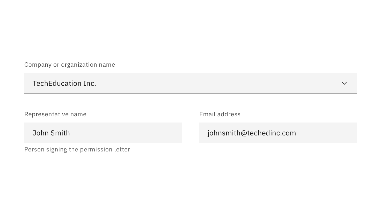
Example of product configuration properties using the required pattern
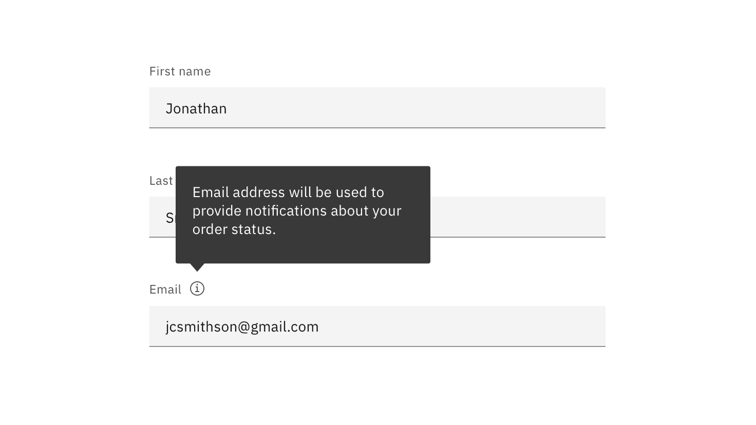
Tooltip appears on hover (desktop) and on click (tablet and mobile).
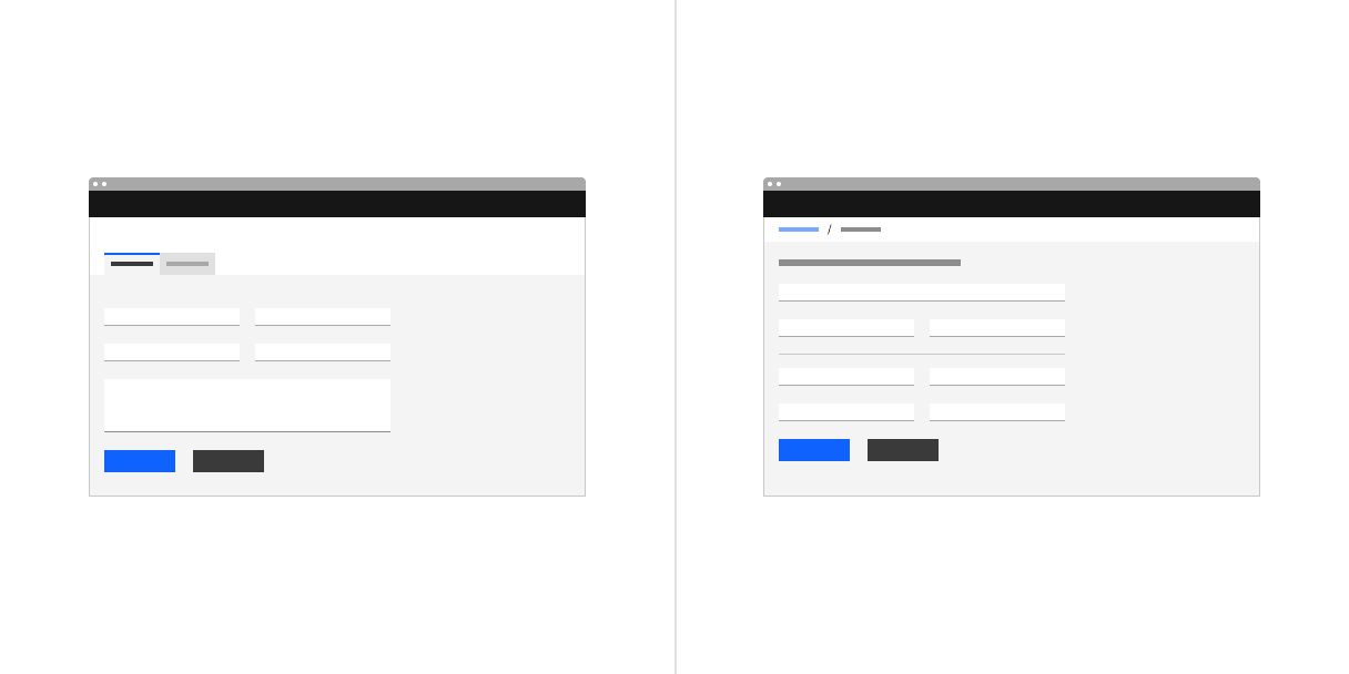
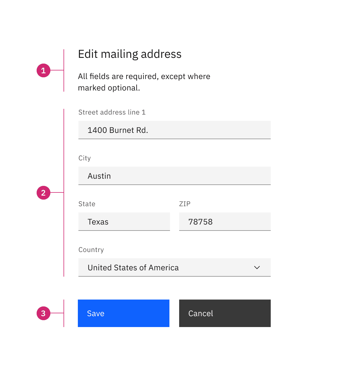
Examples of in-page forms with a left-aligned primary button
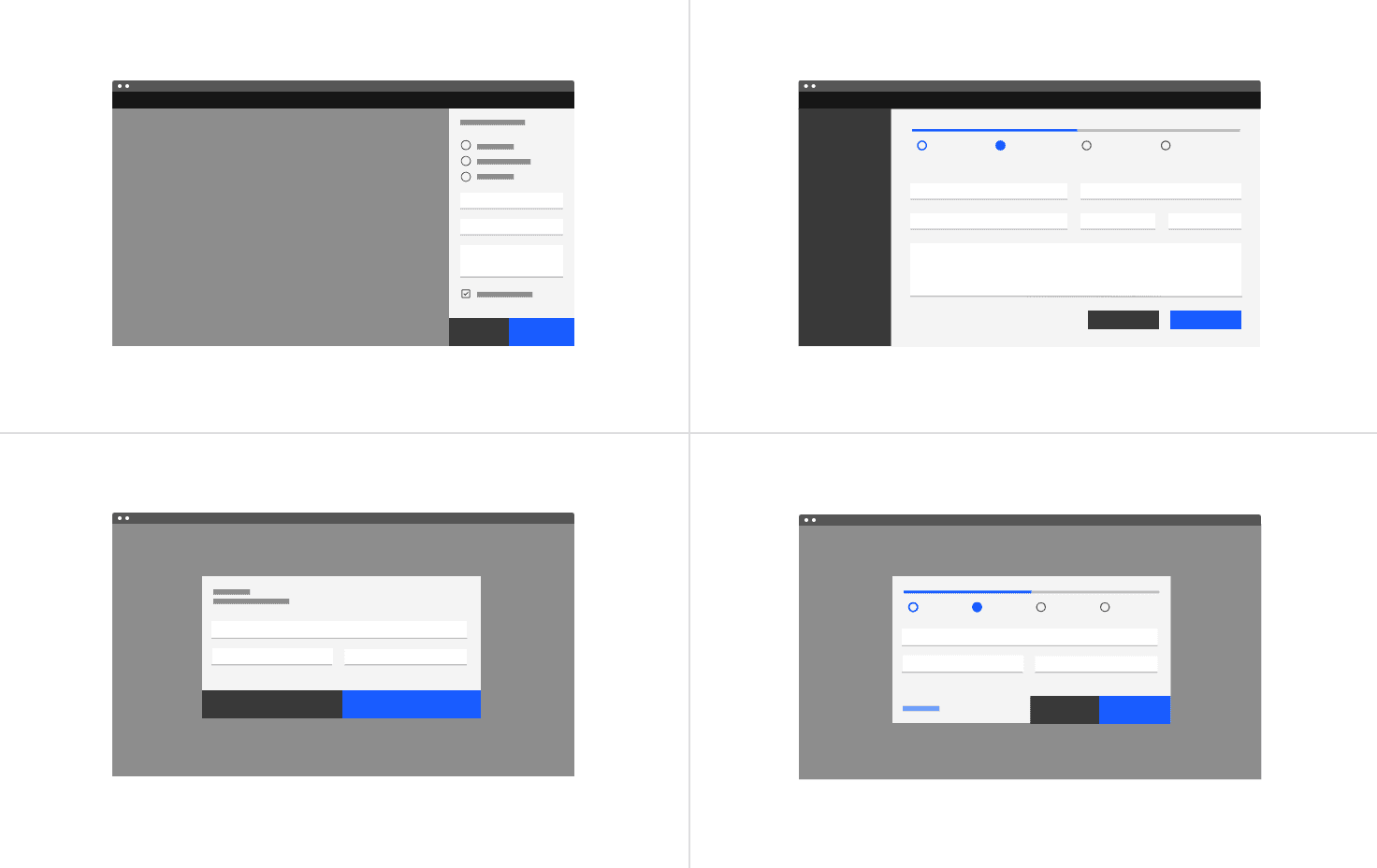
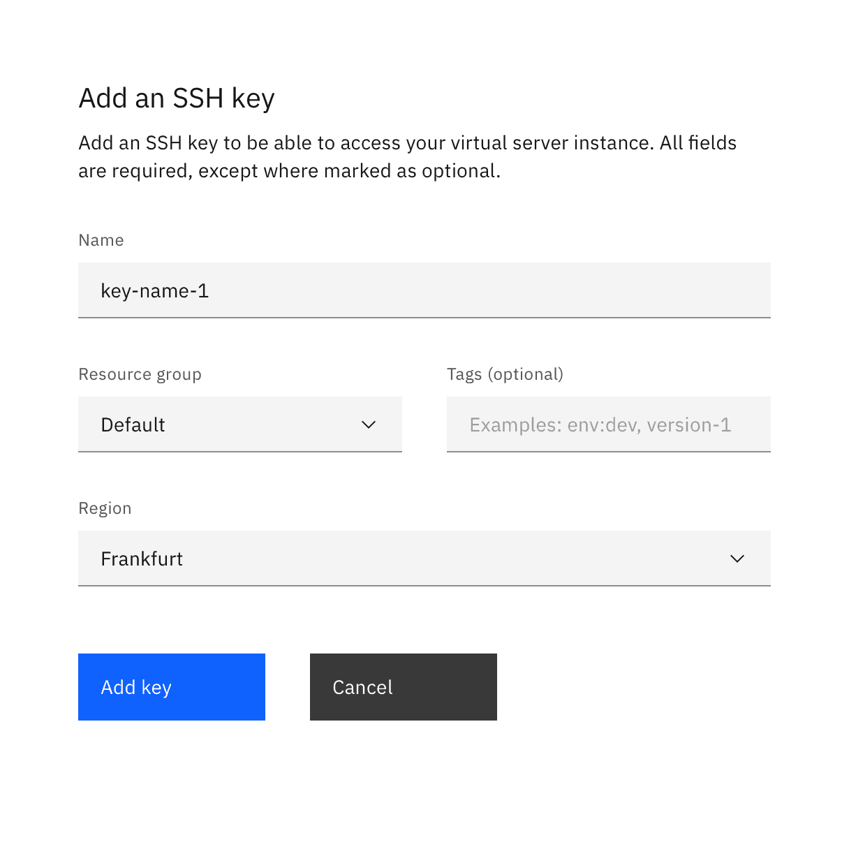
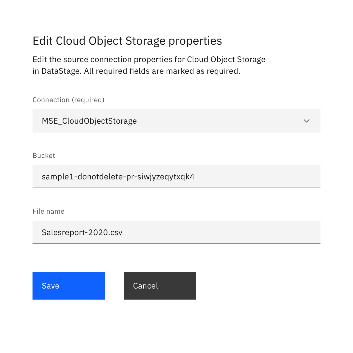
Examples of progressive and dialog forms with a right-aligned primary button
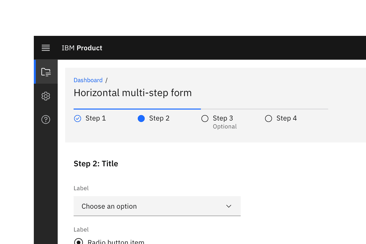
A multistep form with a horizontally oriented progress indicator.
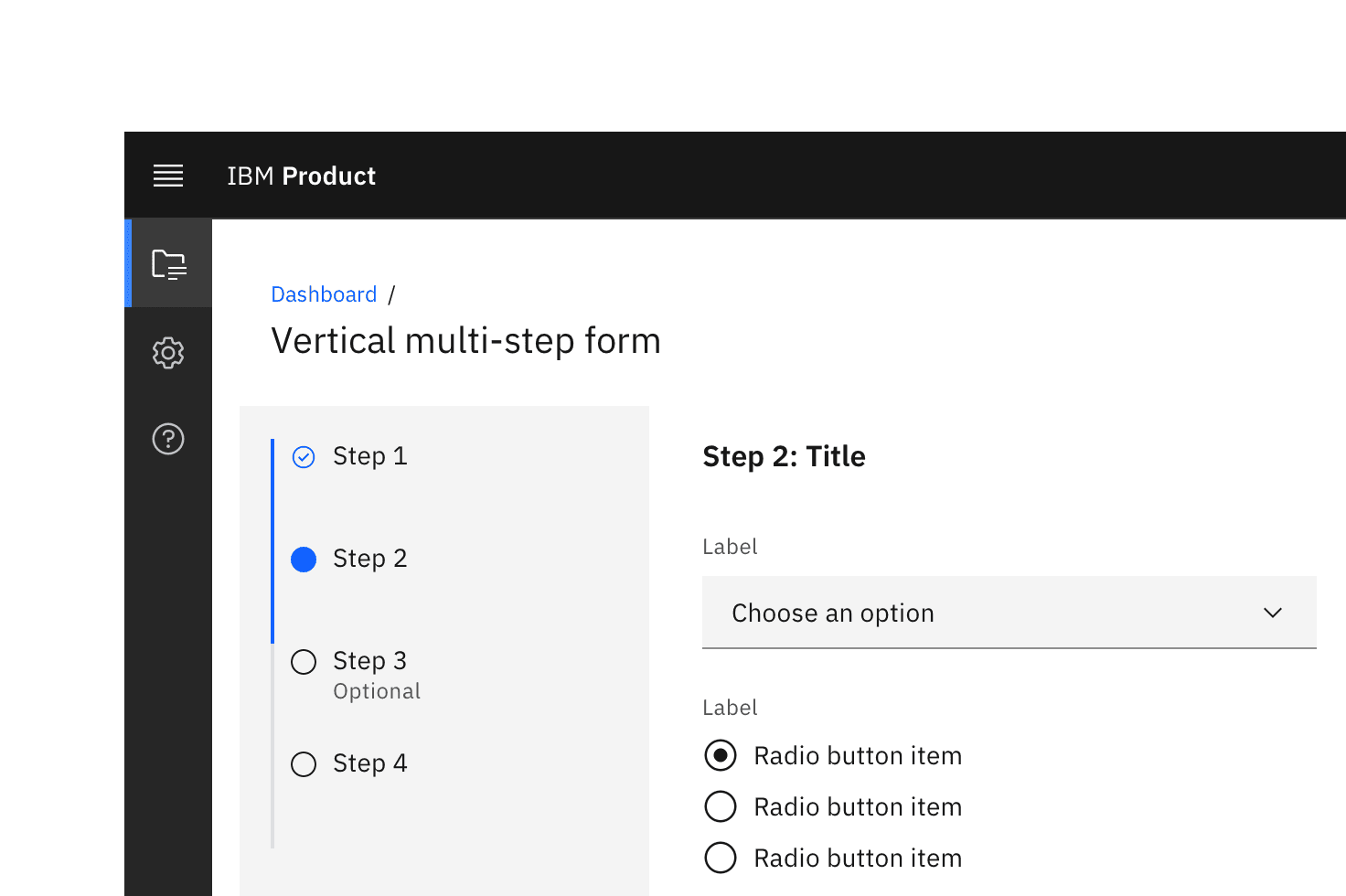
A multistep form with a vertically oriented progress indicator.
Feedback
Help us improve this component by providing feedback, asking questions, and leaving any other comments on GitHub.