This live demo contains only a preview of functionality and styles available for this component. View the full demo on Storybook for additional information such as its version, controls, and API documentation.
Overview
The UI shell header is the foundation for navigating and orienting your user to the UI. The UI shell header can be used by itself or combined with the UI shell left and right panels for more complex UI navigation.
The UI shell is made up of three components—the header, the left panel, and the right panel. All three can be used independently, but the components were designed to work together.
Shell UI component | |
|---|---|
Header | The highest level of navigation. The header can be used on its own for simple products or be used to trigger the left and right panels. |
Left panel | An optional panel that is used for a product’s navigation. |
Right panel | An optional panel that shows additional system-level actions or content associated with a system icon in the header. |
Types
Type | Purpose |
|---|---|
Header base | Has a persistent site title that can be used to identify a single page UI. |
Header with navigation | Includes links and dropdowns for a simple navigation. |
Header with actions | Actions or utilities appear in the header as icon buttons to give users quick access to common utilities. |
Header with sidenav | The header can be paired with the UI shell left panel to offer a deeper level of navigation in a UI. |
Anatomy
The header spans the full width of the viewport and is the topmost element in the browser window. The header is persistent throughout the product experience.
For each UI shell component, left-to-right translates to product-to-global. The left side of the header contains items relevant at the product level. Moving to the right along the header, the functions become more global. Elements in the middle of the header should represent system-level controls. Elements on the right side of the header, such as the switcher, are the most global in their scope and span multiple products.
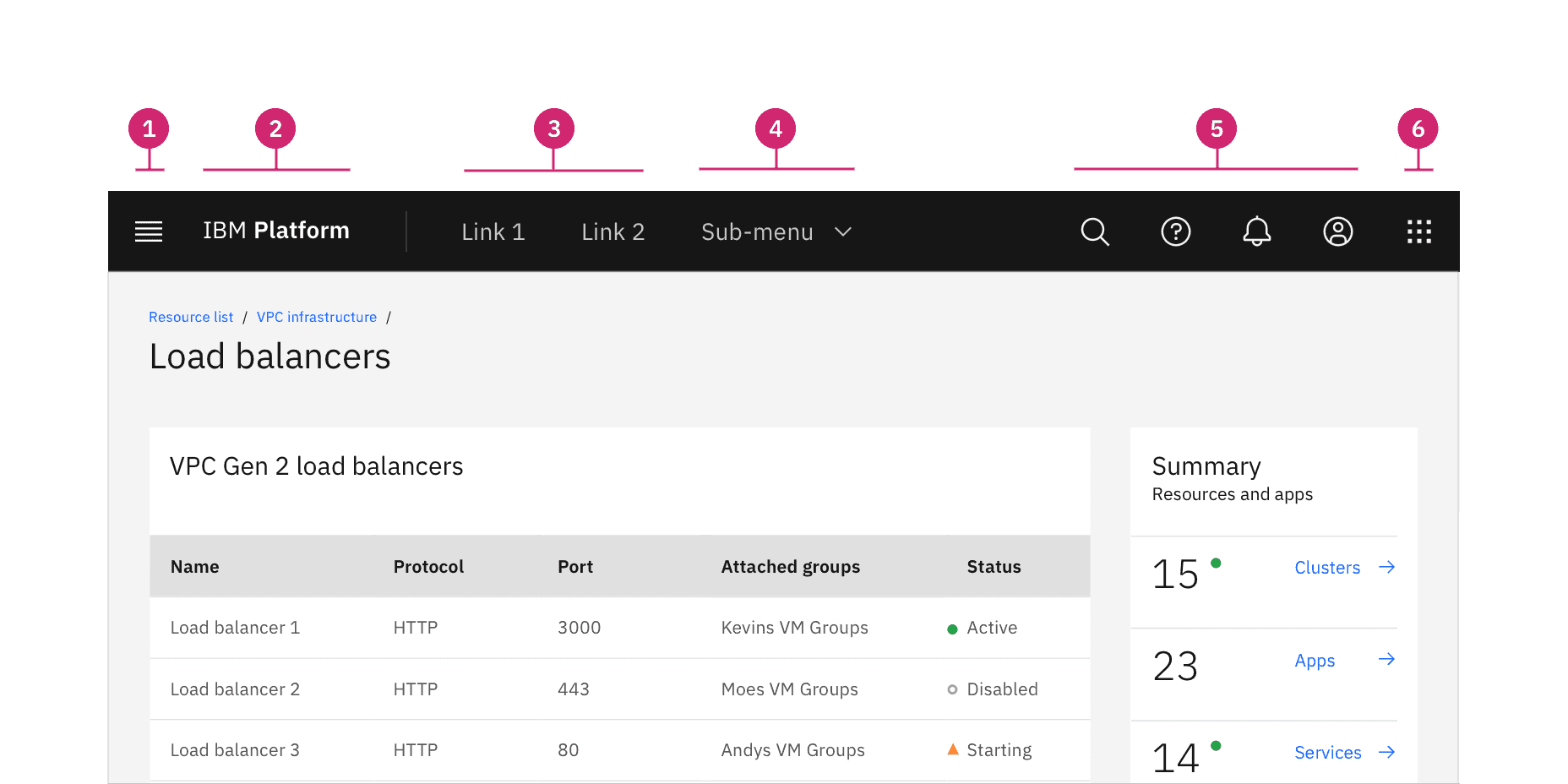
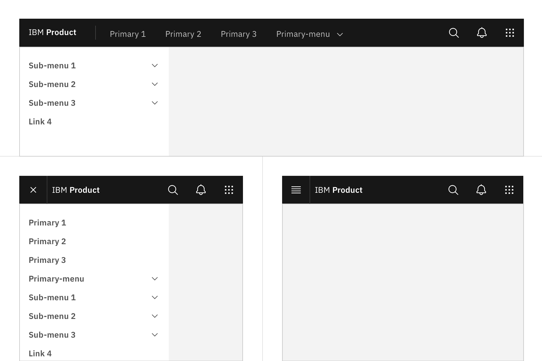
- Hamburger menu: The hamburger icon is used to open product navigation such as the left panel. The hamburger menu is only needed when there is a collapsable left navigation.
- Header name: For IBM products, the header name is always preceded by “IBM.”
- Header links: Links in the header are supported as product navigation, if required. These links move to the side menu in narrow screen widths.
- Sub-menu: Sub-menus are supported as product navigation, if required. Include the down-pointing chevron after the link label. Sub-menus open on click and are closed by either selecting an item in the menu, clicking outside the menu area, or clicking on the menu label. When open, the chevron should point up. Sub-menu labels serve only to open the dropdown; they cannot link to another page in the product.
- Header utilities: These utilities are reserved for universal, system-level functions such as profile, search, notifications, and similar functions. Not every product on a system is required to show the same utilities, but it is recommended for a better cross-product user experience.
- Switcher: The switcher provides a way for the user to easily navigate between products and systems. Recommended uses for this component include recently used apps, frequently used apps, or all apps attached to the user’s account. If the list is a manageable size, include all apps or products available on the system.
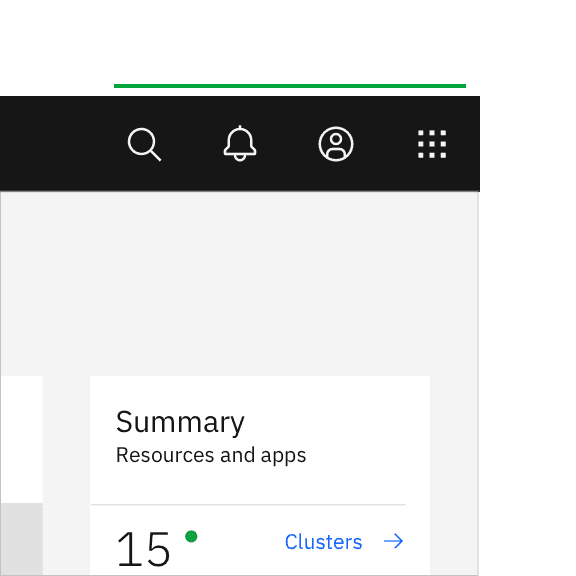
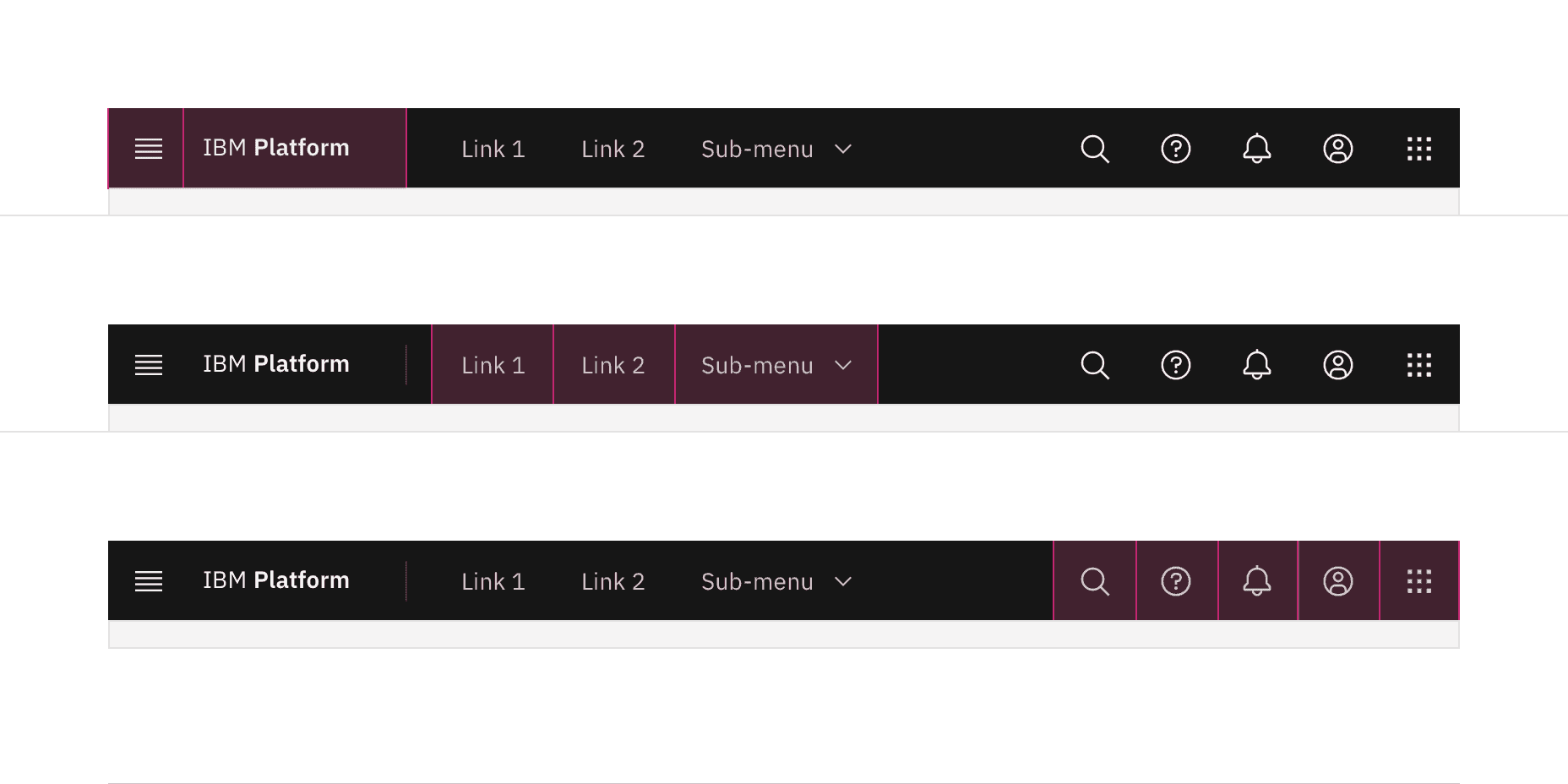
Header utilities are right aligned with no gaps
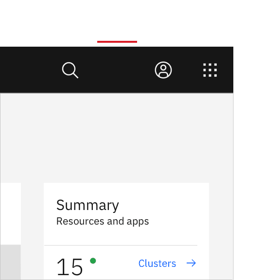
Header utilities with a gap between the account and help icons.
Icon | Placement |
|---|---|
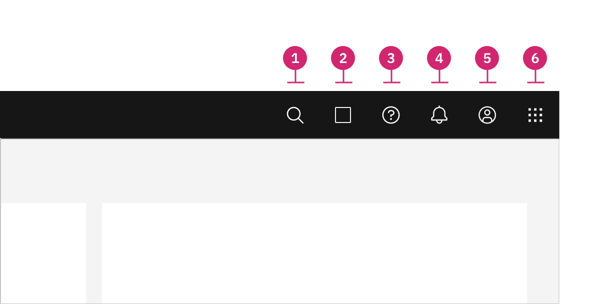
1. Search | Search should always be positioned as the furthest left icon. This is to allow for an expanding search field that does not disrupt other icon positions. |
2. Other | The number of header icons a product uses may vary. This placement will help avoid disrupting the position of the core icons and inconsistencies as your user navigates between other product shell headers. |
3. Help | Help is positioned 4th from the right. |
4. Notifications | Notifications should be 3rd from the right when paired with the account and switcher icon. |
5. Account | The account should be the 2nd from the right. This global link gives a user quick access to their account from anywhere in the product UI. |
6. Switcher | The switcher should always be positioned as the furthest right icon. This ensures the icon does not shift when navigating across systems. |
Keyboard
Some users may use a keyboard to navigate your site. Starting focus in the main navigation lets them quickly navigate to other areas in your UI, but could block them from the main content if there is a large number of navigation items to tab through first.
Success Criterion 2.4.1 (Bypass Blocks) suggest bypassing these blocks by providing a “Skip to main” link at the start of the navigation’s focusable controls. This lets users easily skip the navigation region and begin interacting with the page’s main content area.


The “Skip to main content link” is the first focusable element on the Carbon website.
Screen readers
VoiceOver: Users can trigger a state change by pressing Control-Option-Space or Space while the header area has screen reader focus.
JAWS: Users can trigger a state change by pressing Enter or Space while the header area has screen reader focus.
NVDA: Users can trigger a state change by pressing Enter or Space while the header area has screen reader focus.
Responsive behavior
As a header scales down to fit smaller screen sizes, header links and menus should collapse into a left-panel hamburger menu. See the examples below to better understand the header’s responsive behavior.
If your UI includes a left panel, the header links should be added above the left panel items, pushing them down accordingly.
References
- Susan Farrell, Utility Navigation: What It Is and How to Design It (Nielsen Norman Group, 2015)
- WebAIM, “Skip Navigation” Links (2013)
- Web Content Accessibility Guidelines (W3C, 2018)
Feedback
Help us improve this component by providing feedback, asking questions, and leaving any other comments on GitHub.