This live demo contains only a preview of functionality and styles available for this component. View the full demo on Storybook for additional information such as its version, controls, and API documentation.
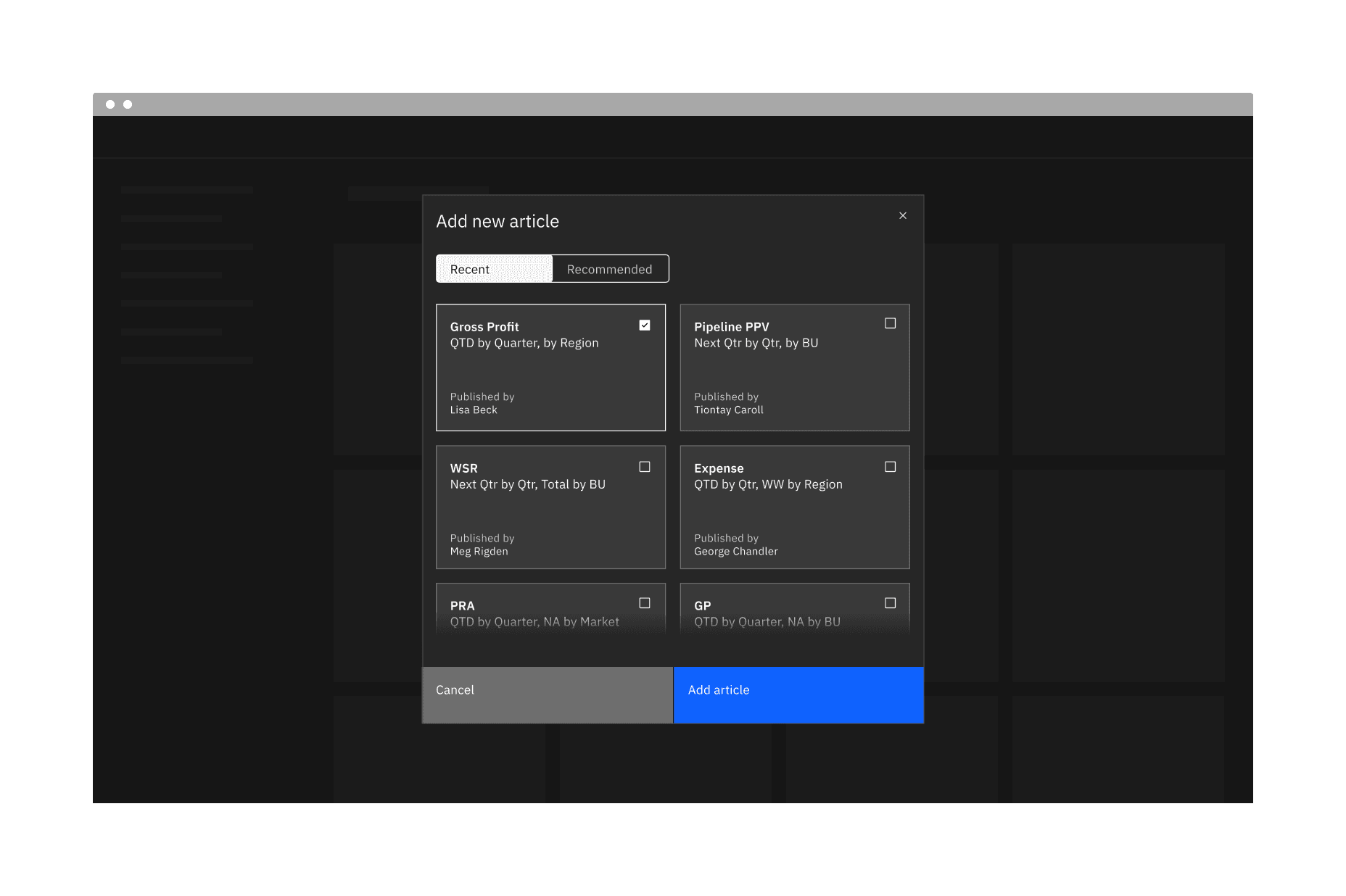
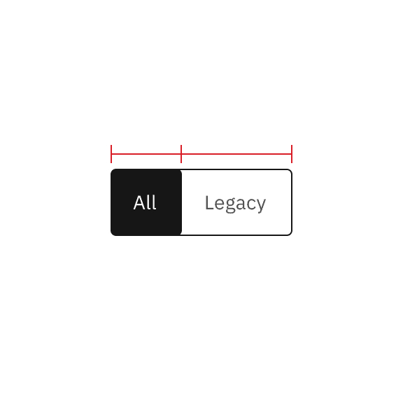
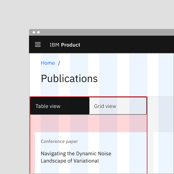
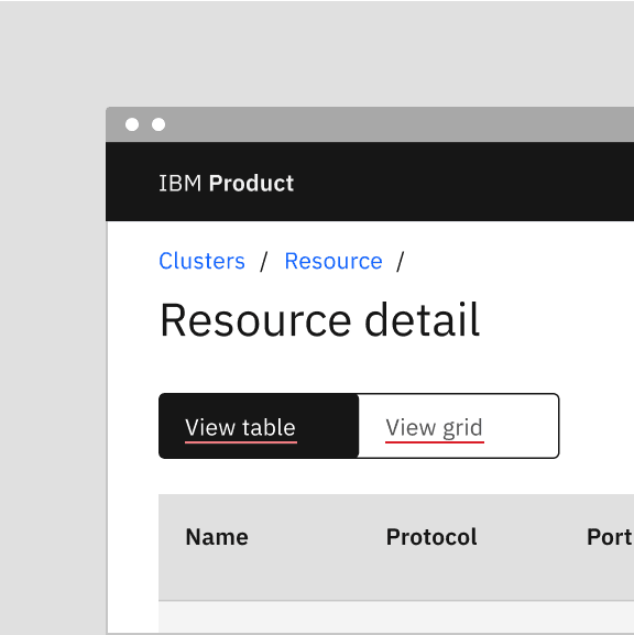
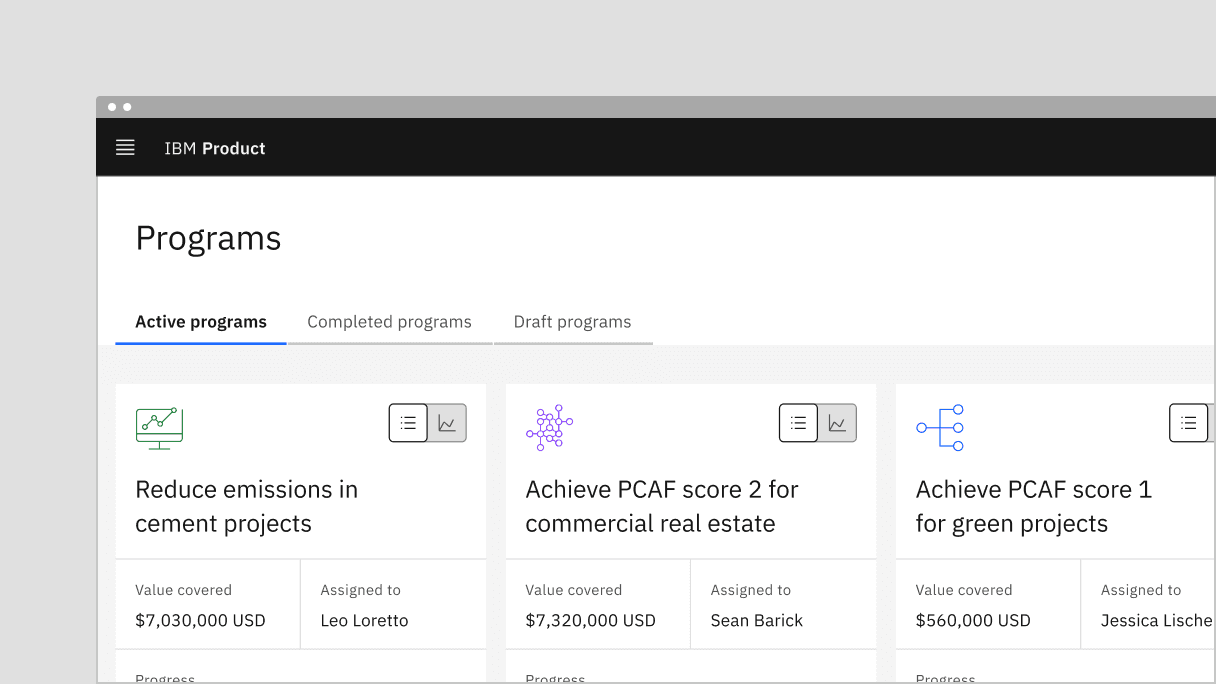
Example of a content switcher in a UI
When to use
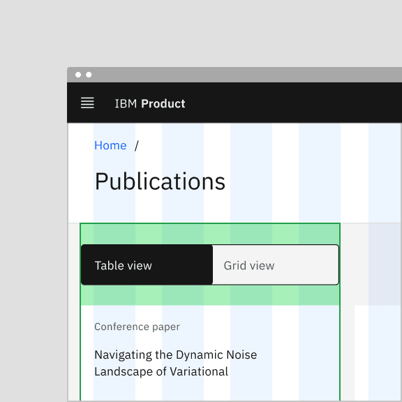
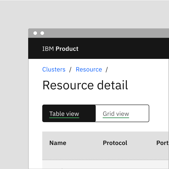
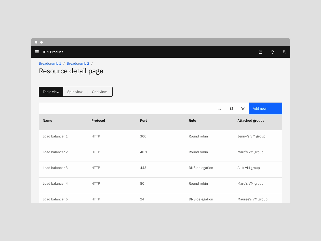
Content switchers are frequently used to let users toggle between different formats, like a grid view and a table view. They are also often used to narrow large content groups or to sort related content. For example, a messaging tool may use a content switcher to divide messages into three views such as "All," "Read," and "Unread."
Distinct content areas
When navigating between distinct content areas like subpages, use tabs instead of a content switcher. Tabs follow the metaphor for sections in a filing cabinet, and two tabs wouldn't contain the same sheet of paper, so the role of tabs in the information hierarchy is to separate content.
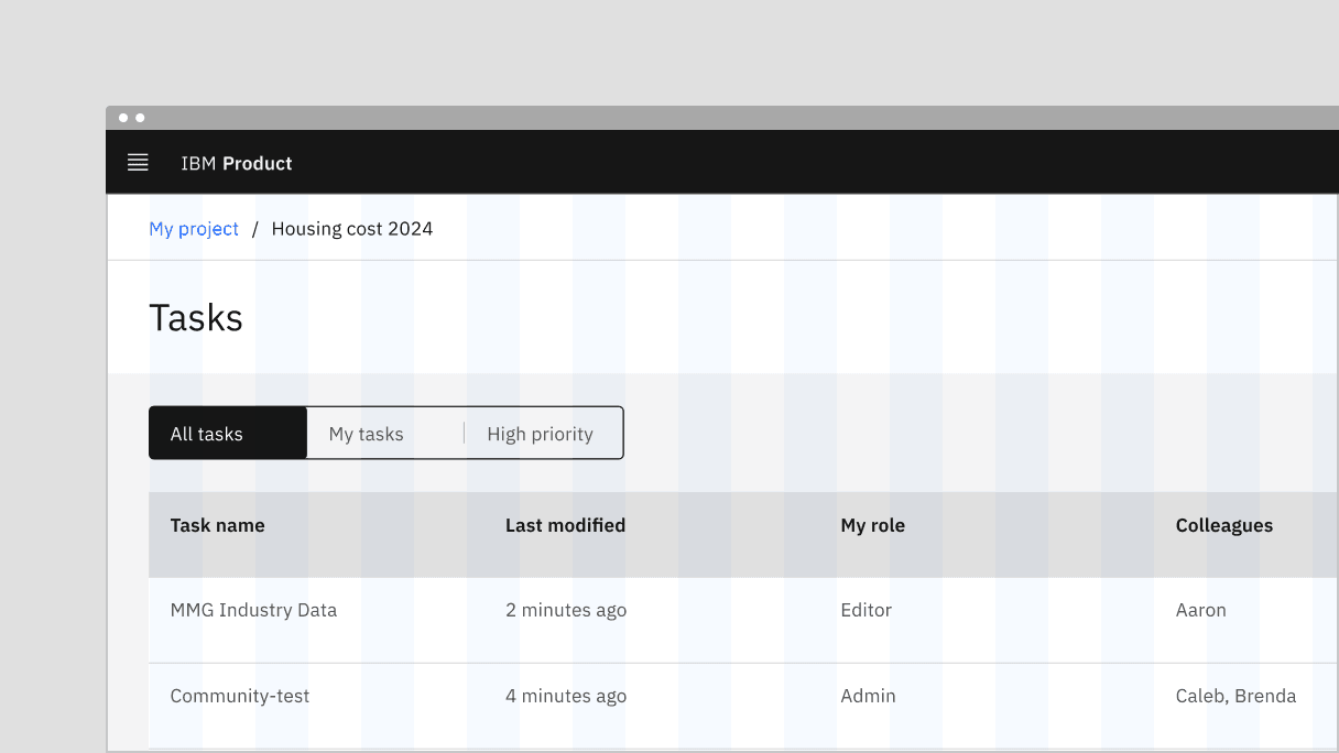
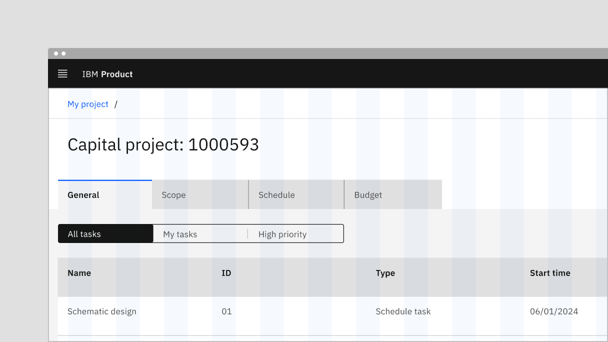
Content switcher is often used with tabs but at a lower hierarchy to sort related contents within that tab content.
Binary actions
For binary actions or choices, such as "yes/no" or "on/off" use a toggle instead of a content switcher. A content switcher can be used for binary views, like switching between a grid and list view but should not be used as a binary input control.
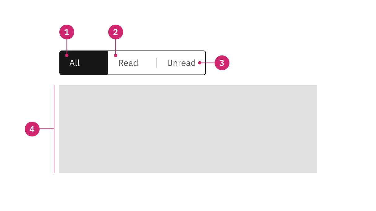
Selected content tab: Only one content tab can be selected at a time and there should always be one selected.
Content tab: Selectable container for each content view.
Label text: Text or icon that describes the content view.
Content view: An area that can consist of component(s) and is usually right below the content switcher. Its view changes based on the selection.
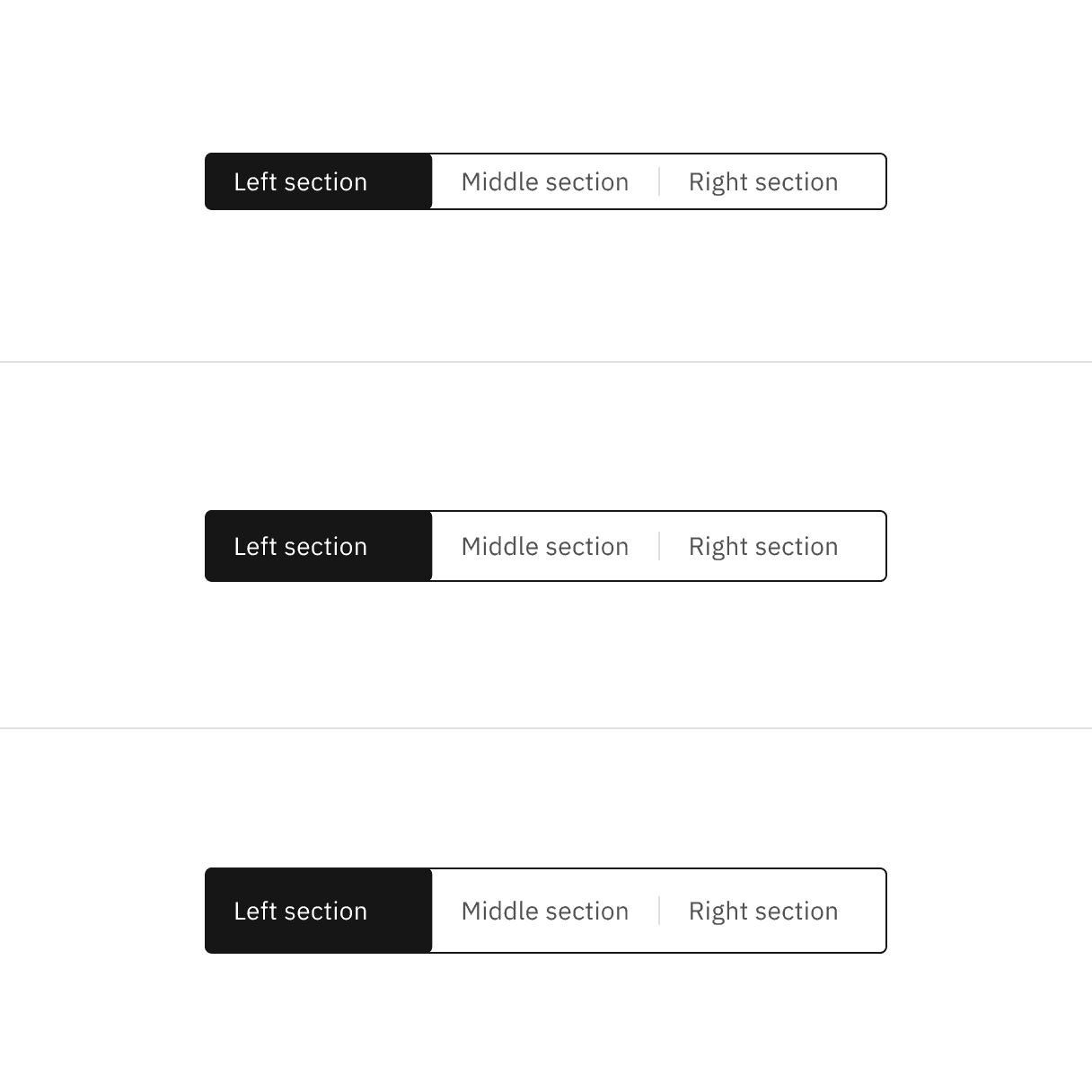
Do base content tab width on the longest label text.
Do not use a different width for each content tab.
Do keep a fixed width container so the height always equals the width.
Do not use different container sizes or extend the container width so it does not equal the height.
Alignment
A content switcher can align to a grid column or hang in the gutter to create type alignment. Use layout and hierarchy cues to determine which alignment is best. In contained space, the content switcher should never be flush to an edge and instead left-align with other content in the container.
Do vertically align switchers with other page content.
Do not flush align the switcher to the edges of containers.
Example shows the content-driven switcher’s text does not align with the grid.
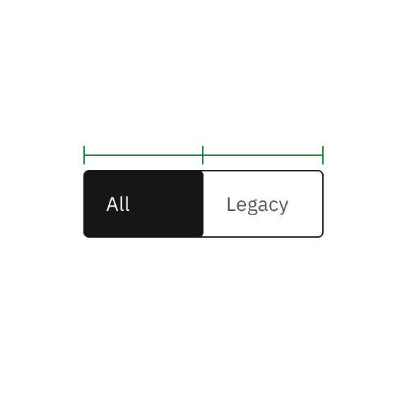
Aligning to the grid
For grid-aware width, the content switcher spans a set of columns, with each tab being equal in size. Depending on placement, the first tab or the tab’s label should align with the first column you are using, with the last tab in the group always ending at a column’s edge. The tabs in between will flow accordingly and may or may not align with the grid, but they will always be the same width.
Example shows the grid-aware switcher’s text aligns on the grid.
Be concise and specific and limit label text to two to three words.
Label text should communicate the view users will see and the content contained in the view.
Label text should be nouns or noun phrases with as few characters as possible.
Avoid phrasing label text as actions or long strings of text that could be mistaken for action buttons.
Do phrase labels as nouns or noun phrases
Do not phrase labels as actions
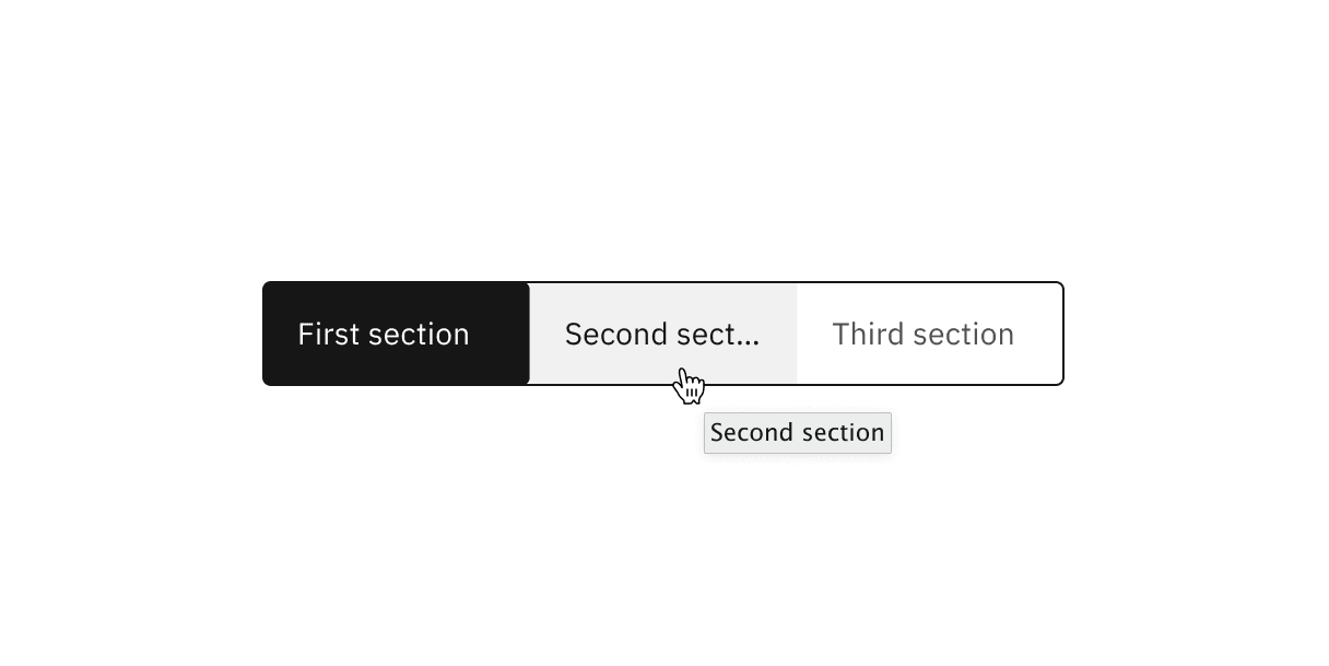
Content switcher label text truncation
Further guidance
For further content guidance, see Carbon's content guidelines.
States
Content switchers have two main enabled states: unselected and selected. Other interactive states are hover, focus, and disabled. Learn more about states on the Specifications tab.
State | When to use |
|---|---|
Unselected | When the first content tab is automatically selected. |
Selected | When the content tab(s) after the first one is unselected. |
Hover | When the user hovers the cursor over an unselected content tab. |
Focus | When the user presses the right or left arrow, or clicks on the content tab, it becomes focused, indicating the user has successfully navigated to the targeted content tab. |
Disabled | When a user cannot interact with the entire content switcher or a content tab. The entire content switcher or the content tabs could be temporarily inactive or unavailable. |
Keyboard
Users can activate the content switcher by pressing Tab and then navigating between content switcher tabs by pressing the Left or Right arrow. Users can choose to automatically change the selection on focus of the selected content tab, or manually change the focus state of the unselected content tab between tabs. For additional keyboard interactions, see the Accessibility tab.

Example shows the text content switcher turns into the icon content switcher in a smaller screen size.
Default selection
The default view typically preselects one tab, usually the first tab. Only one content tab can be selected at a time, displaying its content. When a user chooses a new item, the previous tab deselects automatically, and the new item becomes selected. The first content tab in the switcher should be determined by usage and consistently serve as the default selection.
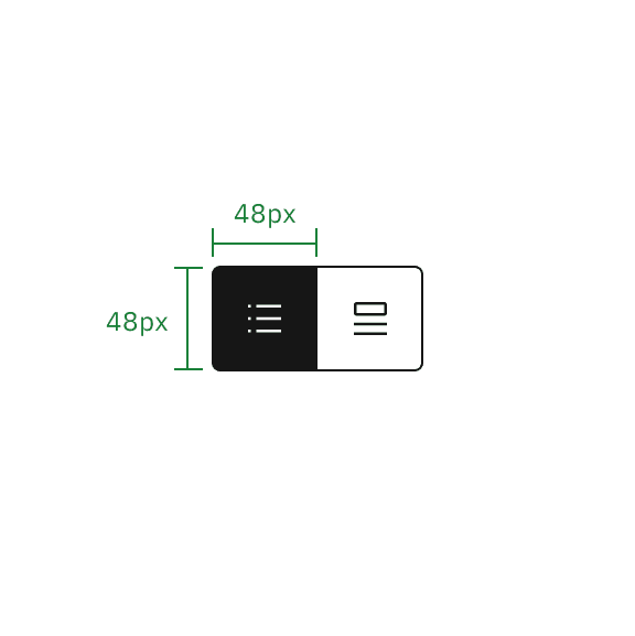
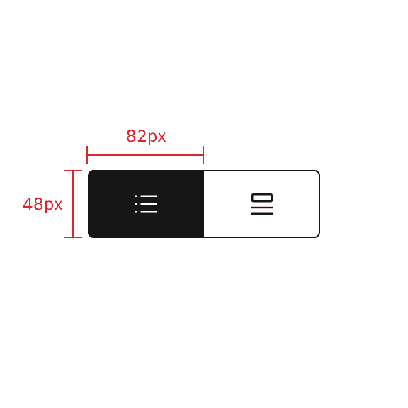
Text and icon content switchers with their clickable areas
High and low contrast
The content switcher is set to the high contrast style by default. However, Carbon also supports a low contrast style. High contrast content switchers are best suited for placement at a higher level in page hierarchy, such as at the top of a page or within a page header. When in doubt, use the high contrast style.
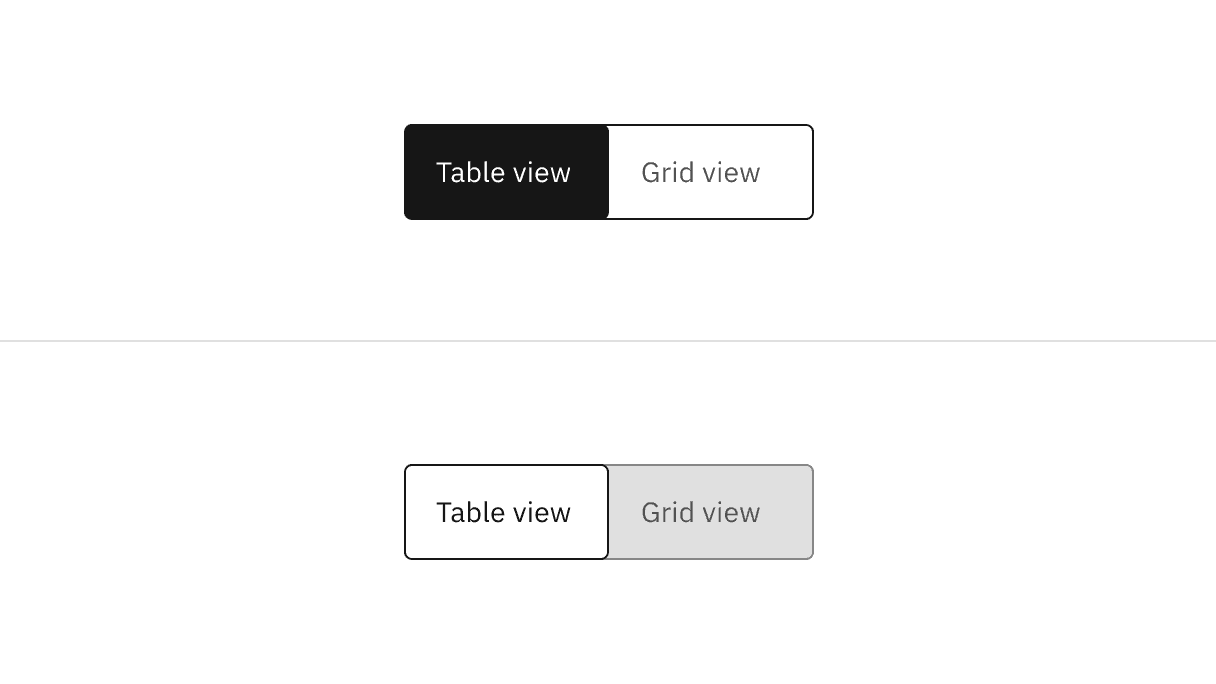
High contrast content switcher (top); low contrast content switcher (bottom)
Low contrast content switchers may be used where they need to be less visually disruptive, such as in cards, modals, and when the component is placed near primary or secondary buttons.
Example of a low contrast content switcher in a UI
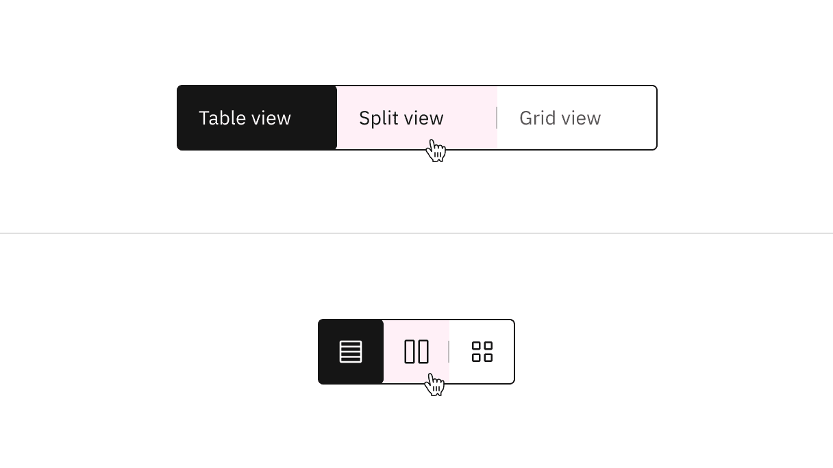
Do use consistent icon or text content switcher sections
Do not mix icon and text content switcher sections
Tabs
Tabs are used to organize related content. They allow the user to navigate between groups of information that appear within the same context. For further guidance, see Carbon's tabs.
Toggle
A toggle is used to quickly switch between two possible states. They are commonly used for "on/off" switches. For further guidance, see Carbon's toggle.
Feedback
Help us improve this component by providing feedback, asking questions, and leaving any other comments on GitHub.