Usage
When possible, avoid using a legend and label data representations directly. Legends rely on visual association, which can make a chart more difficult to understand.
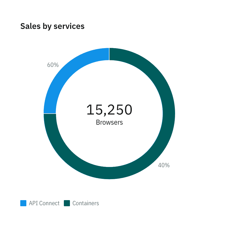
Your chart doesn’t need a legend if it only presents one data category. Only use a legend if you can’t safely assume there will be enough space to apply labels directly.
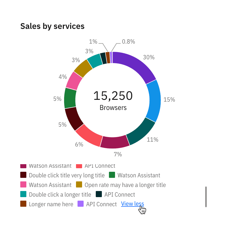
Use clear language and avoid acronyms in legends. This also applies to titles and axis labels.
Remove legends to simplify the chart when only one data category is needed or only one color is used.
In-chart labels are ideal for charts with predictable data and ample empty space.
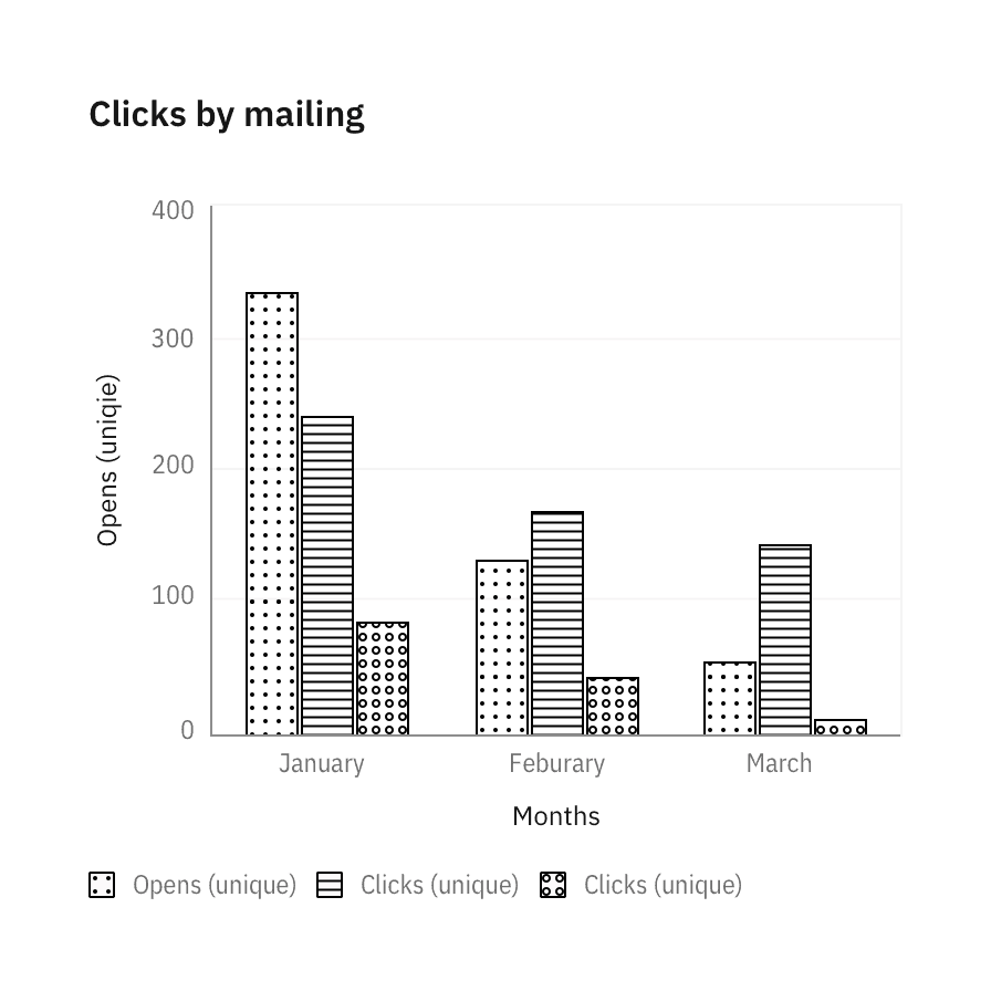
Texture can improve accessibility. See the accessibility page for all approved textures.
Position
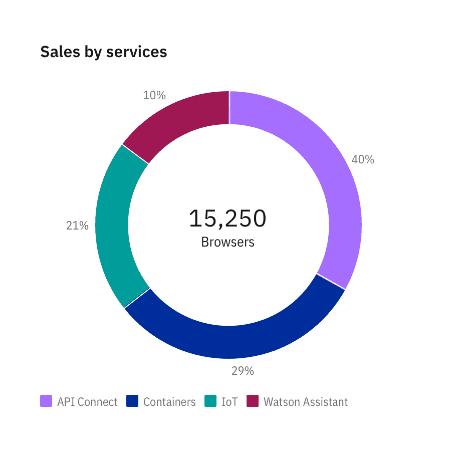
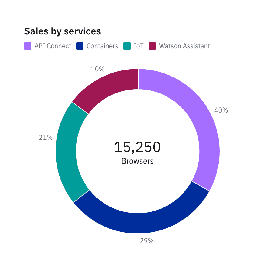
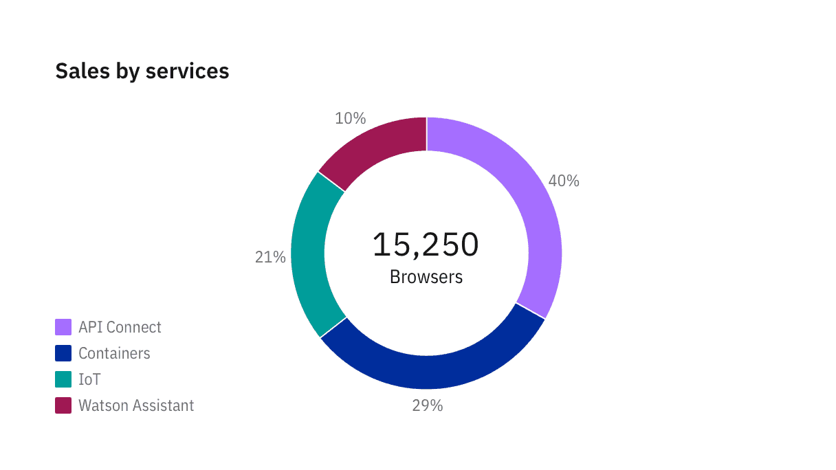
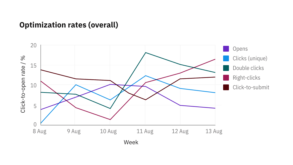
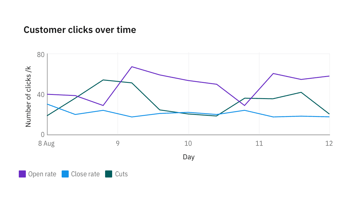
The legends are positioned at the bottom of a chart by default. Depending on the page’s layout and context, you may choose to position the legends at the top, under the chart title, left or right of a chart with respect to the graph frame.
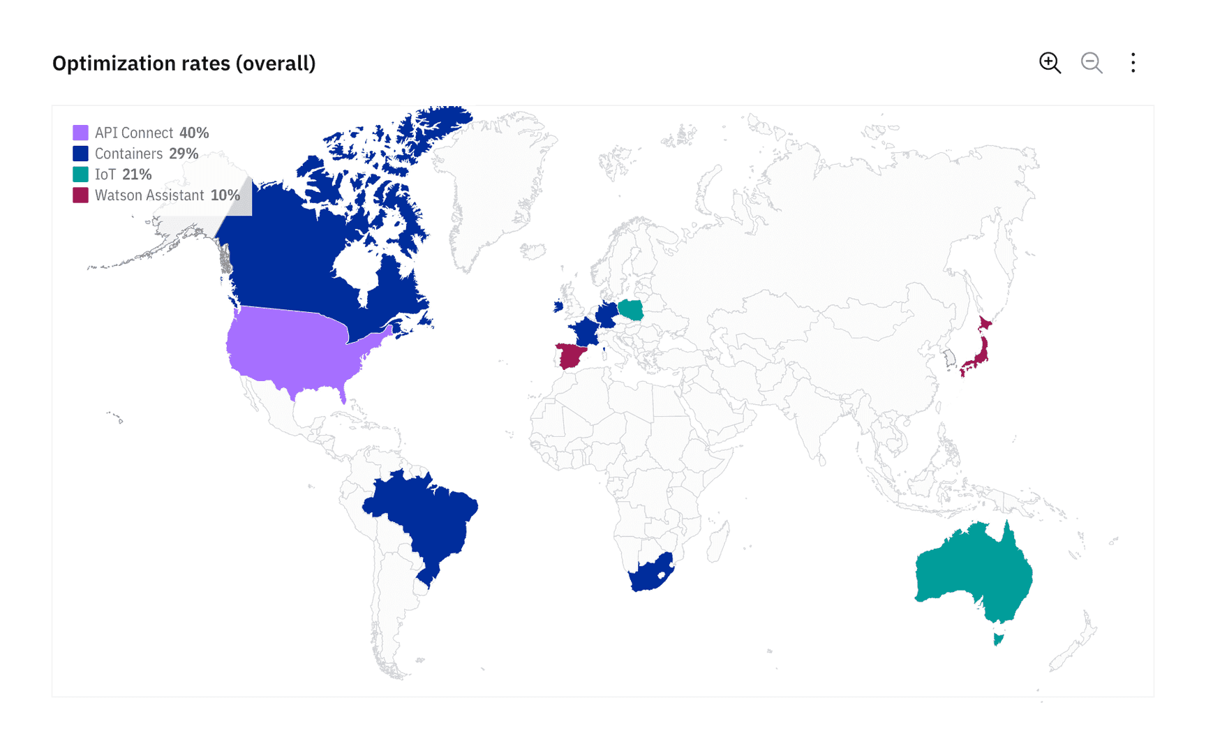
Overlay (geospatial only)
In geospatial charts, legends can be overlaid on top of a graph frame as long as the legend has a background opacity of 80% of the chart’s background color. Since geospatial charts can vary drastically in appearance, the legend can be placed on either side of the chart, top- or bottom-aligned, whatever best accommodates the content.
To demonstrate the legend’s background opacity, we chose to place the legend at the top left in the chart below. See the Master data visualization design file for more detail about geospatial legends.
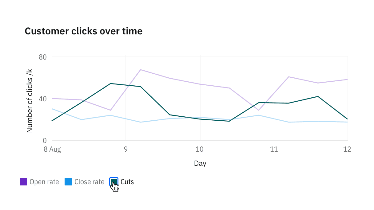
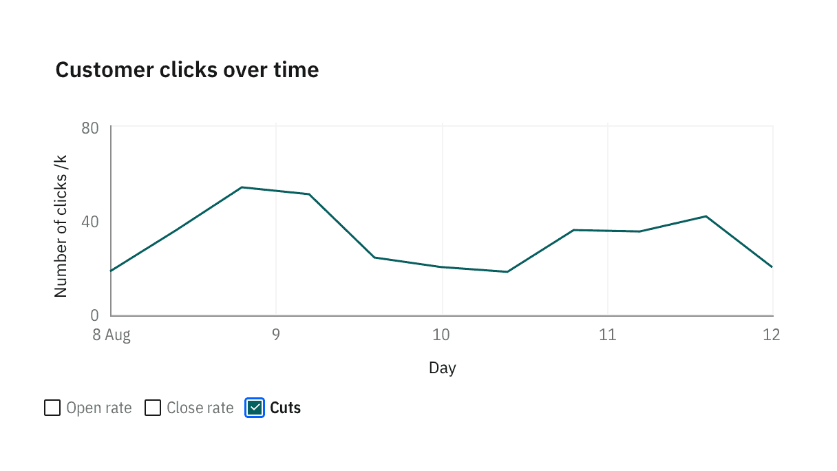
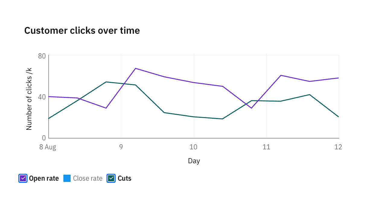
When all categories are selected, checkmarks in legends disappear and the legend resets to its default state.
Hidden legends
Please note that hiding legends is discouraged in data visualizations unless only one category of data is displayed. This design is for mobile displays where offering legends at a glance is less essential. In general, hiding legends reduces the clarity of the visualization and is inaccessible.
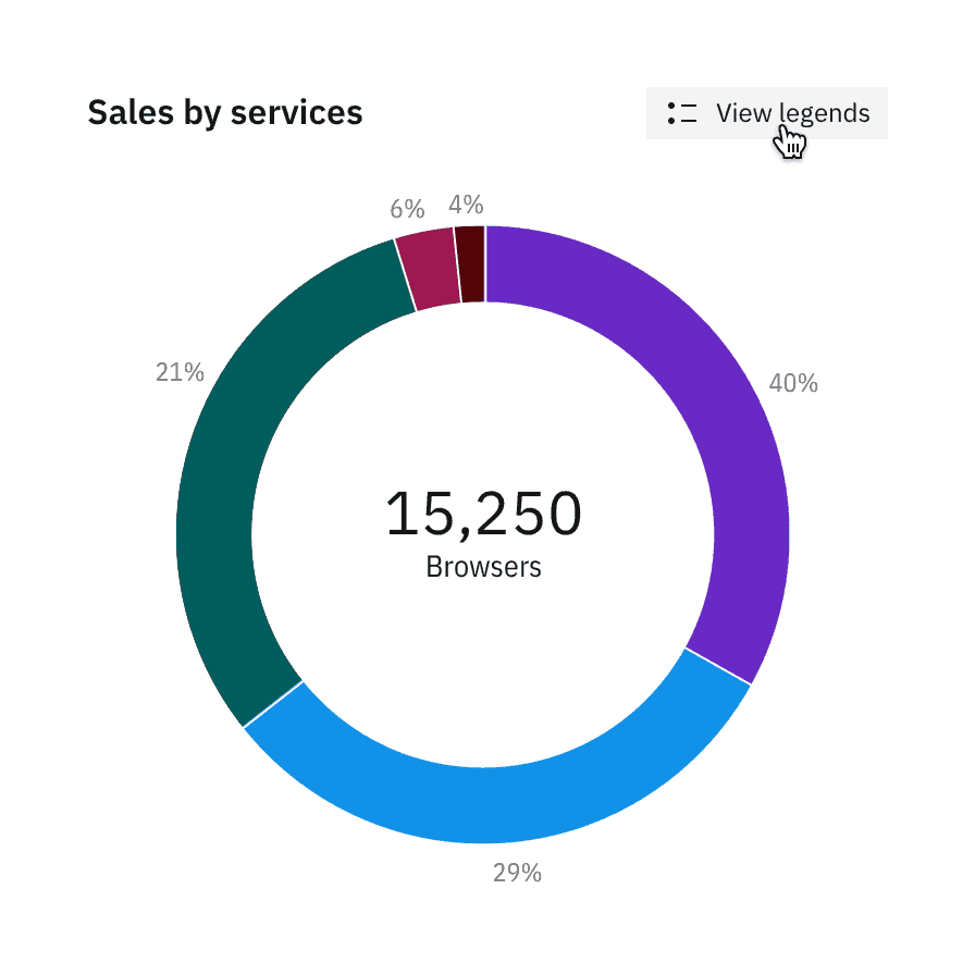
When legends are hidden, a “View legends” button is added so users can surface the legend on tap.
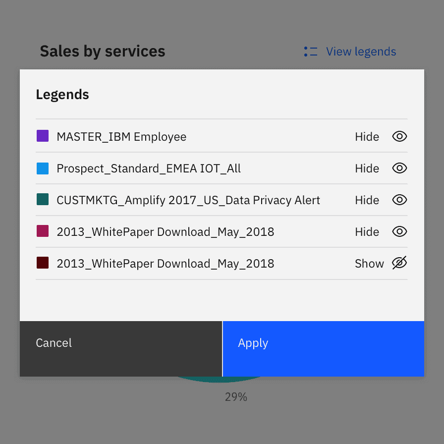
When clicking on “View legends”, a modal with a list of legends appears with options to toggle each data category on and off.
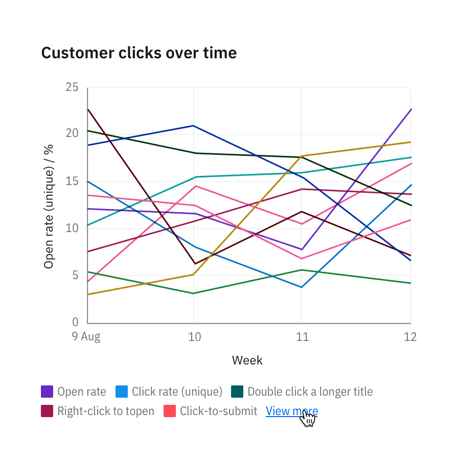
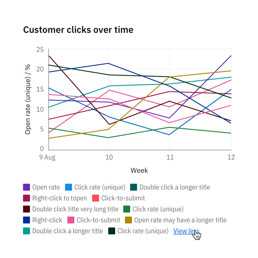
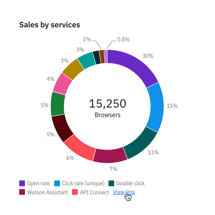
When legends exceed 30 percent of the chart, overflow the content and scroll vertically.