This live demo contains only a preview of functionality and styles available for this component. View the full demo on Storybook for additional information such as its version, controls, and API documentation.
Overview
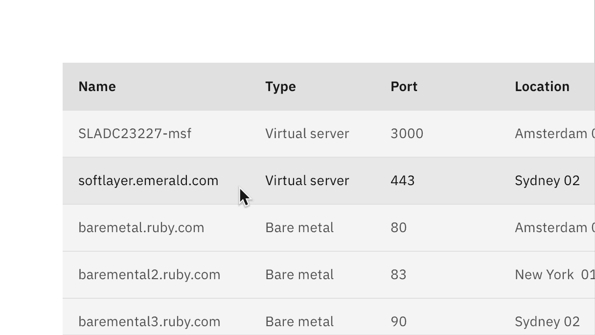
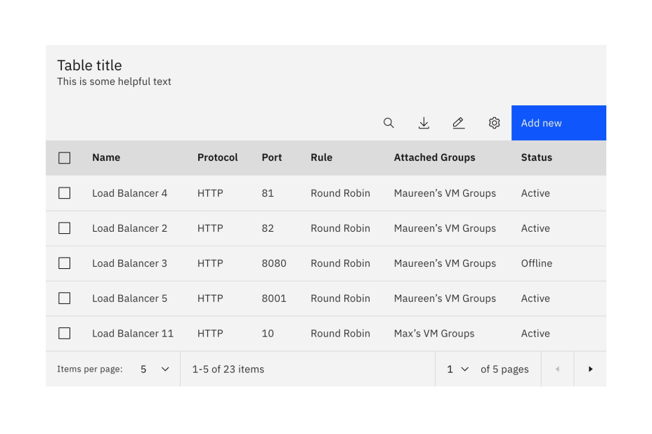
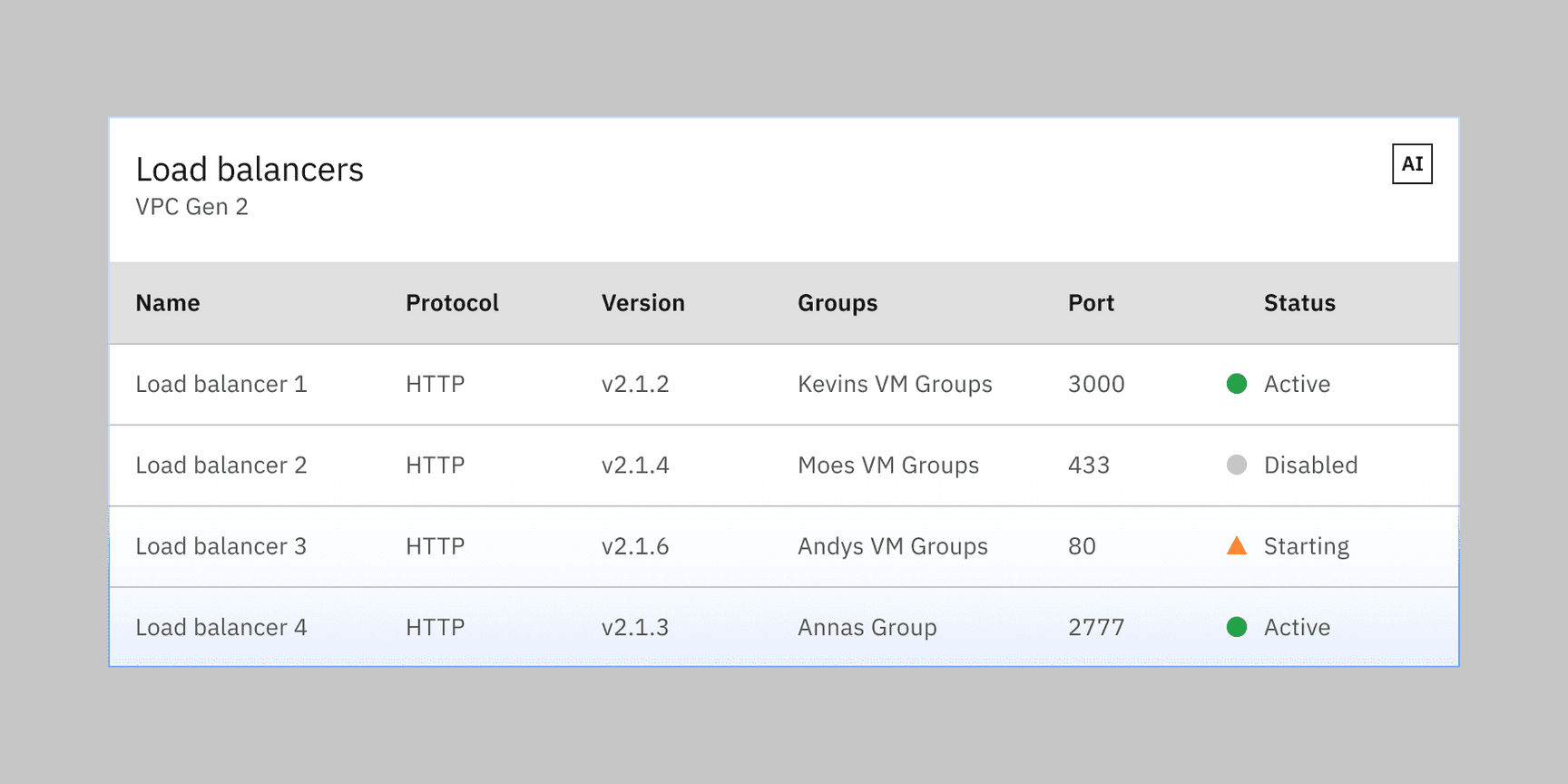
The data table’s features are ideal for organizing and displaying data in a UI. The column headers can sort data in ascending or descending order, rows can be expanded to progressively disclose information, and single or batch actions can be taken on rows.
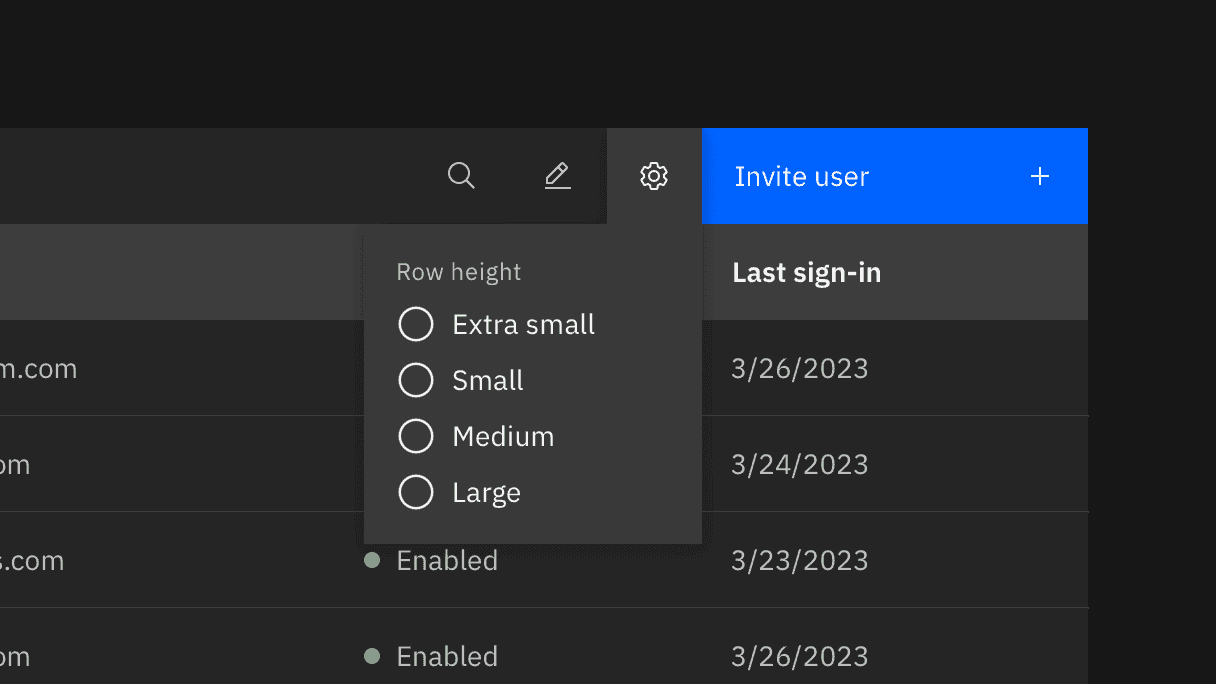
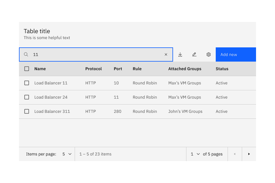
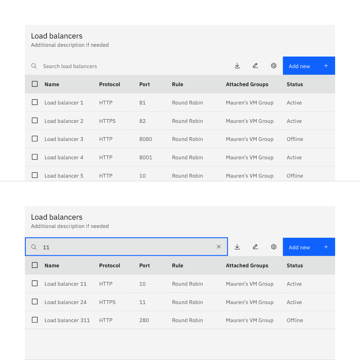
The data table toolbar gives a location for primary buttons, search, filtering, table display settings, and other utilities.
Variant | Purpose |
|---|---|
Default | The basic data table has only the header and table element rows. It is available in five row sizes. |
With selection | The selection variant enables users to select individual rows in a data table. Selection options include a single-select radio button option and a multi-select checkbox option. Users can perform a single action or batch actions against selected items. |
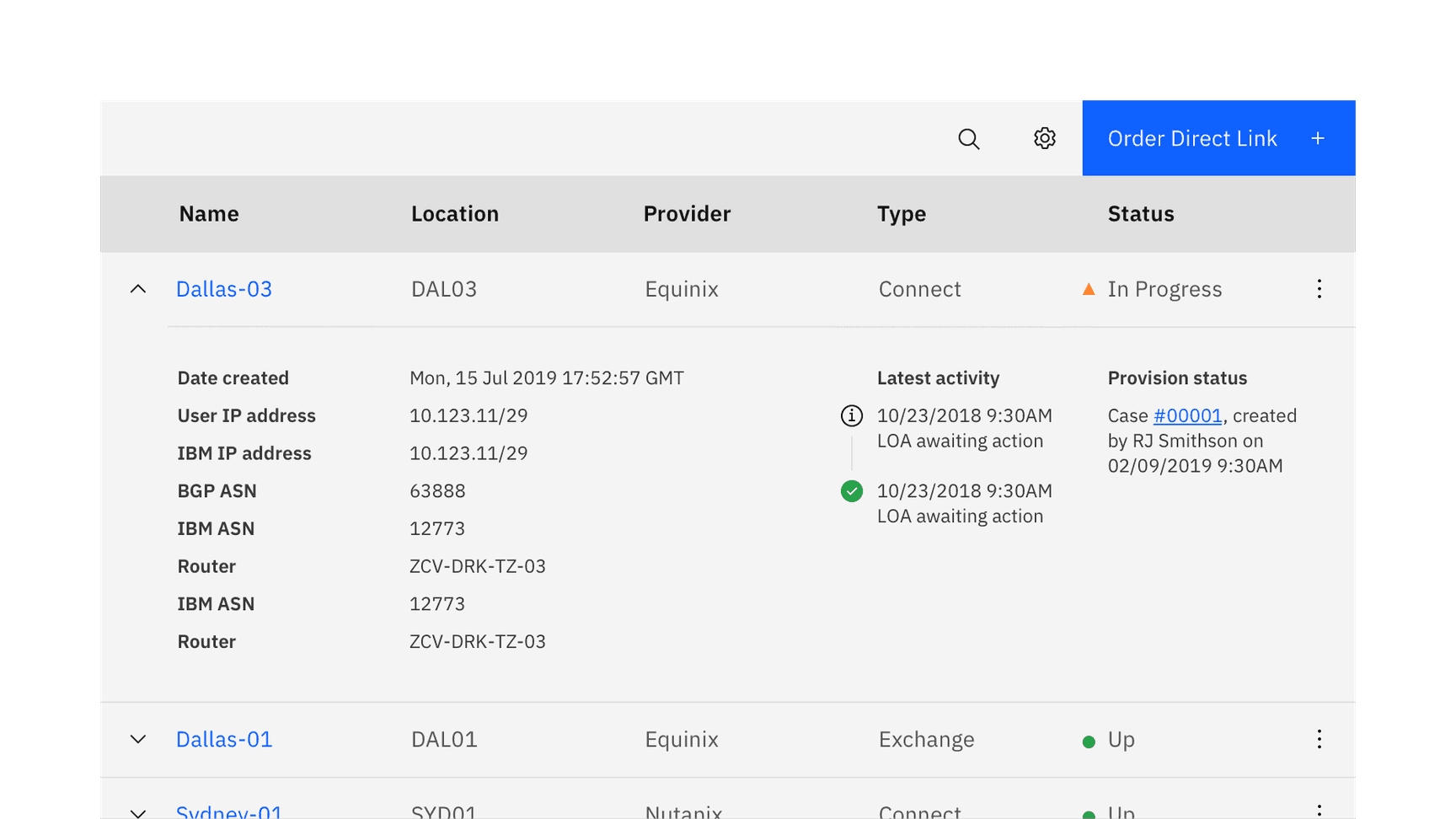
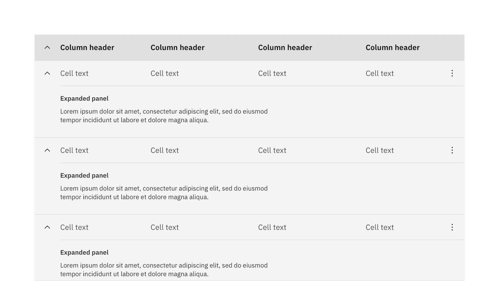
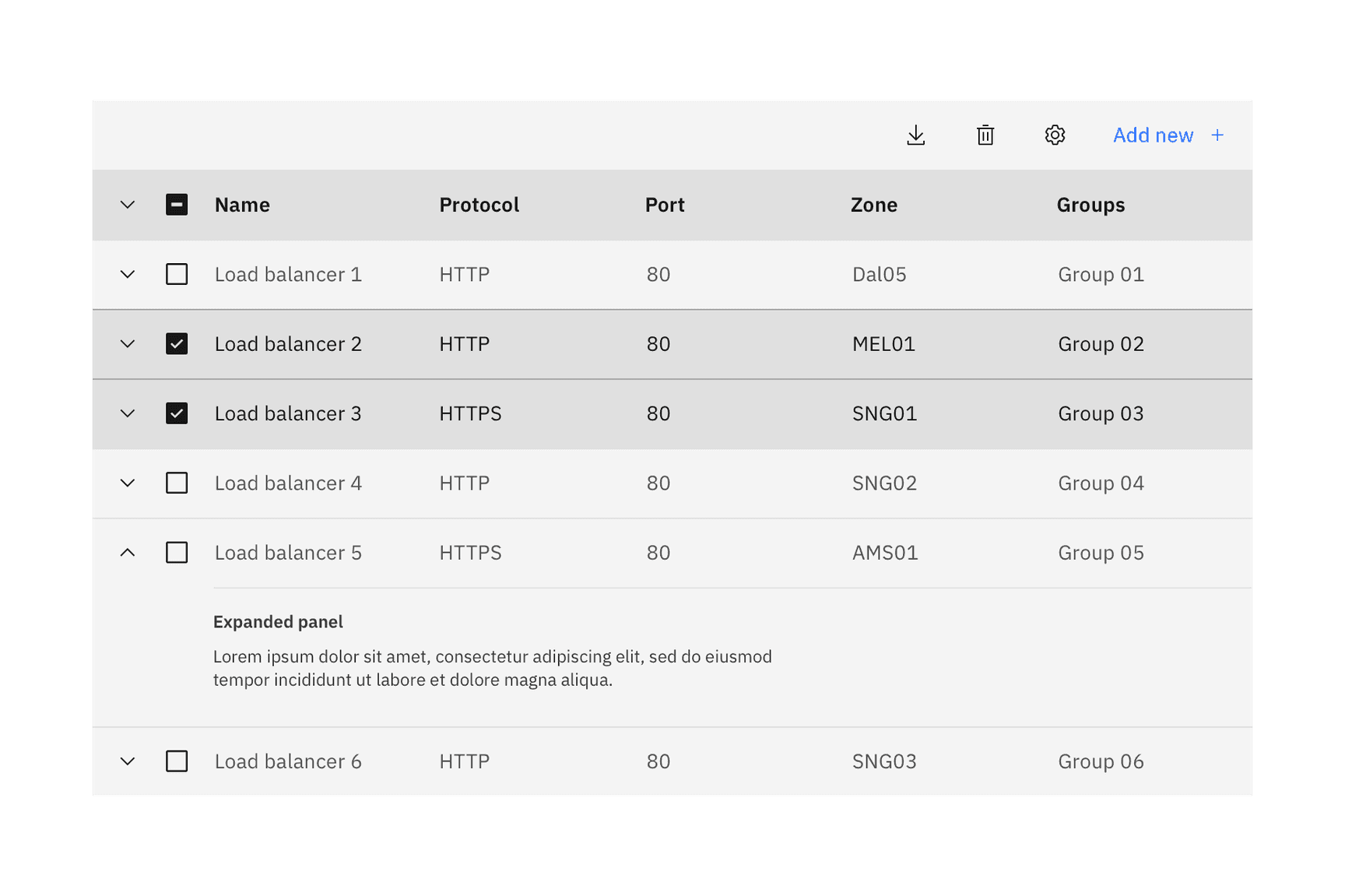
With expansion | The expandable variant helps present large amounts of data in a small space. Users can expand and collapse row panels to reveal and hide additional information. |
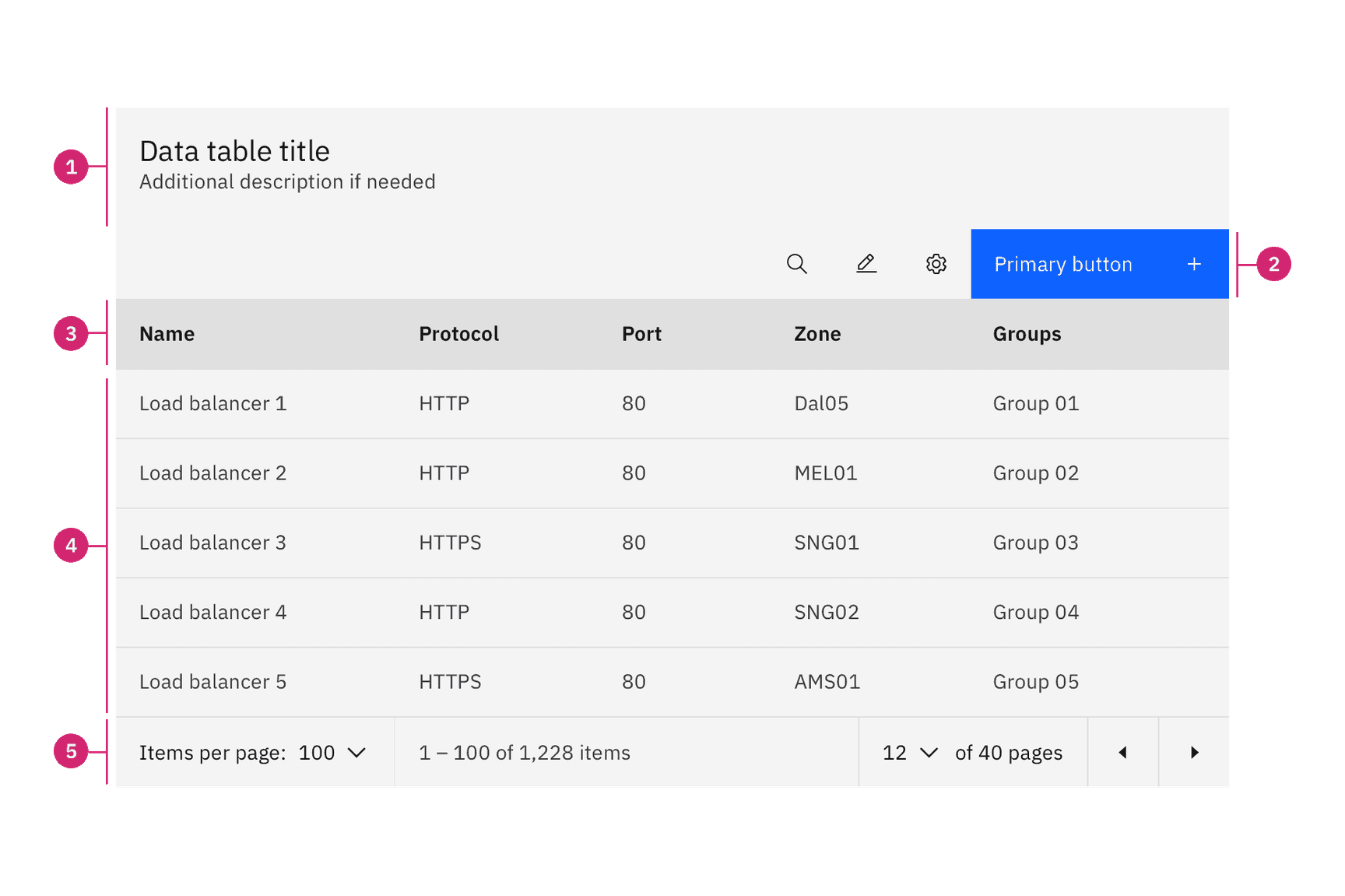
- Title and description: contains the data table title and an optional description.
- Toolbar: global data table controls including search and table settings.
- Column header: title for the row header with the optional sorting behavior.
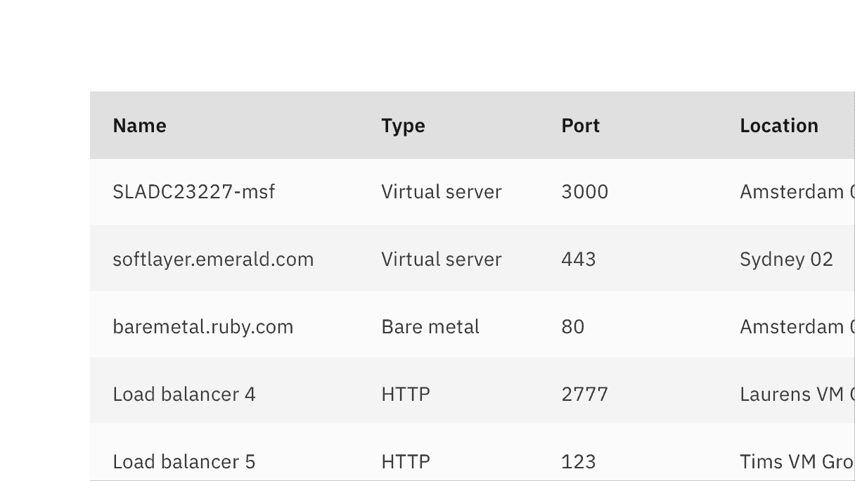
- Table row: can be configured to show different types of data. Rows can be selectable, expandable, and modified to show alternating zebra stripe background colors.
- Pagination table bar: an optional component that lets a user navigate data as pages when the amount of data it too large to be shown at once.
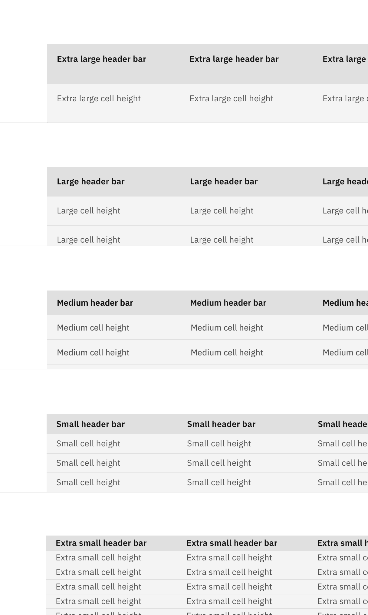
The column header row .cds--data-table thead should always match the row size of the table. Extra large row heights are only recommended if your data is expected to have 2 lines of content in a single row.
Do use the same row height for the table and header rows.
Don’t mix row heights for the table and header rows.
Two heights are available to be paired with the row heights of the data table. The tall toolbar should only be paired with the large and extra large row heights and the small toolbar should only be used with the small and extra small row heights.
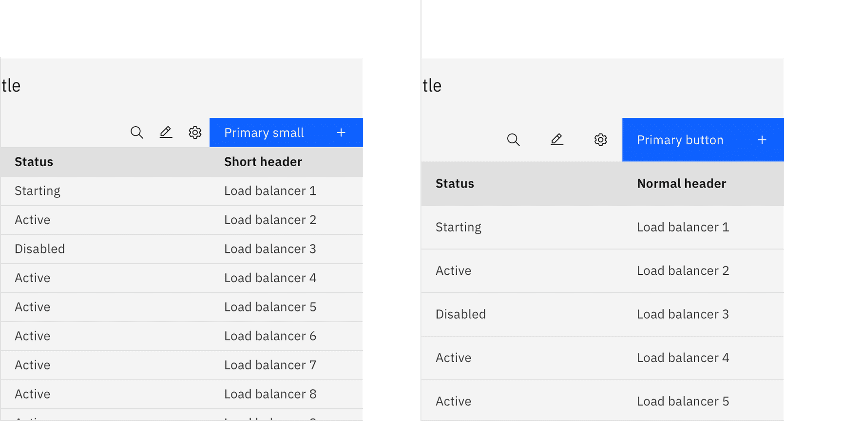
A small toolbar on a short data table and a tall toolbar on a normal data table
Placement
Data tables should be placed in a page’s main content area and given plenty of space to display data without truncation. Avoid placing data tables inside data tables or smaller containers where the information can feel cramped or needs truncation.
The data table can be placed on the grid following the three different gutter modes outlined in the 2x grid guidelines. Although, the data table can share horizontal space with other components and content, consider giving your data table the most width on the page to help your user view dense data.
These three examples show the data table on the wide (default), narrow, and condensed gutter modes. Note the different type alignments and gutter sizes.
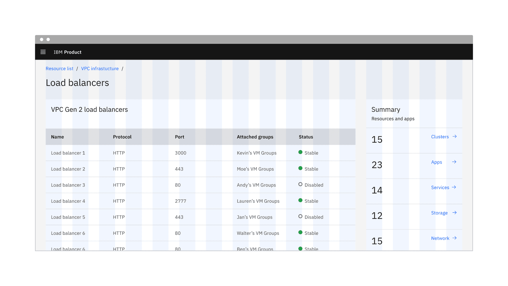
Data table on a wide (default) grid
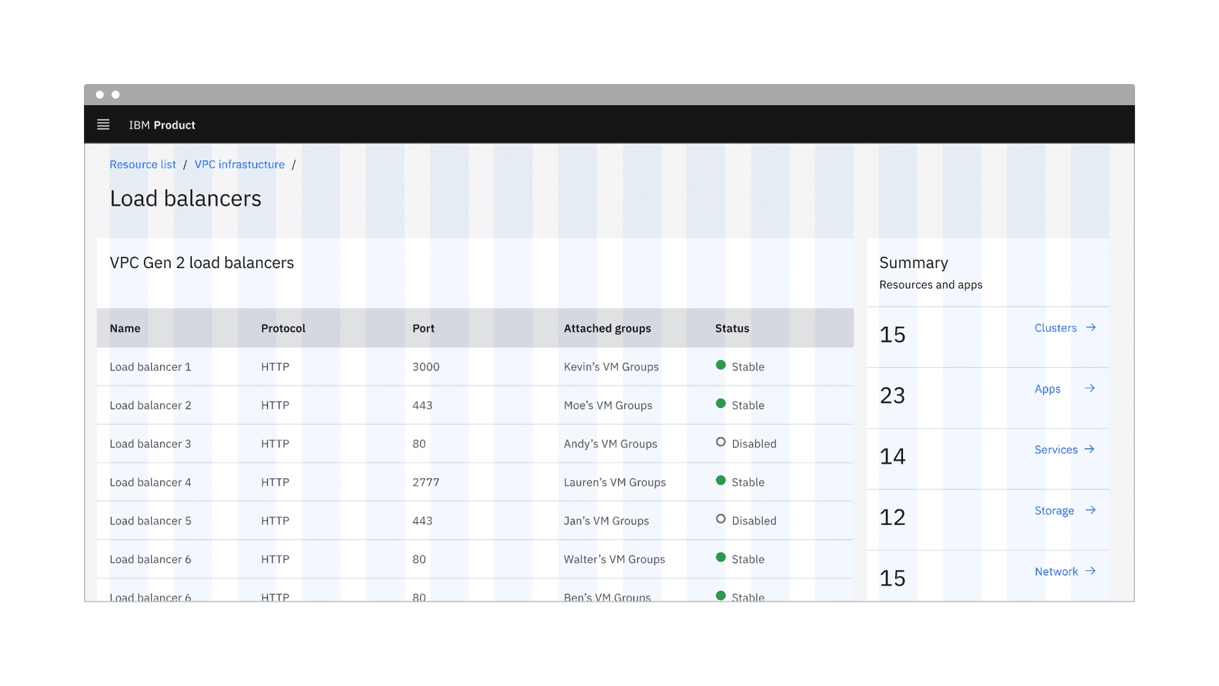
Data table on a narrow grid
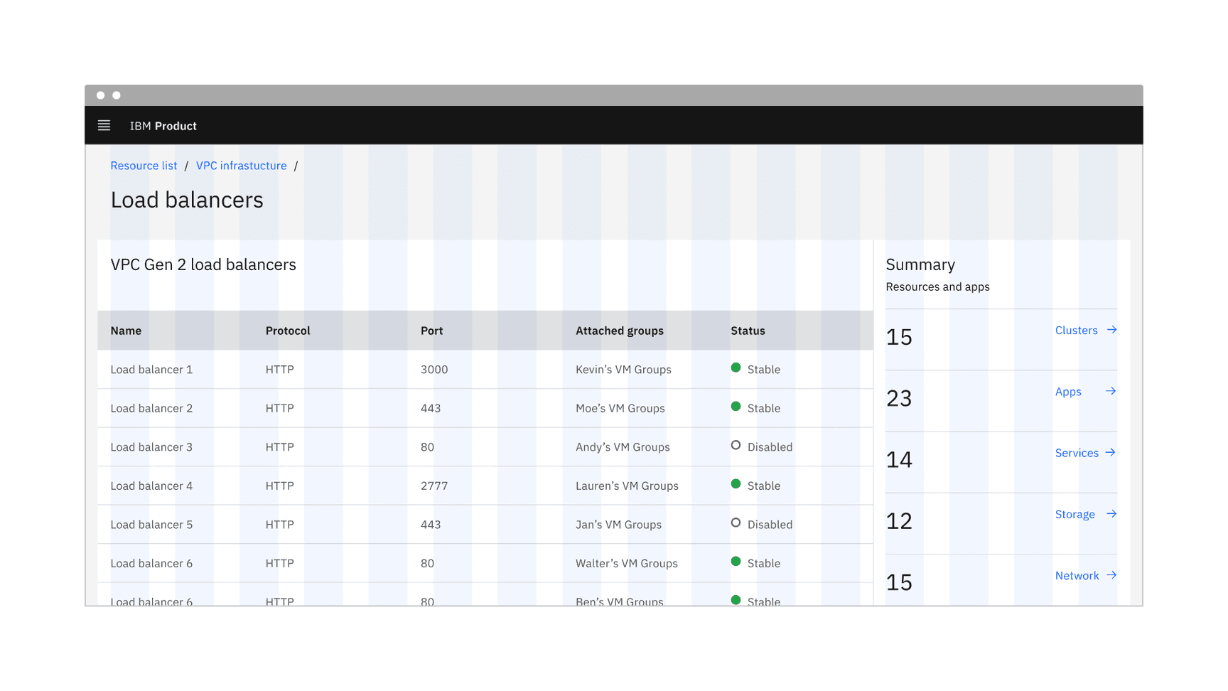
Data table on a condensed grid
Data table title and description
- The table title should make it clear to the user what this the data has in common and what purpose it serves in the UI.
- A description can be added under the title to provide more information about the data or its source.
- A data table’s title and description should use sentence-case capitalization.
Column titles
- Column titles should stick to one or two words that describe the data in that column.
- In cases where a column title is too long, wrap the text to two lines and then truncate the rest of the text. The full text should be shown in a tooltip on hover.
- Column titles should use sentence-case capitalization.
Primary button
- A data table using a primary action should follow the guidance for primary button usage and action labels.
For further content guidance, see Carbon’s content guidelines.
Expandable
The expandable data table helps present large amounts of data in a small space. Use the expanded section for supplementary information or data that needs additional query time. When the content in the expanded area feels cramped, consider taking the user to a dedicated page, side panel, or data table to view the information and complete tasks.
Batch expansion
When appropriate, a batch expansion feature can be added to the table column header to allow the user to open all collapsed sections simultaneously. However, the expand-all chevron is not shown by default in the expandable data table variant. Keeping detailed information in the expanded section saves user loading time by postponing some data queries until needed. Expanding all rows at once will typically negate this advantage of the expandable table.
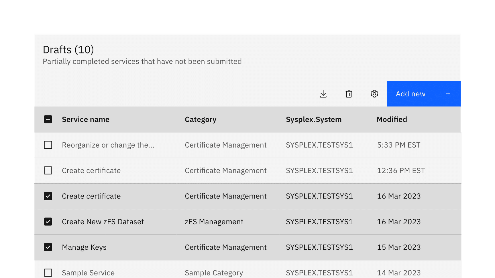
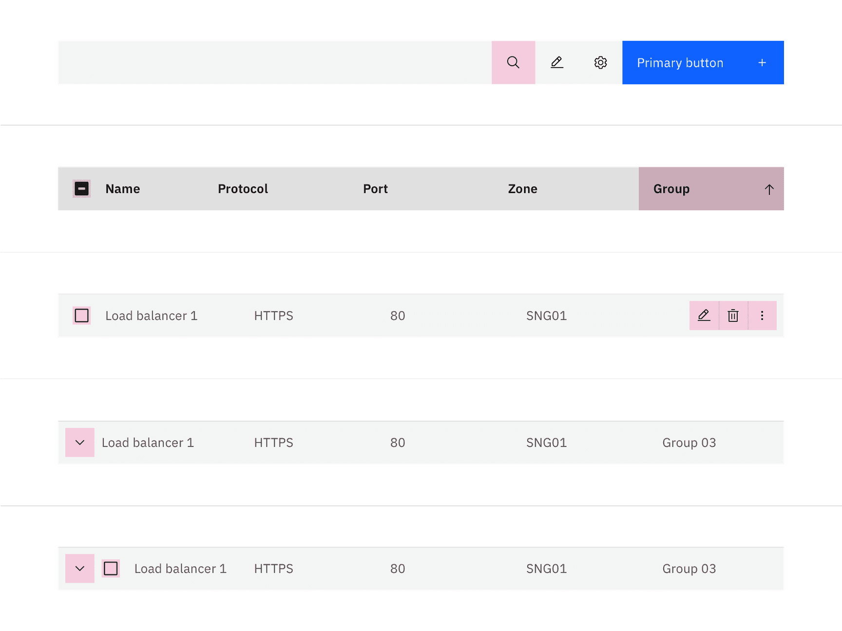
Selectable
By default, the selectable variant allows users to select more than one row in a data table simultaneously. To select a row, the user must select the checkbox associated with the row. The user can select all rows at once by selecting the checkbox in the column header. Checkboxes in the rows have only two states, checked and unchecked. However, the check all checkbox in the column header has three states, check, unchecked, and indeterminate.
Actions applied to the chosen selected items are found in the default table toolbar or batch action mode.
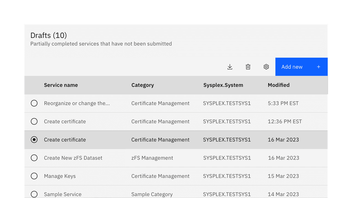
Radio selection
The data table also supports a single-select radio button control, limiting the user to selecting only one row at a time. The radio button is placed in the first column on the left side. Single actions applied to the chosen radio item are often placed on the right side of the table toolbar area. They can manifest as primary, ghost, or icon-only buttons.
Mouse
Users can trigger an action or function in the table by clicking the associated button or component. Each action or function has its own distinct click target. See the Accessibility tab for more information.
Highlighted target areas for data table mouse interactions
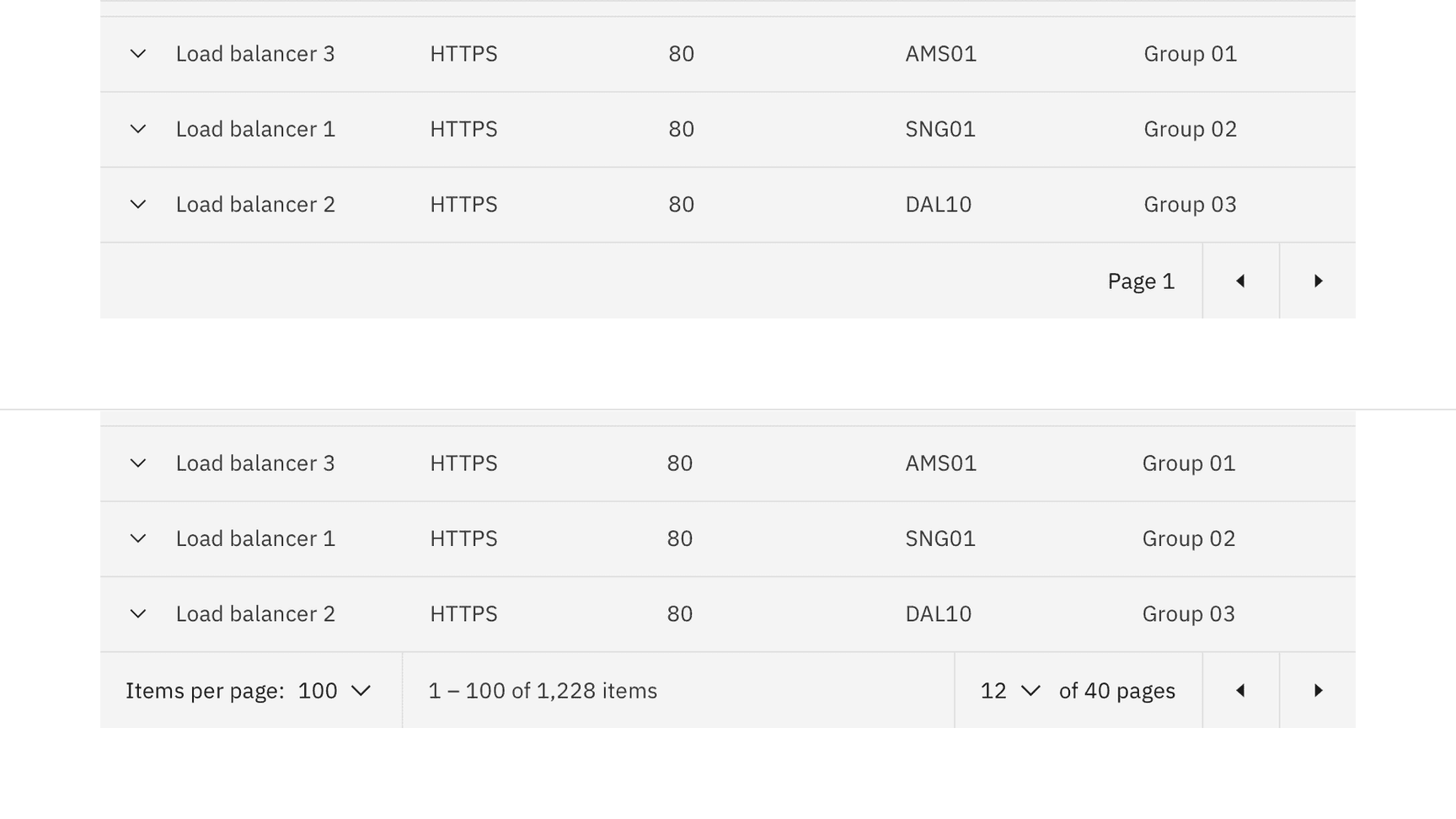
Pagination
Pagination divides a data table into separate pages. Simple pagination indicates the current page in view and offers controls to go to the previous or next page. Advanced pagination is accompanied by an option that enables the user to change the number of items per page and to jump to a specific page number. The pagination component is always placed at the bottom of the data table. For more information, see the pagination component.
Simple (top) and advanced (bottom) pagination configurations
Table toolbar
The table toolbar is reserved for global table actions such as table settings, complex filters, exporting, or editing table data. Actions in the toolbar can use primary, ghost, or icon-only buttons. Include up to five actions within the table toolbar. More actions can be made available through an overflow menu, combo button, or similar components.
Collapsed search
A search field can be triggered through an icon button in the data table toolbar. By default search follows the active search pattern. The search is closed by default, and placed below the table title.
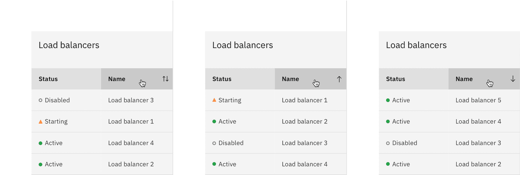
Sorting
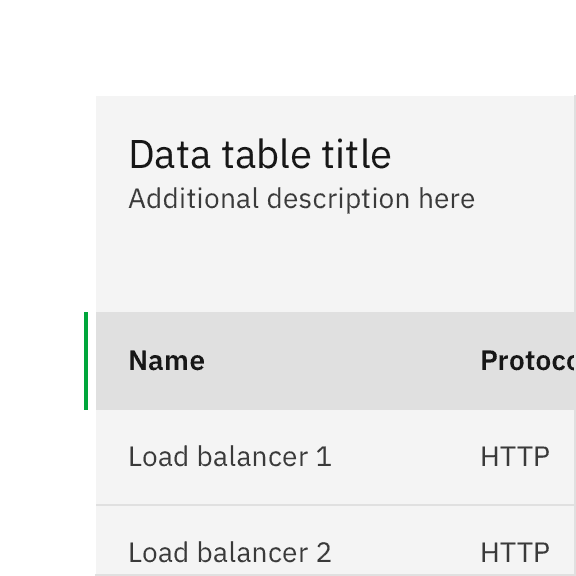
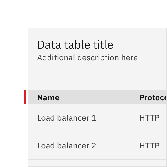
Columns can be sorted in ascending or descending order. Sorting controls are located in the column headers and indicated with an arrow icon on hover and when a column is sorted.
A sorted data table has three states: unsorted (arrows), sorted-up (arrow--up) or sorted-down (arrow--down). The icon indicates the current sorted state and is shown only when the sorting is activated. Only the sorted column displays an icon, and unsorted icons are only visible on hover. You can see a demo of sorting in Carbon’s React Storybook.
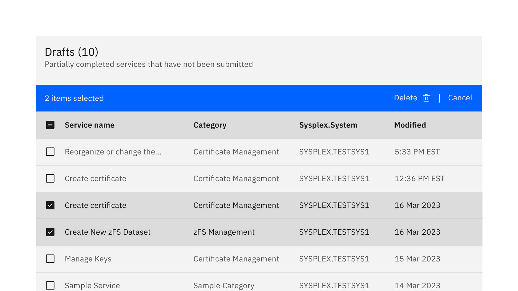
Batch actions
Users can perform batch actions on one or more items within a table. Once an item from the table is selected, the batch action bar appears at the top of the table, presenting a set of possible actions to apply to all select items. This feature can increase user efficiency compared to the effort of repetitively performing the same inline action across multiple table items. When batch mode is active, single action icons and overflow menus on the row should be disabled.
To exit the batch action mode, the user can select the cancel button on the far right of the bar or deselect all items.
Inline actions
Inline actions are functions that might be performed on a specific table row. Each row is accompanied by an overflow menu that contains actions that are related specifically to that row.
When the overflow menu contains fewer than three options, keep the actions inline as icon buttons instead. This approach reduces a click and makes available actions visible at a glance.
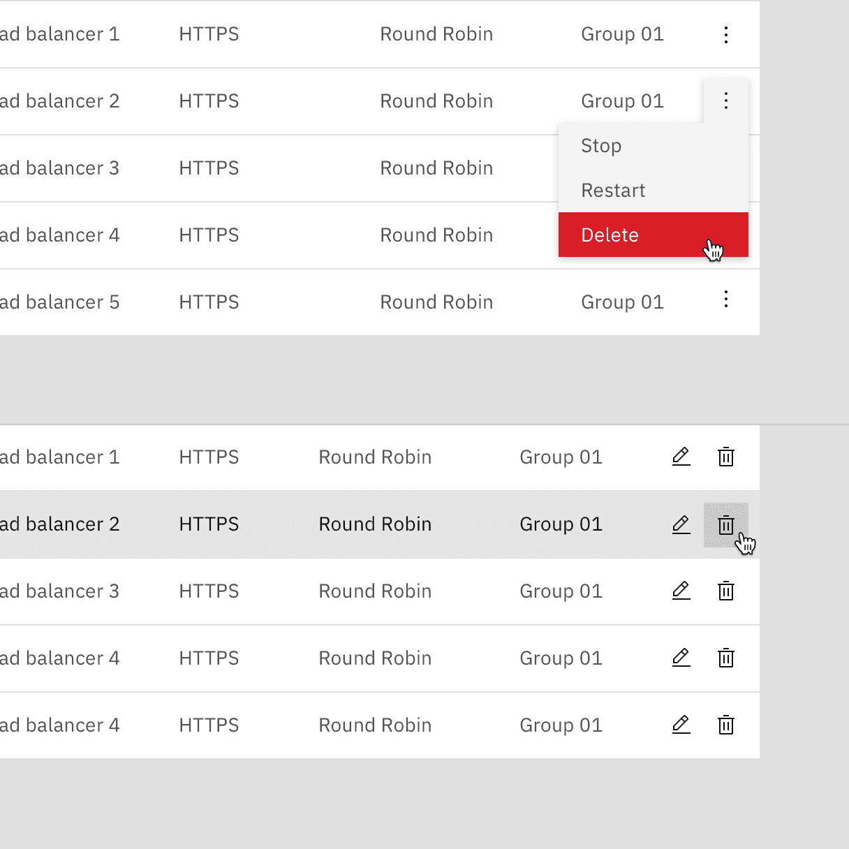
Overflow menu
By default, the overflow menu icons are persistent on each row. Having the overflow menus always visible signals to the user actions can be taken on the table rows. Alternatively, a product team may use the overflowMenuOnHover prop to only show the overflow menu on hover and focus to reduce the visual clutter of an overflow menu on every row.
For mobile and touch devices the data table will detect if the user agent supports hover-over and persist the overflow menus even if the overflowMenuOnHover prop is enabled.
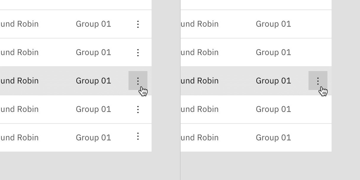
Persistent overflow (left), on hover (right).
Expanding all rows with skeleton states
AI presence
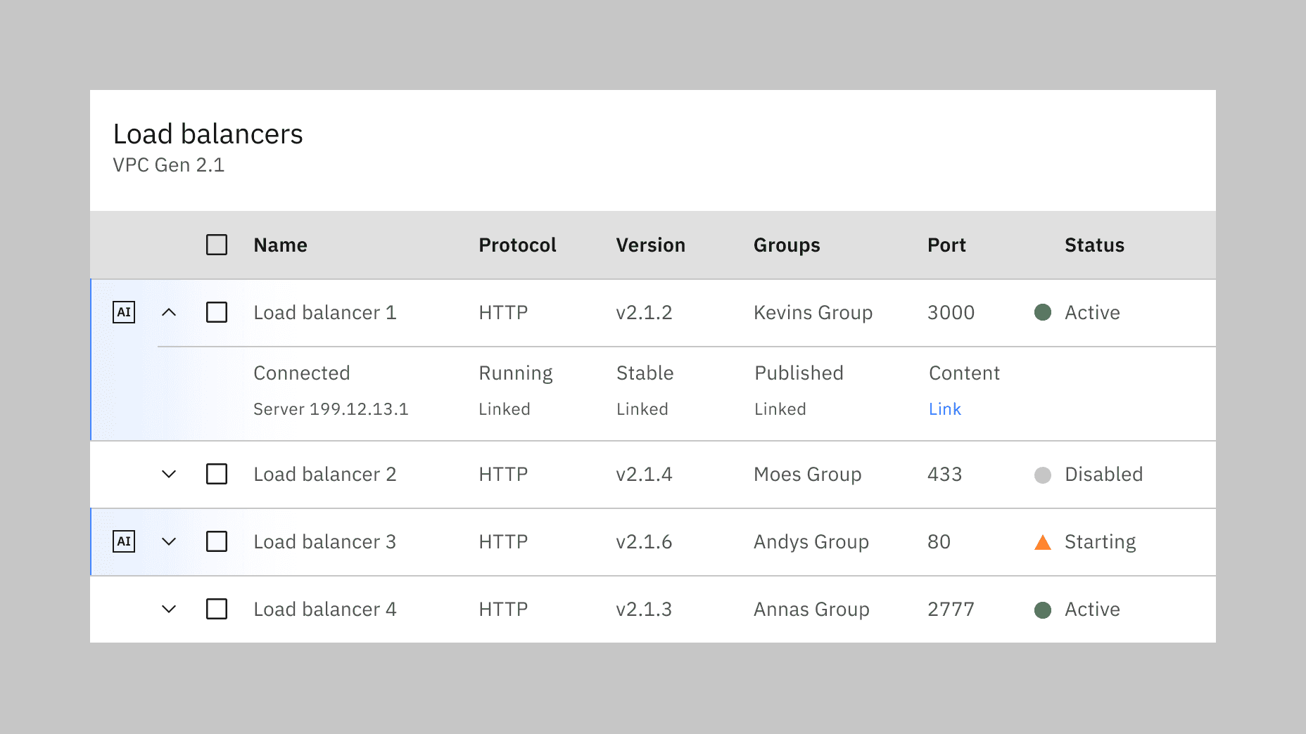
Data table has a modification that takes on the AI visual styling when AI is present in the table. The AI variants of a data table function the same as the normal variants except for the addition of the AI label, which is both a visual indicator and the trigger for the explainability popover. Where the AI label goes inside of a data table depends on which parts of the data are AI generated.
For more information on designing for AI, see the Carbon for AI guidelines.
Example of a data table generated by AI.
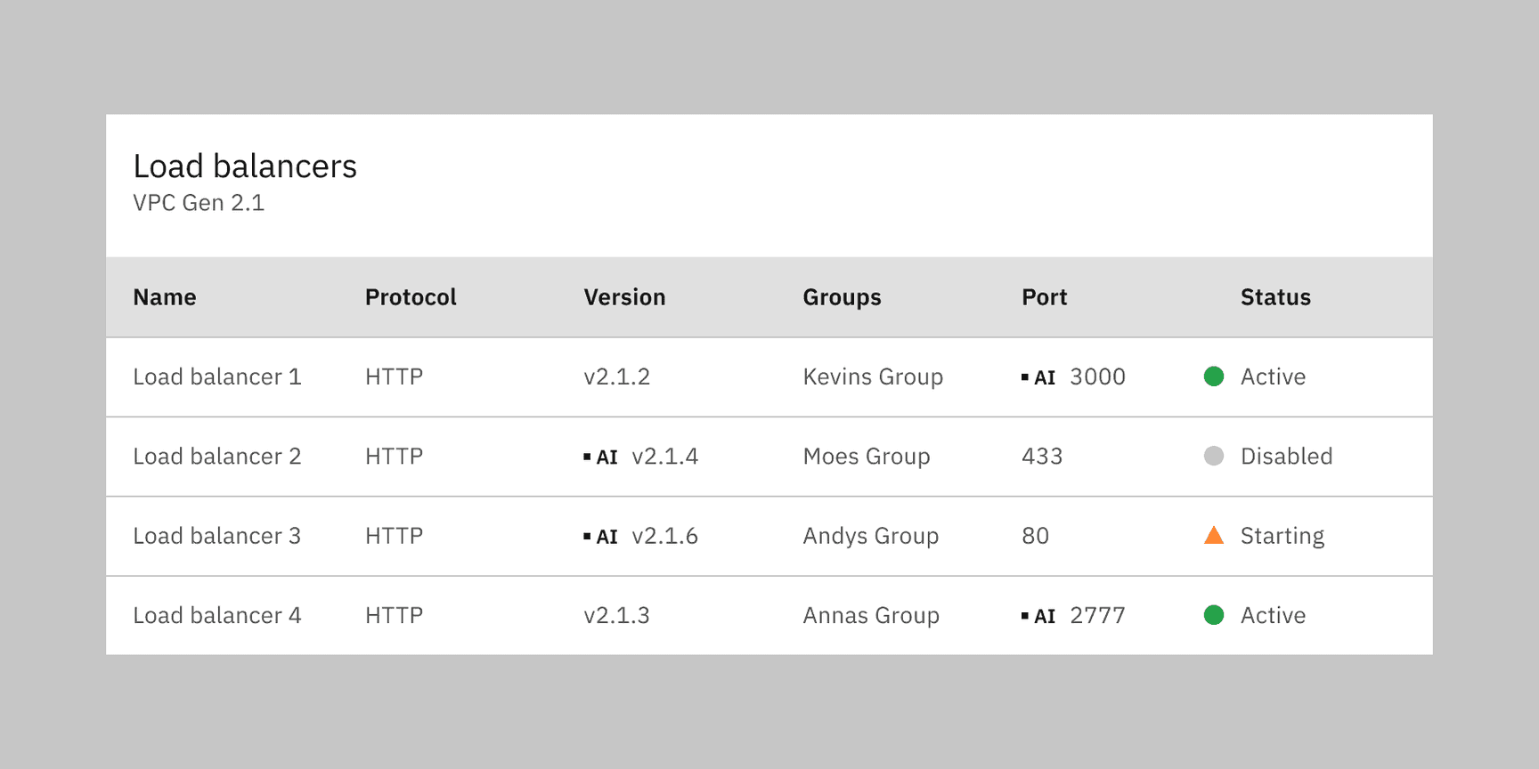
Example of a data table cell generated by AI represented by the in-line AI label.
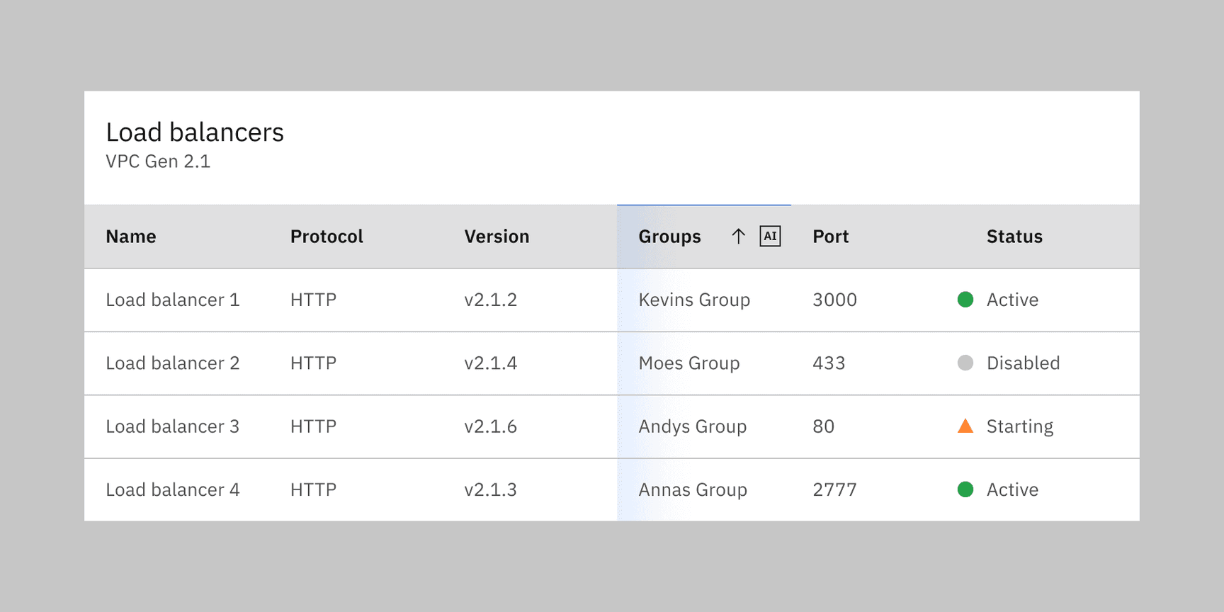
Example of a data table column generated by AI.
Feedback
Help us improve this component by providing feedback, asking questions, and leaving any other comments on GitHub.