This live demo contains only a preview of functionality and styles available for this component. View the full demo on Storybook for additional information such as its version, controls, and API documentation.
Use when placing interactive elements, like links, buttons, or rich media to make the component more accessible. Disclosures that contain interactive elements use popovers as a base container layer to achieve this accessibility standard. For further guidance on how to display content within a popover, see the disclosure pattern.
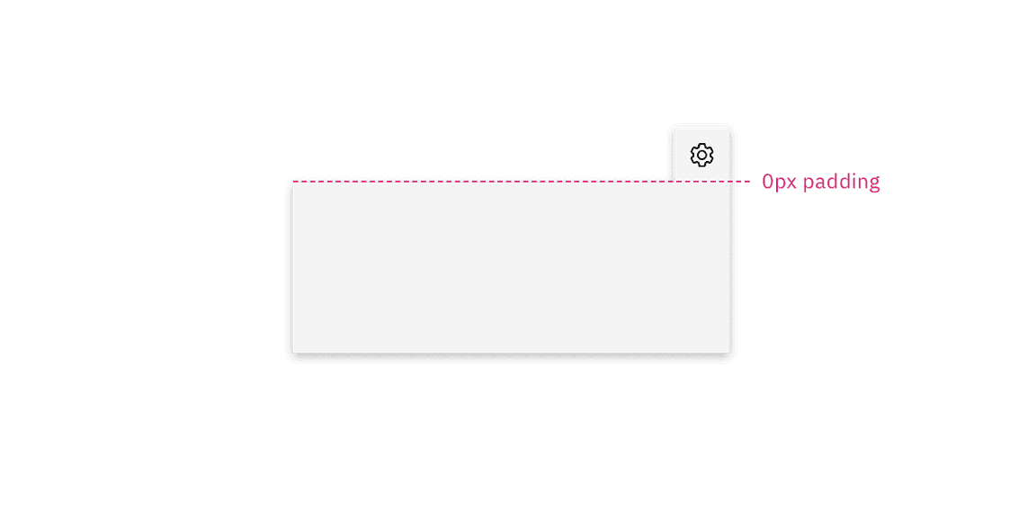
Use when you need to display additional details for specific elements on a page. If your popover exceeds four columns in width, use a modal instead.
Variant | Purpose |
|---|---|
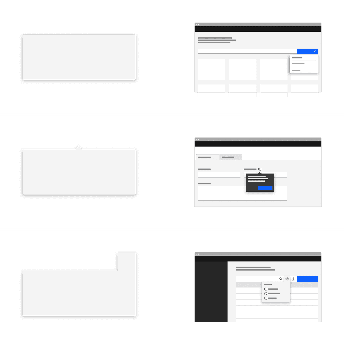
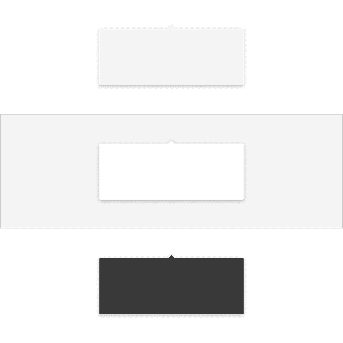
Popovers without a tip are typically used when the trigger button has a visually defined down state. | |
Popovers with a caret tip should be used to help show the relationship between the popover and where it was triggered from. A caret tip is typically used when the trigger button does not have a visually defined down state and for icon buttons. | |
Popovers can have a tab tip when the popover is connected to a toolbar or header area. |
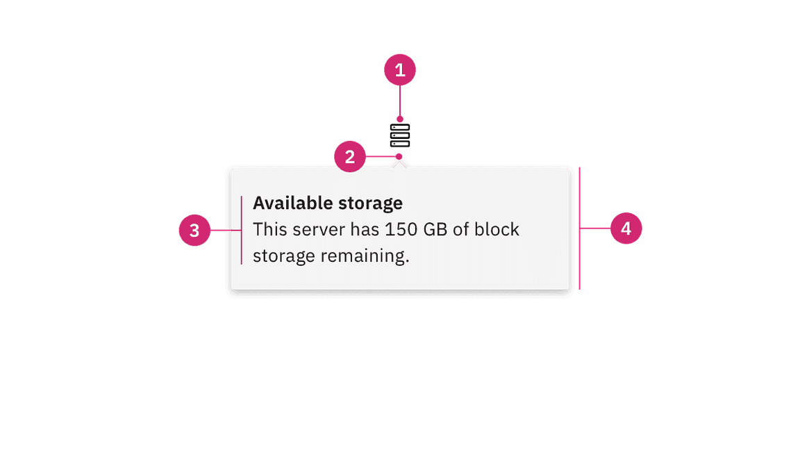
- UI trigger button: An interactive element that triggers the popover to open on click, hover, or focus.
- Tip: An indicator that is added to a popover container to help show the relationship between the popover and where it was triggered from.
- Content area: An area to place text and interactive elements.
- Container: An area to place text and interactive elements.
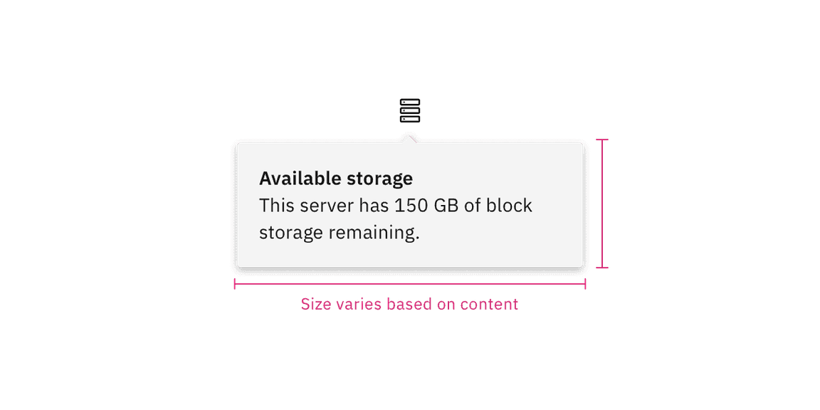
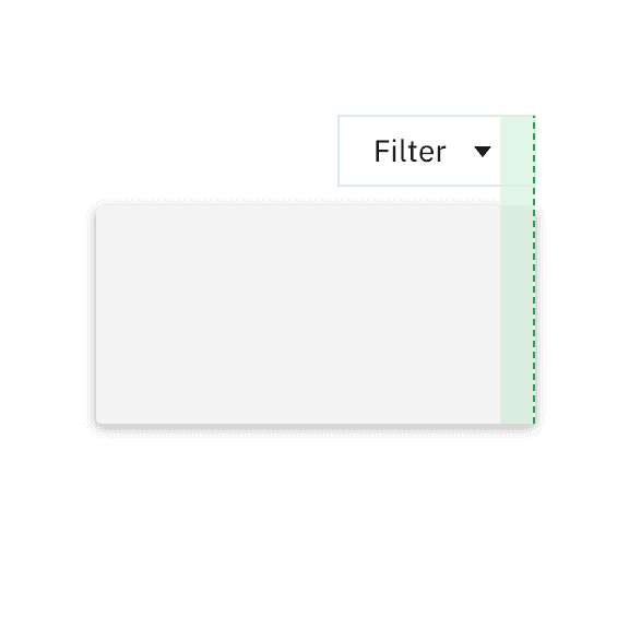
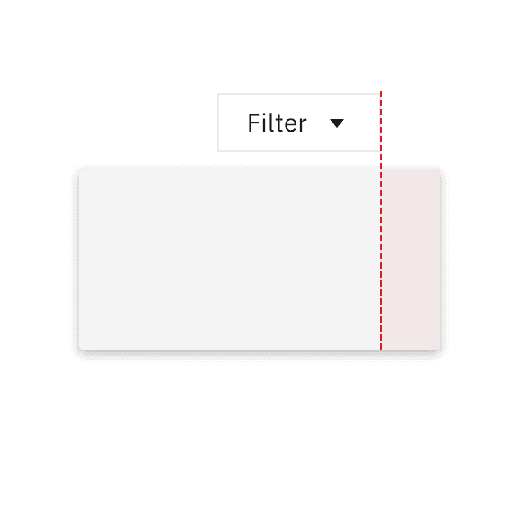
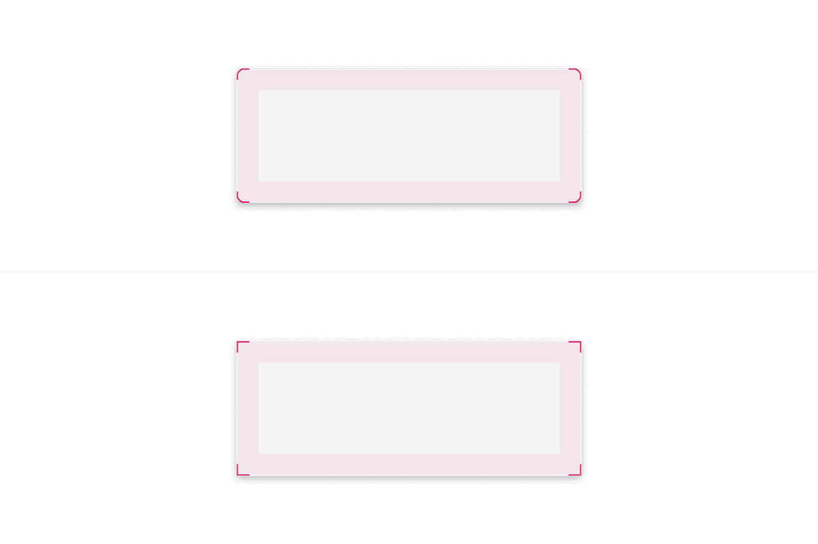
Do keep width between one to four columns.
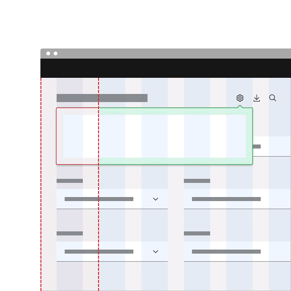
Don't exceed width of four columns.
Trigger button
A popover is controlled by a trigger button. By default, we use an icon button to trigger a popover to open. However, as long as the trigger button is interactive it can visually change its shape and size depending on the use case.
The trigger button can open the popover on click, hover, or focus depending on what it is being used for. For more information about trigger buttons, see the disclosure pattern.
Main elements
Heading, body, and footer content can vary based on your use case. To see examples of content used in popovers, see the disclosure pattern.
Overflow content
Scrolling is usually not needed when using a popover. If scrolling is needed, in a dropdown like situation for instance, then the body section should scroll vertically with the header and footer remaining fixed in place if those elements are present. Do not scroll horizontally or let content bleed off the page.
Further guidance
For further content guidance, see Carbon's content guidelines.
Placement
Popover directions by default are set to auto. Upon opening, popovers can detect the edges of the browser to properly be placed in view so the container does not get cutoff. Alternatively, popovers can also specify distinct directions. Direction options vary depending on the popover variant.
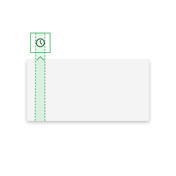
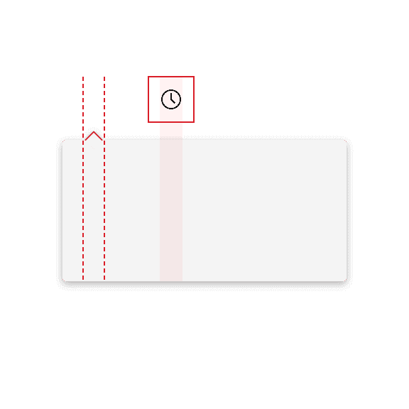
When a popover does not have a tip, the trigger button should be flush to the side of the popover. The popover can open from the left, right, bottom, or top of the trigger button.
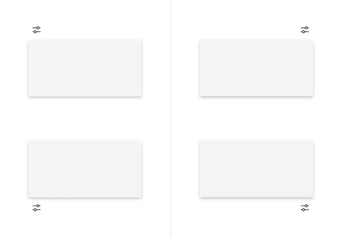
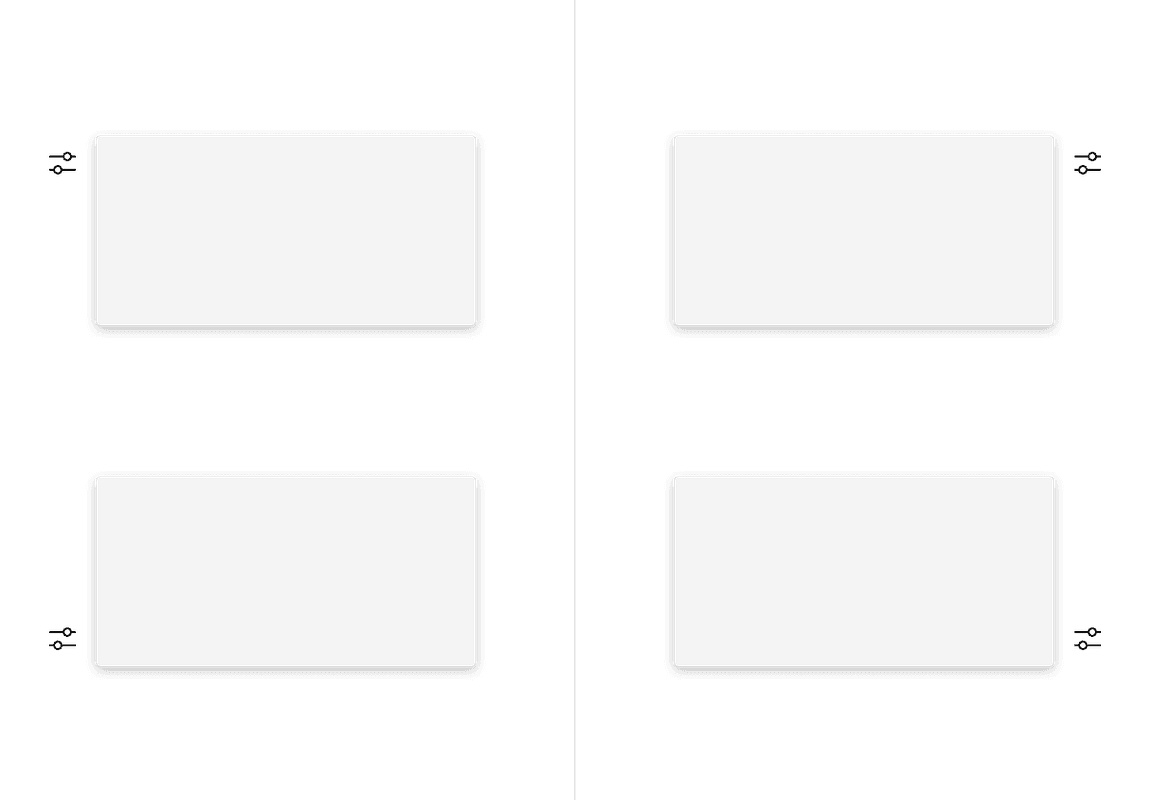
Do flush align the popover edge with the trigger button.
Don't arbitrarily place the popover near the trigger button.
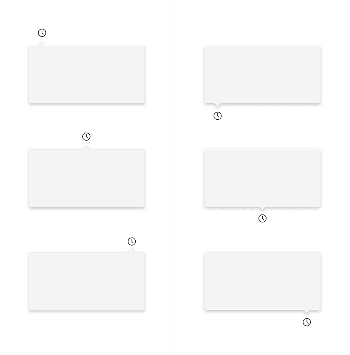
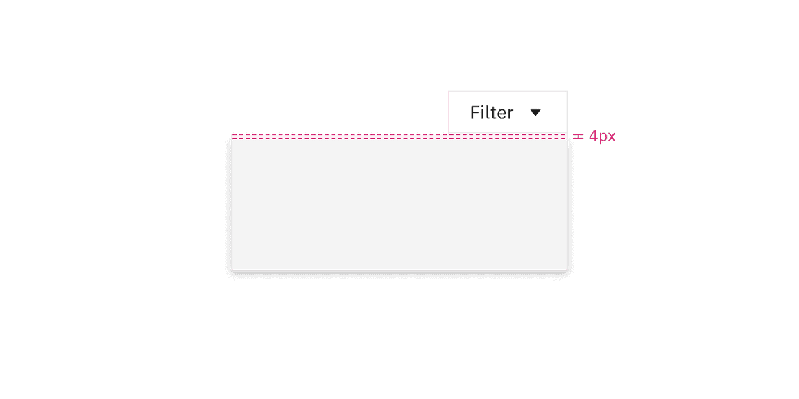
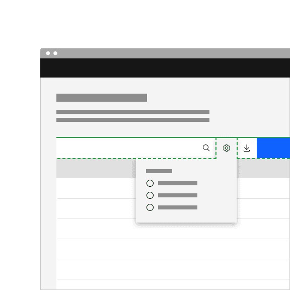
Similarly with no tip popovers, a trigger button paired with a caret tip popover should be placed 4px away from the popover container.
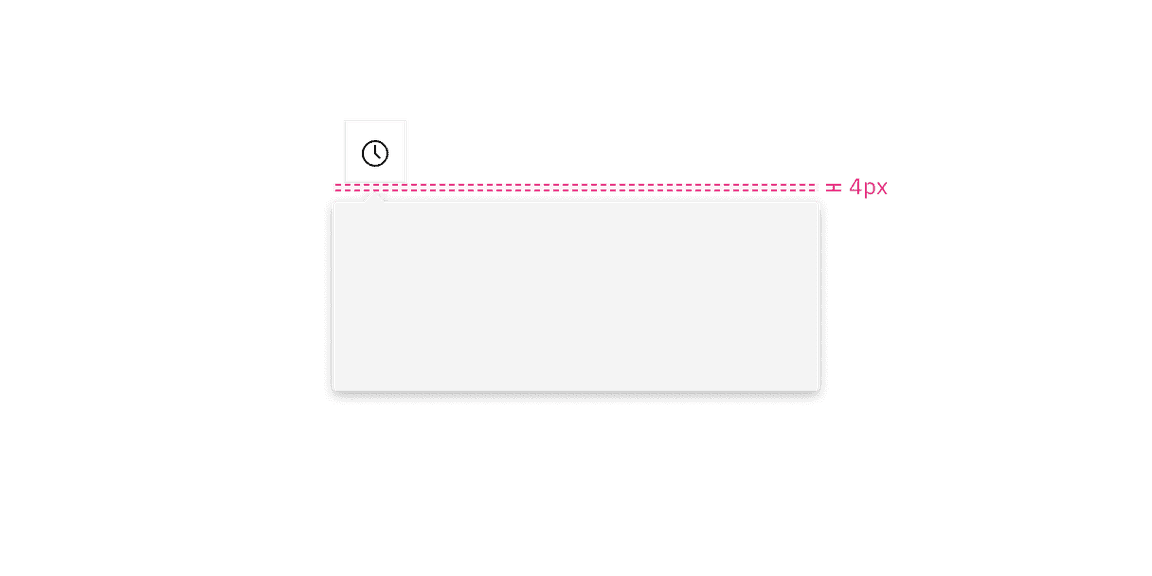
Do align the caret tip center with the trigger button.
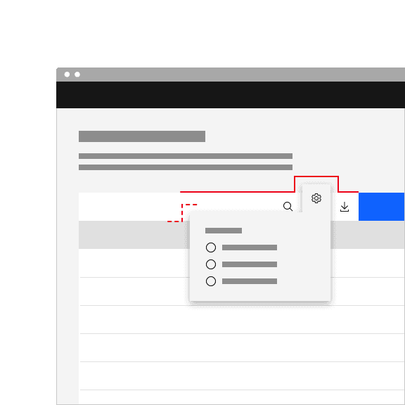
Don't misalign the caret tip with the trigger button.
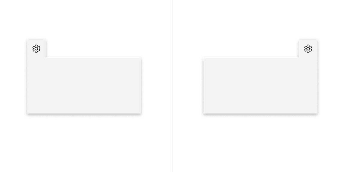
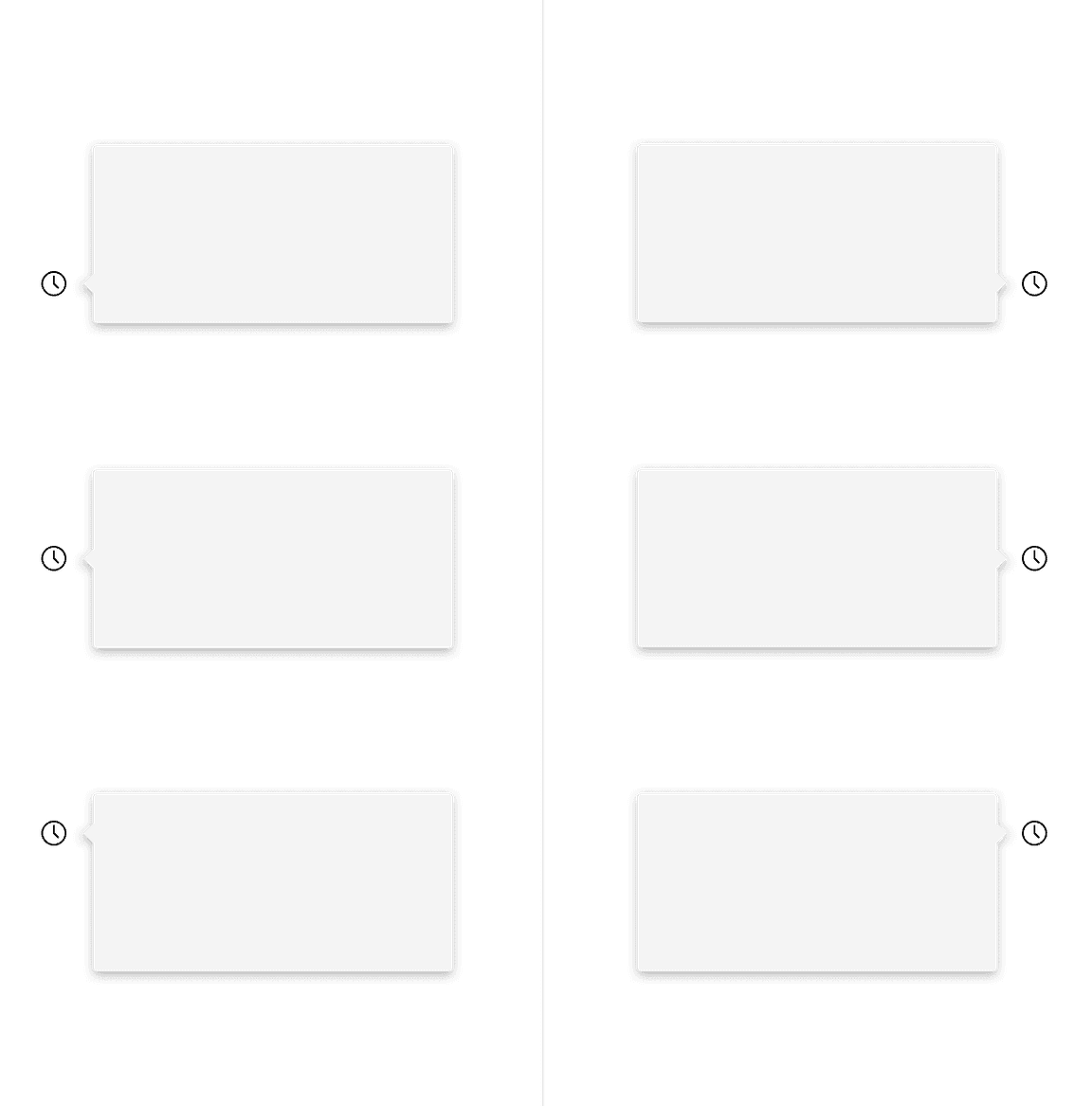
Do top align the tab tip with the layer behind it.
Don't misalign the tab tip with the layer behind it.
Mouse
Users trigger a popover to open and close by clicking or hovering on the trigger button depending on the use case.
Click: Open the popover by clicking on the trigger button. Close the popover by clicking on the trigger button again, or anywhere outside of the open popover container.
Hover: Open the popover by hovering over the trigger button. Close the popover by hovering off of the popover or clicking anywhere outside of the open popover container.
Screen readers
VoiceOver: Users can trigger a button to open a popover by pressing Enter or Space while the button has focus.
JAWS: Users can trigger a button to open a popover by pressing Enter or Space while the button has focus.
NVDA: Users can trigger a button to open a popover by pressing Enter or Space while the button has focus.
Nesting
Placing one popover inside another can cause confusing interactions and accessibility issues. Consider using a modal or a different experience instead.
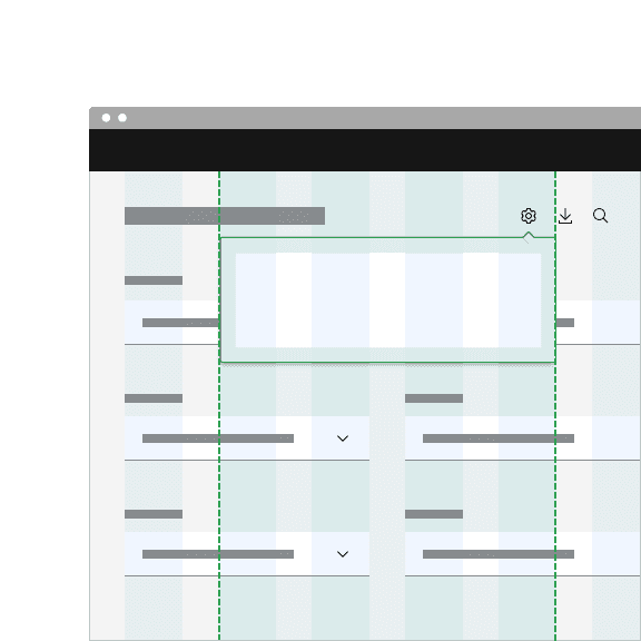
Tooltips can be used on interactive elements within a popover, but consider their placement carefully. Ensure tooltips are positioned in a way that prevents them from being cut off within the popover container.
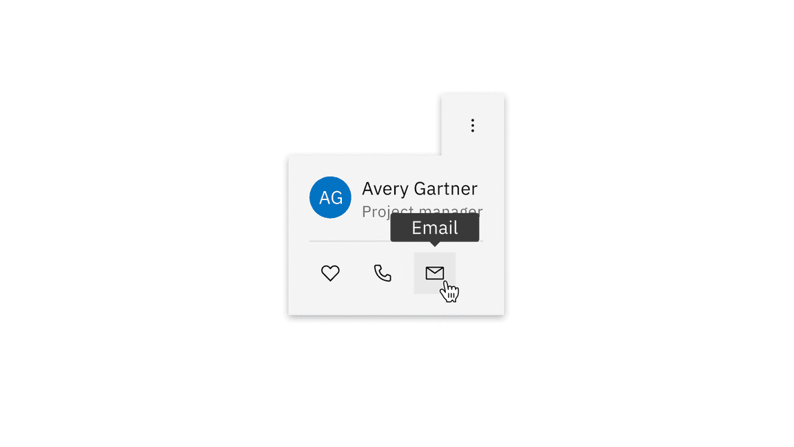
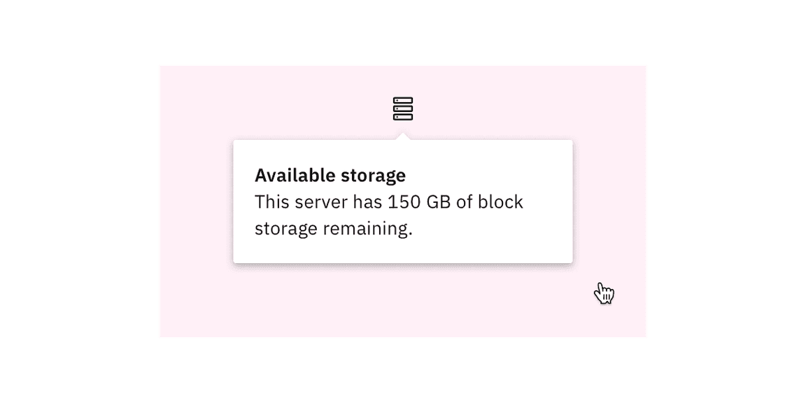
Example of tooltip within popover
Disclosures
Disclosures use popovers as a base layer. Disclosures are comprised of a popover container, text, and interactive elements. For further guidance, see Carbon's disclosure pattern.
Overflow menus
Overflow menus use popovers as a base layer. When the overflow menu icon button is triggered, the menu opens and uses a tab tip popover as its base. For further guidance, see Carbon's overflow menu.
Toggletips
Toggletips use the popovers as a base layer. Toggletips allow interactive elements within the popover container while still being accessible. For further guidance, see Carbon's toggletip component.
Tooltips
Tooltips use popovers as a base layer. Tooltips are comprised of a trigger button, popover container and text. For further guidance, see Carbon's tooltip component.
Popup, Component research, (OpenUI)
Disclosure, W3C WAI-ARIA practices, (W3C Working Group Note)
Feedback
Help us improve this component by providing feedback, asking questions, and leaving any other comments on GitHub.