This live demo contains only a preview of functionality and styles available for this component. View the full demo on Storybook for additional information such as its version, controls, and API documentation.
Overview
Notifications provide a method for communicating with users and sharing feedback. They come in four statuses which when combined with the right variants make notifications that are relevant, timely, and informative for each use case. Their status signifies the purpose of the information being conveyed and allow you to tailor the disruptiveness of the notification to the specific situation.
When to use
Use notifications to inform users of updates or changes to system status. Communicating with users and providing immediate feedback are important for building trust. While notifications are an effective method of communicating with users, they are disruptive and should be used sparingly.
For more context on when to use each notification variant, including modals, refer to the notifications pattern. Carbon supports only inline, toast, actionable, and modal notification variants, although some product teams also support banners and notification centers.
Variant | Purpose |
|---|---|
Inline notifications show up in task flows, to notify users of the status of an action. They usually appear at the top of the primary content area. | |
Toast notifications are non-modal, time-based window elements used to display short messages; they usually appear at the top of the screen and disappear after a few seconds. | |
Actionable notifications allow for interactive elements within a notification styled like an inline or toast notification. | |
Callouts are used to highlight important information that loads with the contents of the page, is placed contextually, and cannot be dismissed. |
Feature flags
A feature flag has been added to the actionable notification variant to improve accessibility and changes parts of its functionality, not its visual appearance. For code-specific feature flag information, refer to the Code tab. The current actionable notification is not being deprecated, but teams are encouraged to use the feature flag notification for their products moving forward. Once the next major release (v12) is released in the future, this feature flag will become the default version of the component.
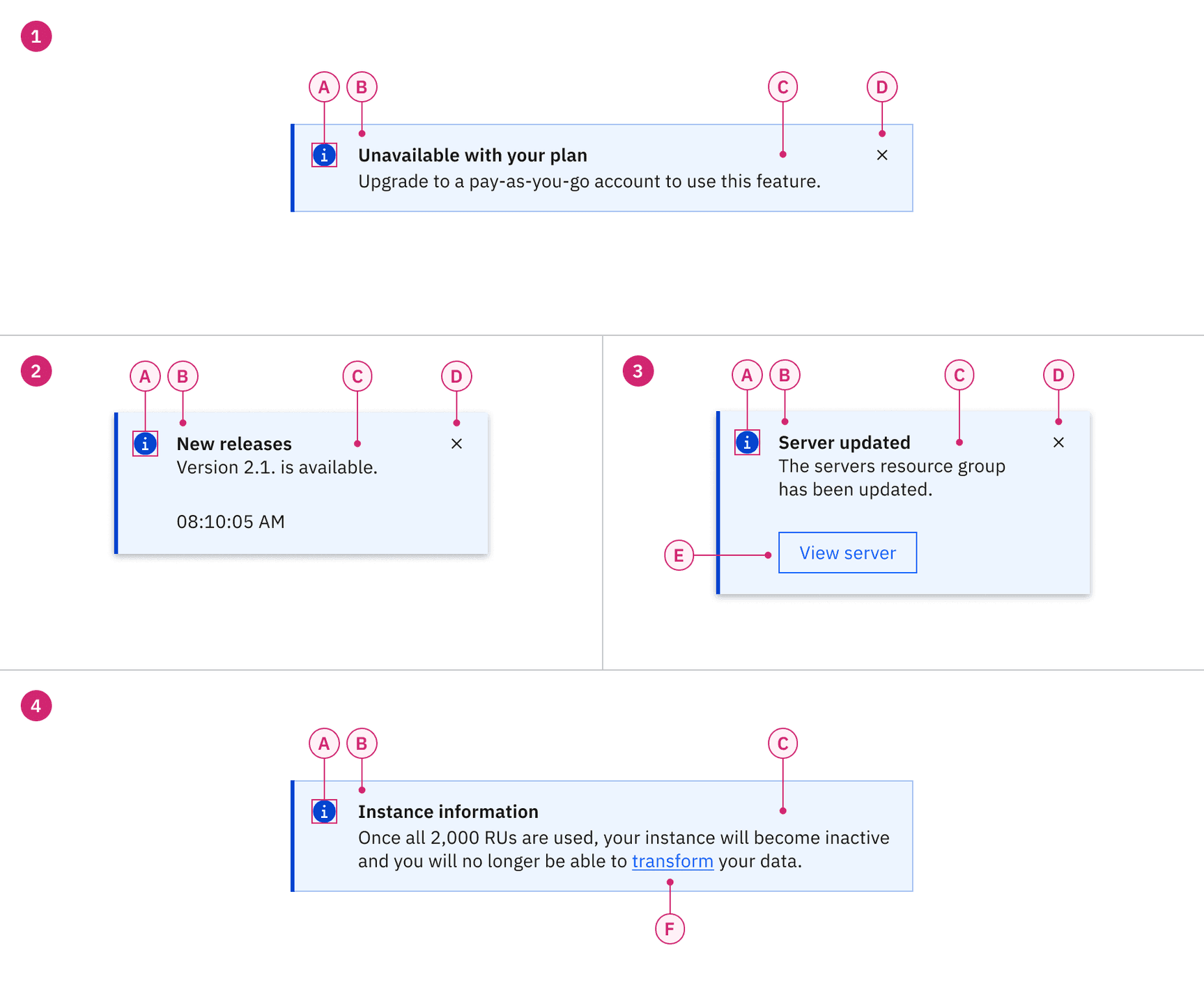
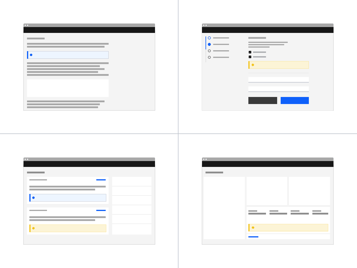
1. Inline
A. Icon
B. Title
C. Body content
D. Close button
2. Toast
A. Icon
B. Title
C. Body content
D. Close button
3. Actionable (inline and toast)
A. Icon
B. Title
C. Body content
D. Close button
E. Action button
4. Callout
A. Icon
B. Title
C. Body content
F. Link
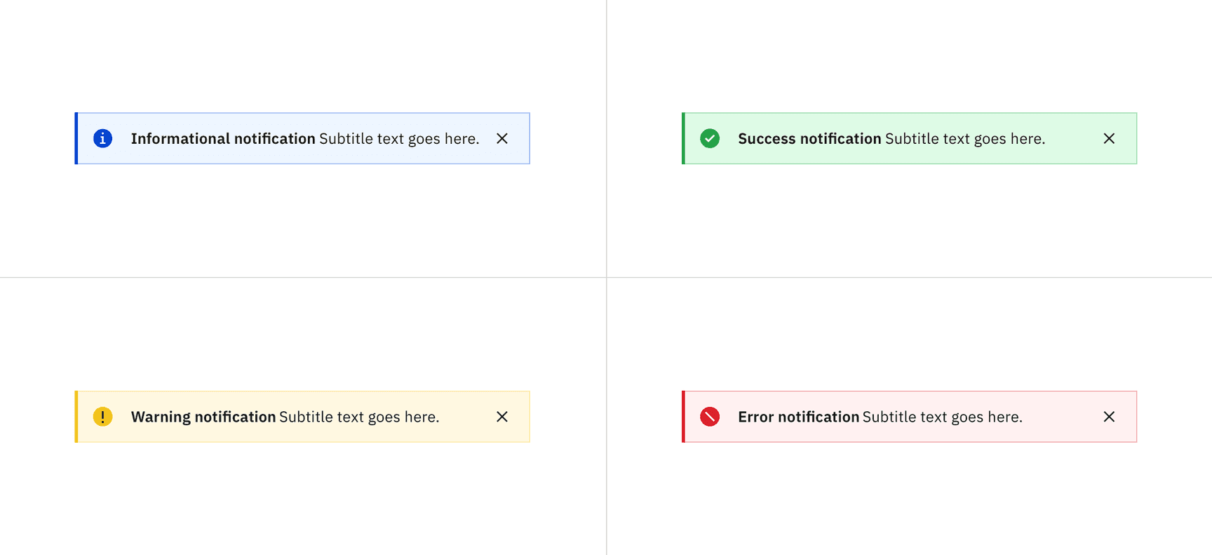
Notification status for the inline variant
Deciding what to use
When choosing between the various notification statuses, consider the context and the emotion that needs to be conveyed. All notification variants, except for callout, typically serve as feedback after an action or task is completed. The callout variant is unique, as it provides guidance before users begin a task or take action and, therefore, does not include success or error statuses.
Status | Usage | Color | Icon | Variants |
|---|---|---|---|---|
Informational | Provide additional information to users that may not be tied to their current action or task | Blue |
| Inline, Toast, Actionable, Callout |
Success | Confirm a task was completed as expected | Green |
| Inline, Toast, Actionable |
Warning | Inform users that they are taking actions that are not desirable or might have unexpected results | Yellow |
| Inline, Toast, Actionable, Callout |
Error | Inform users of an error or critical failure and optionally block the user from proceeding until the issue has been resolved | Red |
| Inline, Toast, Actionable |
Content
Notifications provide limited space for content and, therefore, the content must be short and concise. Follow the guidance in IBM Style - Messages and write the message so the user can, by scanning the notification, be apprised of the situation and quickly know what to do next.
- The title should be short and descriptive, explaining the most important piece of information. For error messages, tell users what stopped or can’t be done in the title, for example “Server instance unavailable”.
- Don’t use a period to end a title.
- When using rich text, such as in a title, a screen reader will read aloud the entire message as one sentence. Because the message will be read as one string, do not depend on text styling to convey meaning.
- Be concise; limit the content to one or two short sentences.
- Don’t repeat or paraphrase the title.
- Explain how to resolve the issue by including any troubleshooting actions or next steps. This is what IBM Style calls the “user action”. User actions are mandatory for error messages.
- When possible, use an actionable notification and include links in the notification body that redirect the user to where they resolve the problem.
- Keep labels concise and clearly indicate the action the user can take.
- Limit action labels to one or two words. For a list of recommended action labels, see Carbon’s content guidelines.
- They must be descriptive and meaningfully indicate the link’s destination.
- They don’t necessarily have to be at the end of the sentence—they can also be within the body content.
Overflow
If a toast or inline notification requires a message that is longer than two lines, use an actionable notification and include a short message with a “View more” link that takes the user to a view of the full notification message. This destination can be either a full page with more details or a modal.
Further guidance
For further content guidance, see Carbon’s content guidelines.
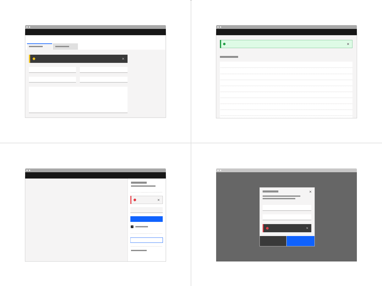
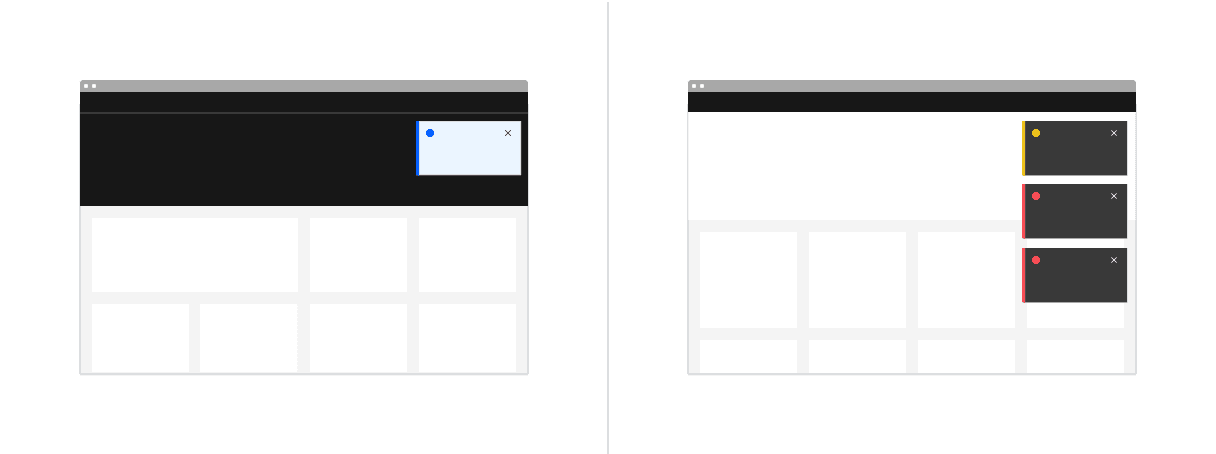
Examples of inline notification placements across different UI layouts
Placement
Inline notifications appear near their related items. They can expand to fill the width of the container or content area they are in and should align to the grid columns.
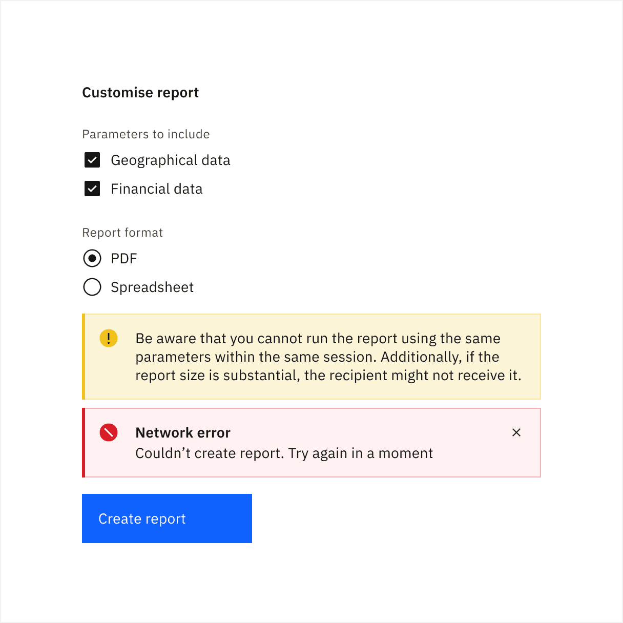
Place inline notifications at the bottom of forms, just above the submission and cancel buttons. When error notifications apply to individual text inputs, they should supplement the error state on that specific input field.
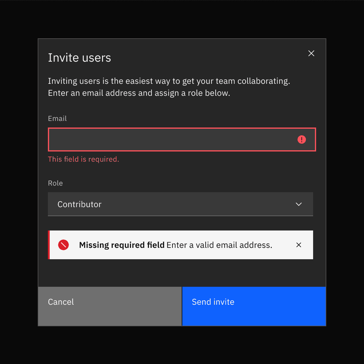
Examples of an inline notification supporting an error message on a form
Dismissal
Inline notifications do not dismiss automatically. They persist on the page until the user dismisses them or takes action that resolves the notification.
A small “x” in the top right corner is used to dismiss inline notifications. Including the close button is optional and should not be included if it is critical for a user to read or interact with the notification.
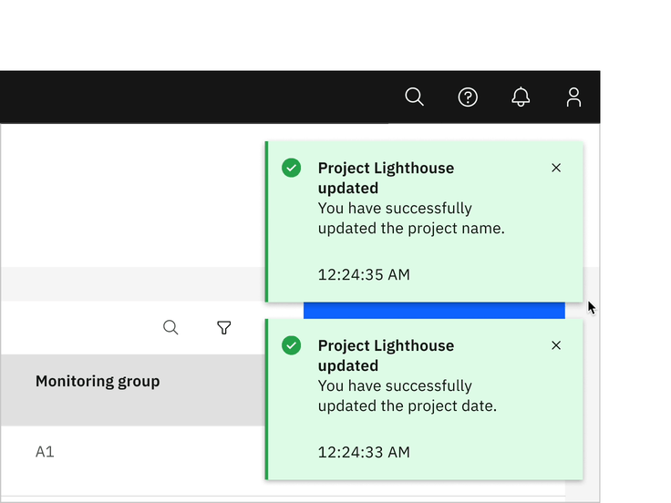
Examples of toast notification placements across different UI layouts
Time stamp
Toast notifications can include a time stamp at the bottom the container. The time stamp shows the time the notification was sent. Using time stamps is optional but toast notifications should be consistent across the product so either all toast notifications should include time stamps or none of them should. The time stamp is optional and can be removed if a third line of content is needed.
Dismissal
Toast notifications persist by default, but they can timeout and be coded to dismiss automatically after five seconds on the screen. They can also include a close button so users can dismiss them sooner. Toast notifications cover content on the screen so they should always be easily dismissed. Because toast notifications can dismiss automatically, users should be able to access them elsewhere after the toast notification disappears if they need more time to read the notification or who want to refer to it later.
Actionable
Actionable notifications are inline or toast notifications that have interactive elements. Because actionable notifications require user interaction, actionable notifications come into focus when triggered and, therefore, they disrupt screen readers and keyboard users. Only one action is allowed for each notification, and this action frequently takes users to a flow or page related to the message where they can resolve the notification.
Consider using a notification center where a user can revisit and act on past notifications.
Toast
Actionable toast notifications can include a tertiary button at the end of their body content. This button should be short and should take users to a page or modal where they can take action to address the notification or find further information. Because toast notifications automatically dismiss, ensure there are alternative routes to navigate to the link destination.
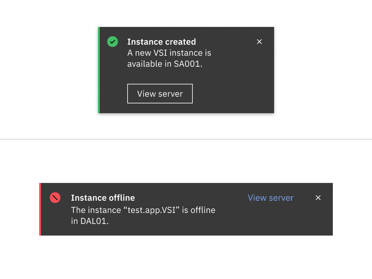
Actionable toast notification (top); actionable inline notification (bottom)
Dismissal
Actionable notifications persist until a user dismisses them. If you’re using inline styling, refer to inline notifications for inline dismissal. If you’re using toast-notification style for an actionable notification, the notification should remain on screen until the user dismisses it. Because the notification remains open, the user has enough time to interact with the button without the toast closing too soon. For more information, see toast notifications.
Callout
Callouts are used to highlight important information contextually within the contents of the page, and cannot be dismissed. Unlike other notification components they are not triggered by the user or system, rather they load with the contents of the page. They do not act as a feedback mechanism, they are persistent, and always present on the screen to provide necessary information to the user.
Callout can be used within forms, dashboard, articles, etc when there is a need to highlight information. It’s designed to draw attention to important information that can prevent a negative user experience. Additionally, it can be used to emphasize details that guide users toward making informed decisions, ultimately enhancing their overall experience.
- With button or input: If important information affects an action, place the callout above the relevant button or input. This highlighted message ensures that users feel confident about their action before proceeding.
- With data or information: Place the callout contextually, either before or after the data being viewed by users, depending on what fits best.
- With inline notification: When a callout and an inline notification need to coexist during a user journey, move the callout above the inline notification and position the short-lived inline notification closer to the button or input that triggered it.
Example of how a callout is placed when an inline error notification appears
Screen readers
VoiceOver: To close notifications, press Enter or Space while the close x has focus or use the Esc key.
JAWS: To close notifications, press Enter or Space while the close x has focus or use the Esc key.
NVDA: To close notifications, press Enter or Space while the close x has focus or use the Esc key.
High and low contrast
Carbon supports high and low contrast style notifications. High-contrast notifications are best for critical messaging while low-contrast notifications are less visually disruptive for users.
It’s up to the product team to decide which notification style to use in their product. Callouts, inline, and toast notifications can use different styles, but you should never mix styles within each notification variant. When in doubt, use low-contrast notifications.
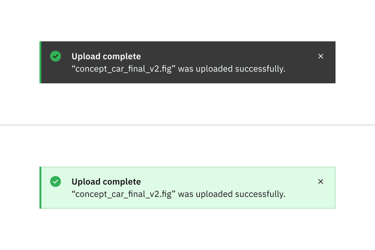
High contrast notification (top); low contrast notification (bottom)
Feedback
Help us improve this component by providing feedback, asking questions, and leaving any other comments on GitHub.