Element | Property | Color token |
|---|---|---|
Text: enabled | text-color |
|
Text: current | text-color |
|
Slash | text-color |
|
Overflow: icon | svg |
|
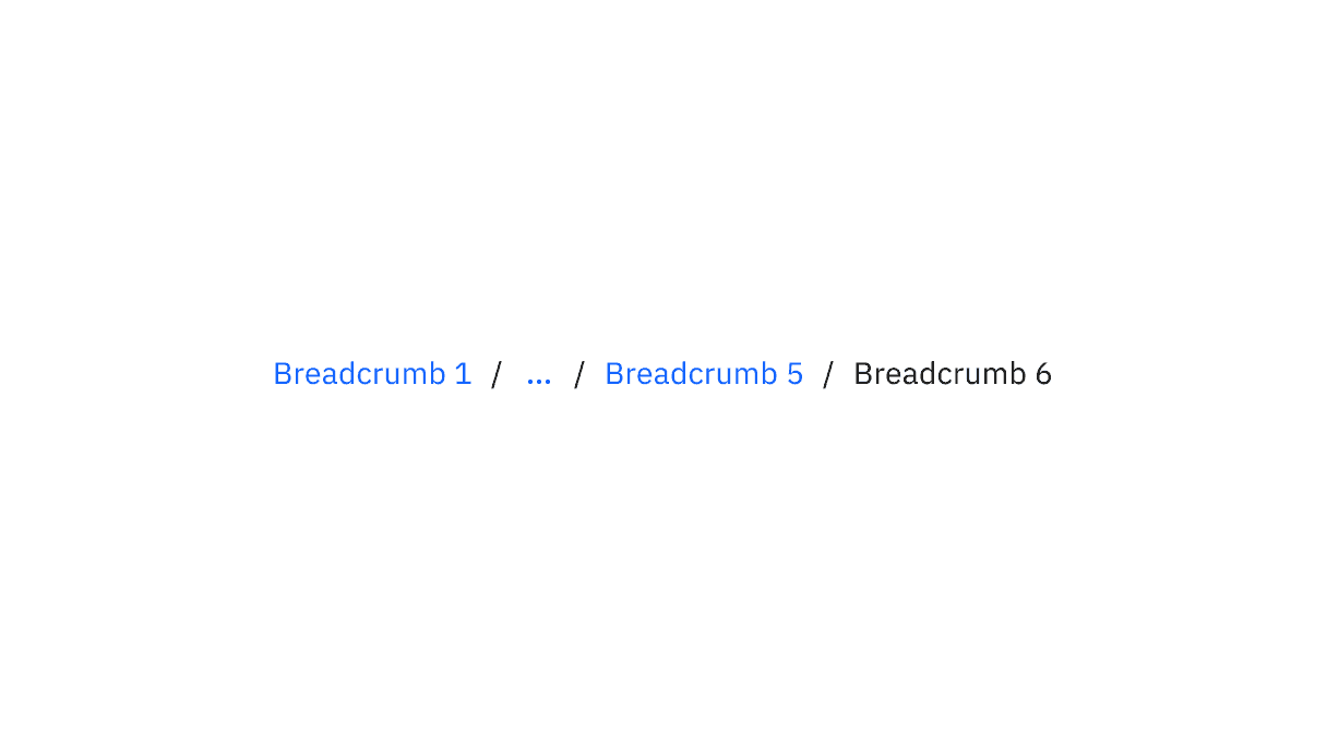
Breadcrumb color and overflow color
State | Element | Property | Color token |
|---|---|---|---|
Hover | Text | text-color |
|
Focus | Text | text-color |
|
Border | border |
| |
Active | Text | text-color |
|
Border | border |
| |
Current | Text | text-color |
|
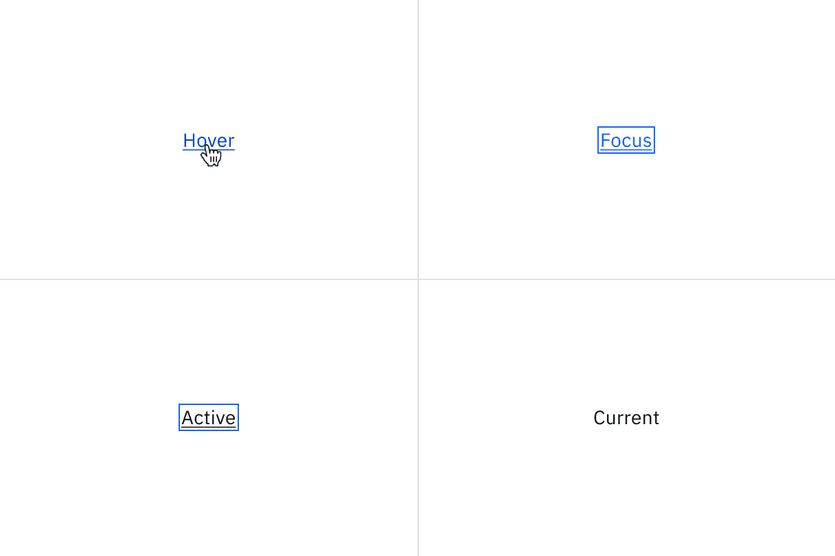
Breadcrumb interactive state color
State | Element | Property | Color token |
|---|---|---|---|
Hover | Icon | svg |
|
Focus | Icon | svg |
|
Border | border |
| |
Active | Icon | svg |
|
Border | border |
|
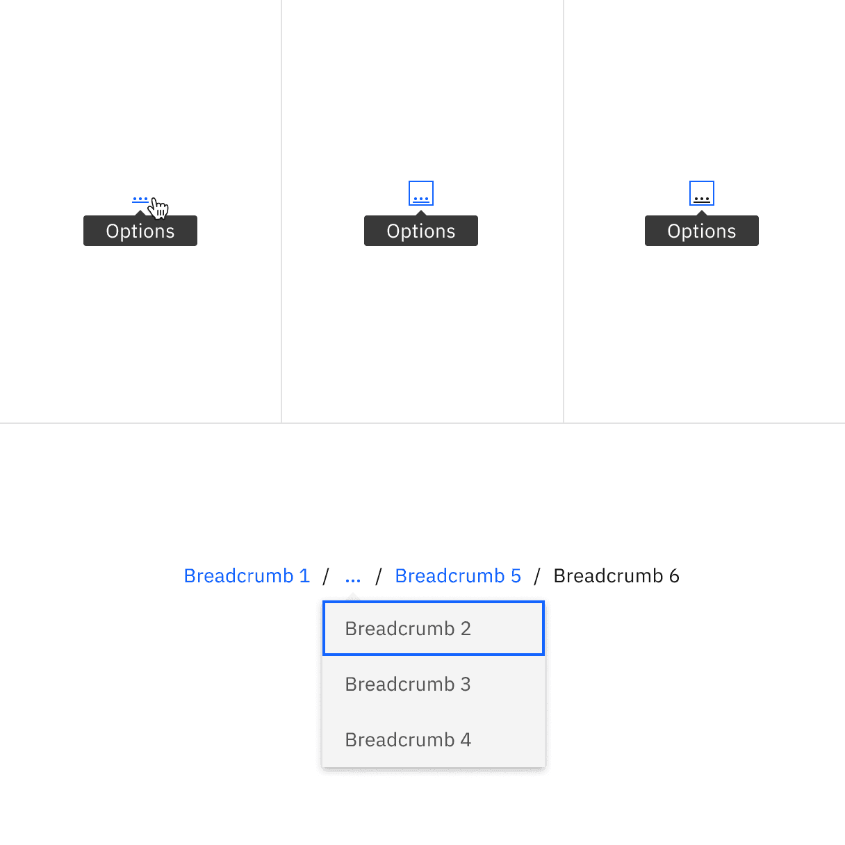
Breadcrumb overflow interactive state color
Element | Font-size (px/rem) | Font-weight | Type token |
|---|---|---|---|
Text: small | 12 / 0.75 | Regular / 400 |
|
Text: medium | 14 / 0.875 | Regular / 400 |
|
Text: overflow menu | 14 / 0.875 | Regular / 400 |
|
Structure
When an overflow menu is present to disclose overflow breadcrumbs, use the menu component structure.
Element | Property | px/rem | Spacing token |
|---|---|---|---|
Link | margin-left, margin-right | 4 / 0.25 |
|
Link: overflow icon | margin-left, margin-right | 4 / 0.25 |
|
Link: overflow menu | height | 40 / 2.5 |
|
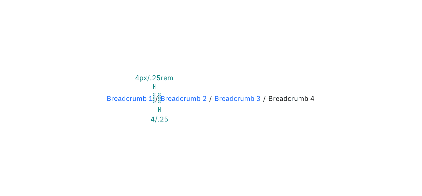
Structure and spacing measurements for small breadcrumb | px / rem
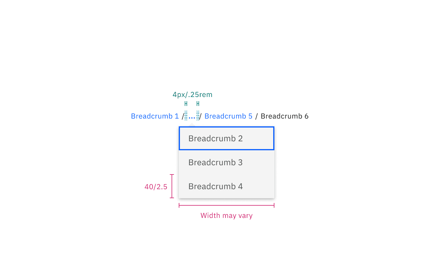
Structure and spacing measurements for small breadcrumb overflow | px / rem
Element | Property | px/rem | Spacing token |
|---|---|---|---|
Link | margin-left, margin-right | 8 / 0.5 |
|
Link: overflow icon | margin-left, margin-right | 8 / 0.5 |
|
Link: overflow menu | height | 40 / 2.5 |
|
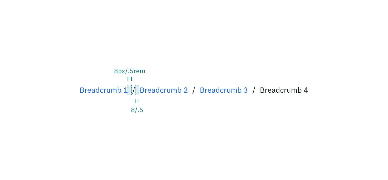
Structure and spacing measurements for medium breadcrumb | px / rem
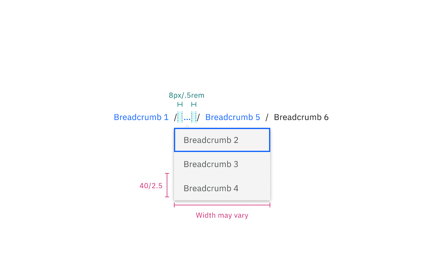
Structure and spacing measurements for medium breadcrumb overflow | px / rem
Feedback
Help us improve by providing feedback, asking questions, requesting features, or leaving any other comments on GitHub.