Overview

Stable
Last updated Jun 30, 2026

Components are one of the key building blocks of the design system. Their systematic reuse helps to create visual and functional consistency across products.

Overview

Overview

When a new feature flag is introduced, it is set to false or “off” by default to ensure backward compatibility. We are not deprecating the current components but encourage all teams to use the new feature flag-enabled components in their products moving forward. Once the next major release (v12) is released in the future, these feature flags will become the default version of the component.

Components with feature flags

Component

Design change

Code change

Menu buttons (Overflow menu)

No design change

React

Modal

No design change

React

Notification

No design change

React

Structured list

Usage tab

React

Tile

Usage tab

React

Toggle

Usage tab

React

Tree view

No design change

React

How to implement

Code

Each framework handles feature flags differently. At the moment, only React has available feature flags. This may change in the future, check back later for updates related to all available feature flags.

React

The development specifics for feature flags in React can be found in the @carbon/react framework.

Design

Inside a design file, click on the component with a feature flag (A). In the properties panel, locate the v12 feature flag boolean property (B). By default, this feature is turned off, but can be toggled on to enable the v12 feature flag.

Feature flag implementation in Figma

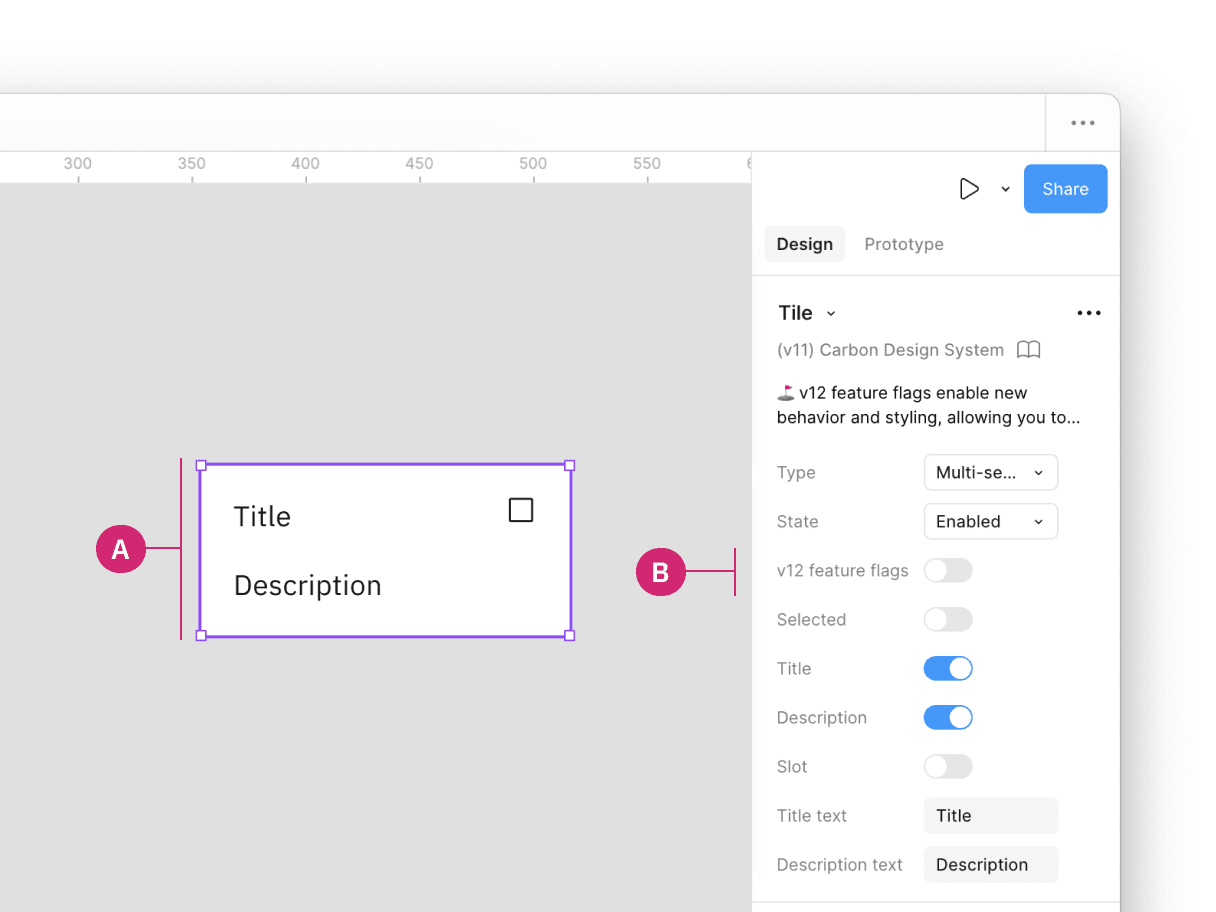
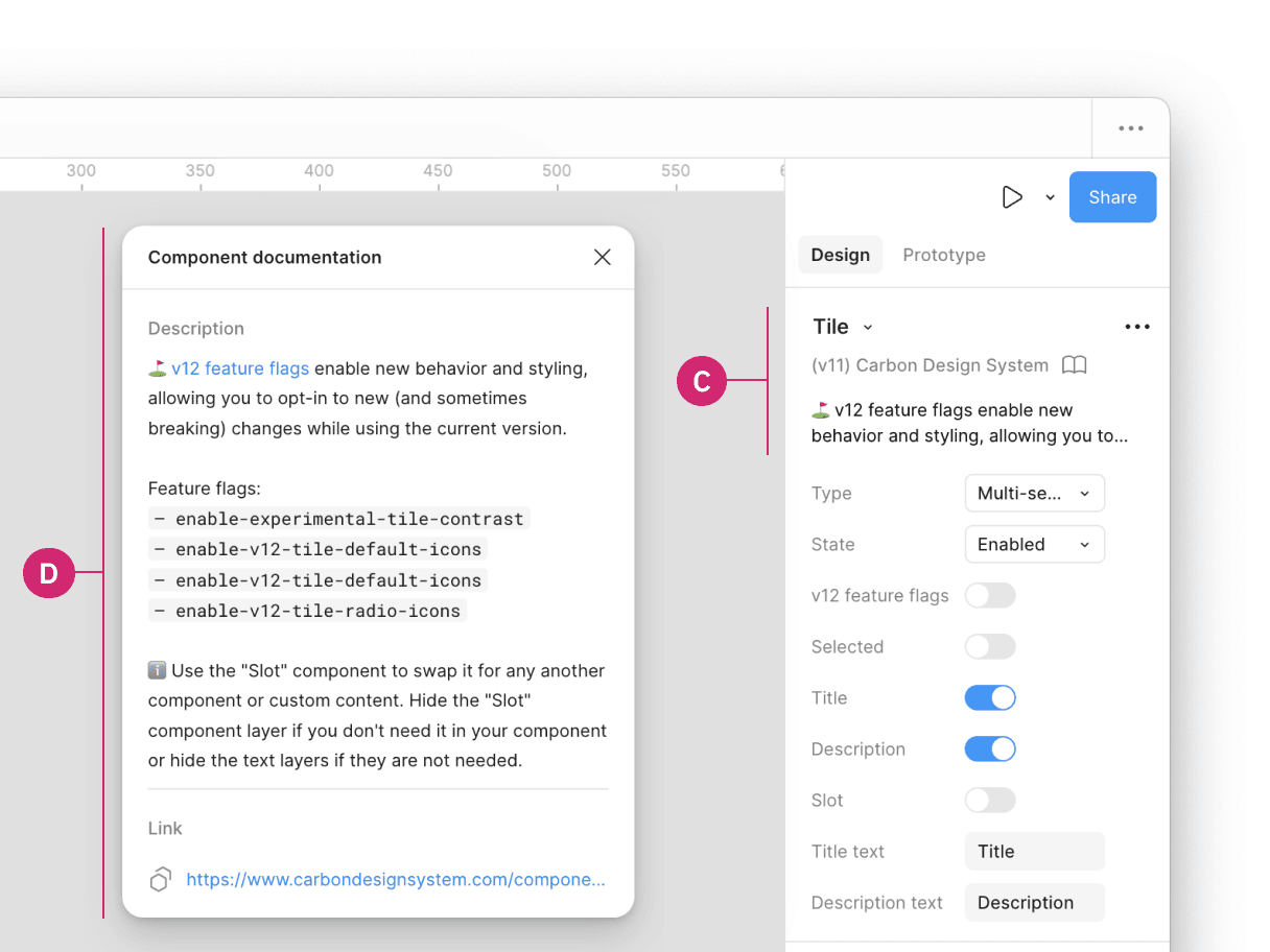
Additionally, when clicking on the components details (C) in the properties panel, a description of the v12 feature flag, and a link to the component’s usage guidance is provided for more information in the Component documentation window (D).

Feature flag implementation in Figma

Feedback

Help us improve this component by providing feedback, asking questions, and leaving any other comments on GitHub.