This live demo contains only a preview of functionality and styles available for this component. View the full demo on Storybook for additional information such as its version, controls, and API documentation.
Overview
Links are used as navigational elements and can be used on their own or inline with text. They provide a lightweight option for navigation, but like other interactive elements, too many links will clutter a page and make it difficult for users to identify their next steps. This is especially true for inline links, which should be used sparingly.
Navigate to a different page within the application
Navigate to an entirely different site
Jump to an element on the same page
Link to emails or phone numbers
When not to use
Do not use links for actions that will change data or manipulate how it is displayed, change a state, or trigger an action. Instead, use buttons to guide users to specific actions.
Do not use images as links. Instead, use a tile that can contain an image and additional information such as links.
- Link text: Communicates what is being linked to.
- Icon (optional): Indicates the destination or type of content being referenced.
Size | Height (px / rem) |
|---|---|
Small | 16 / 1 |
Medium | 18 / 1.125 |
Large | 22 / 1.375 |
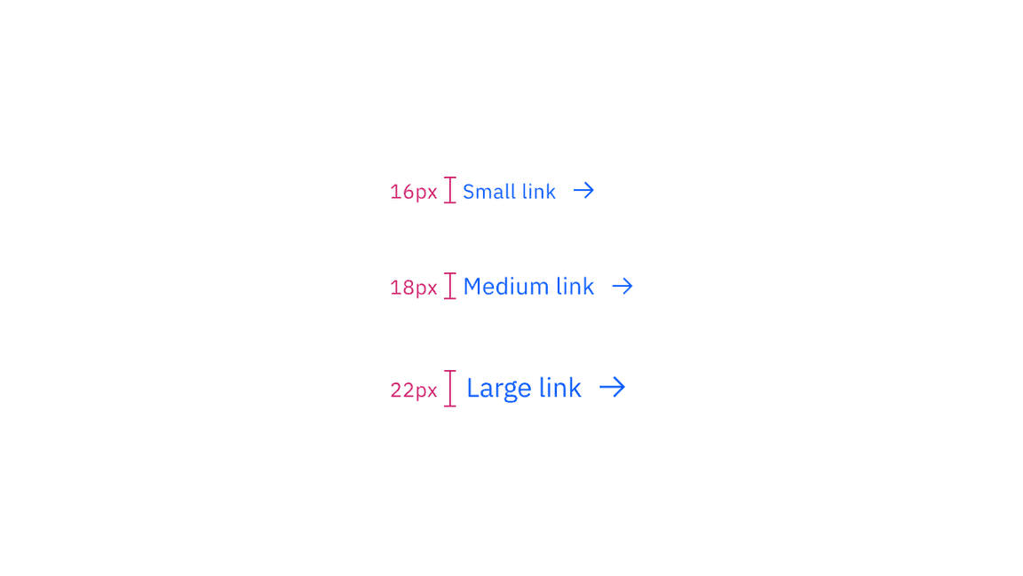
Sizing applies to both standalone and inline links
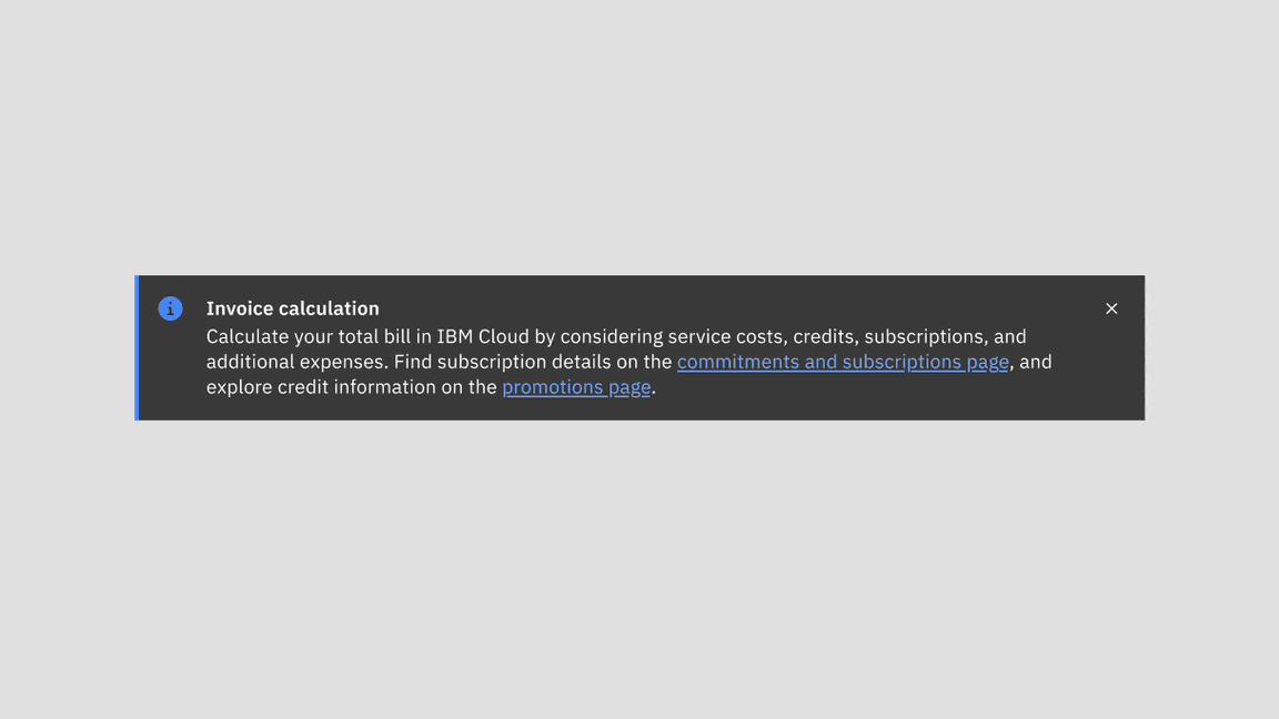
Example of inline link in a notification
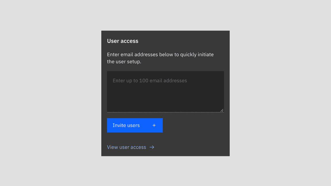
Example of standalone link in a card
Use distinctive and meaningful link text.
Ensure that links accurately reflect the content users will find at the link destination.
If your design uses generic link names such as "read more," consider making them unique. See the Accessibility tab for more information.
Avoid using the same link text for different destinations on the same page and try to differentiate between links by using unique text for each.
Ensure links are understandable but not excessively long, especially if they wrap.
Further guidance
For further content guidance, see Carbon's content guidelines.
States
List has six main states – enabled (unvisited), hover, focus, active, visited, and disabled. Learn more about states on the Style tab.
State | When to use |
|---|---|
Enabled (unvisited) | This is the default state of a link. When the user has not clicked on a link yet. |
Hover | When the user hovers the cursor over a link. |
Focus | When the user tabs to or clicks on the link, it becomes focused, indicating the user has successfully navigated to the component. |
Active | When the user is clicking on a link. |
Visited | When the user has previously clicked on unvisited links. There’s a change in the color token as |
Disabled | When a user cannot interact with the link. Links could be temporarily inactive or unavailable. |
Keyboard
Users can open a link by pressing Enter while the link has focus. For additional keyboard interactions, see the accessibility tab.
Open up a modal with read-only information
Navigate the user to a new page, changing the URL and causing a browser refresh
Support jumps to different sections within the same page
Open web resources such as images, videos, or HTML documents
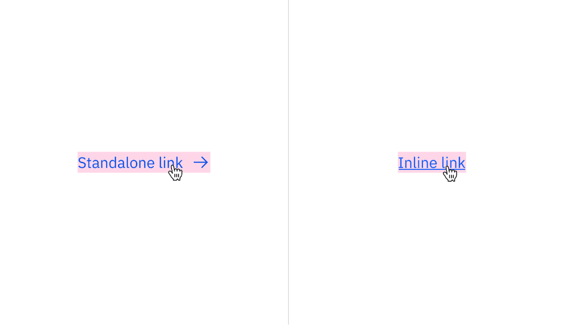
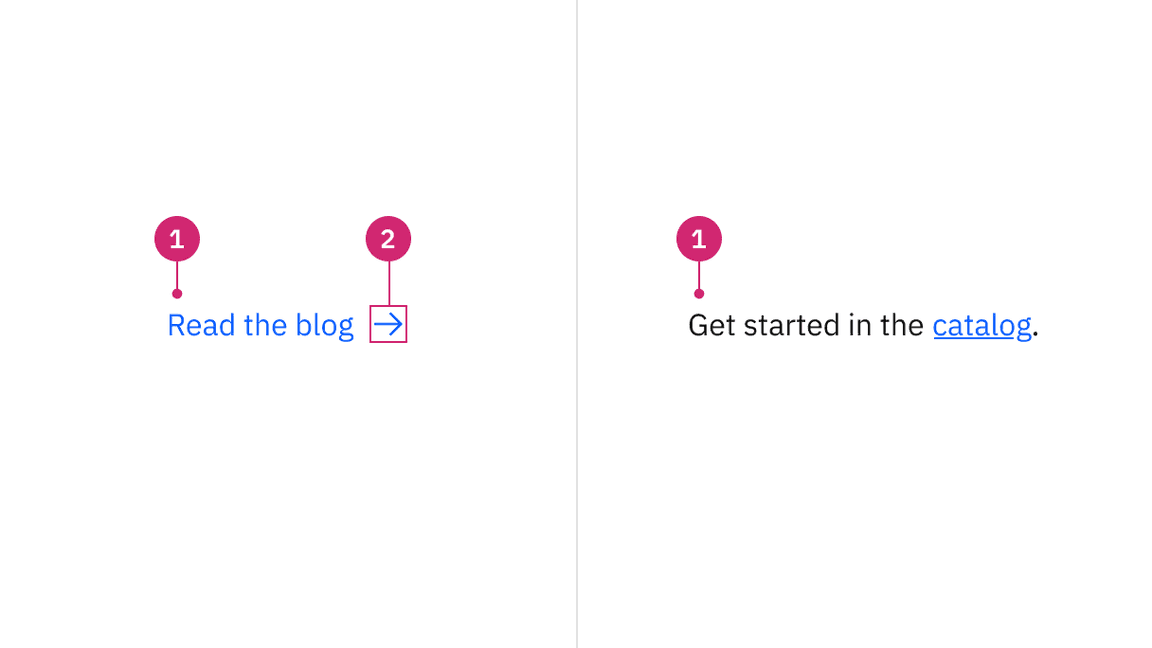
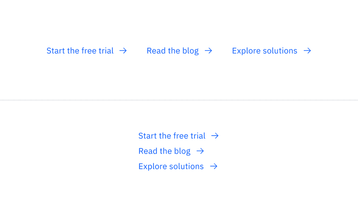
Standalone and inline links with their clickable areas
Standalone link
Standalone links are used on their own directly following content. They should not be used within sentences or paragraphs. Standalone links are the default link style for Carbon and only have an underline in the hover state, focus state, and active state.
The standalone link component can be paired with an icon. Icons should always be the same color as the link text. When necessary, utilize appropriate icons to distinguish them from ghost buttons or inline links when they appear within the same context or page.
Example shows the standalone link within context
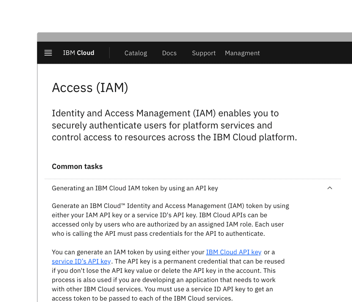
Inline link
Inline links are used in sentences or paragraphs of text. The inline link behaves the same as the standalone link but it is styled with an underline. This helps differentiate them from the text they are placed next to and makes it clear users can interact with them.
Inline links should not be used on their own and should not be paired with icons.
Example shows inline links within the body text
Visited style
By default, the link component does not use a visited style. Visited links indicate that a user has already opened the link so they can be a helpful indicator during task completion. Visited styles should be used sparingly because they often clutter the page and add further visual noise as users are trying to navigate a product. They can be used to show users they have already clicked on a link if it's important.
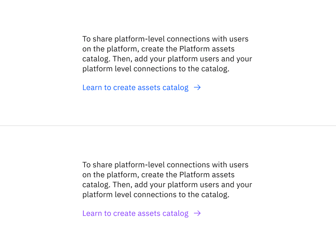
Example shows unvisited and visited links
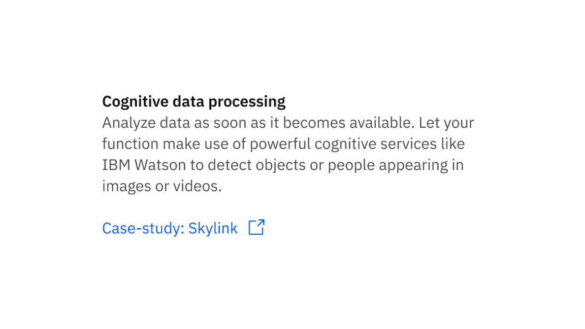
Links that trigger actions
Some links trigger actions to aid task completion in addition to navigation. These links should still serve a navigation purpose. A common example is linking an email address that opens an email client with the address pre-populated. Avoid using a link to trigger an action that does not have a navigation element. Using a link in this case might confuse the user on what action will be triggered and where the user will be directed.
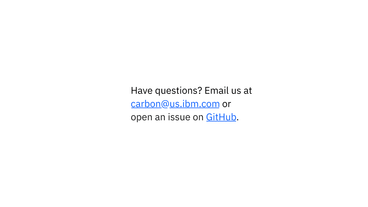
Example shows inline links for email
Do use links when actions navigate users to resources
Do not use buttons when actions serve as a navigation purpose
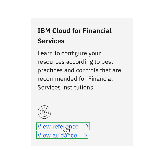
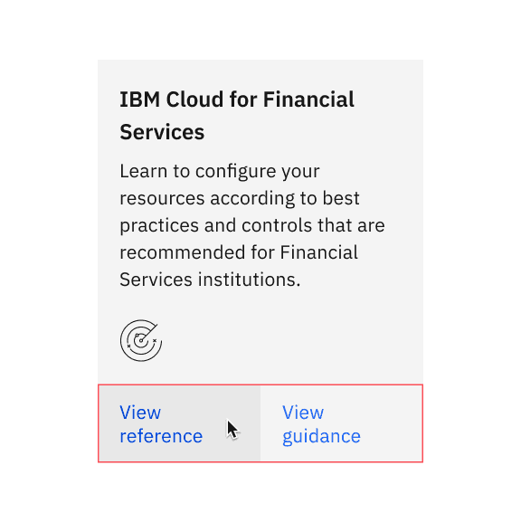
Links can be grouped horizontally or vertically. One variation displays links in a horizontal row with an icon and is typically used within the main body of the page. Vertical links are typically used for resource links on the side of the main page content or additional links in tiles.
Example shows horizontal and vertical grouping of links
Button
Buttons are used to initialize an action. Button labels express what action will occur when the user interacts with it. For further guidance, see Carbon's button.
Tile
Tiles are a highly flexible component for displaying a wide variety of content, including information, getting started, how-to, next steps, and more. For further guidance, see Carbon's tile.
Jakob Nielsen, Guidelines for Visualizing Links (Nielsen Norman Group, 2004)
Feedback
Help us improve this component by providing feedback, asking questions, and leaving any other comments on GitHub.