Color
Enabled and interactive states of menu buttons follow the button style guidelines. Menu buttons can use primary, tertiary, or ghost buttons. Combo buttons can only use a primary button. Overflow menu can only use a ghost button.
The menu used in menu buttons should follow the menu style.
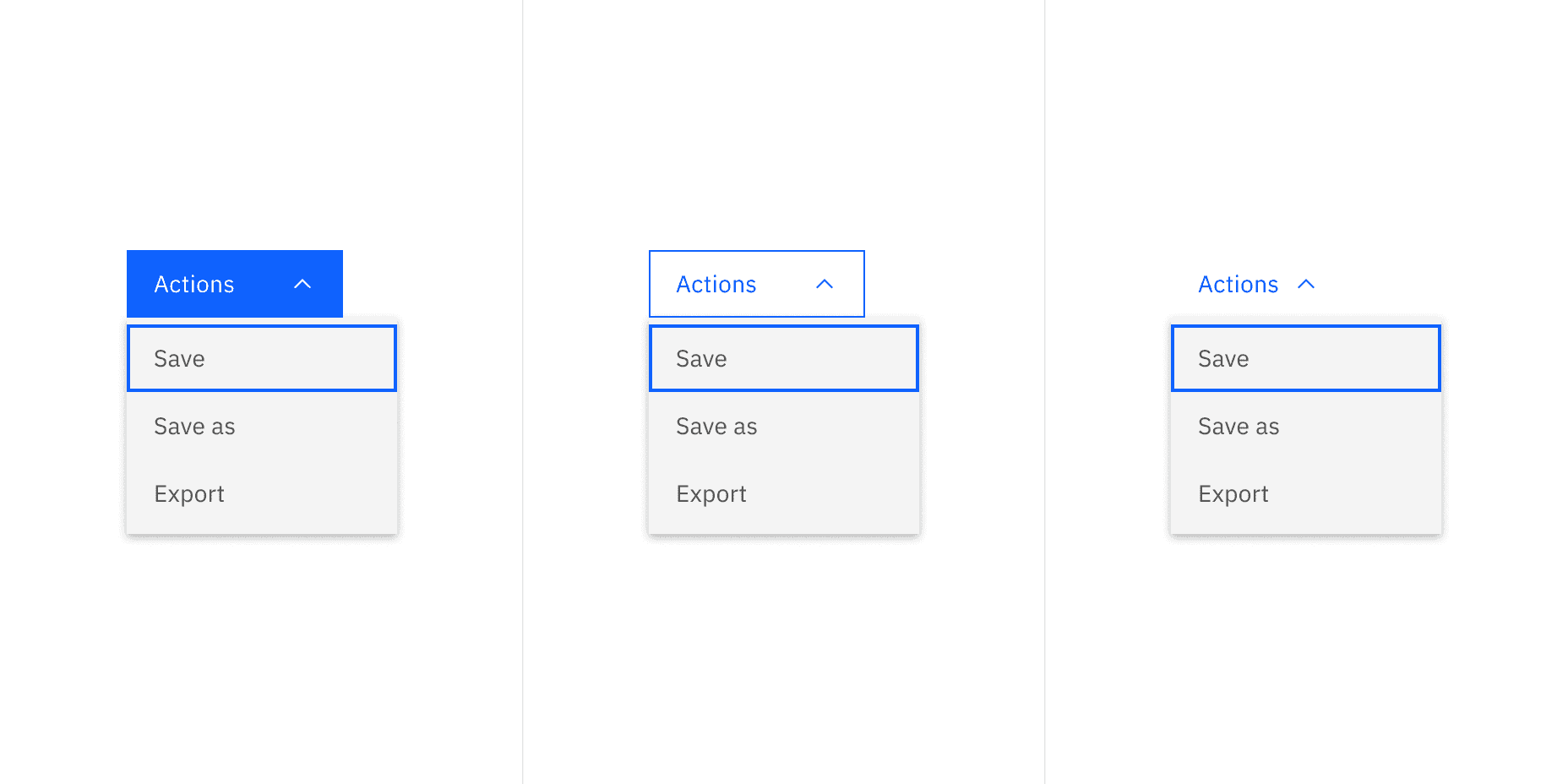
Example of menu button using three different types of buttons
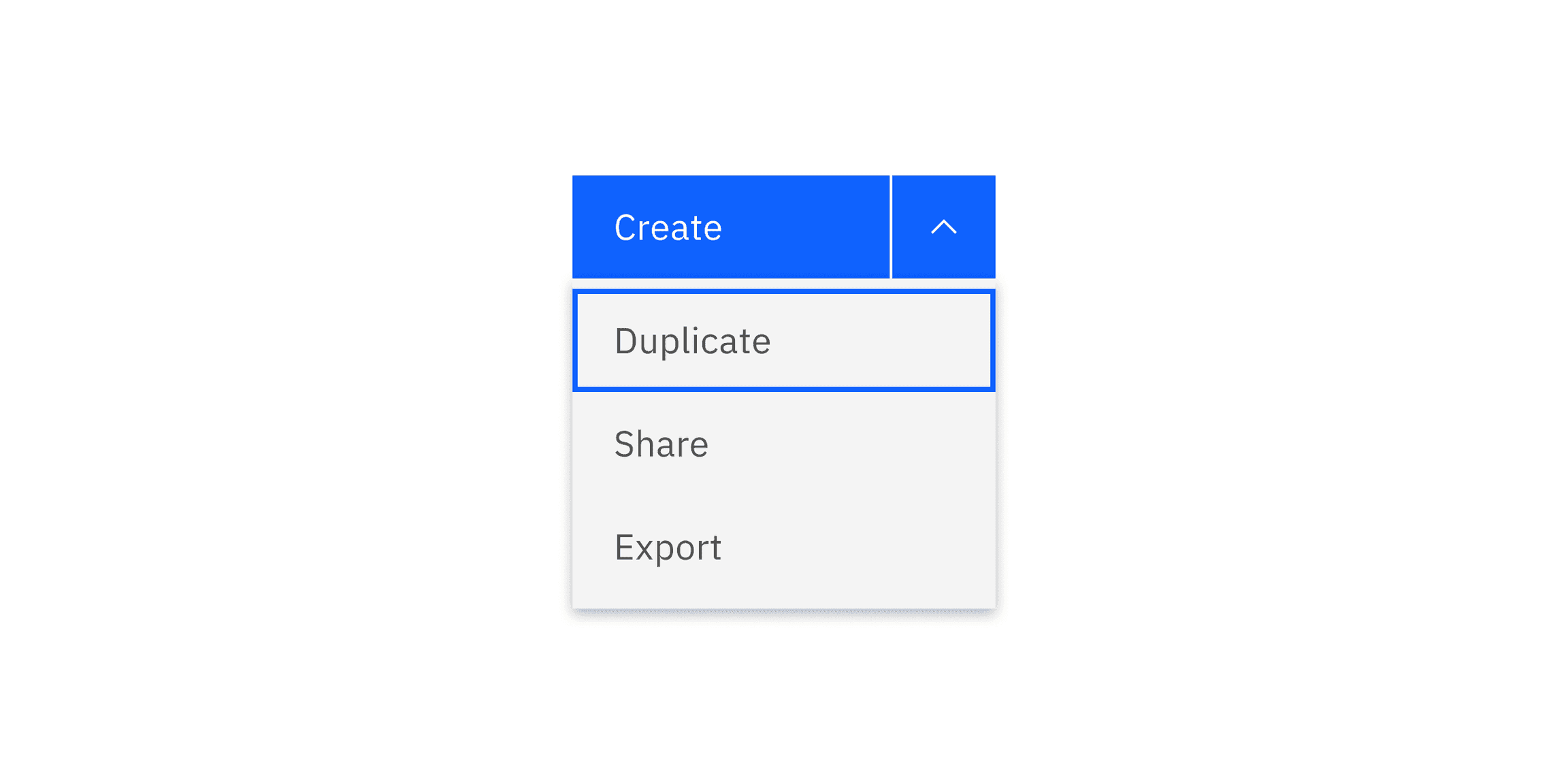
Example of a combo button using a primary button
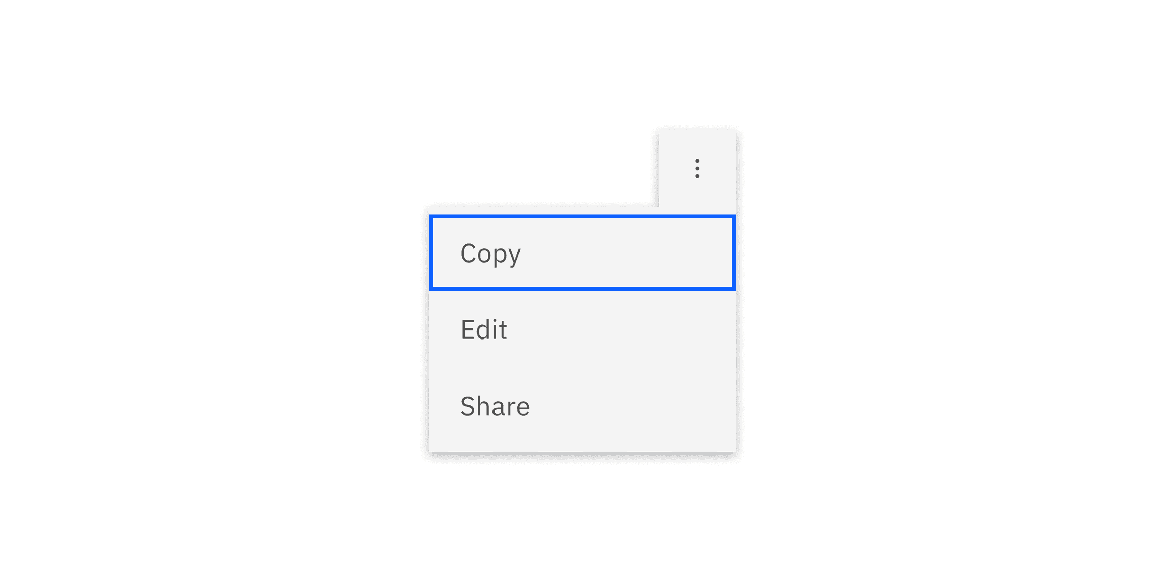
Overflow menu appears as a ghost button when closed and once it opens the color changes to the correct $layer color token to match the menu.
Structure
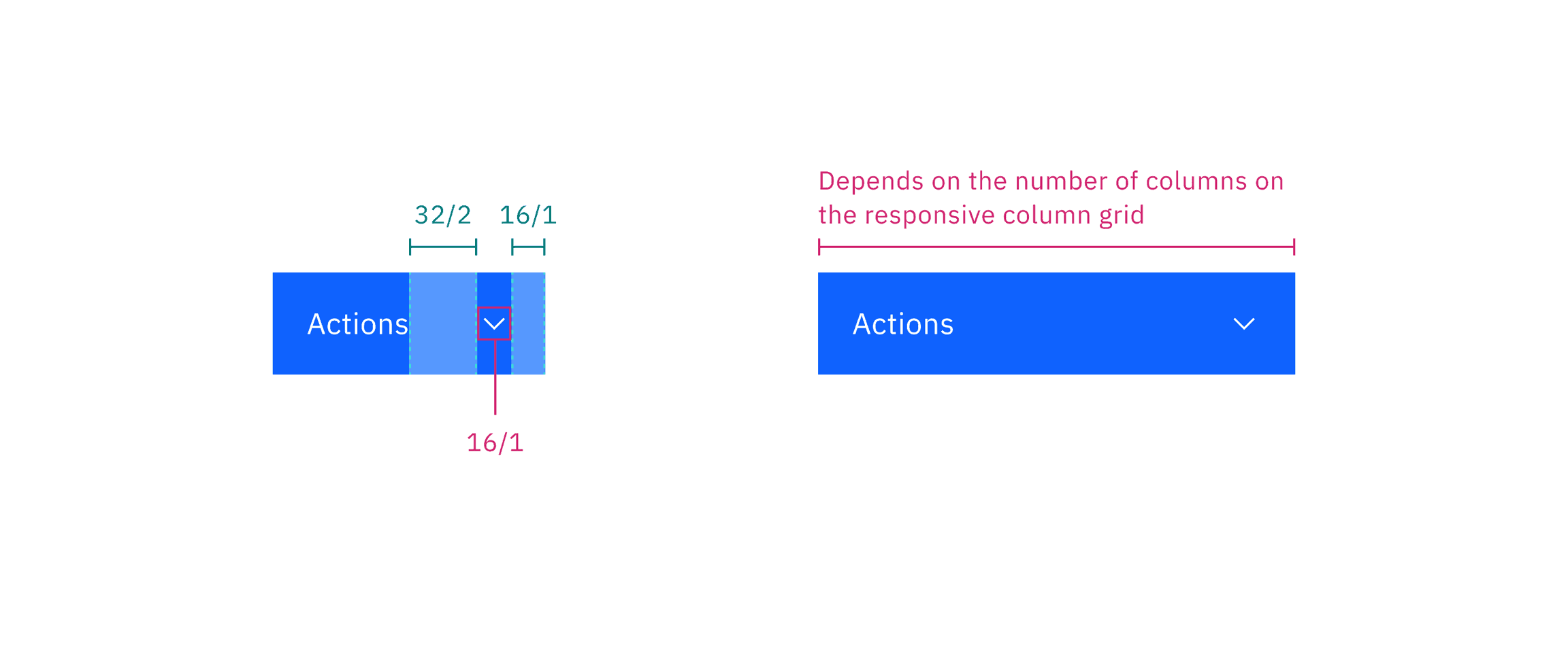
The structure of menu buttons should follow the button style guidelines.
Menu button in default width (left) and menu button in fluid width (right)
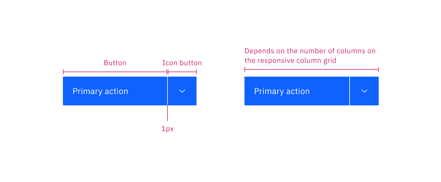
Combo button in default width (left) and menu button in fluid width (right)
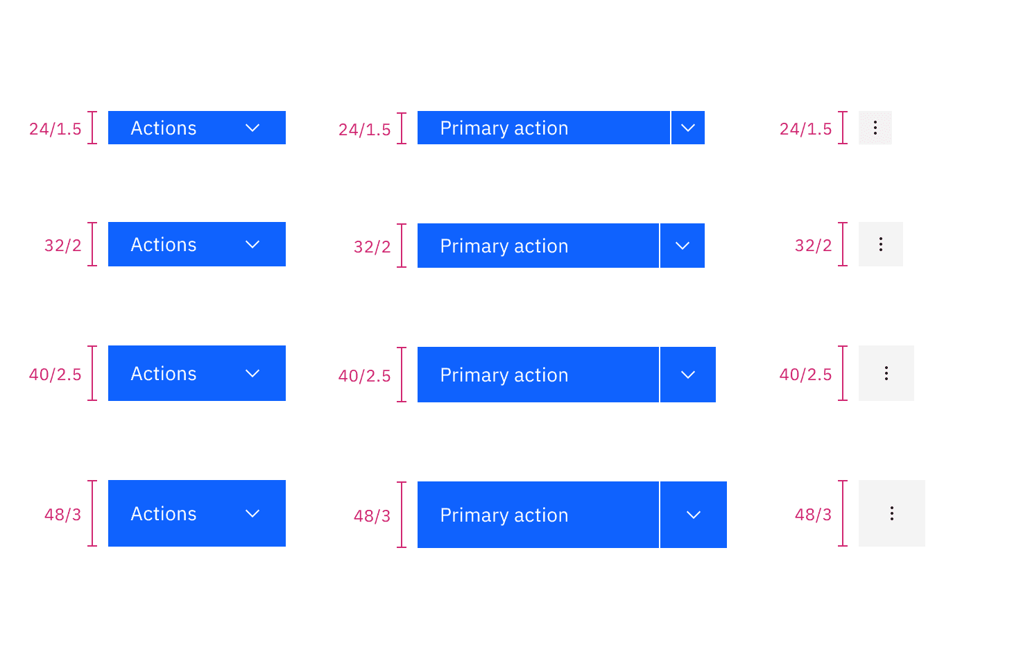
Elements | Size | Height (px/rem) |
|---|---|---|
Button | Extra small (xs) | 24 / 1.5 |
Small (sm) | 32 / 2 | |
Medium (md) | 40 / 2.5 | |
Large (lg) | 48 / 3 |
Feedback
Help us improve this component by providing feedback, asking questions, and leaving any other comments on GitHub.