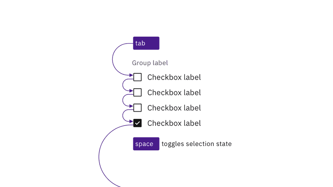
Carbon checkboxes retain expected interactions.
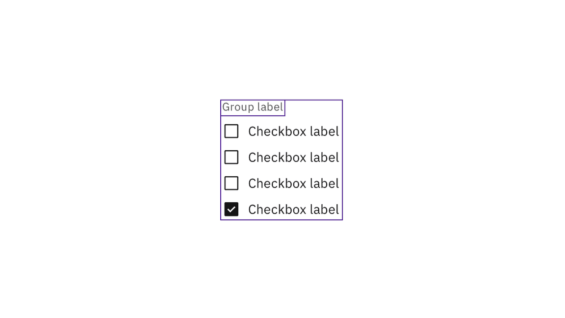
Carbon handles the accessibility of grouped checkboxes.
Meaningful order
Checkboxes can appear in multiple columns. If there is a meaningful order to the items (such as days of the week), annotate whether the tab order is by row or by column. See specify the tab order.
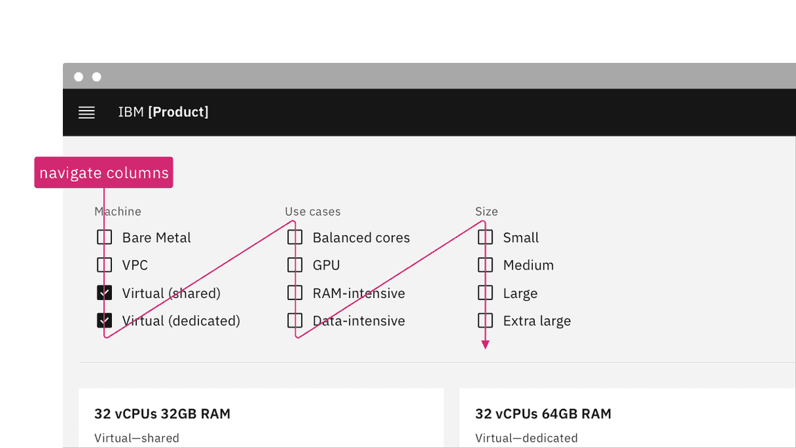
Annotate if there is meaningful navigation order in rows of checkboxes.
- Checkboxes are grouped using
<fieldset>and<legend>. - A tri-state checkbox that is partially checked (indeterminate) has
aria-checkedset to"mixed". See Behaviors on the Guidelines tab for details. - See the ARIA authoring practices for more considerations.
Accessibility testing status
Latest version: 1.112.0 | Framework: React (@carbon/react)
| Component | Accessibility test | Status | Link to source code |
|---|---|---|---|
| Checkbox | Test(s) that ensure the initial render state of a component is accessible. | Passes all automated tests with no reported accessibility violations. | GitHub link |
| Tests that ensure additional states of the component are accessible. This could be interactive states of a component or its multiple variants. | Passes all automated tests with no reported accessibility violations. | ||
| Tests that ensure focus is properly managed, and all interactive functions of a component have a proper keyboard-accessible equivalent. | Passes all automated tests with no reported accessibility violations. | ||
| This manual testing ensures that the visual information on the screen is properly conveyed and read correctly by screen readers such as JAWS, VoiceOver, and NVDA. | A human has manually tested this component, e.g. screen reader testing. |
Feedback
Help us improve by providing feedback, asking questions, requesting features, or leaving any other comments on GitHub.