This live demo contains only a preview of functionality and styles available for this component. View the full demo on Storybook for additional information such as its version, controls, and API documentation.
General guidance
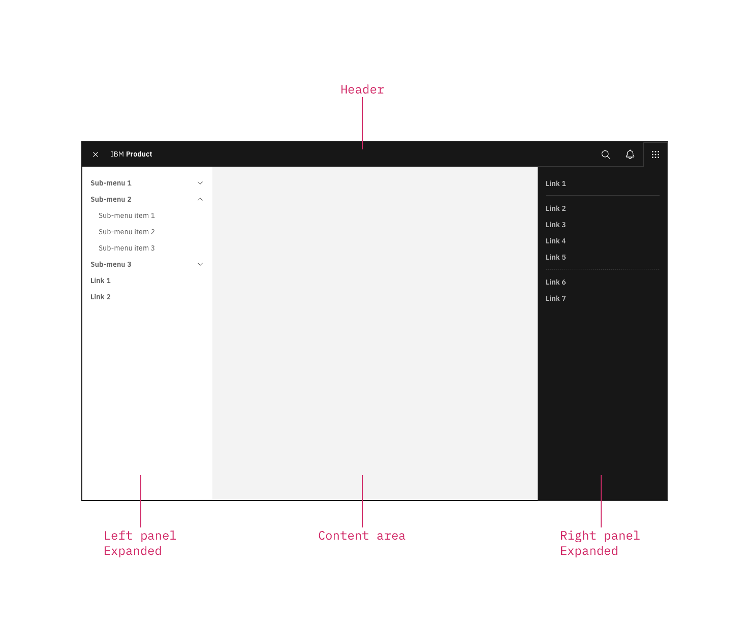
The UI shell is made up of three components: The header, the left panel, and the right panel. All three can be used independently, but the components were designed to work together.
Shell UI component | |
|---|---|
Header | The highest level of navigation. The header can be used on its own for simple products or be used to trigger the left and right panels. |
Left panel | An optional panel that is used for a product’s navigation. |
Right panel | An optional panel that shows additional system level actions or content associated with a system icon in the header. |
UI shell components
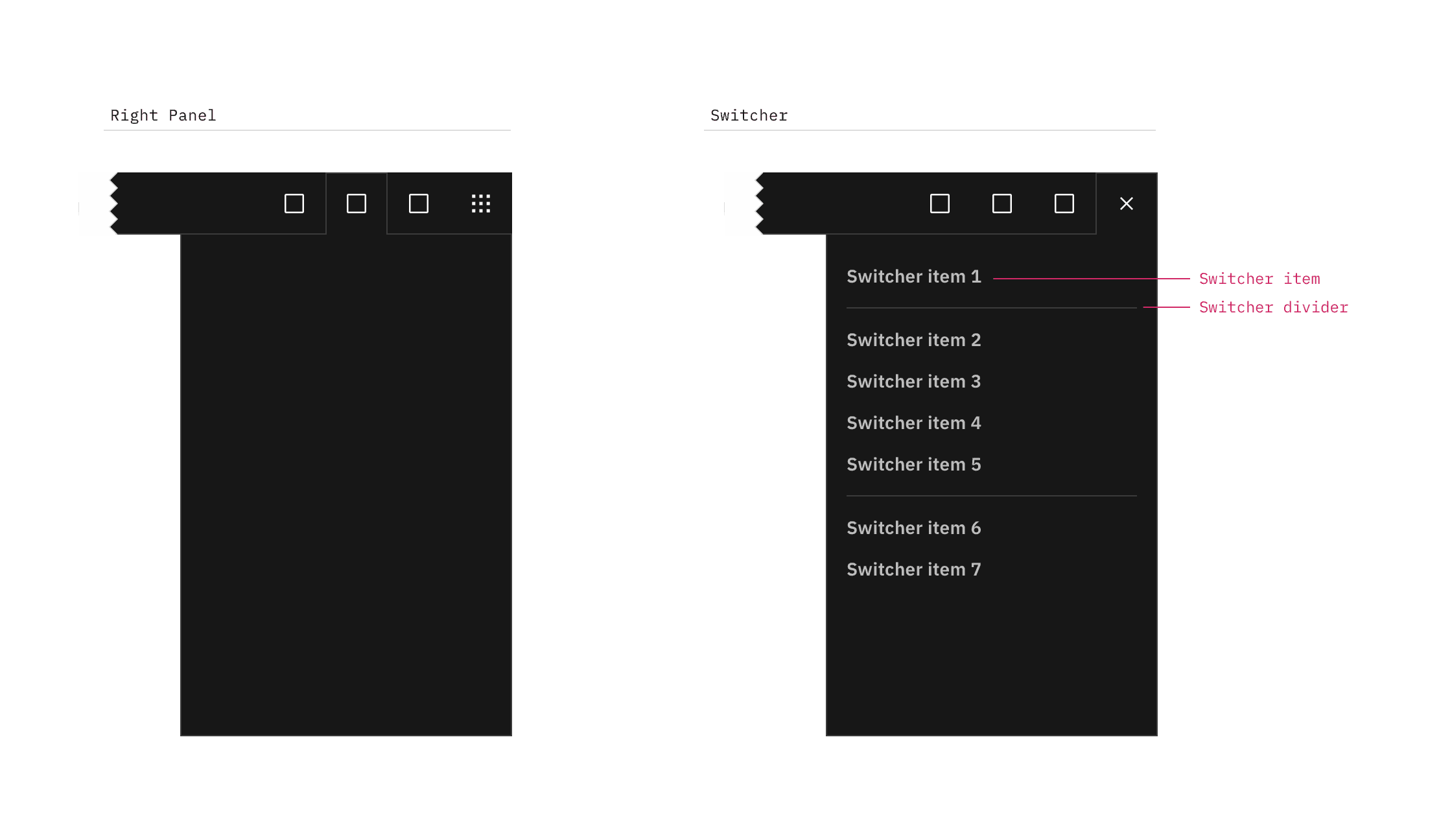
The right panel configured as an empty header panel (left) and a switcher (right).
Switcher item
A switcher item is anything that changes what product, offering, or property occupies the UI shell. Consider moments in a product when you switch from a calendar to a mailbox, from Kubernetes to Catalog. These items belong in the switcher.
Switcher divider
A switcher divider groups similar switcher items. You can use a divider to set apart a parent domain, group child domains similar in hierarchy to the parent, and set apart additional resources. The divider should not be used to separate every switcher item.
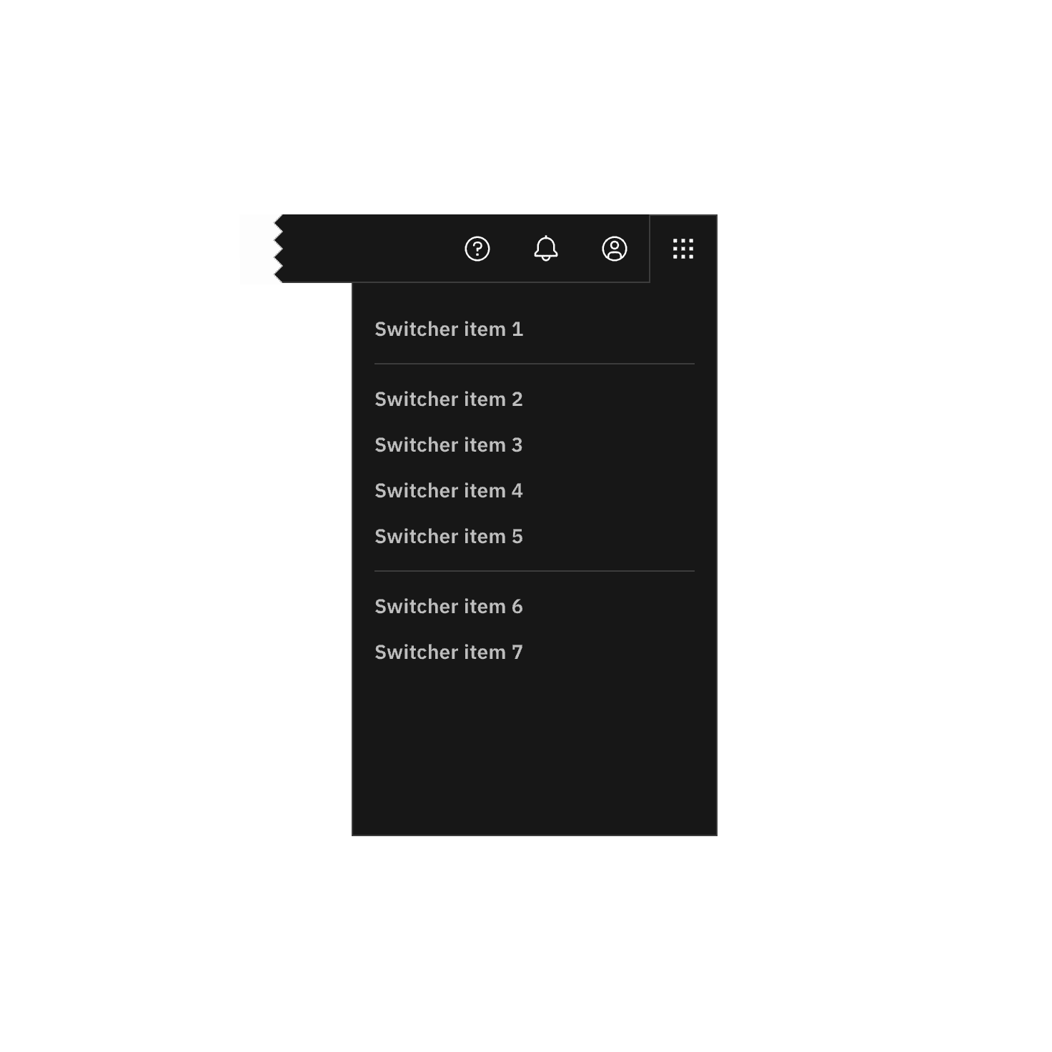
Positioned the switcher to the far right.
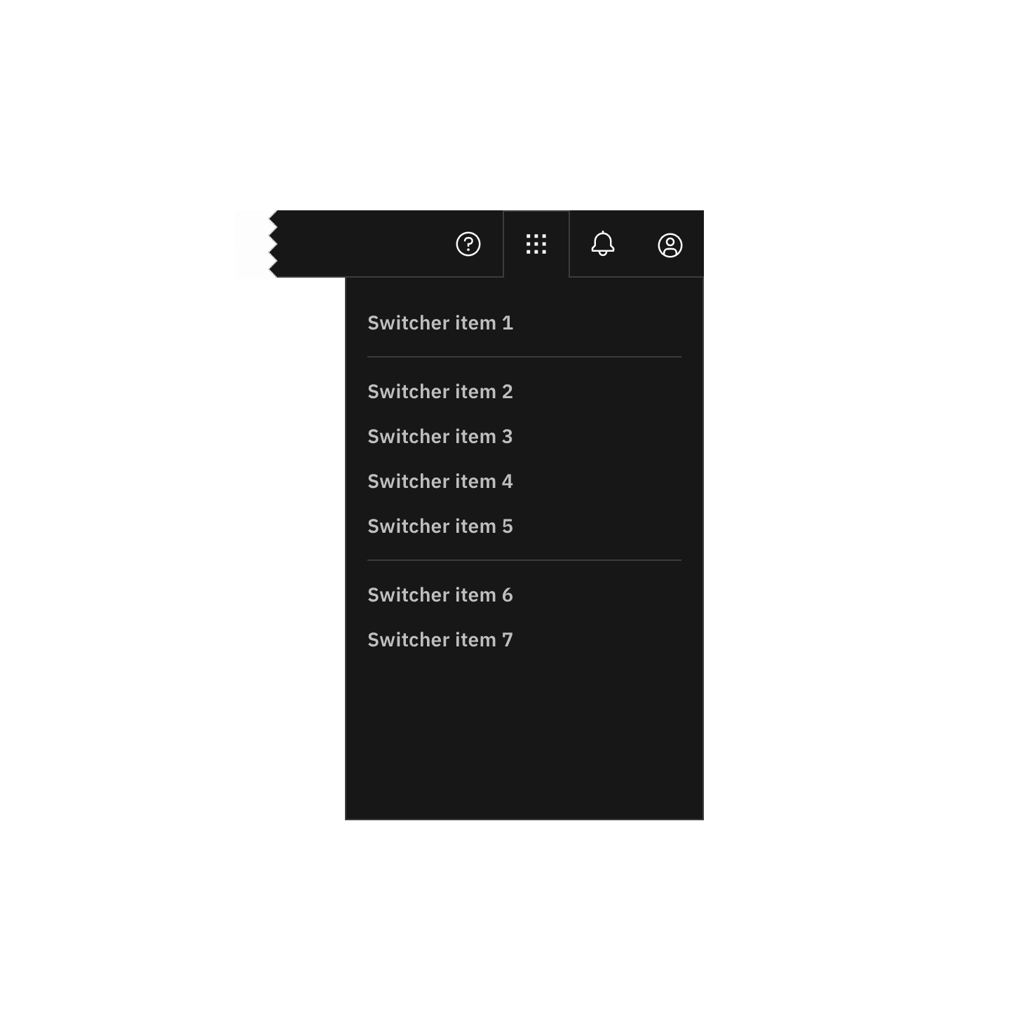
Do not position other icons to the right of the switcher.

Do not use another icon for the switcher.
Feedback
Help us improve this component by providing feedback, asking questions, and leaving any other comments on GitHub.