This live demo contains only a preview of functionality and styles available for this component. View the full demo on Storybook for additional information such as its version, controls, and API documentation.
Overview
A tree view consists of nested heading levels that create a content hierarchy for users and assist with navigating large amounts of information. Following on with the tree analogy, the tree view component has branch nodes that can be expanded or collapsed to reveal or hide child nodes. The tree may also have leaf nodes. Leaf nodes can appear at any level of the tree hierarchy and do not have child nodes.
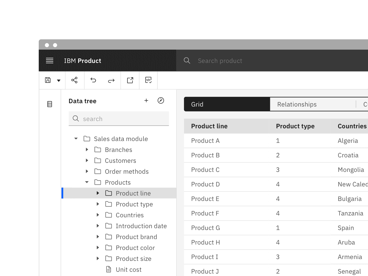
Often used for navigating file system structures that are made up of folders and documents.
To organize large amounts of information that can nest within multiple levels.
- To show and hide UI elements or content on a page.
- When you only need one level of nested information. In this case, use a different component like the accordion or data table for expandable views that go one level deep.
- As the primary navigation in a product's UI. Instead, use the UI Shell left panel for product navigation. A combination of the UI Shell left panel and the breadcrumb component can support an information architecture several levels deep.
Feature flags
A feature flag has been added to tree view to improve accessibility and changes parts of its functionality, not its visual appearance. For code-specific feature flag information, refer to the Code tab. The current tree view is not being deprecated, but teams are encouraged to use the feature flag tree view for their products moving forward. Once the next major release (v12) is released in the future, this feature flag will become the default version of the component.
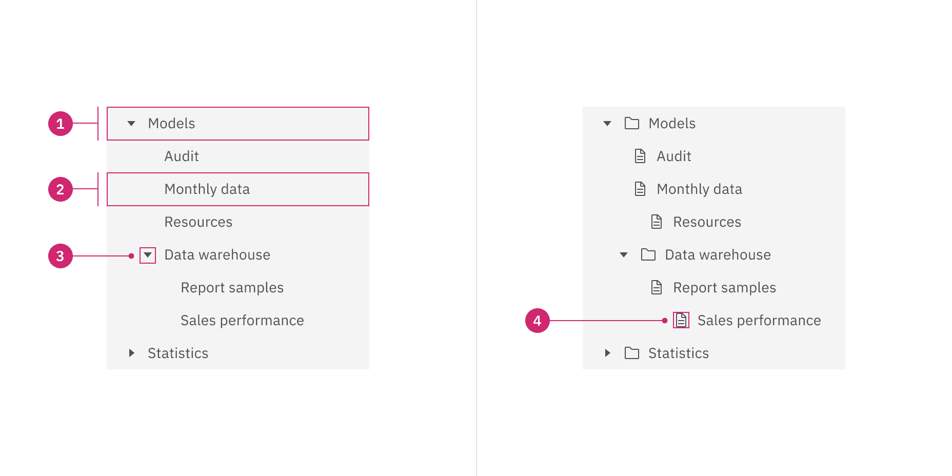
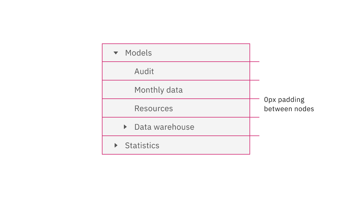
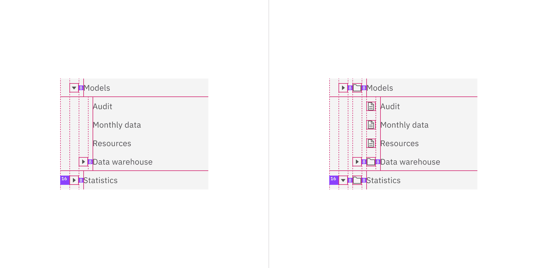
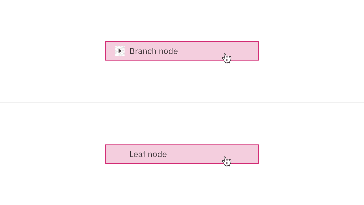
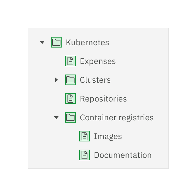
Branch node: A node that has one or more child nodes. Can be expanded or collapsed to reveal or hide child nodes.
Leaf node: A node that has no child nodes and can appear at any level of the tree view hierarchy. A leaf node may be referred to as a child node when it is nested underneath a branch node.
Caret icon: An icon to expand or collapse a branch node.
Node icon (optional): An icon to visually represent and support a node label, they can assist the user to scan different content types quickly.
Sizing
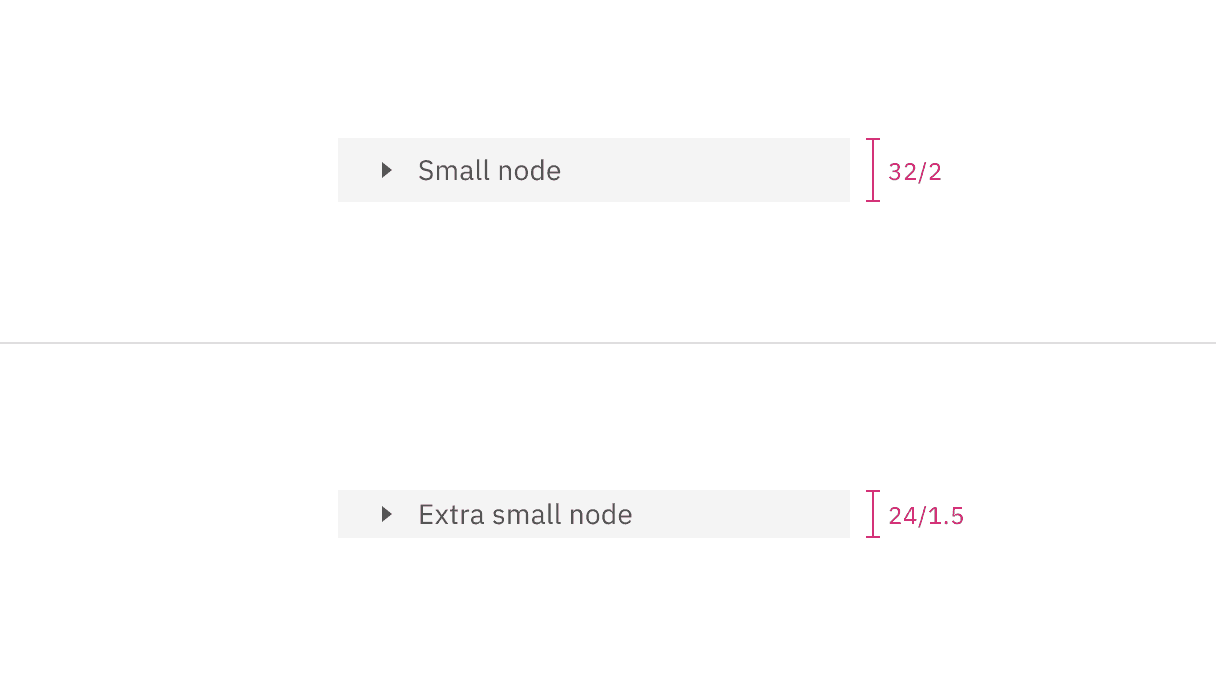
There are two node sizes: small (default), and extra small. Supporting two different node sizes gives you more flexibility when structuring a tree view. If you have a tree structure with complex nesting levels, use the extra small node size to keep as much information in view as possible. When in doubt of which size to use, use the small node size because it is our default.
Node size | Height (px/rem) | Purpose |
|---|---|---|
Small | 32 / 2 | This is the default size and is the most commonly used as it has similar geometries as the UI shell left navigation panel. |
Extra small | 24 / 1.5 | Use when space is constricted on the page and/or when you need a more condensed view to show more of the tree view on the screen. |
Overflow content
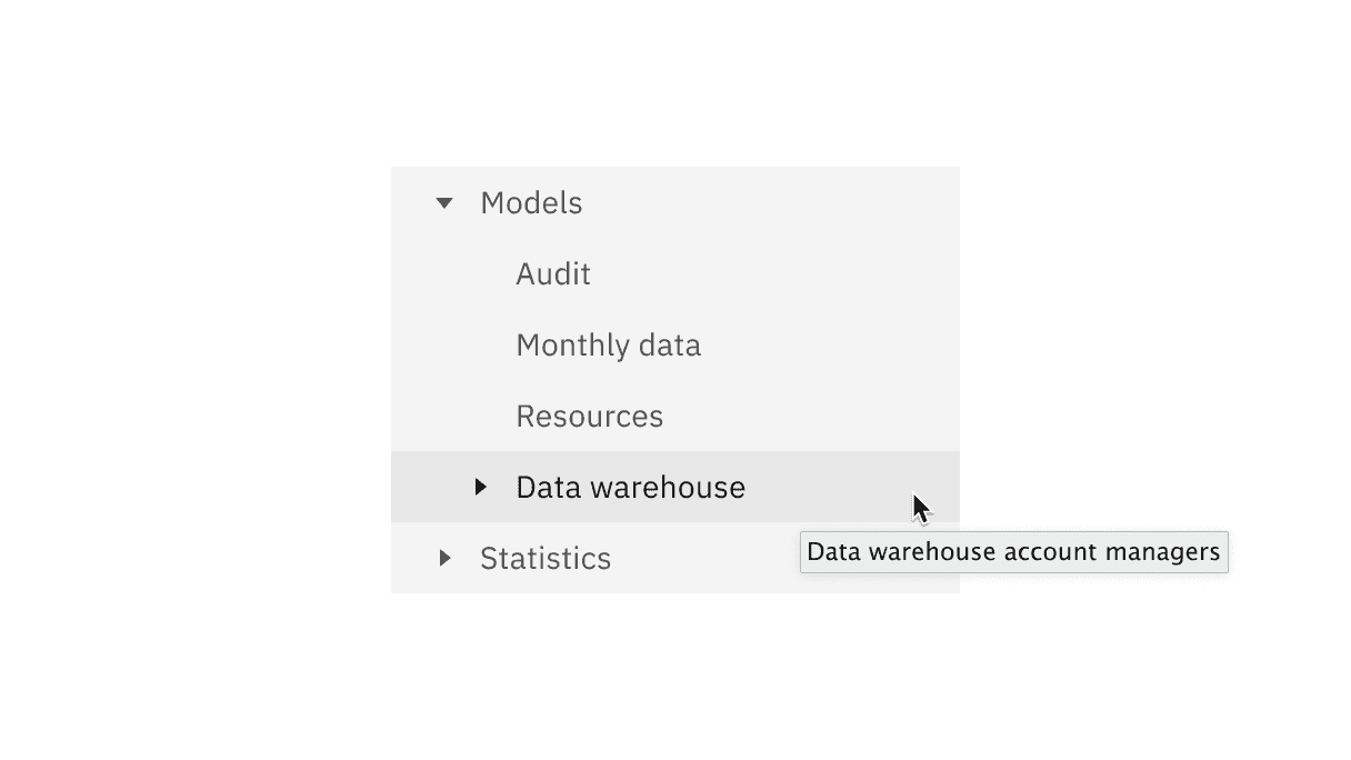
If the node label is too long for one line in your tree view, add an ellipsis … and accompany with a browser-based tooltip to show the full string of text. While truncation is not preferred, you can customize the view by positioning the ellipsis at the front-line, mid-line, or end-line of a node label depending on what information is most useful to the user to keep persistent in the tree view.
Further guidance
For further content guidance, see Carbon's content guidelines.
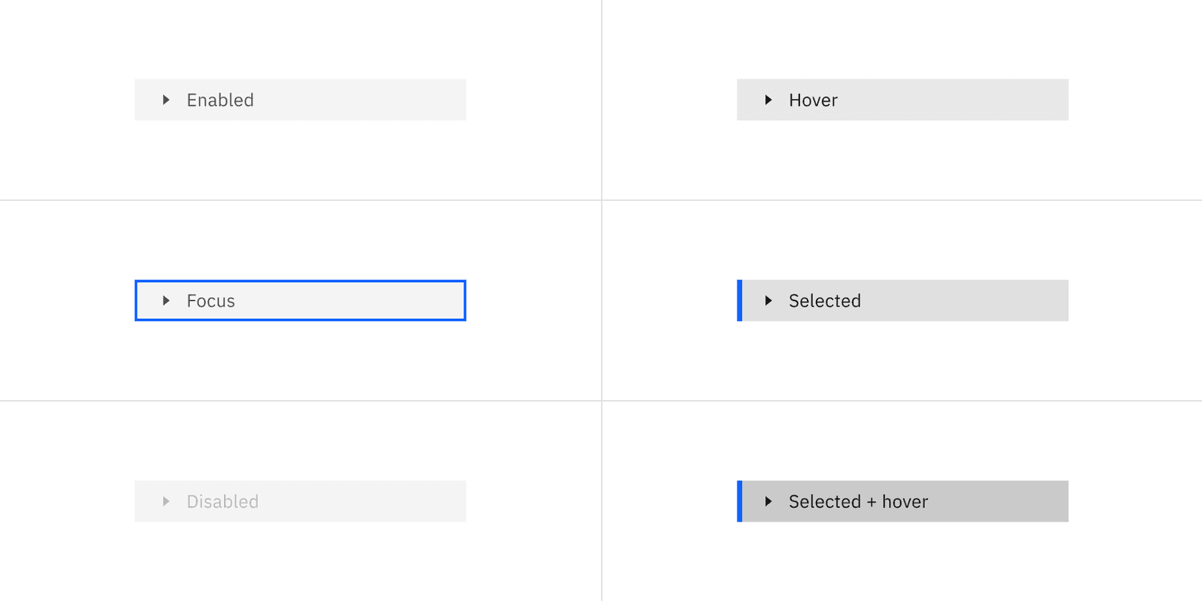
Focus is set on the previously selected node.
If none of the nodes were selected before the tree receives focus, focus is set on the first node.

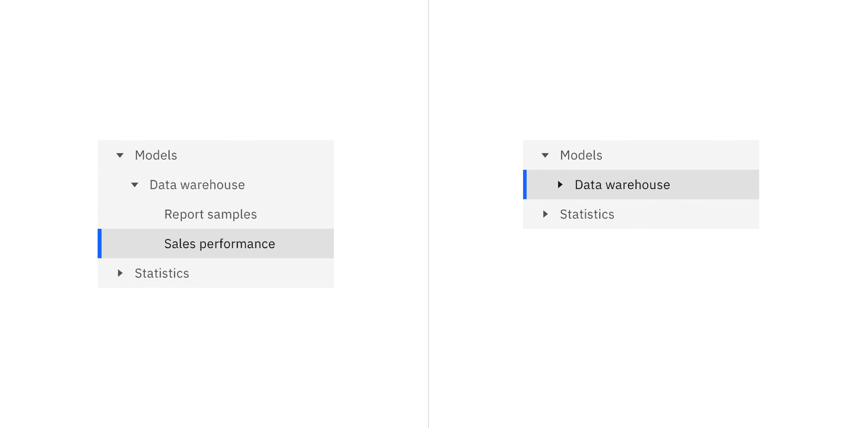
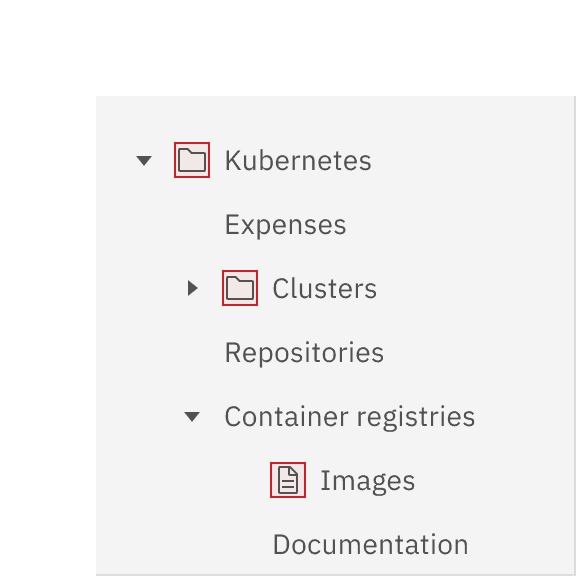
To select a branch node the user can click anywhere on the node excluding the caret icon bounding box.
To select a leaf node the user can click anywhere on the node container.
Key | Interaction |
|---|---|
Right arrow | When focus is on a closed node, opens the node; focus does not move. |
When focus is on an open node, moves focus to the first child node. | |
When focus is on a leaf node, does nothing. | |
Left arrow | When focus is on an open node, closes the node. |
When focus is on a child node that is also either a leaf node or a closed node, moves focus to its parent node. | |
When focus is on a top level node that is also either a leaf node or a closed node, does nothing. | |
Down arrow | Moves focus to the next node that is focusable without opening or closing a node. |
Up arrow | Moves focus to the previous node that is focusable without opening or closing. |
Enter | Activates a node. In single-select trees where selection does not follow focus, the default action is typically to select the focused node. |
Node icons
You can add node icons to visually represent and support a written node label. We recommend having consistent icon usage for all branch and leaf nodes. Make sure the icons accurately represent each node that they are related to. Using a folder icon for branch nodes and a document icon for leaf nodes is a commonly recognized pairing of icons used in tree view structures. If individual node data cannot be identified, do not display icons. When in doubt, use nodes without icons.
Tree view versus accordion
Use the accordion component when you need to organize lengthy information in sections that only go one level deep. Tree view is best used for nesting categories of information in a hierarchy of multiple levels / in a hierarchical form.
Tree view versus UI Shell left panel
Use the UI Shell left panel component for product navigation. A combination of the UI Shell left panel and the breadcrumb component can support an information architecture several levels deep of a product. Tree view is best used for on page navigation instead of being used for architecture of a website or product.
Tree view versus data table
Use the data table component for displaying large amounts of detailed information that is easy to scan horizontally in one view. Data table rows can be expanded, but we recommend only expanding a row one level deep. Tree view is used to organize multiple nested levels of information with concise labels that do not need to be organized in a column structure.
Feedback
Help us improve this component by providing feedback, asking questions, and leaving any other comments on GitHub.