Element | Property | Color token |
|---|---|---|
Handle | fill |
|
Track | background-color |
|
Track: filled | background-color |
|
Label | text-color |
|
Rangel label | text-color |
|
* Denotes a contextual color token that will change values based on the layer it is placed on.
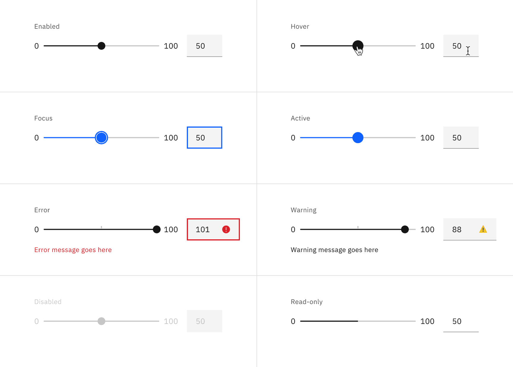
Interactive states
Slider uses a number input to type in values. See number input for more information on its interactive states.
State | Element | Property | Color token |
|---|---|---|---|
Focus | Handle | border |
|
Track | background-color |
| |
Active | Handle | fill |
|
Track | background-color |
| |
Error | Number input | border |
|
Error icon | svg |
| |
Error message | text-color |
| |
Warning | Warning icon | svg |
|
Warning message | text-color |
| |
Disabled | Label | text-color |
|
Range label | text-color |
| |
Handle | fill |
| |
Track | background-color |
| |
Read-only | Label | text-color |
|
Range label | text-color |
| |
Track | background-color |
| |
Track: filled | background-color |
|
* Denotes a contextual color token that will change values based on the layer it is placed on.
* Denotes a contextual color token that will change values based on the layer it is placed on.
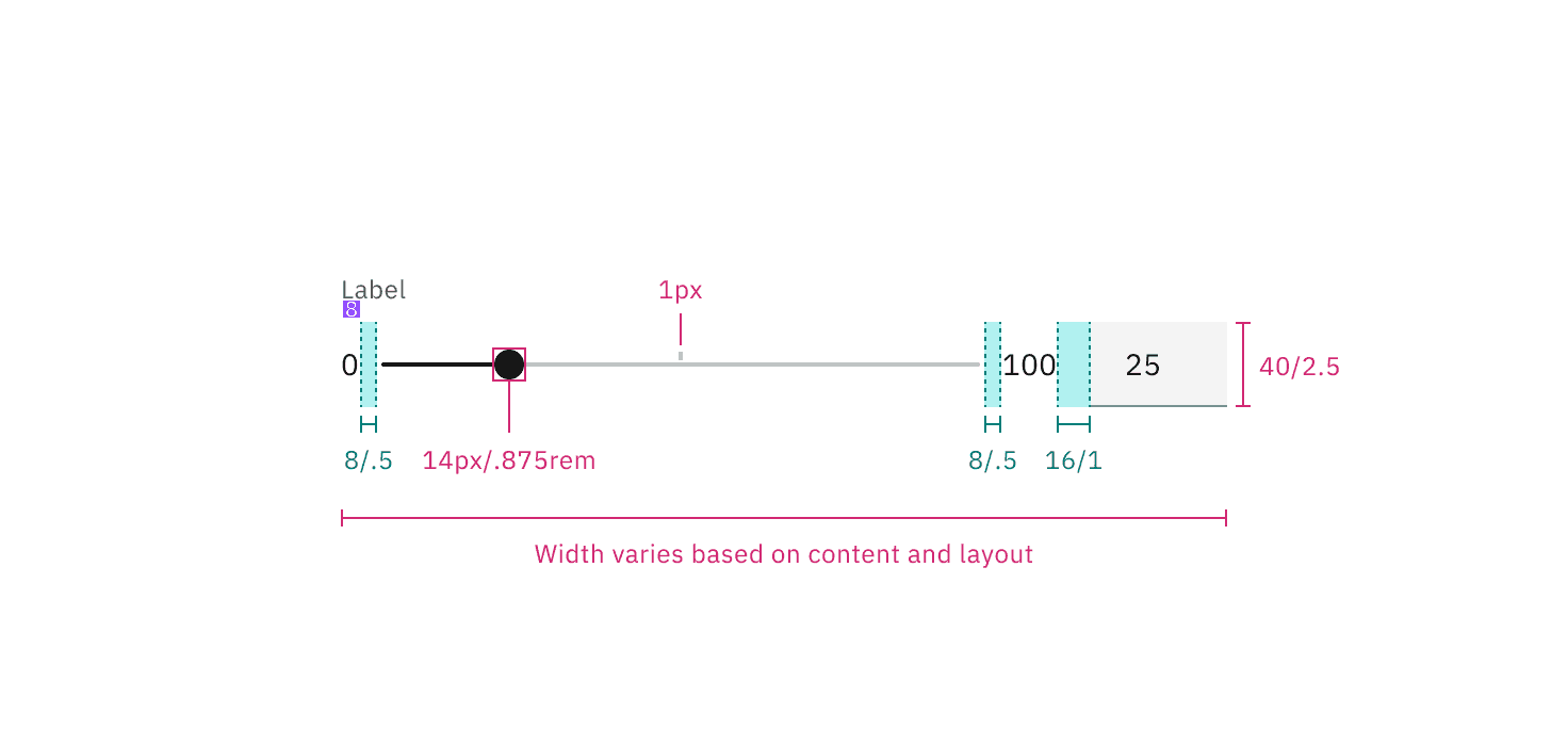
Element | Property | px / rem | Spacing token |
|---|---|---|---|
Handle | height, width | 14 / 0.875 | – |
Handle: active | height, width | 20 / 1.25 | – |
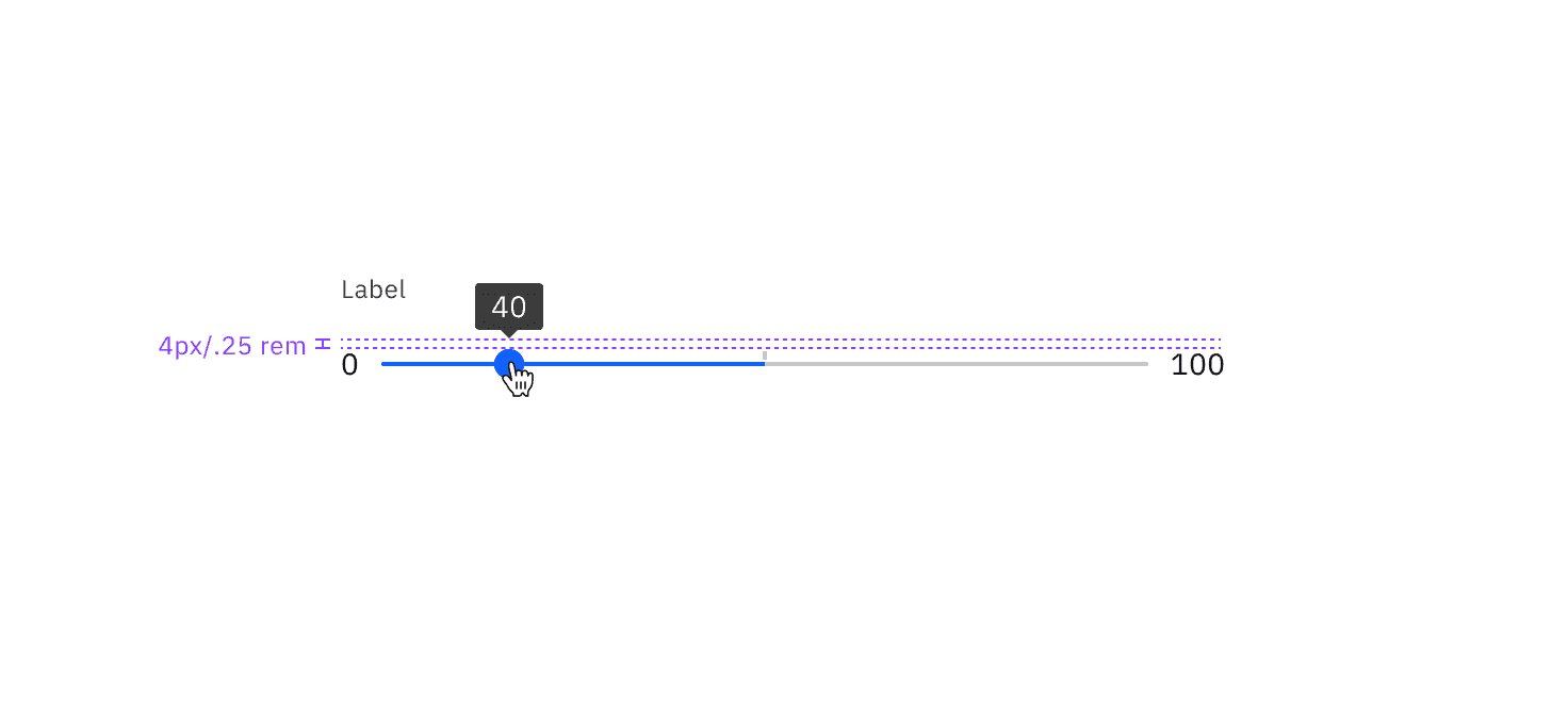
Track | height | 4 / 0.25 | – |
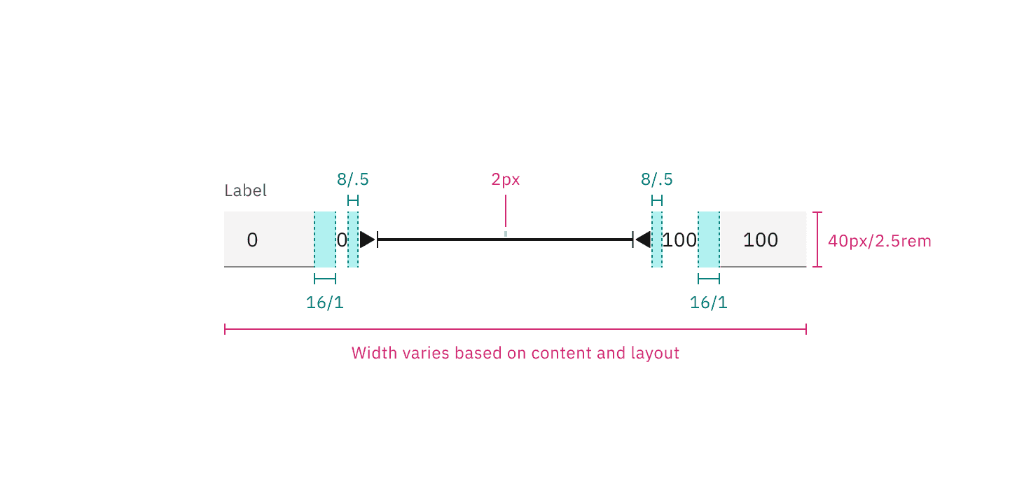
margin-left, margin-right | 8 / 0.5 |
| |
Label | margin-bottom | 8 / 0.5 |
|
Range label | margin-right | 16 / 1 |
|
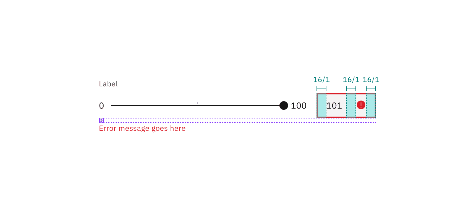
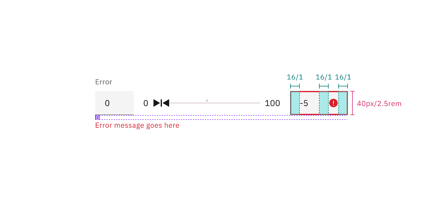
Error message | margin-top | 16 / 1 |
|
Error icon | padding-right, padding-left | 16 / 1 |
|
Tooltip | padding-bottom | 4 / 0.25 |
|
Element | Property | px / rem | Spacing token |
|---|---|---|---|
Handle | height, width | 16 / 1 |
|
Handle: active | height, width | 16 / 1 |
|
Track | height | 4 / 0.25 | – |
margin-left, margin-right | 16 / 1 |
| |
Label | margin-bottom | 8 / 0.5 |
|
Range label | margin-right | 16 / 1 |
|
Error message | margin-top | 16 / 1 |
|
Error icon | padding-right, padding-left | 16 / 1 |
|
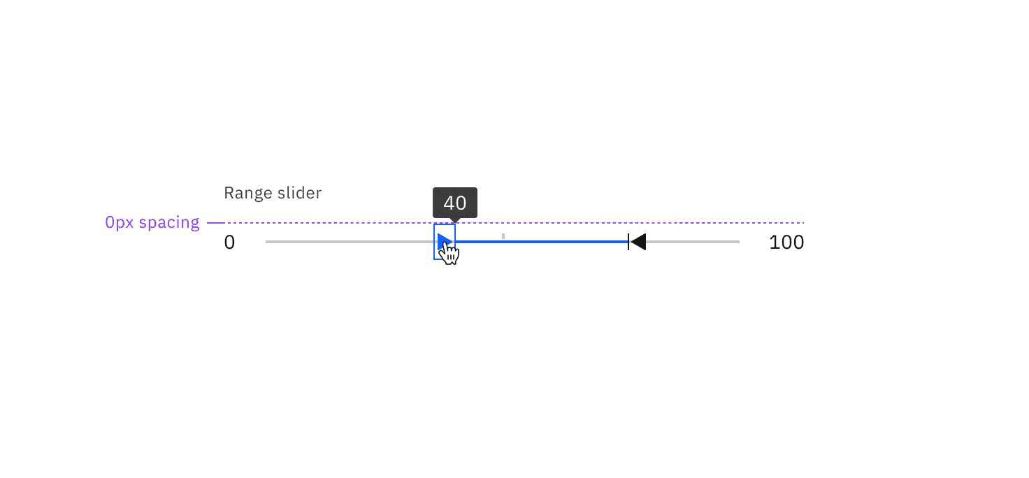
Tooltip | padding-bottom | 0 | – |
Feedback
Help us improve this component by providing feedback, asking questions, and leaving any other comments on GitHub.