
Typography
Label text is not included with the loading indicator by default. If including text, it is recommended to use body-compact-01 with the large indicator or with the small indicator. See more specific typography guidance on the inline loading Specification tab.
Size
There are two loading indicator sizes: large and small. For more information about specific use cases for each loading indicator size, see the sizing section on the Usage tab.
Element | Size | Height (px / rem) |
|---|---|---|
Indicator | Large (lg) | 88 / 5.5 |
Small (sm) | 16 / 1 |
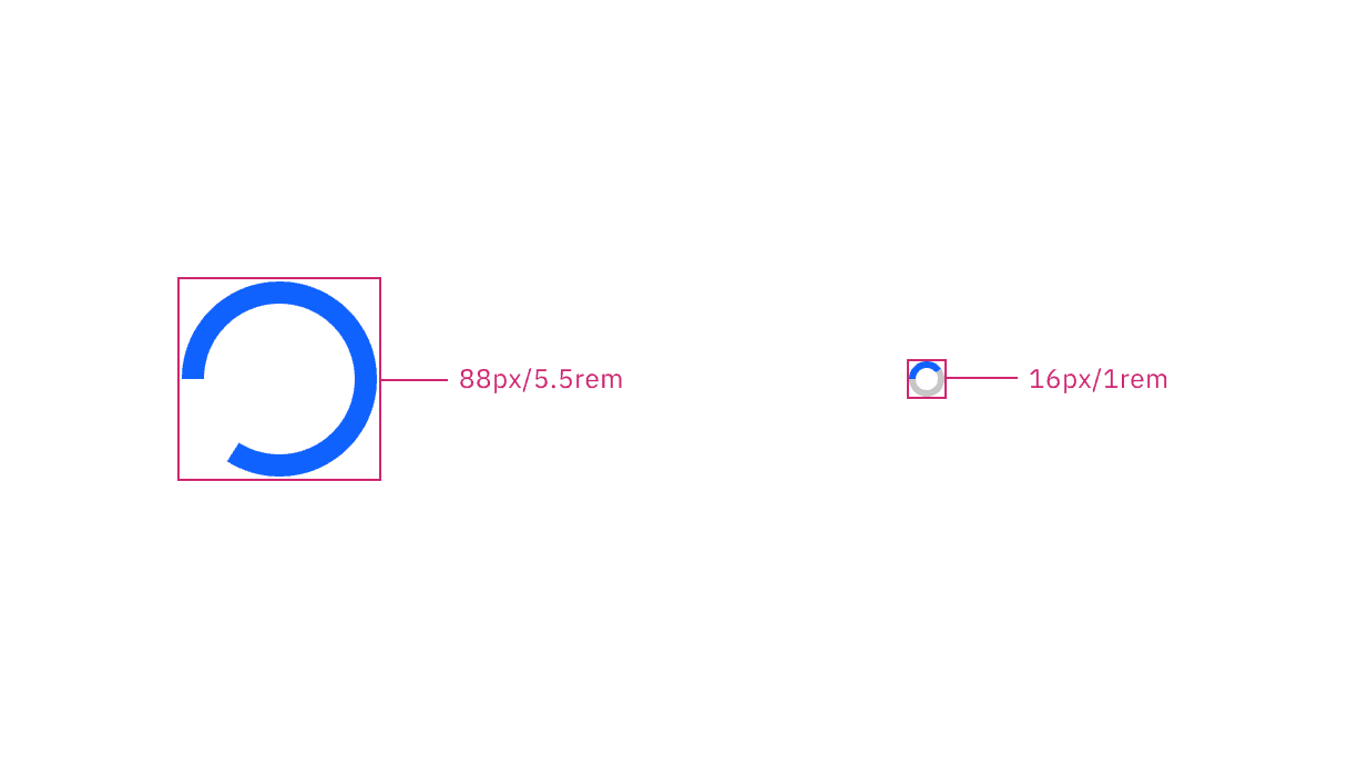
Large and small indicator sizes
Feedback
Help us improve this component by providing feedback, asking questions, and leaving any other comments on GitHub.