Inline loading

Stable
Last updated Jul 1, 2026

The inline loading component provides visual feedback that data is being processed.

Inline loading

Color

Class

Property

Color token

.cds--loading__background

stroke

$border-subtle *

.cds--loading__stroke

stroke

$border-interactive

.cds--inline-loading__text

color

$text-secondary

status: finished

svg

$support-success

status: finished

svg

$support-error

* Denotes a contextual color token that will change values based on the layer it is placed on.

Example of inline loading states

Typography

Text should be set in sentence case, with only the first word in a phrase and any proper nouns capitalized.

Element

Font-size (px/rem)

Font-weight

Type token

Text

14 / 0.75

Regular / 400

$body-compact-01

Structure

Class

Property

px / rem

Spacing token

Spinner

width, height

16 / 1

Checkmark

width, height

16 / 1

Inline loading spinner structure measurements

Placement

The inline loading component should appear during any user action loading. If button is used to trigger the action, the inline loading component should replace that button.

Inline loading spinner in context example

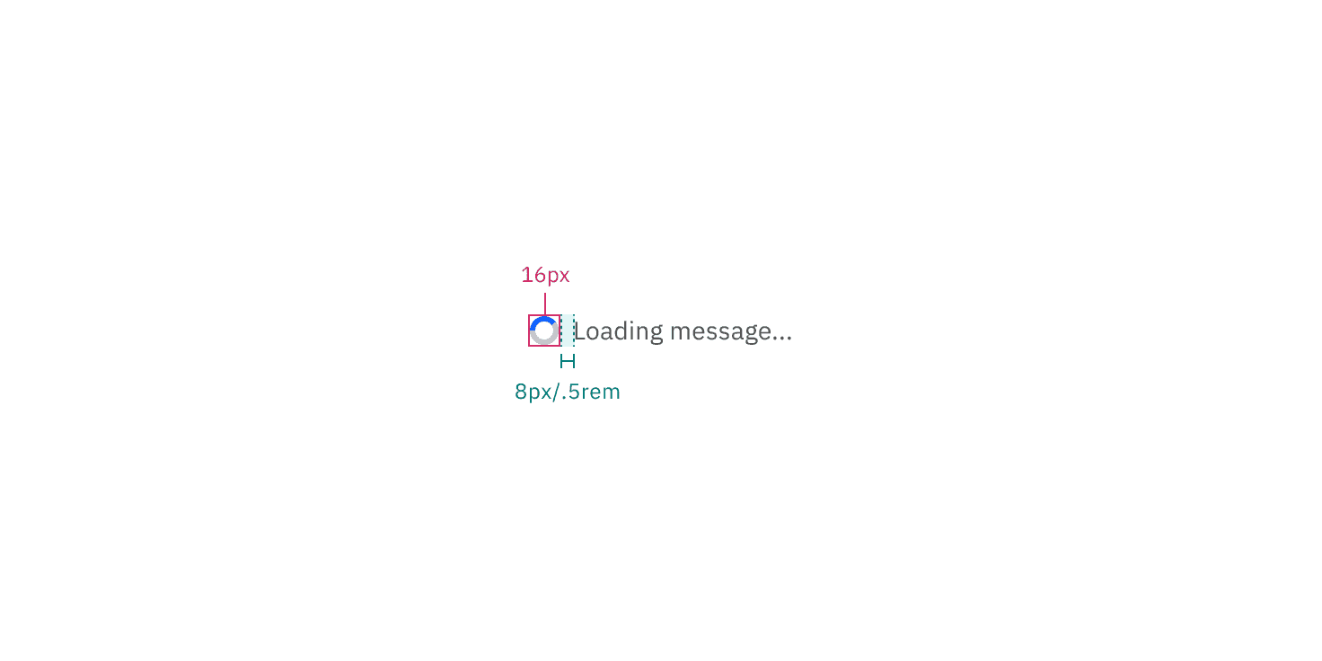
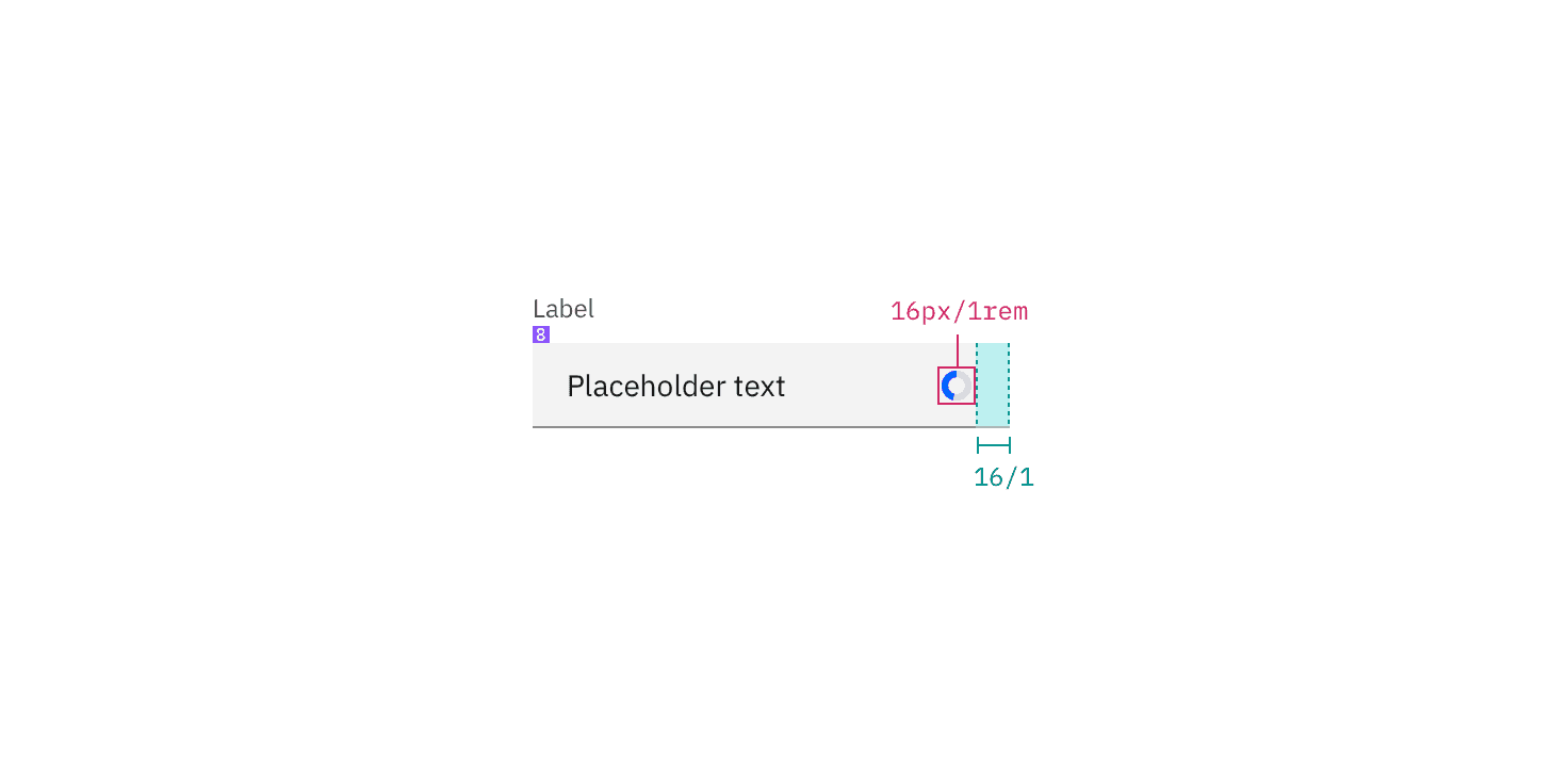
Structure measurements for small and large loading spinner | px / rem
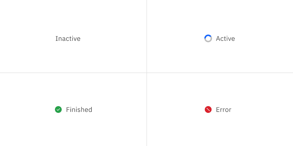
Feedback

Help us improve this component by providing feedback, asking questions, and leaving any other comments on GitHub.