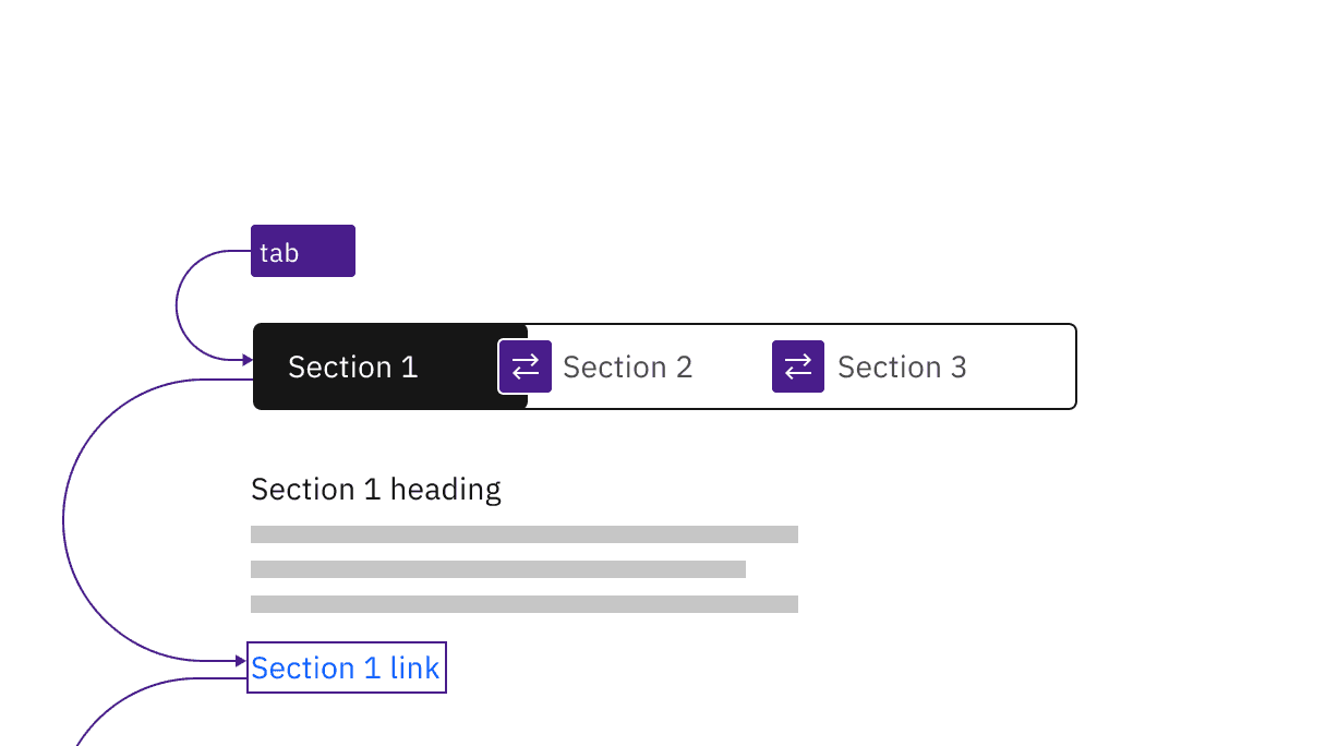
Manual and automatic content switchers have the same basic keyboard interaction.
Manual and automatic content switchers have the same basic keyboard interaction.
Automatic and manual switchers differ in how they are activated. The following illustration shows what will happen for each variant when a right arrow key is pressed with the All content tab selected and focused.
For automatic switchers, focus and selection are synchronized. When the user arrows to a tab, it is selected and the content section under the switcher is updated in real time.
Manual switchers allow the user to arrow between the content tabs without updating the content section underneath. When the user right arrows, the All content tab remains selected while focus moves to the Read tab. In order to select the Read tab (and update the content section under the switcher) the user would press Enter or Space.
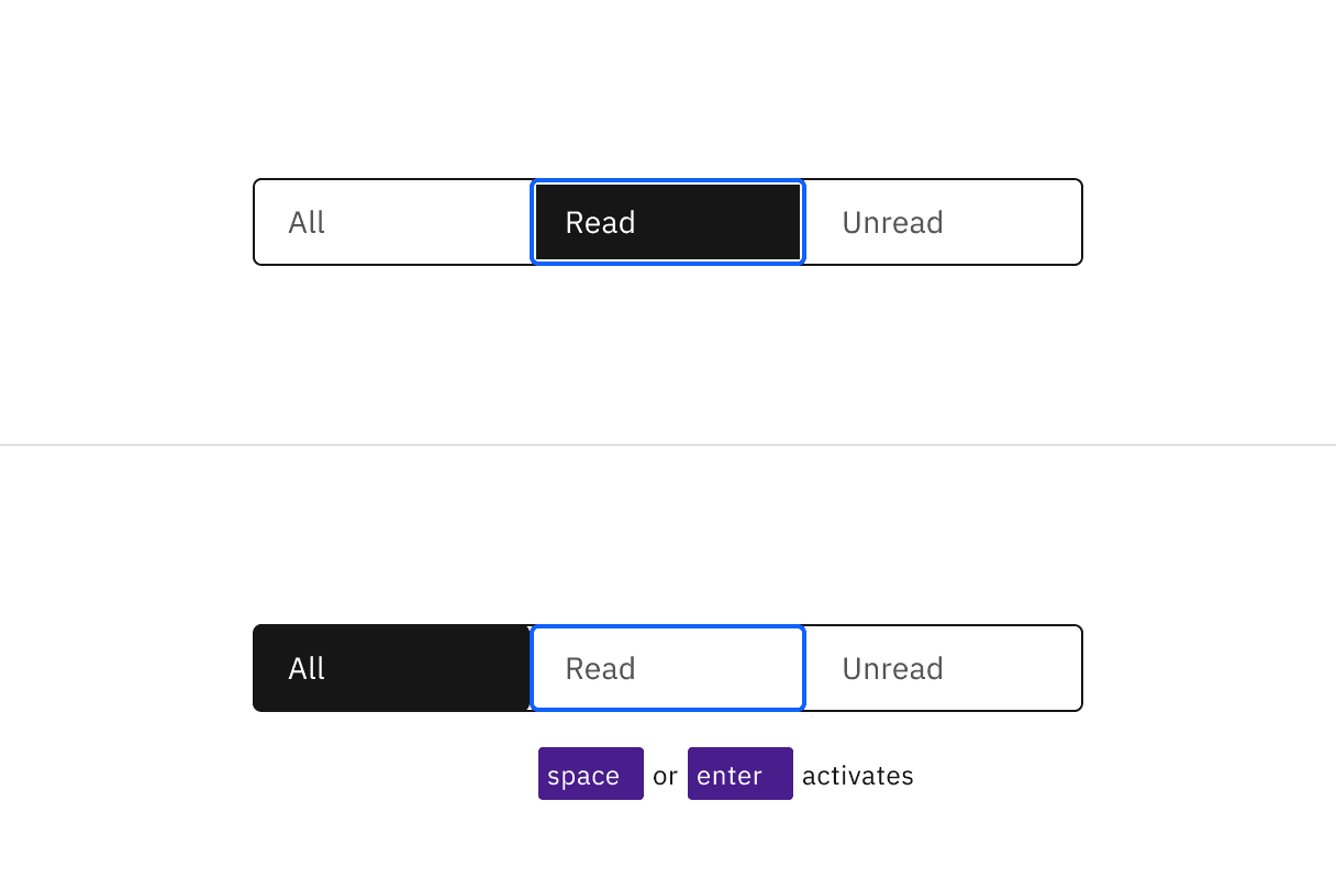
Arrows keys alone update the selected tab in an automatic content switcher. The Space and Enter keys are used to select a content tab after arrowing to it in a manual variant.
Indicate which variant to implement
The automatic and manual switchers are visually indistinguishable in a wireframe, so designers should annotate which variant the team has decided to implement. Since the choice largely concerns technical considerations about potential latency when updating the content section’s information, architects or developers should be involved in the discussion.
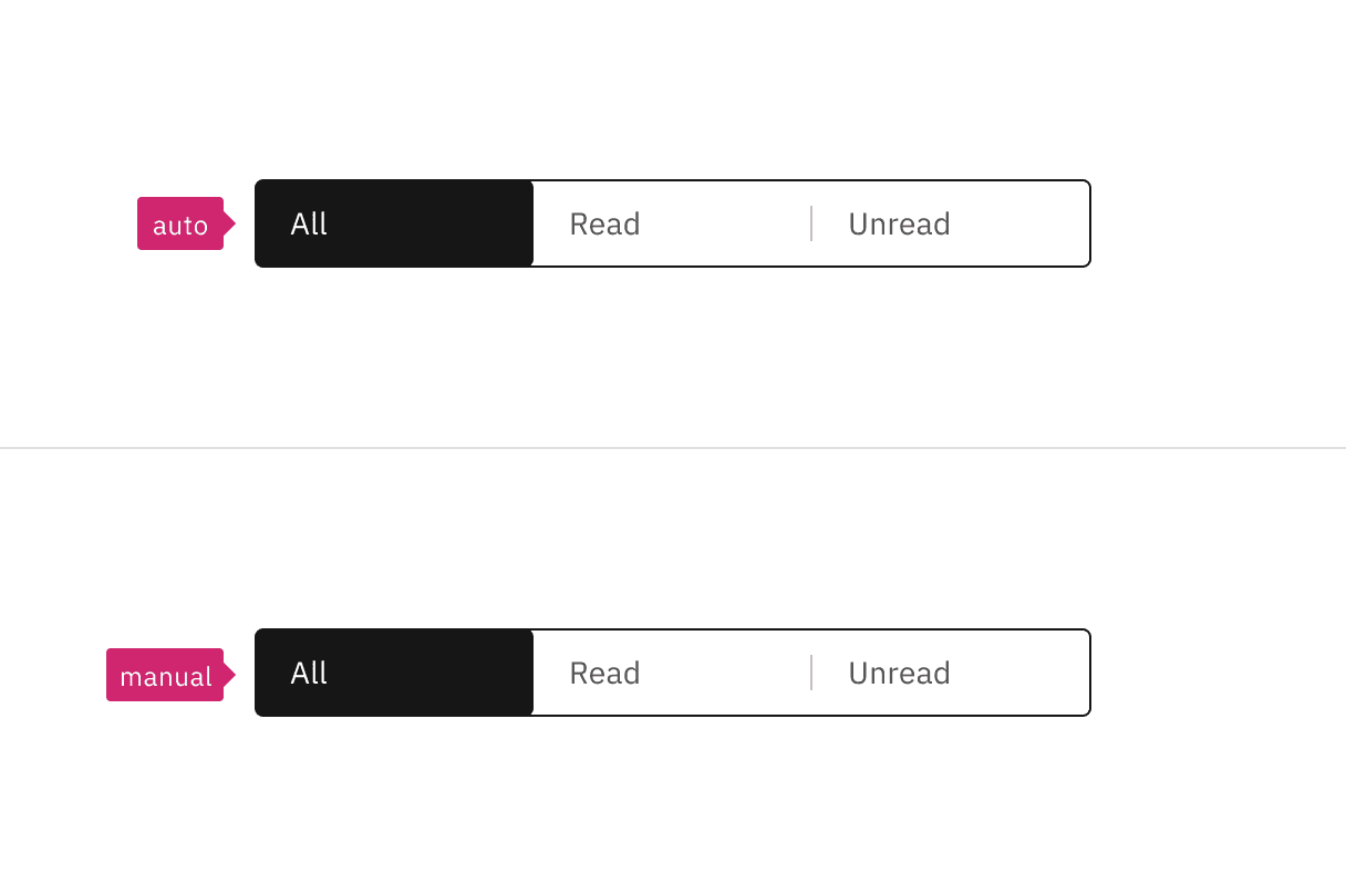
Annotate whether the switcher should be implemented as automatic or manual.
The Content switcher is implemented as a
tablist, with each content tab implemented as abuttonwith a role oftab.The selected content tab has attributes
aria-selected="true"andtabindex="0". All other tabs have these attribute values set to"false"and"-1".See the ARIA authoring practices guidance for tabs for more considerations.
For accessibility considerations for manual content switchers, see Deciding when to make selection automatically follow focus.
Accessibility testing status
Latest version: 1.109.0 | Framework: React (@carbon/react)
| Component | Accessibility test | Status | Link to source code |
|---|---|---|---|
| Content switcher | Test(s) that ensure the initial render state of a component is accessible. | Automated or manual testing has been temporarily deferred. | GitHub link |
| Tests that ensure additional states of the component are accessible. This could be interactive states of a component or its multiple variants. | Automated or manual testing has been temporarily deferred. | ||
| Tests that ensure focus is properly managed, and all interactive functions of a component have a proper keyboard-accessible equivalent. | Test data is either not available or not applicable for this component state. | ||
| This manual testing ensures that the visual information on the screen is properly conveyed and read correctly by screen readers such as JAWS, VoiceOver, and NVDA. | Test data is either not available or not applicable for this component state. |
Feedback
Help us improve this component by providing feedback, asking questions, and leaving any other comments on GitHub.