Overview
With two pages comprised mostly of Carbon components, let’s revisit the landing page and complete the principles section using Carbon pictograms and tokens.
Carbon provides a solid foundation for building web applications through its color palette, layout, spacing, type, as well as common building blocks in the form of components. So far, we've only used Carbon components to build out two pages.
Other tutorials at this point build a component using Carbon, as we are staying vanilla here, and we don't want to turn this into a Web Component tutorial, we will use a HTML template and BEM class names to prevent our CSS affecting others.
Here's a preview of what you'll build.
This tutorial has an accompanying GitHub repository called carbon-tutorial-web-components that we’ll use as a starting point for each step. If you haven’t forked and cloned that repository yet, and haven’t added the upstream remote, go ahead and do so by following the [step 1 instructions](previous step.
Then, start the app:
You should see something similar to where the previous step left off.
Review design
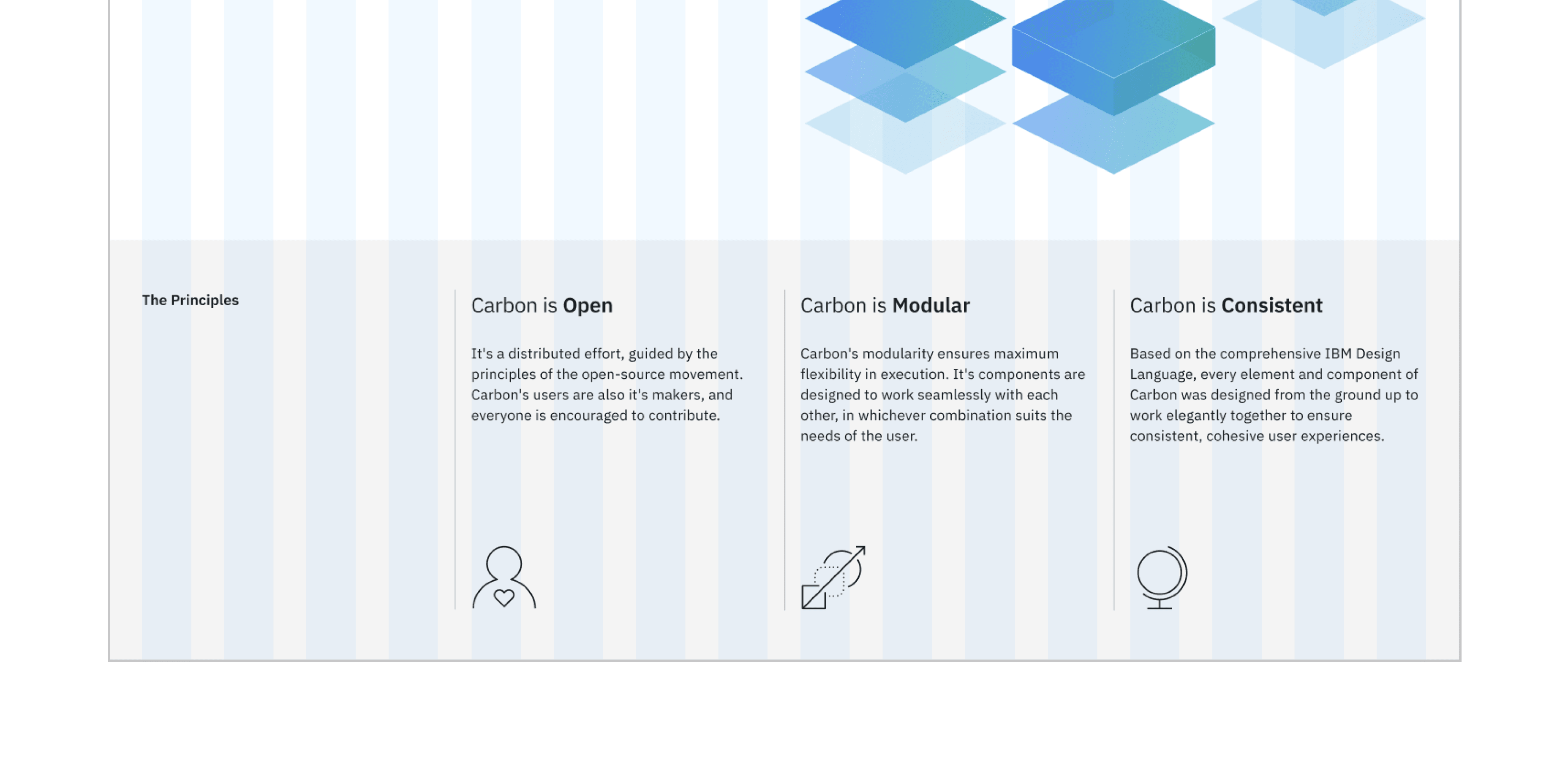
Here’s what we’re building – an informational section that has a heading and three subheadings. Each subheading has accompanying copy and a pictogram. We’ll assume that this informational section is used elsewhere on the site, meaning it’s a great opportunity to build it as a reusable component. As for naming, we’ll call it an InfoSection with three InfoCards as children.
Info section layout
and replace The principles and surrounding column with which changes the column settings and provides a class for us to style the section heading.
Style the info-section__heading with:
Before we make use of the template we need to remove the column settings from the remaining three elements page-landing__title and replace with `info-card to leave:
Then add a script tag to index.html to import landing.js
After making sure everything add, to landing.js, the script to create the info card elements. First adding the data we will use to construct the info cards from.
Then create the utility function updateInfoCard
Followed by a query to find the info card elements and a loop to add our data.
Looking at the landing page you should see the updated information where previously only the title was rendered. In order to complete our info card we need to add some styling.
First up let’s make the picograms visible with the following.
The remaining styling is to make the info cards pleasing on the eye. Use of Carbon breakpoints, which also control the number of grid columns, keeps our page looking great even on the narrowest of devices.
Check accessibility
We’ve added new markup and styles, so it’s a good practice to check Equal Access Checker and make sure our rendered markup is on the right track for accessibility.
With the browser extension installed, Chrome in this example, open Dev Tools and run Accessibility Assessment.