Overview
With two pages comprised entirely of Carbon components, let’s revisit the landing page and build a couple components of our own by using Carbon pictograms and tokens.
Carbon provides a solid foundation for building web applications through its color palette, layout, spacing, type, as well as common building blocks in the form of components. So far, we've only used Carbon components to build out two pages.
Next, we're going to use Carbon assets to build application-specific components. We'll do so by including accessibility and responsive considerations all throughout.
Here's a preview of what you'll build.
Fork, clone and branch
This tutorial has an accompanying GitHub repository called carbon-tutorial-nextjs that we’ll use as a starting point for each step. If you haven’t forked and cloned that repository yet, and haven’t added the upstream remote, go ahead and do so by following the step 1 instructions.
Then, start the app:
You should see something similar to where the previous step left off.
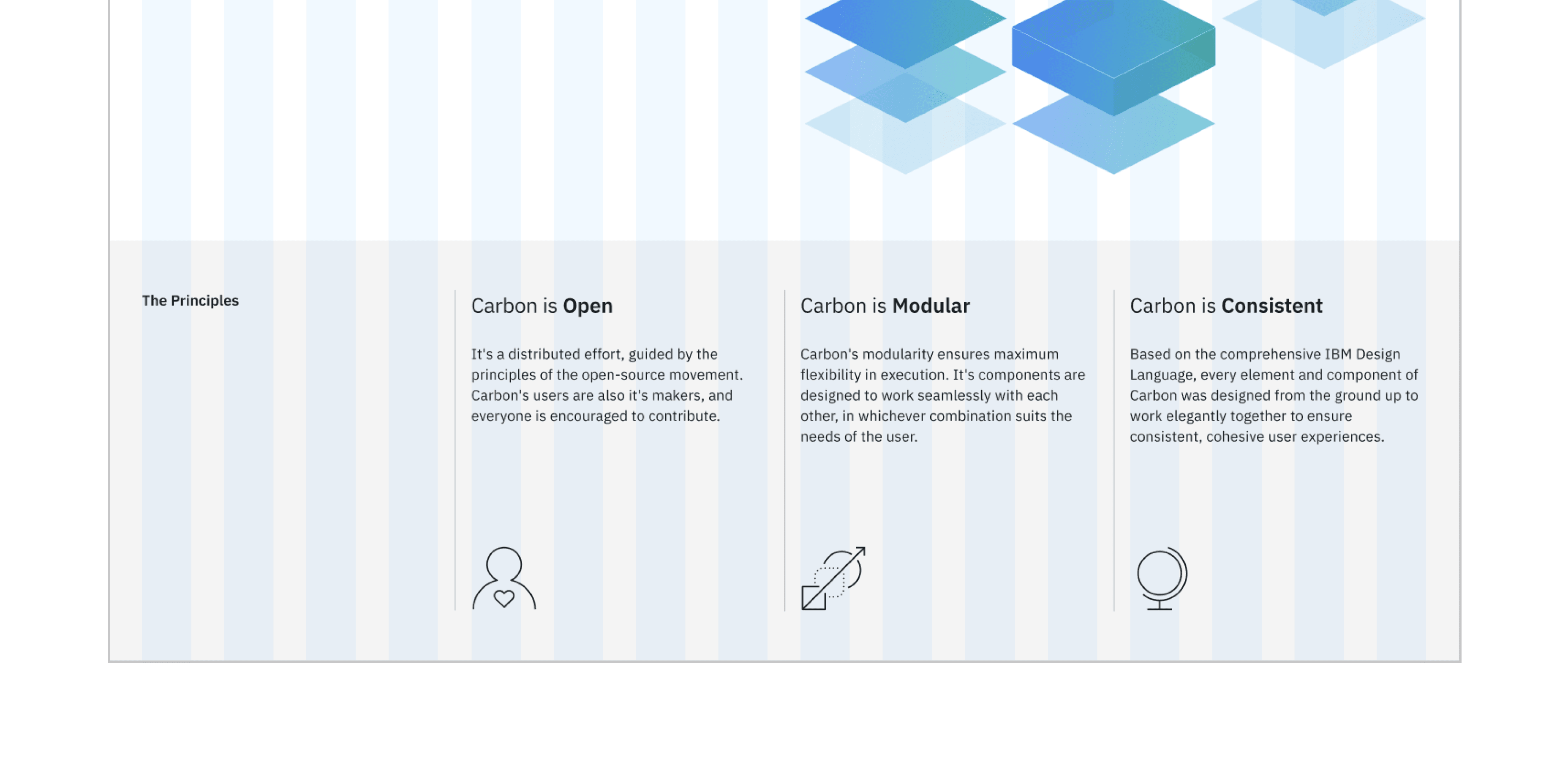
Review design
Here’s what we’re building – an informational section that has a heading and three subheadings. Each subheading has accompanying copy and a pictogram. We’ll assume that this informational section is used elsewhere on the site, meaning it’s a great opportunity to build it as a reusable component. As for naming, we’ll call it an InfoSection with three InfoCards as children.
Info section layout
Import _info.scss in app.scss after all of the tutorial-header.scss import.
We want to do a few things when abstracting it to a component. First, we only want this component’s class names; we don’t want to include landing-page__r3 as that’s specific to the landing page. For that we’ll use React props so we can pass in and use props.className.
We’ll also:
- Add component class names like
info-section,info-card, andinfo-section__heading - We will be using the
GridandColumncomponents - Replace
The Principleswith{props.heading} - Replace columns 2 - 4 with
{props.children}
Using props we can render any heading and any number of children components (InfoCard that we’ll build soon.)
At this point let’s import our needed styles and add styling for the new class names that we just added.
In doing so, we:
- Added
info-cardclasses - Used
propsto render the heading, body copy, and icon - Set columns to match the grid
Next, we will install the pictograms we will use in the header.
While we’re at the top of LandingPage, import the pictograms that we’ll need as well.
With everything imported, replace the current:
With the new components:
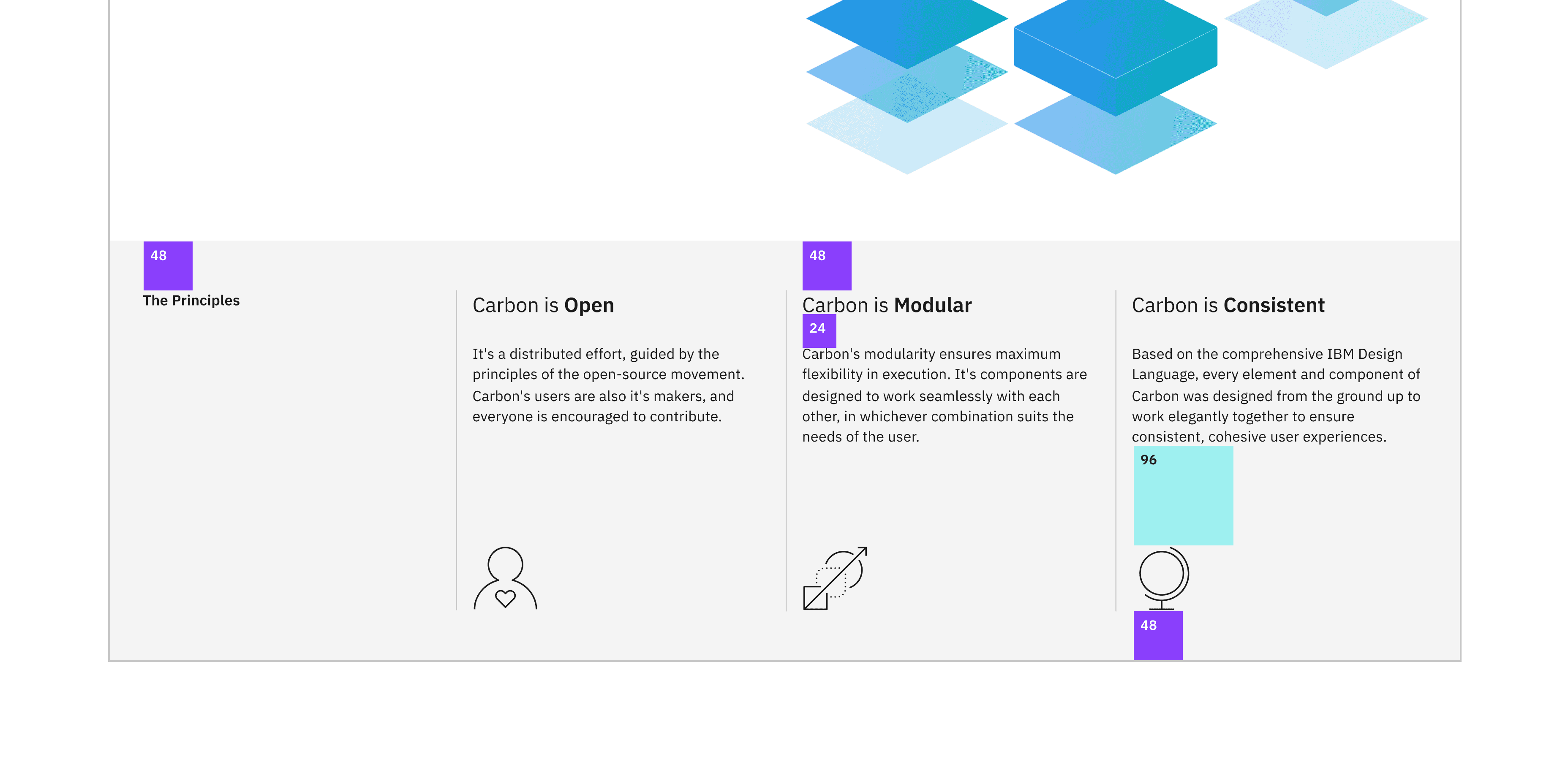
We will then add the following styles to the same file to style our info cards.
Once you save, go ahead and resize your browser to see the responsive layout at the different breakpoints. Make sure to review these color and spacing tokens. There are also a few breakpoint mixins that may be new to you.
Also, the design has the last word in each subheading as bold. To accomplish that, add this helper function after the import in Info.js.
Then, update InfoCard to use createArrayFromPhrase.
Finally, add the declaration block in _info.scss to set InfoCard body copy styles and to bottom-align the pictograms.
Check accessibility
We’ve added new markup and styles, so it’s a good practice to check Equal Access Checker and make sure our rendered markup is on the right track for accessibility.
With the browser extension installed, Chrome in this example, open Dev Tools and run Accessibility Assessment.
Then, push to your repository:
Pull request (PR)
Finally, visit carbon-tutorial-nextjs to “Compare & pull request”. In doing so, make sure that you are comparing to v11-next-step-4 into base: v11-next-step-4.