Fork, clone and branch
This tutorial has an accompanying GitHub repository called carbon-tutorial that we’ll use as a starting point for each step. If you haven’t forked and cloned that repository yet, and haven’t added the upstream remote, go ahead and do so by following the step 1 instructions.
Then, start the app:
You should see something similar to where the previous step left off.
Add landing page grid
Let’s add our grid elements to our LandingPage page component.
In order to use the grid, we need to wrap everything in a <Grid>. Because we’re building with the new CSS Grid, we won’t be using typical rows. We’ll use a combination of <Column> and nested subgrids to create our layout.
The CSS Grid is a 16 column grid. We will specify the span of a <Column> using the sm, md, and lg props. For example, <Column sm={2} md={8} lg={8}/> means the column will span 2/4 columns at the small breakpoint, 8/8 columns at the medium breakpoint, 8/16 columns at the large breakpoint.
We’ve included the designs for this tutorial app in the design.figma file found as a top-level file in the carbon-tutorial repository. But, if you don’t have Sketch installed and available to inspect the design, we’ll provide screenshots.
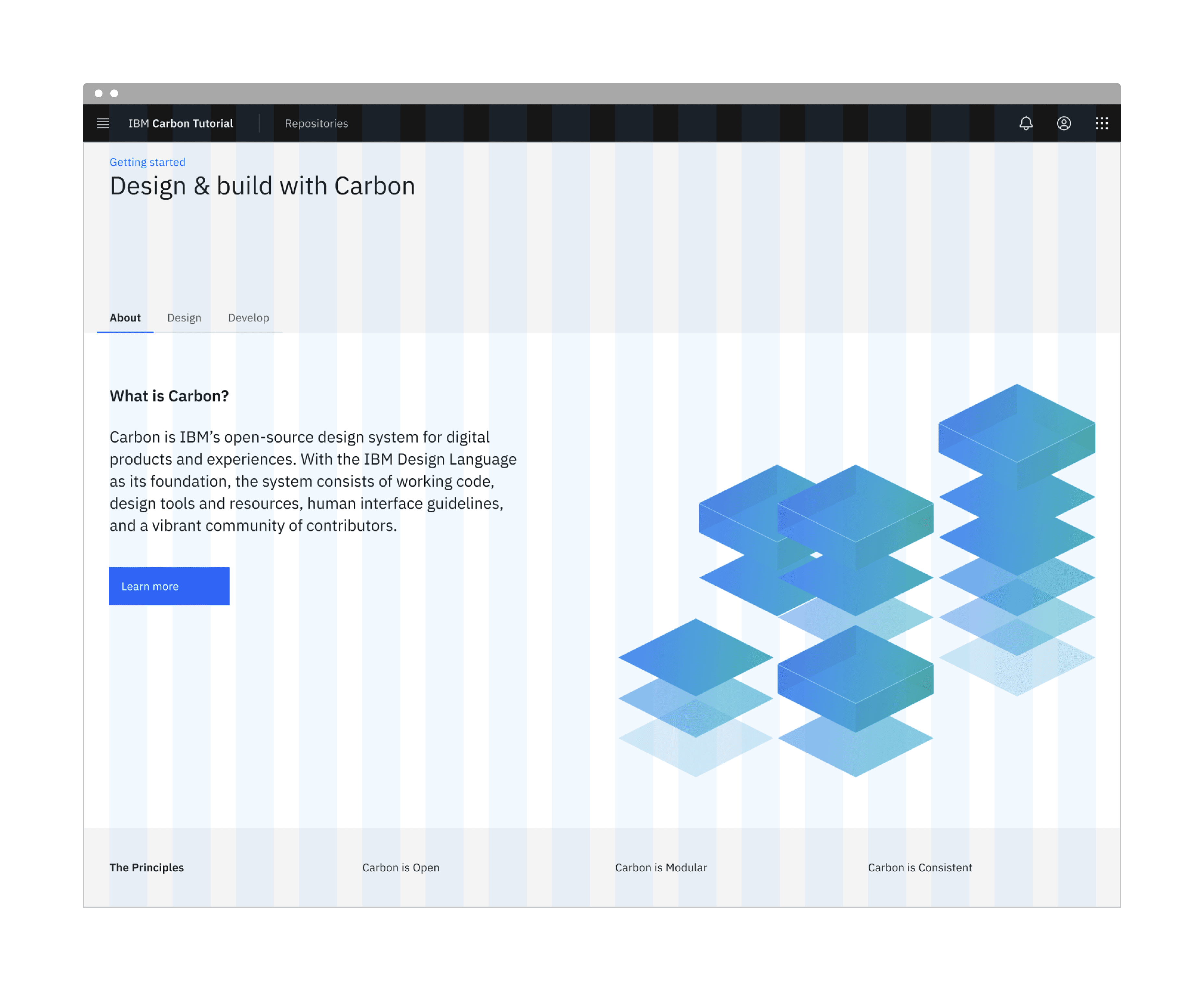
Landing page grid
First, we need to import our grid components at the top of LandingPage:
We'll break this down into three rows. The first row with the gray background doesn't appear to need any columns. The second row with the white background looks like it has two columns of different widths. The third row with the gray background looks like it has four columns of equal width.
We'll make rows like so:
We added a prop of fullWidth to the main grid container since our rows need to expand the whole page without any margins. We also added some custom classes like landing-page, landing-page__banner, landing-page__r2, etc., which we will use later.
We can now add our component to the first row, along with a header, like so:
You may notice that the styles look off. Don't worry, we'll fix these later.
Modify the second row to use the Tabs components.
The <TabList> is the tab navigation, and the <TabPanels> contains each tab content. You'll notice that within each <TabPanel>, we nested another <Grid> and . This is because the parent column is acting as a faux row, and each tab within that row contains the actual column content. When nesting columns, you must always wrap the nested group within another <Grid>.
Hold up! If you were to run the Equal Access Toolkit to check for accessibility violations, you'd see Multiple navigation landmarks must have unique labels specified with aria-label or aria-labelledby because both the Breadcrumb and Tabs components use <nav> elements. To fix, add aria-label to the Breadcrumb opening tag:
Same goes for the TabList opening tag:
Next, we'll need to add some styling overrides to move the tabs to the right on large viewports. Create a file _overrides.scss in src/app/home with this declaration block.
Then in _landing-page.scss add this import at the top of the file.
We can now add our images and text for each column in the first Tab in LandingPage.
Let’s import Image from Next.js by adding the following import under our Carbon React component imports.
Now let's set the image size in _landing-page.scss and also set the background color of our page:
Assuming that the second and third tab would have a similar design, we would set them up in the same way. However, since our design specs don’t show those tabs, we’ll leave the code as is.
Style landing page
We've added basic layout styles in _landing-page.scss, so now let's add type, color, and spacing styles to match the design. We'll be using our spacing tokens. In _landing-page.scss, add these imports at the top of the file (above our overrides import) so we can use Carbon breakpoints, tokens, and typography Sass mixins and functions:
Banner vertical spacing
Back to _landing-page.scss, we need to add space above the breadcrumb and below the heading. For that, add:
Referencing the spacing token table, 16px can be set with the $spacing-05 token. The design calls for 128px of space below the heading and that's not in the spacing scale. We can achieve this in Sass by multiplying 32px ($spacing-07) by 4. We could use 128px or 8rem directly in our styling, but using our tokens preserves consistency should the token values get updated in the future.
Looking at the design, we need a wall-to-wall light gray background behind the banner and also behind the third row. This is a great opportunity to use a Sass mixin. We could put this at the top of _landing-page.scss, but it's best practice to place mixins in a dedicated file, so create a _mixins.scss file in src/app/home.
Add the following in _mixins.scss. Per the design we need to use Gray 10 for our banner background color, which can be set with the $layer-01 color token. Also, we want the background to extend into the grid's outermost gutters to go the full width of the viewport, so given the DOM structure, we can achieve that by setting the background in an absolutely positioned pseudo element.
After you have created _mixins.scss, import it at the top of _landing-page.scss. By now you should have six imports:
Now to use the new mixin, update the .landing-page__banner declaration block to:
Next, we can see that the h1 is using the heading-05 type token.
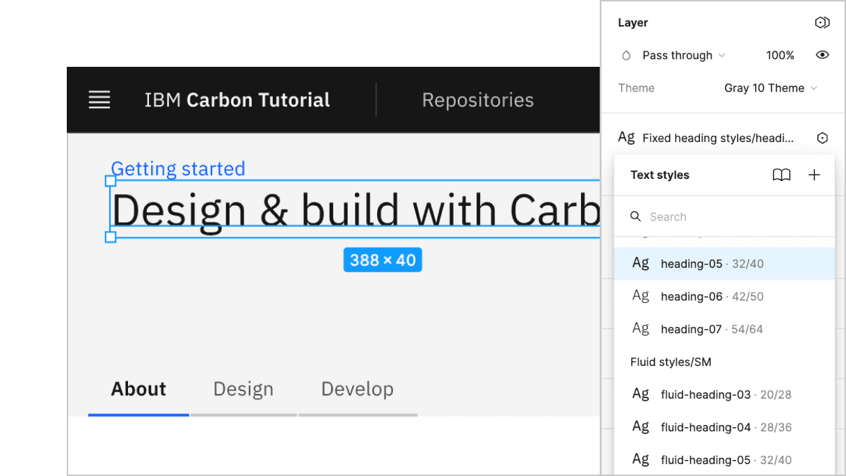
Banner heading type
The Sketch symbol naming is consistent with the development Sass tokens to help translate design to development. So, looking up the type token, we know to use productive-heading-05:
For our second row, we need to fix the tabs vertical positioning to match the design. By inspecting the tabs component, you can see that the tab height computes to 40px. We can use that to create our negative top margin in rem units.
We also need to adjust our vertical spacing and type treatment. Like before, it's a matter of using spacing and type tokens like so:
Row 2 vertical spacing
Row 3 vertical spacing
Let's also add some styles for the last row, even though that will get used later in the tutorial. You'll notice that we get to re-use the landing-page-background mixin that we just created.
Lastly, we'll fix some grid alignment issues along with the image size for smaller screens and the HeaderGlobalAction component. We'll use one of our breakpoint mixins for the media queries, like so:
We are almost done with the landing page. You may notice a few styles are off. To fix this, we'll update some of the overriding styles in globals.scss. We already have some overriding styles for .cds--content. We need to add padding: 0; to this selector and add one more selector for the grid below that:
Since we are using our breakpoint mixin, we need to import the styles for that below our Carbon styles import:
Ta-da! You should see a finished landing page! Now we can move on to the repo page.
Build repo page
We currently have RepoPage that just contains a grid and placeholder content for the time being. In the next tutorial step we’re going to be querying an API to populate the DataTable component in this page. As a best practice to separate data fetching from the presentation components, go ahead and create a RepoTable.js as a sibling to page.js in src/app/repos.
Then, let's create the RepoTable component and export it at the very bottom of RepoTable.js.
This component uses two props, rows and headers, and returns a Carbon DataTable. As for where the various Table* components came from? The DataTable story in Storybook was used to put together the data table structure.
At this point, return to RepoPage because now we need to render a static RepoTable.
Then below the imports, include the following arrays to pass into the RepoTable component. We’ll be setting the rows array from an API in the next tutorial step, but for now, static example rows will suffice.
Lastly in RepoPage, we need to simply replace Data table will go here with:
Then, push to your repository:
Pull request (PR)
Finally, visit carbon-react-tutorial to “Compare & pull request”. In doing so, make sure that you are comparing to v11-next-step-2 into base: v11-next-step-2.