Keyboard interaction
The left panel is comprised of both expandable sections (often called “sub-menus”) and links to content. All items can be reached by Tab. Toggling a collapsed section with Space or Enter expands it, which reveals additional links. Activating any of the links (with Enter) updates the main content area and puts focus back at the top of the page. The link becomes bold to show it is the current page. (It remains in the tab order, but can no longer be activated.)
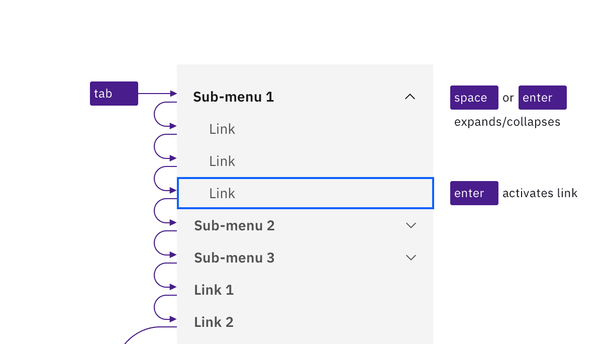
Sub-menus and links are reached by Tab. Space and Enter keys expand/collapse sub-menus, and the Enter key is used to activate links.
Non-persistent left panel
On smaller screens, or if content is zoomed up to approximately 175% magnification, Carbon responsively hides the left panel behind a ‘hamburger’ button, which appears at the start of the UI shell header. Activating the button (with Space or Enter) causes the left panel to appear. It overlays the main content area, which often becomes dimmed. The hamburger button’s icon becomes an X, and must be activated to close the left panel.
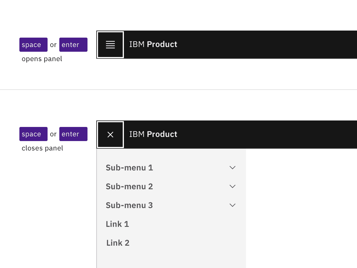
The hamburger button expands and collapses the left panel.
The left panel can also be implemented as a “Side rail” variant, which slides into view from the left side when reached by keyboard or hovered by mouse. Keyboard interaction within the revealed left panel does not change. When users tab out of the left panel, the side rail slides out of view.
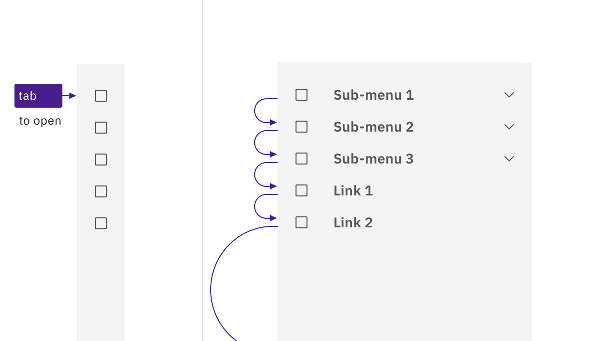
The side rail expands on hover or focus, and collapses when not hovered or focused.
Development considerations
Keep these considerations in mind if you are modifying Carbon or creating a custom component.
- The left panel is in a
<nav>section witharia-label="Side navigation". - All items in the left panel are in a nested
<ul>structure, which provides additional information to assistive technologies. - Each ‘sub-menu’ is implemented as a
<button>witharia-expanded. - Activated links receive an
aria-current="page"attribute.
Feedback
Help us improve by providing feedback, asking questions, requesting features, or leaving any other comments on GitHub.