Color
Both the default and small toggle variants share the same color and interactive state properties.
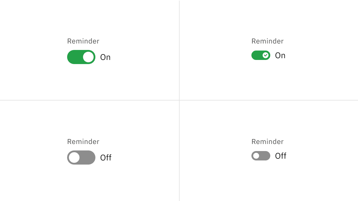
Element | Property | Color token |
|---|---|---|
Label text | text-color |
|
State text | text-color |
|
Background (off) | background-color |
|
Handle (off) | background-color |
|
Background (on) | background-color |
|
Handle (on) | background-color |
|
Checkmark | fill |
|
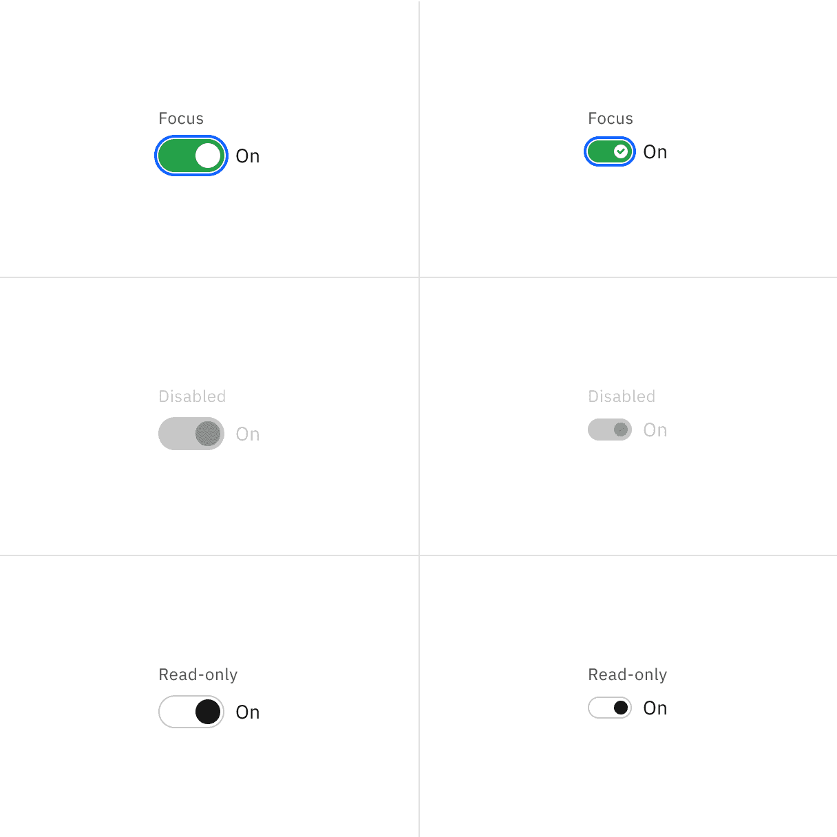
State | Element | Property | Color token |
|---|---|---|---|
Focus | Toggle | border |
|
Disabled | Label text | text-color |
|
State text | text-color |
| |
Background | background-color |
| |
Handle | background-color |
| |
Checkmark | inner fill |
| |
Read-only | Label text | text-color |
|
State text | text-color |
| |
Background | background-color | transparent | |
Border | border |
| |
Handle | background-color |
|
* Denotes a contextual color token that will change values based on the layer it is placed on.
Element | Property | px / rem | Spacing token |
|---|---|---|---|
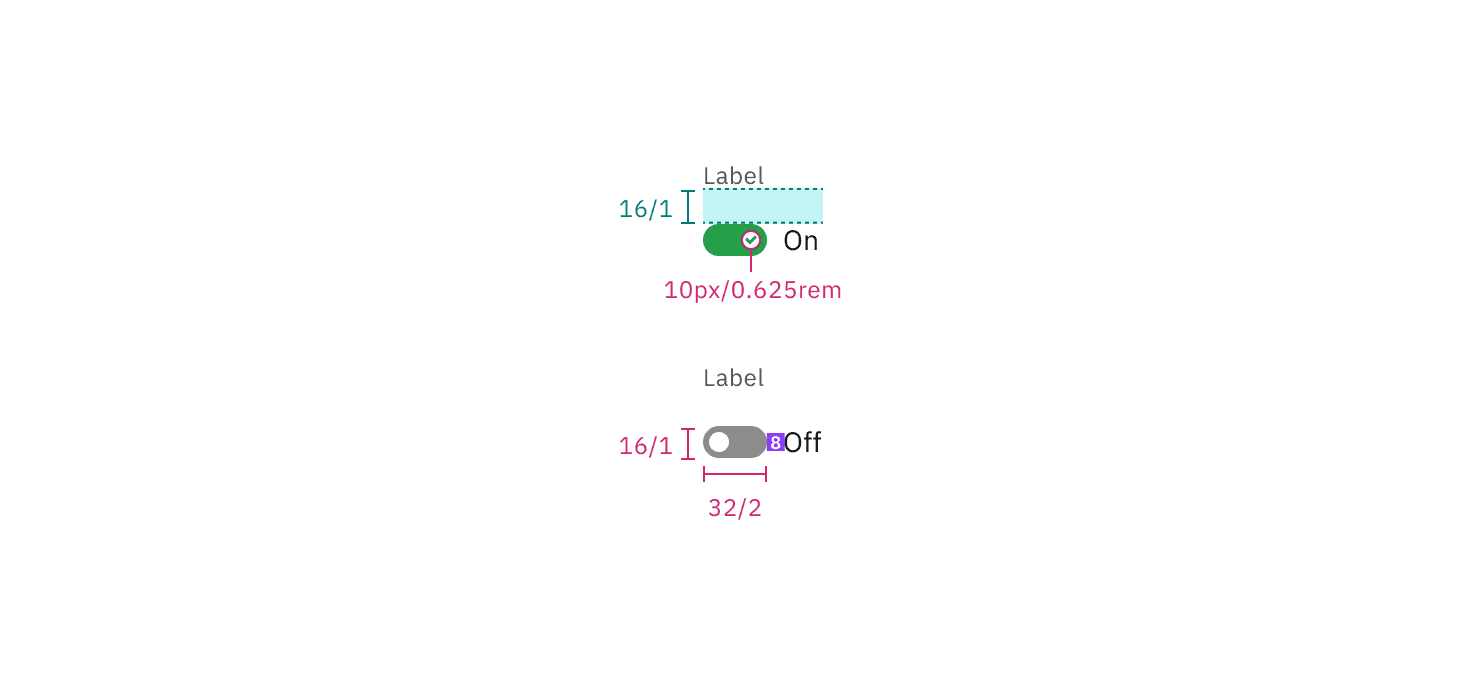
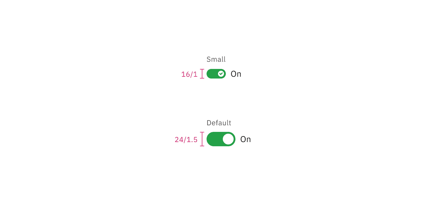
Toggle | width | 48 / 3 | – |
height | 24 / 1.5 | – | |
Handle | height, width | 18 / 1.25 | – |
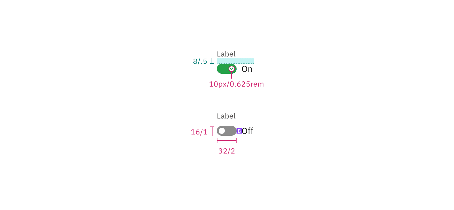
Label text (feature flag) | margin-top, margin-bottom | 8 / 0.5 |
|
Label text | margin-top, margin-bottom | 16 / 1 |
|
State text | margin-left | 8 / 0.5 |
|
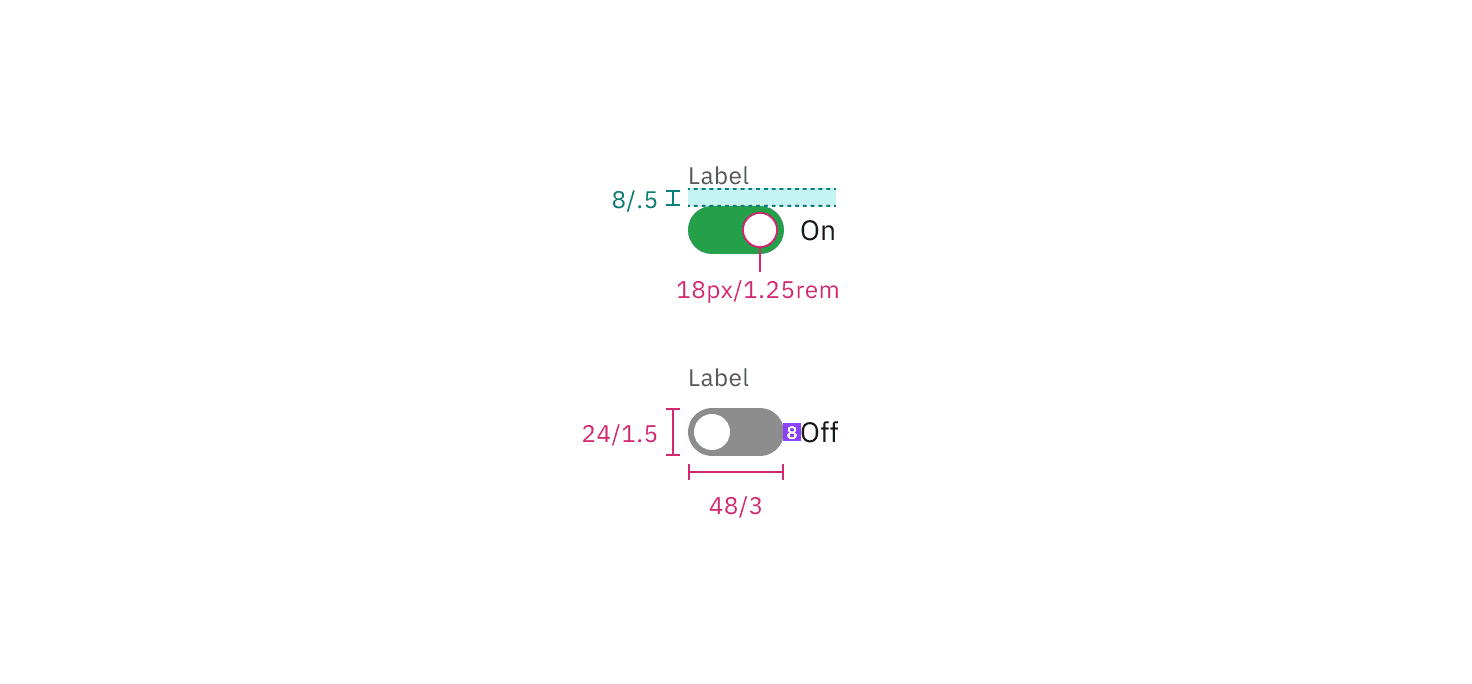
Structure and spacing measurements for default toggle with a feature flag enabled | px / rem
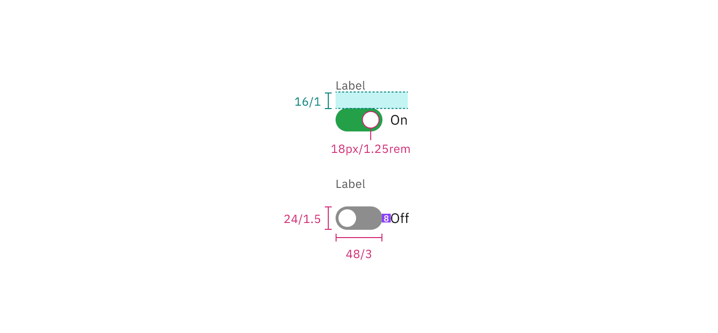
Structure and spacing measurements for default toggle with a feature flag disabled | px / rem
Element | Property | px / rem | Spacing token |
|---|---|---|---|
Toggle | width | 32 / 2 | – |
height | 16 / 1 | – | |
Handle | height, width | 10 / 0.625 | – |
Label text (feature flag) | margin-top, margin-bottom | 8 / 0.5 |
|
Label text | margin-top, margin-bottom | 16 / 1 |
|
State text | margin left | 8 / 0.5 |
|
Structure and spacing measurements for small toggle with a feature flag enabled | px / rem
Structure and spacing measurements for small toggle with a feature flag disabled | px / rem
Feedback
Help us improve this component by providing feedback, asking questions, and leaving any other comments on GitHub.