Color
Read-only, dismissible, and operational variants of tag use component tokens with values from the IBM Design Language color palette. Light themes use step 70 for text and icons, step 40 for borders, and step 20 for backgrounds. Dark themes use step 20 for text and icons, step 50 for borders, and step 70 for backgrounds. The only exception where core tokens are used are in high contrast and outline styles.
The selectable tag variant only uses core tokens and does not use component tokens.
Variant | Color | Element | Property | Color token |
|---|---|---|---|---|
Read-only tag | All colors | Text | text-color | See all component color tokens |
Icon | icon-color | See all component color tokens | ||
Background | background-color | See all component color tokens | ||
High contrast | Text | text-color |
| |
Icon | icon-color |
| ||
Border | border |
| ||
Background | background-color |
| ||
Outline | Text | text-color |
| |
Icon | icon-color |
| ||
Border | border |
| ||
Background | background-color |
| ||
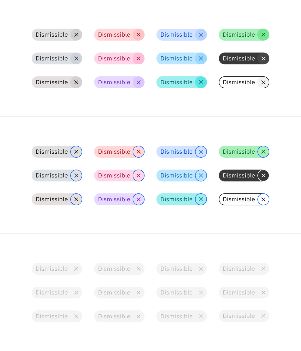
Dismissible tag | All colors | Text | text-color | See all component color tokens |
Icon | icon-color | See all component color tokens | ||
Background | background-color | See all component color tokens | ||
High contrast | Text | text-color |
| |
Icon | icon-color |
| ||
Border | border |
| ||
Background | background-color |
| ||
Outline | Text | text-color |
| |
Icon | icon-color |
| ||
Border | border |
| ||
Background | background-color |
| ||
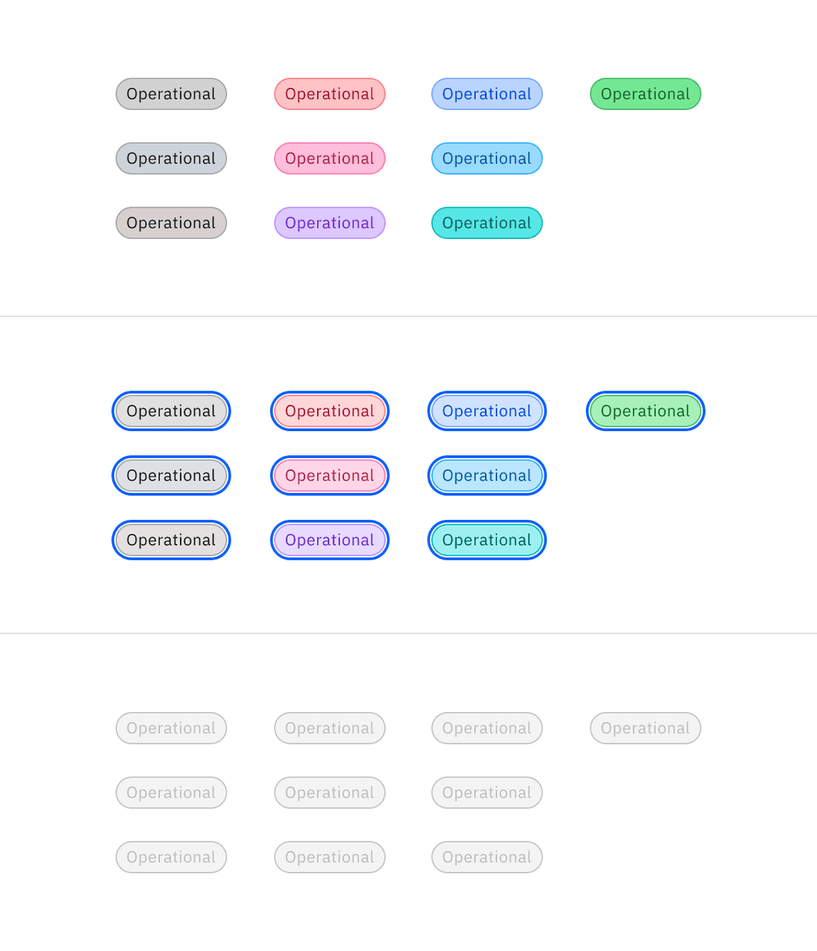
Operational tag | All colors | Text | text-color | See all component color tokens |
Icon | icon-color | See all component color tokens | ||
Border | border | See all component color tokens | ||
Background | background-color | See all component color tokens | ||
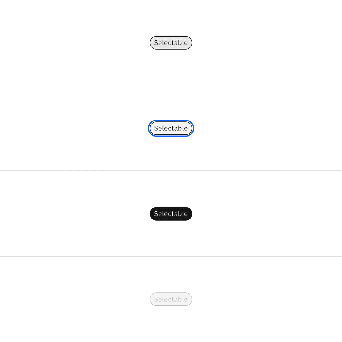
Selectable tag | Text | text-color |
| |
Icon | icon-color |
| ||
Border | border |
| ||
Background | background-color |
|
* Denotes a contextual color token that will change values based on the layer it is placed on.
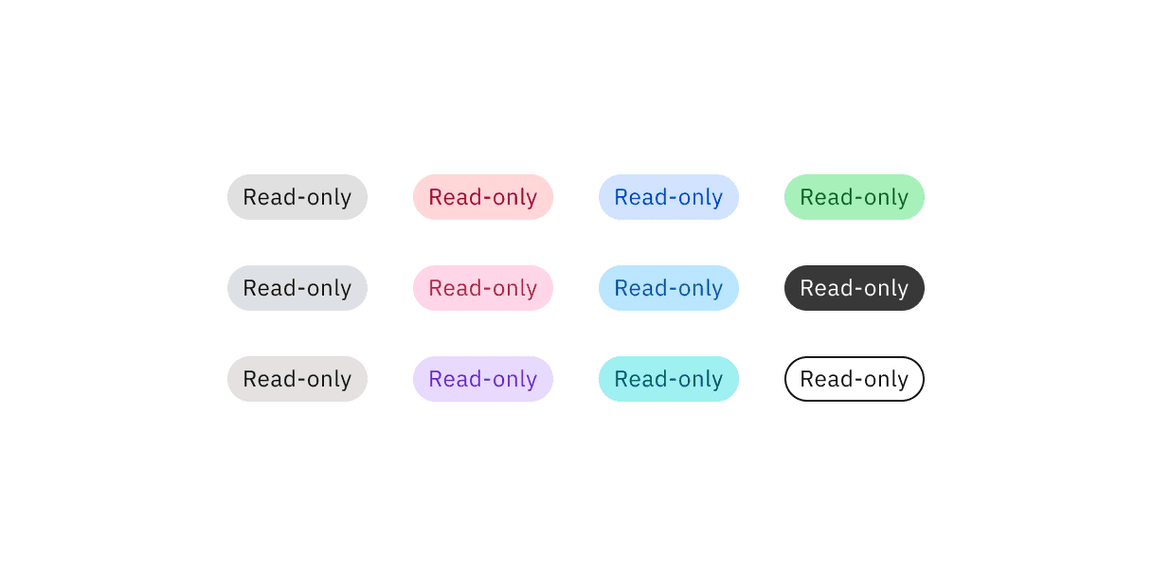
Read-only tag colors
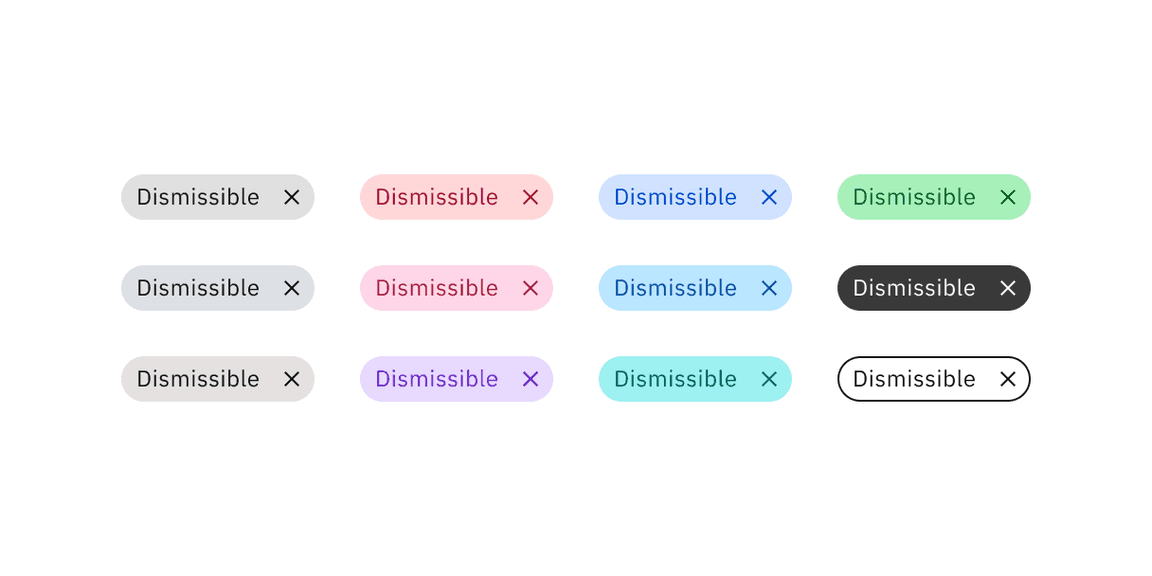
Dismissible tag colors
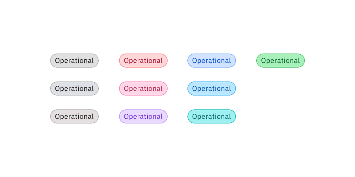
Operational tag colors
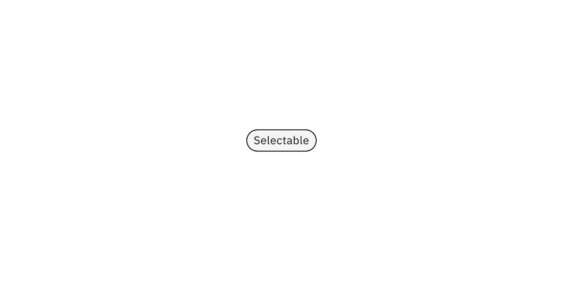
Selectable tag color
Interactive state color
Read-only tag variants do not have interactive state colors because they do not have interactive functionality.
Dismissible and operational tag variants use component tokens for hover states. They use core tokens for focus and disabled states.
The selectable tag variant only uses core tokens and does not use component tokens.
Variant | Color | State | Element | Property | Color token |
|---|---|---|---|---|---|
Dismissible tag | All colors | Hover | Background | background-color | See all component color tokens |
Focus | Border | border |
| ||
Disabled | Text | text-color |
| ||
Background | background-color |
| |||
High contrast | Hover | Background | background-color |
| |
Focus | Border | border |
| ||
Disabled | Text | text-color |
| ||
Background | background-color |
| |||
Outline | Hover | Background | background-color |
| |
Focus | Border | border |
| ||
Disabled | Text | text-color |
| ||
Border | border |
| |||
Background | background-color |
| |||
Operational tag | All colors | Hover | Background | background-color | See all component color tokens |
Focus | Border | border |
| ||
Disabled | Text | text-color |
| ||
Border | border |
| |||
Background | background-color |
| |||
Selectable tag | Hover | Background | background-color |
| |
Focus | Border | border |
| ||
Selected | Text | text-color |
| ||
Background | background-color |
| |||
Disabled | Text | text-color |
| ||
Border | border |
| |||
Background | background-color |
|
* Denotes a contextual color token that will change values based on the layer it is placed on.
Dismissible tag interactive colors
Operational tag interactive colors
Selectable tag interactive colors
Typography
Tag titles should be concise and describe the tag in a few words or be under 20 characters when possible. Only include long title content in tags when necessary, for instance, for user-defined names or system-generated strings of text.
Element | Font size (px/rem) | Font weight | Type token |
|---|---|---|---|
Title | 12 / 0.75 | Regular / 400 |
|
Element | Property | px / rem | Spacing token |
|---|---|---|---|
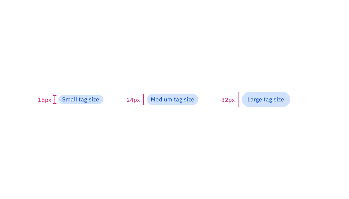
Tag container (lg) | height | 32 / 2 | – |
radius | 16px | – | |
padding-left, padding-right | 12 / 0.75 |
| |
Tag icon (lg) | padding-left (decorative) | 8 / 0.5 |
|
padding-right (decorative) | 4 / 0.25 |
| |
padding-left (dismissible) | 12 / 0.75 |
| |
padding-right (dismissible) | 8 / 0.5 |
| |
icon | 16px | – | |
Tag container (md) | height | 24 / 1.5 | – |
radius | 16px | – | |
padding-left, padding-right | 8 / 0.5 |
| |
Tag icon (md) | padding-left, padding-right (decorative) | 4 / 0.25 |
|
padding-left (dismissible) | 8 / 0.5 |
| |
padding-right (dismissible) | 4 / 0.25 |
| |
icon | 16px | – | |
Tag container (sm) | height | 18 / 1.125 | – |
radius | 16px | – | |
padding-left, padding-right | 8 / 0.5 |
| |
Tag icon (sm) | padding-left (dismissible) | 8 / 0.5 |
|
padding-right (dismissible) | 1 / 0.0625 | – | |
icon | 16px | – |
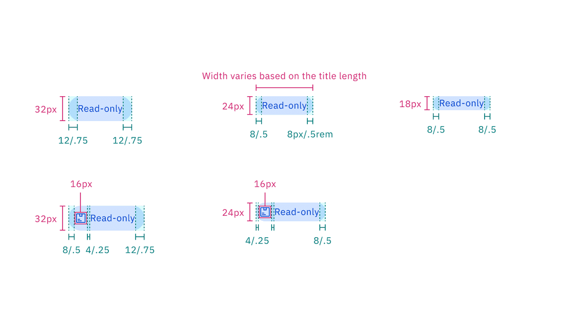
Structure and spacing measurements of read-only tag | px / rem
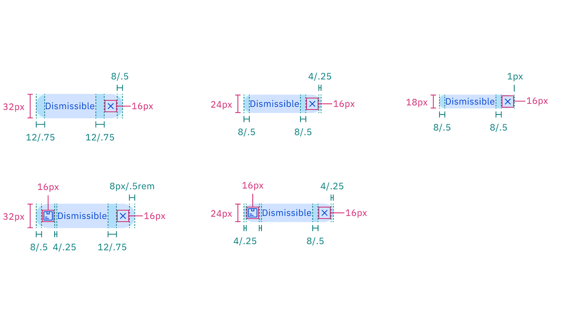
Structure and spacing measurements of dismissible tag | px / rem
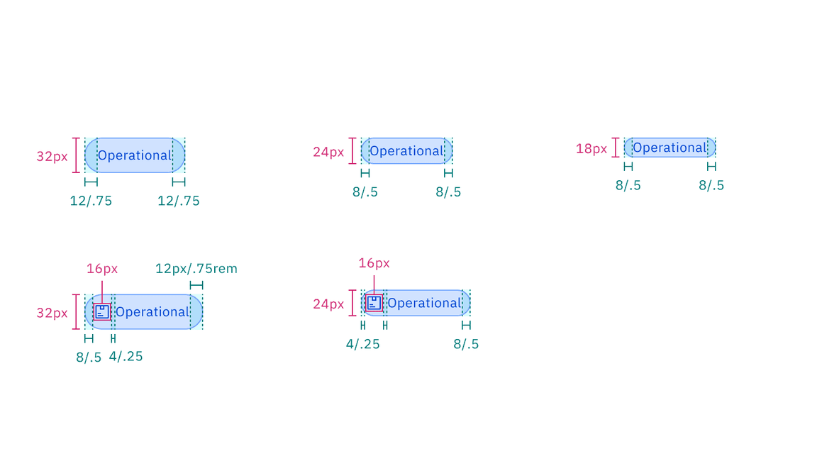
Structure and spacing measurements of operational tag | px / rem
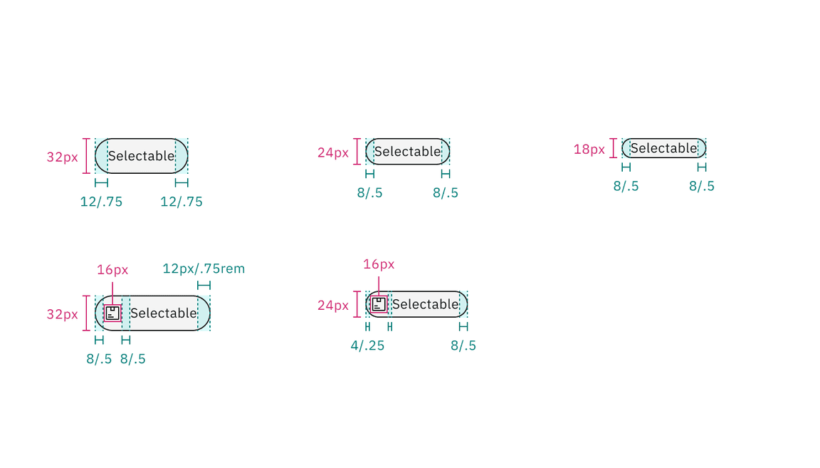
Structure and spacing measurements of selectable tag | px / rem
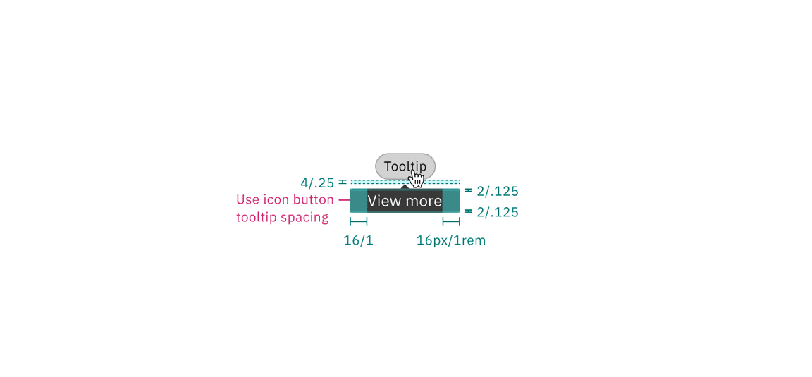
Structure and spacing measurements of operational tag tooltip | px / rem
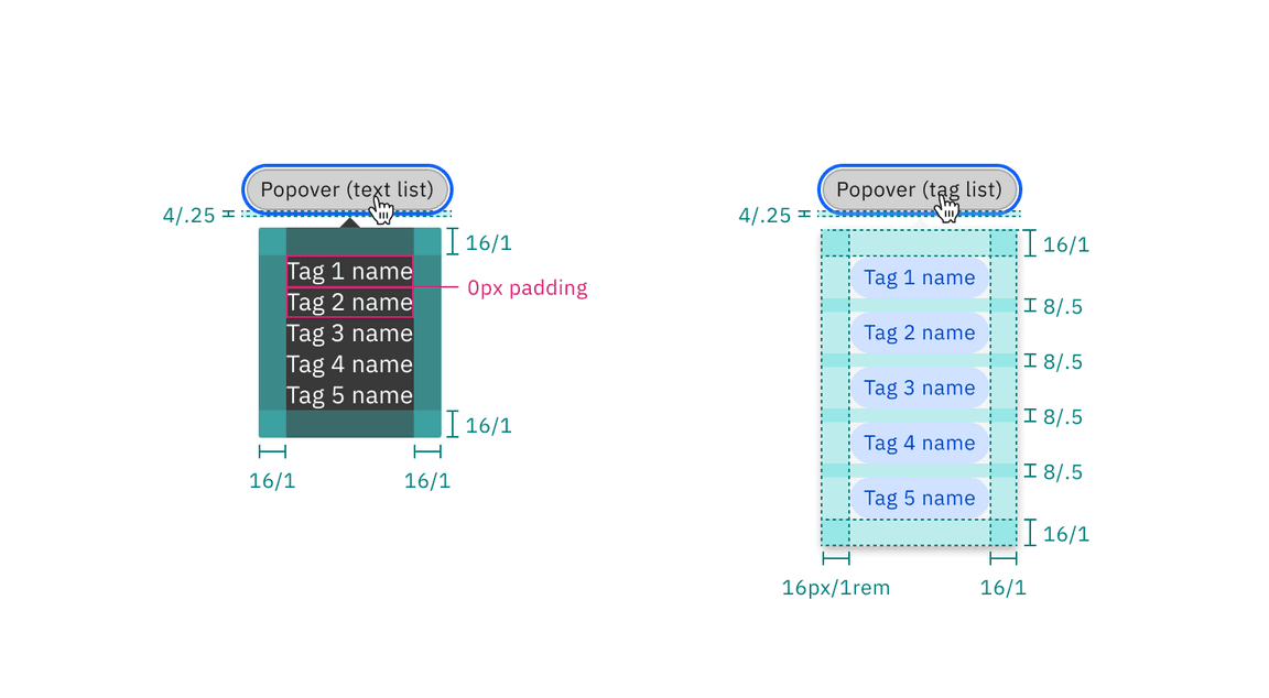
Structure and spacing measurements of operational tag popover styles | px / rem
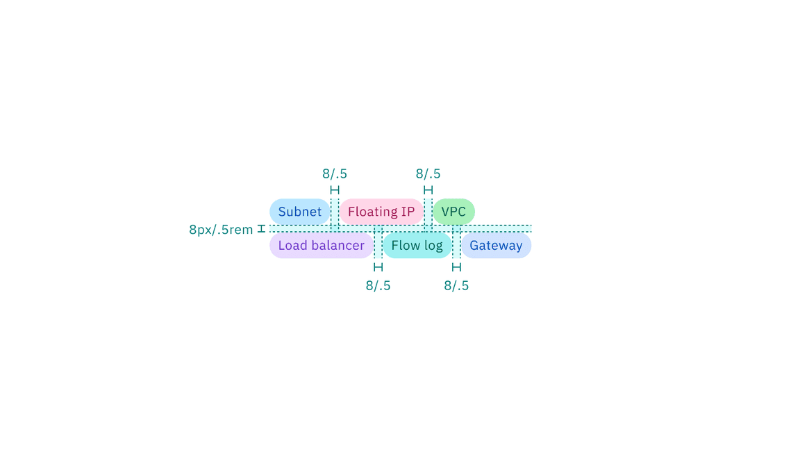
Recommended structure and spacing measurements between tags in a group | px / rem
AI presence
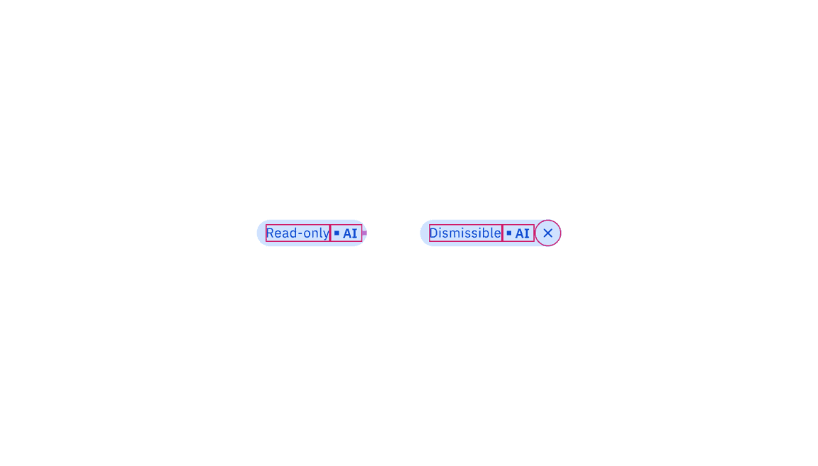
The only style modification an AI variant of the tag has is the addition of the AI label. All other tokens in the component including the same as the non-AI variants. The color of the AI label should match the color of the tag text.
For more information on the AI style elements, see the Carbon for AI guidelines.
Element | Property | Value | Spacing token |
|---|---|---|---|
AI label (inline) | size | small | – |
padding-right | 4px / 0.25rem |
|
Structure and spacing measurements of AI tags | px / rem
Feedback
Help us improve this component by providing feedback, asking questions, and leaving any other comments on GitHub.