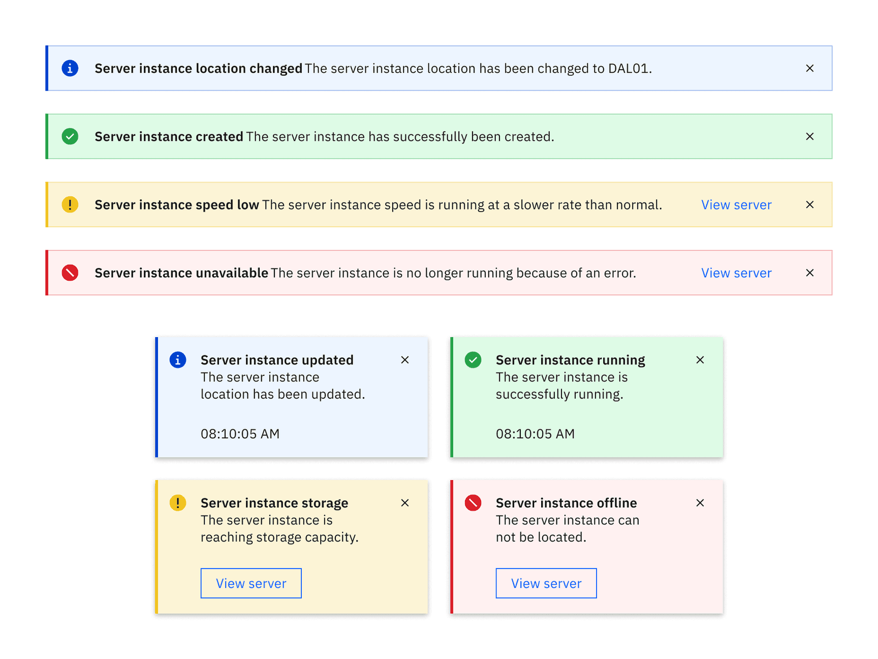
Low contrast notifications in the White theme
Element | Property | Color token |
|---|---|---|
Title | text color |
|
Subtitle | text color |
|
Close button | fill |
|
Error | background-color |
|
border-left |
| |
svg |
| |
Success | background-color. |
|
border-left |
| |
svg |
| |
Warning | background-color |
|
border-left |
| |
svg |
| |
Information | background-color |
|
border-left |
| |
svg |
|
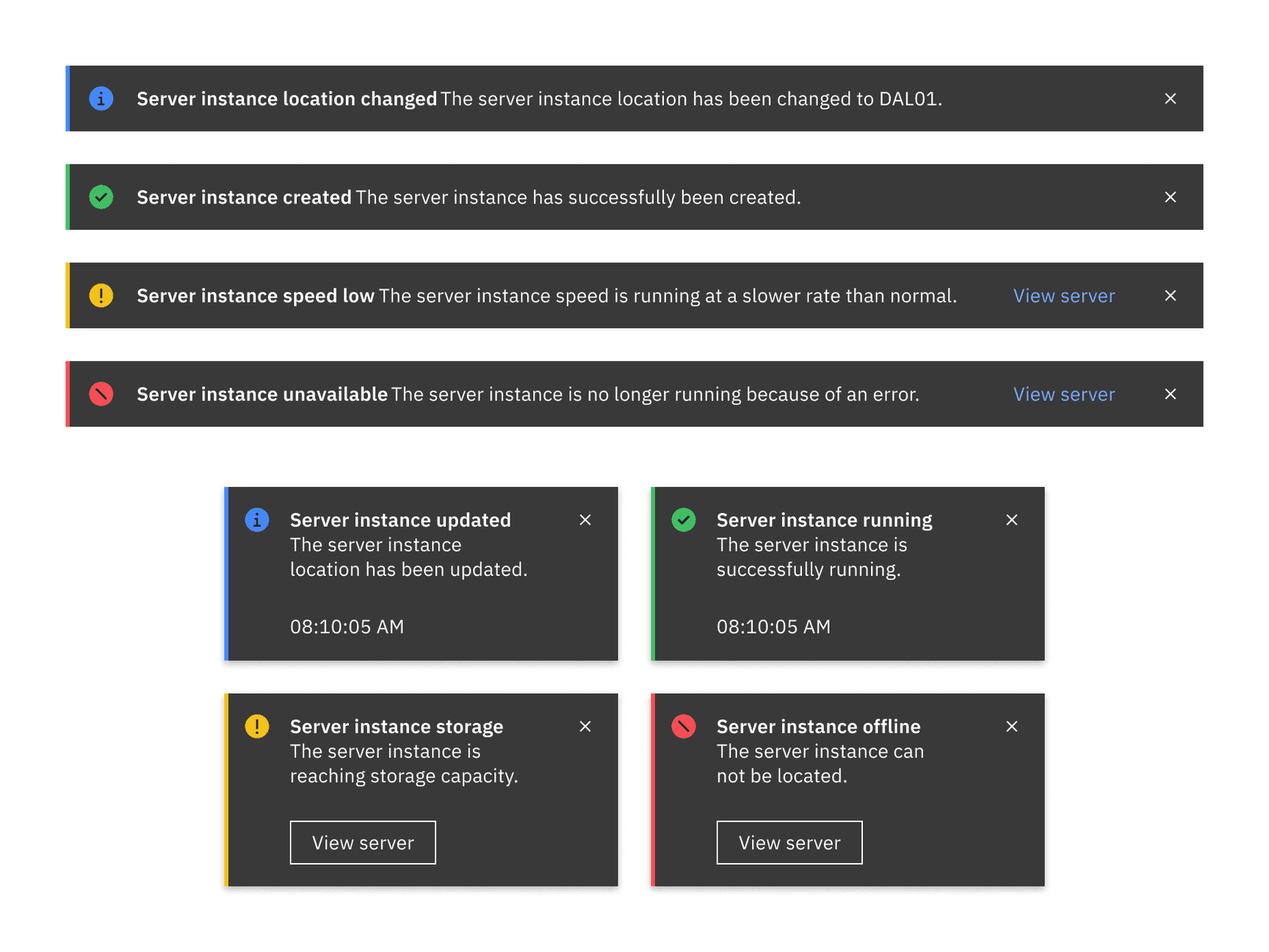
High contrast notifications in the White theme
Element | Property | Color token |
|---|---|---|
Title | text color |
|
Subtitle | text color |
|
Close button | fill |
|
Background | background-color |
|
Error | border-left |
|
svg |
| |
Success | border-left |
|
svg |
| |
Warning | border-left |
|
svg |
| |
Information | border-left |
|
svg |
|
Toast
Element | Property | px / rem | Spacing token |
|---|---|---|---|
Notification | width | 288 / 18 | – |
border-left | 3px | – | |
padding-right | 16 / 1 |
| |
Title | margin-top | 16 / 1 |
|
Subtitle | margin-bottom | 24 / 1.5 |
|
Details | padding-right | 16 / 1 |
|
Caption | margin-bottom | 16 / 1 |
|
Close button | height, width | 48 / 3 | – |
Close icon | margin-top, margin-right | 16 / 1 |
|
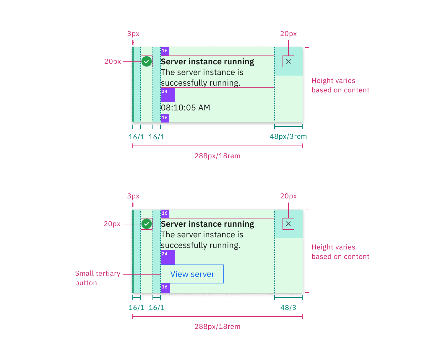
Structure and spacing measurements for a toast notification | px / rem
Inline
The width of an inline notification will vary based on content or layout.
Element | Property | px / rem | Spacing token |
|---|---|---|---|
Inline notification | min-height | 48 / 3 |
|
border-left | 3px | – | |
Details | margin-left, margin-right | 16 / 1 |
|
Text-wrapper | padding-top, padding-bottom | 12 / 0.75 |
|
Icon | margin-right | 16 / 1 |
|
Close button | height, width | 48 / 3 | – |
Close icon | icon size | 16 x 16 | – |
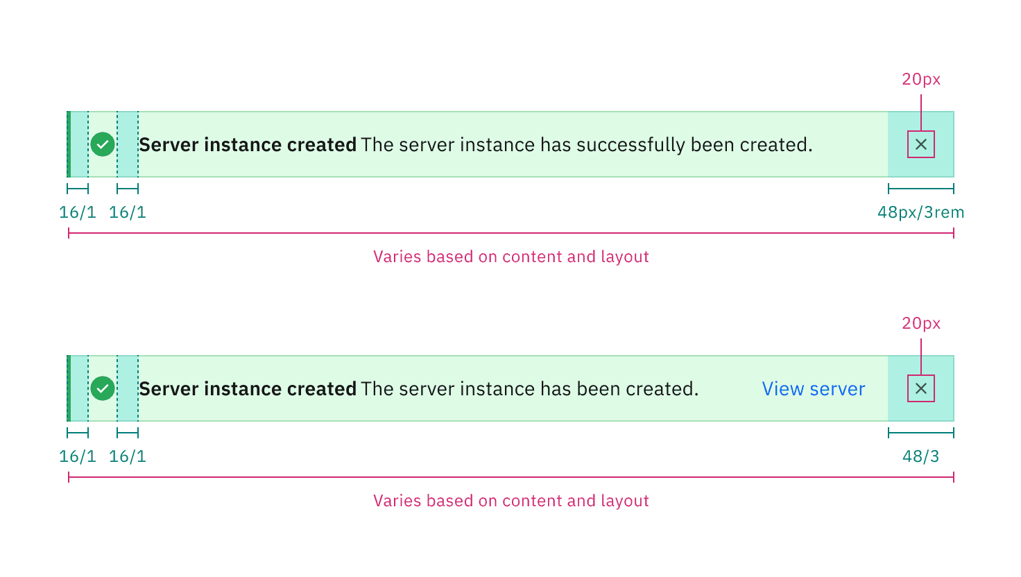
Structure and spacing measurements for an inline notification | px / rem
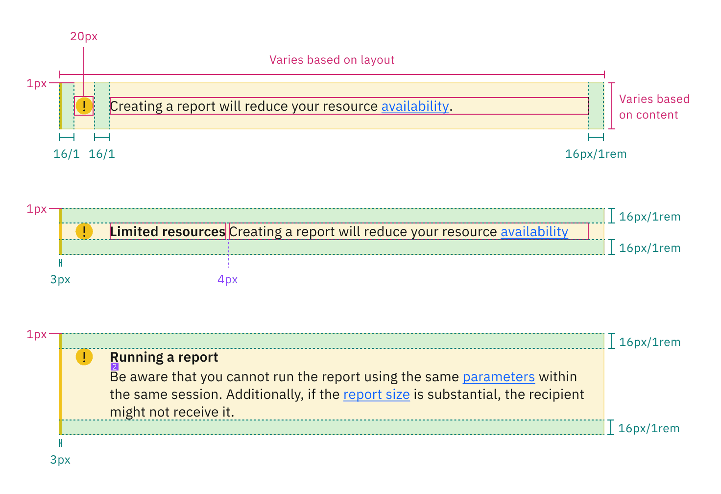
Structure and spacing for a callout | px / rem
Feedback
Help us improve this component by providing feedback, asking questions, and leaving any other comments on GitHub.