What Carbon provides
Design annotations are needed for specific instances shown below, but for the standard loading component, Carbon already incorporates accessibility.
The loading component has no keyboard accessibility considerations since it is intentionally not operable or navigable. However, Carbon incorporates other accessibility considerations, some of which are described below.

Screen readers hear “loading” when a spinning icon appears on the screen.
Convey when loading has completed
When the loading indicator disappears, it conveys a second meaning, which is ‘not loading’ or ‘finished’. However, especially where loads may take more than a few seconds, a user who cannot see the icon disappear needs to be made aware the system is no longer “loading” and is thus available for usage.
There are several ways to do this. If new content takes focus when the loading is completed (for instance after a full page load), then users will understand the system is now available. Annotating what component takes focus will ensure this is properly implemented.
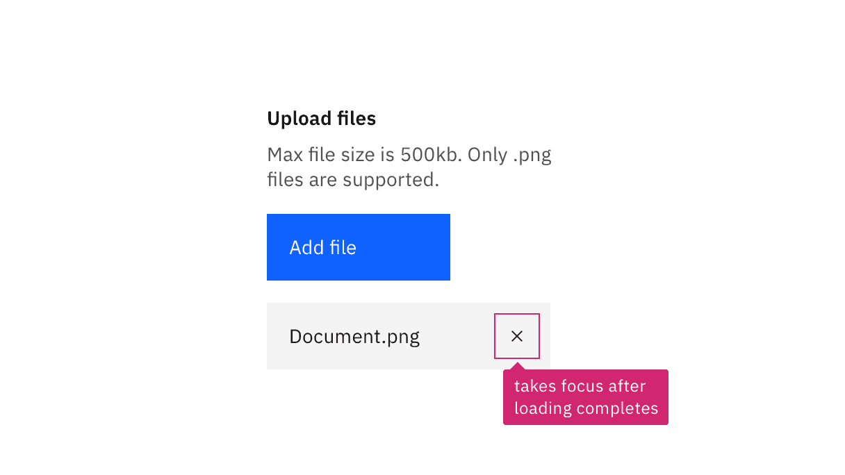
Annotate if a control takes focus after a loading completes.
Where a change of focus is not appropriate when the loading icon disappears, the information can be surfaced to users through a non-displayed status message, such as “finished” or “loading complete,” that can be conveyed to users through assistive technology.
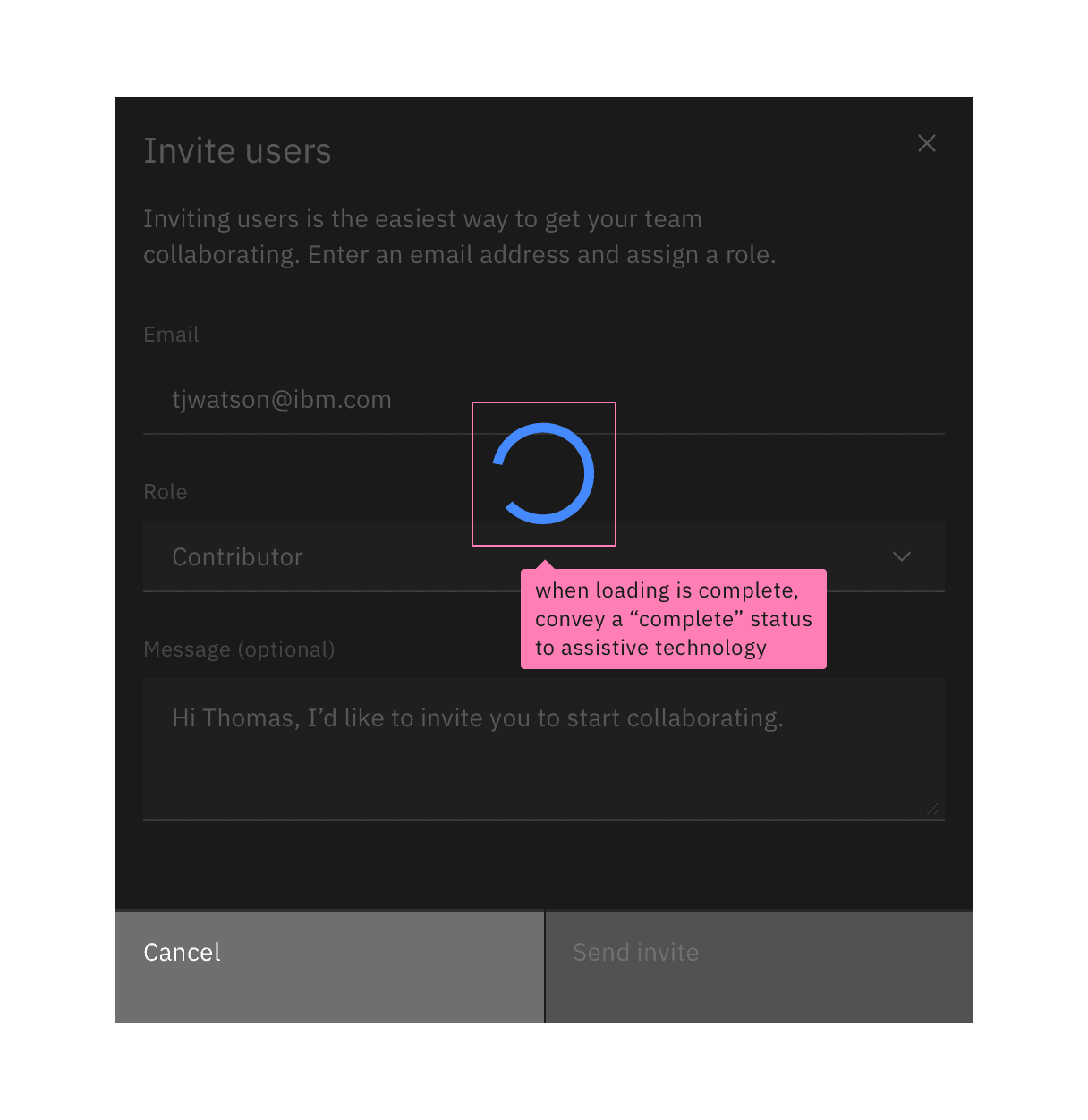
Annotate the information that developers need to convey programmatically to assistive technology.
Development considerations
Keep these considerations in mind if you are modifying Carbon or creating a custom component.
- Carbon uses
aria-liveset to “assertive” to immediately surface a loading status to assistive technologies. - Carbon provides an SVG
titlevalue for the loading icon, which is exposed through thearia-livesection. - The completion of the loading state should be conveyed to assistive technologies. A non-visible status message such as “loading complete” could be put in the
aria-livesection or exposed through arole="status". Alternatively, focus could be set to an appropriate element. - See the Equal Access Toolkit information on status messages.
Accessibility testing status
Latest version: 1.112.0 | Framework: React (@carbon/react)
| Component | Accessibility test | Status | Link to source code |
|---|---|---|---|
| Loading | Test(s) that ensure the initial render state of a component is accessible. | Passes all automated tests with no reported accessibility violations. | GitHub link |
| Tests that ensure additional states of the component are accessible. This could be interactive states of a component or its multiple variants. | Automated or manual testing has been temporarily deferred. | ||
| Tests that ensure focus is properly managed, and all interactive functions of a component have a proper keyboard-accessible equivalent. | Test data is either not available or not applicable for this component state. | ||
| This manual testing ensures that the visual information on the screen is properly conveyed and read correctly by screen readers such as JAWS, VoiceOver, and NVDA. | A human has manually tested this component, e.g. screen reader testing. |
Feedback
Help us improve by providing feedback, asking questions, requesting features, or leaving any other comments on GitHub.