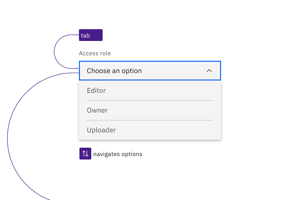
Dropdowns are in the tab order and operable by Up and Down arrow keys, once opened.
Dropdown
The default dropdown opens with Enter, Space, or Down arrow. If an option is already selected or if Down arrow is used to open the component, the focus moves to the first or currently selected option. Arrow keys change options, and any option with focus is selected with Space or Enter, which also closes the dropdown. Pressing Esc or Tab closes a dropdown without changing the selected option.
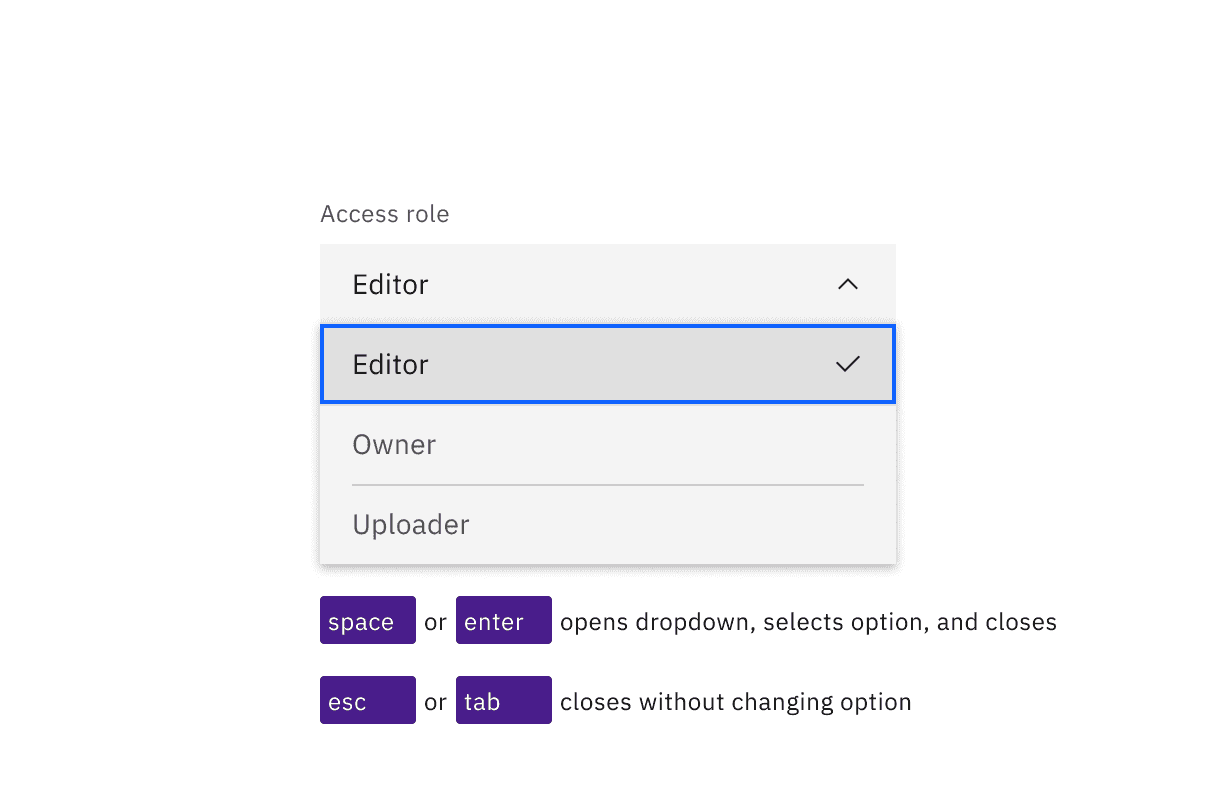
The Space and Enter keys can be used to open dropdowns and also select an option with focus. Esc cancels and closes the interaction.
Multiselect
The multiselect opens with Down arrow, or with the Enter or Space keys, which are also used to toggle the selection of any option. Focus handling is the same as with the default dropdown: focus is only moved to the options list if an item is already selected or if the multiselect is opened with the Down arrow. Once items are selected, a tag appears in the field, showing a numerical representation of the number of items selected along with an ‘x’. Pressing Esc closes the multiselect. Pressing Delete while focus is in the collapsed field will clear all selected options.
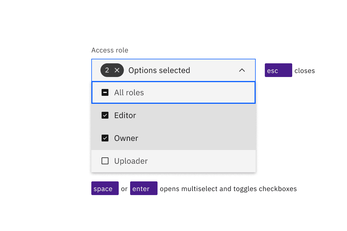
Space and Enter keys open multiselects and toggle the state of the checkboxes in the list. Esc closes the list.
Combo box
The combo box’s operation (as well as the filterable multiselect’s) is quite different, since it is a combination of a text input and a dropdown. Enter or the Up or Down arrow keys will open the list of options, as will typing any matching character or string of characters (which will also filter the list to only show items that match the typed string). Focus handling in the options list is similar to the default dropdown: focus is only moved to the options list if an item is already selected, a matching string is entered, or if opened with an arrow key. Pressing Esc will collapse the list or clear the typed string. Pressing Enter will select a highlighted option and collapse the list. (If nothing is highlighted in the list, pressing Enter will toggle the combo box open and closed.) Space cannot be used for selecting, as pressing it will submit a space character into the filter string.
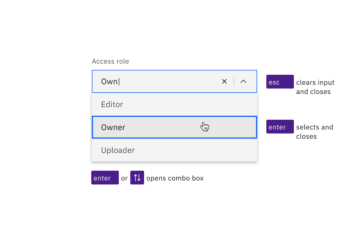
Combo boxes can be opened with the Enter or Up and Down arrow keys. Enter selects the highlighted option in the list. Esc clears the input and closes the combo box.
Development considerations
Keep these considerations in mind if you are modifying Carbon or creating a custom component.
- The dropdown and multiselect variant use a
buttonwitharia-haspopup="listbox". - Ensure the ID of the referenced label, such as “Access role” in the code example, is unique when there are multiple dropdown components on a page
- The combo box uses an input with
role="combo box",aria-autocomplete="list",aria-haspopup="listbox"andautocomplete="off". - The combo box uses
aria-controlsfor a div withrole="listbox". - All variants use
aria-expandedto track the state of the listbox. - See the ARIA authoring practices for combo box for more considerations.
Accessibility testing status
Latest version: 1.109.0 | Framework: React (@carbon/react)
| Component | Accessibility test | Status | Link to source code |
|---|---|---|---|
| Dropdown | Test(s) that ensure the initial render state of a component is accessible. | Automated or manual testing has been temporarily deferred. | GitHub link |
| Tests that ensure additional states of the component are accessible. This could be interactive states of a component or its multiple variants. | Automated or manual testing has been temporarily deferred. | ||
| Tests that ensure focus is properly managed, and all interactive functions of a component have a proper keyboard-accessible equivalent. | Test data is either not available or not applicable for this component state. | ||
| This manual testing ensures that the visual information on the screen is properly conveyed and read correctly by screen readers such as JAWS, VoiceOver, and NVDA. | Test data is either not available or not applicable for this component state. |
Feedback
Help us improve this component by providing feedback, asking questions, and leaving any other comments on GitHub.