Carbon buttons retain expected interactions.
Behavior
Icon-only buttons, which do not persistently display a text label, expose their label on hover and focus. When icon-only buttons are used to open menus, they are treated as separate components in Carbon. See Dropdown and Overflow menu.
Icon-only buttons have their labels exposed automatically on hover and focus.
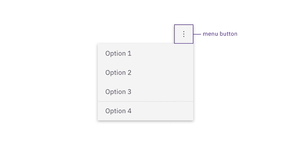
Buttons that open menus are separate components in Carbon.
Development considerations
Keep these considerations in mind if you are modifying Carbon or creating a custom component:
- Where links have been ‘repurposed’ as a button, they need to be coded so the
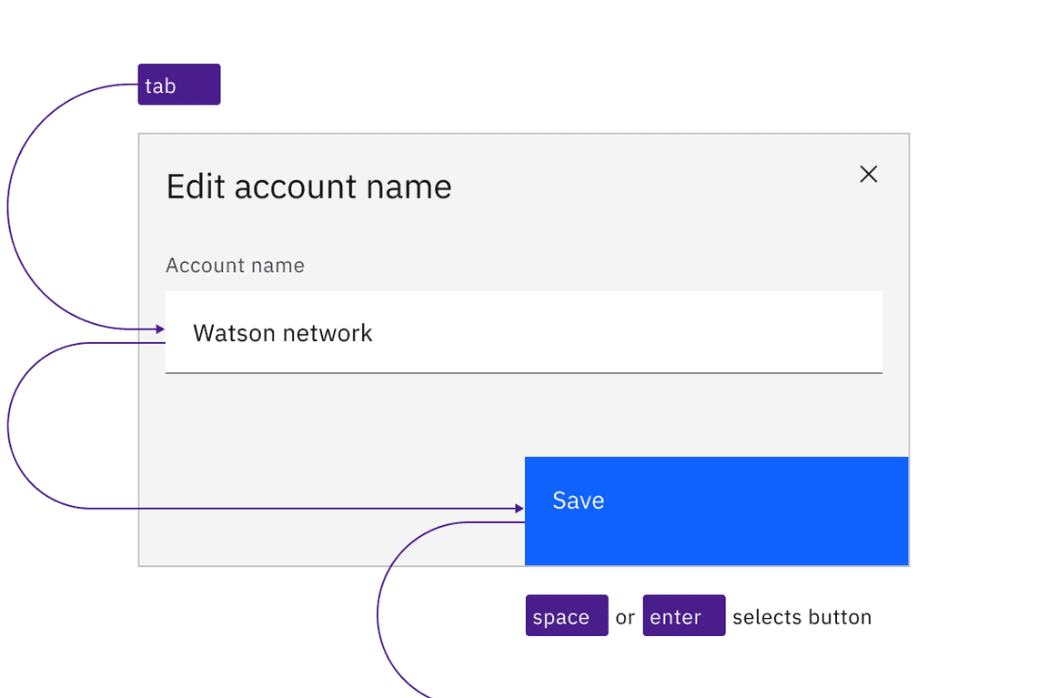
Spacekey can also activate (since links are only activated by default byEnter). - Toggle buttons can be accessibility supported by changing the value of
aria-pressedbetween"true"and"false"or with a change of name that reflects a change in the icon shape (for example: “play” / “pause” ) - See the ARIA authoring practices for more considerations.
Accessibility testing status
Latest version: 1.109.0 | Framework: React (@carbon/react)
| Component | Accessibility test | Status | Link to source code |
|---|---|---|---|
| Button | Test(s) that ensure the initial render state of a component is accessible. | Automated or manual testing has been temporarily deferred. | GitHub link |
| Tests that ensure additional states of the component are accessible. This could be interactive states of a component or its multiple variants. | Automated or manual testing has been temporarily deferred. | ||
| Tests that ensure focus is properly managed, and all interactive functions of a component have a proper keyboard-accessible equivalent. | Test data is either not available or not applicable for this component state. | ||
| This manual testing ensures that the visual information on the screen is properly conveyed and read correctly by screen readers such as JAWS, VoiceOver, and NVDA. | Test data is either not available or not applicable for this component state. |
Feedback
Help us improve this component by providing feedback, asking questions, and leaving any other comments on GitHub.