Element | Property | Color token |
|---|---|---|
Title | color |
|
Content | color |
|
Icon | fill |
|
Header | border-top |
|
background | Transparent | |
Panel | border-bottom |
|
background | Transparent |
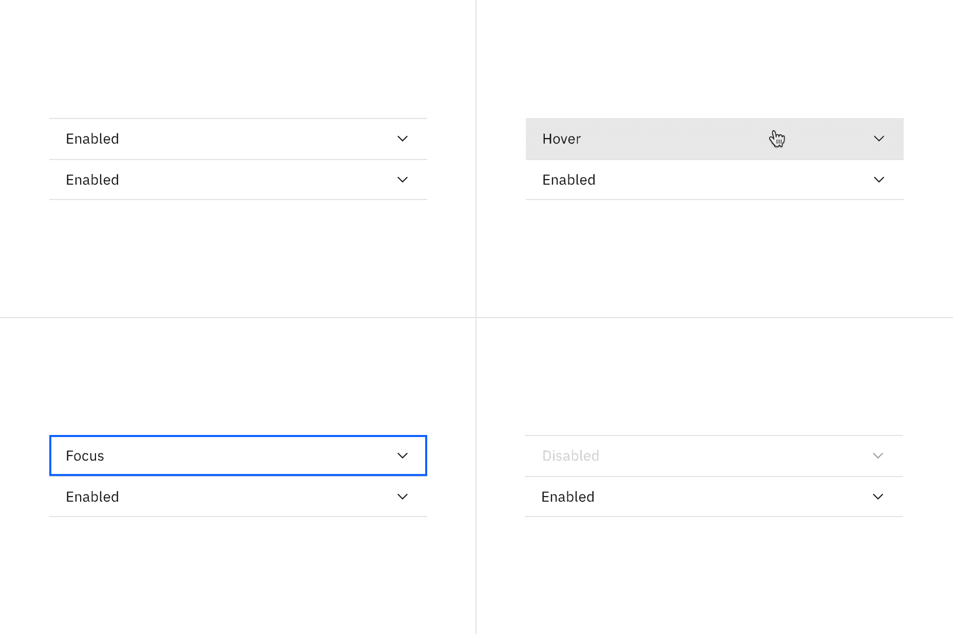
Element | State | Property | Color token |
|---|---|---|---|
Header | Hover | background |
|
Focus | border |
| |
Disabled | border-top |
| |
Title | Disabled | background |
|
Icon | Disabled | fill |
|
Typography
All accordion titles are set in sentence case. See the accordion content guidelines for more details.
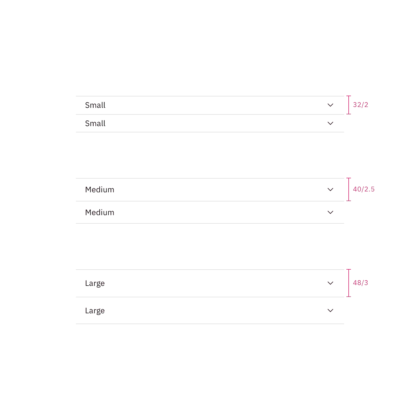
Element | Font-size (px/rem) | Font-weight | Type token |
|---|---|---|---|
Title | 14 / 0.875 | Regular / 400 |
|
Content | 14/ 0.875 | Regular / 400 |
|
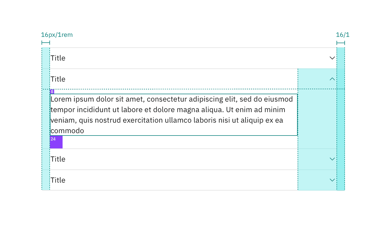
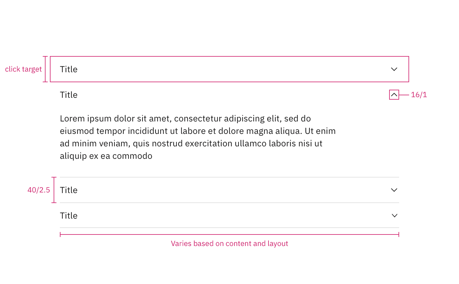
Structure
There is no max-height for an open panel but an accordion may scroll if constrained by vertical space. The width of an accordion varies based on the content, layout, and page design. The icon used in the header is a chevron. The accordion has an indented default alignment but can also be set to have a flush alignment.
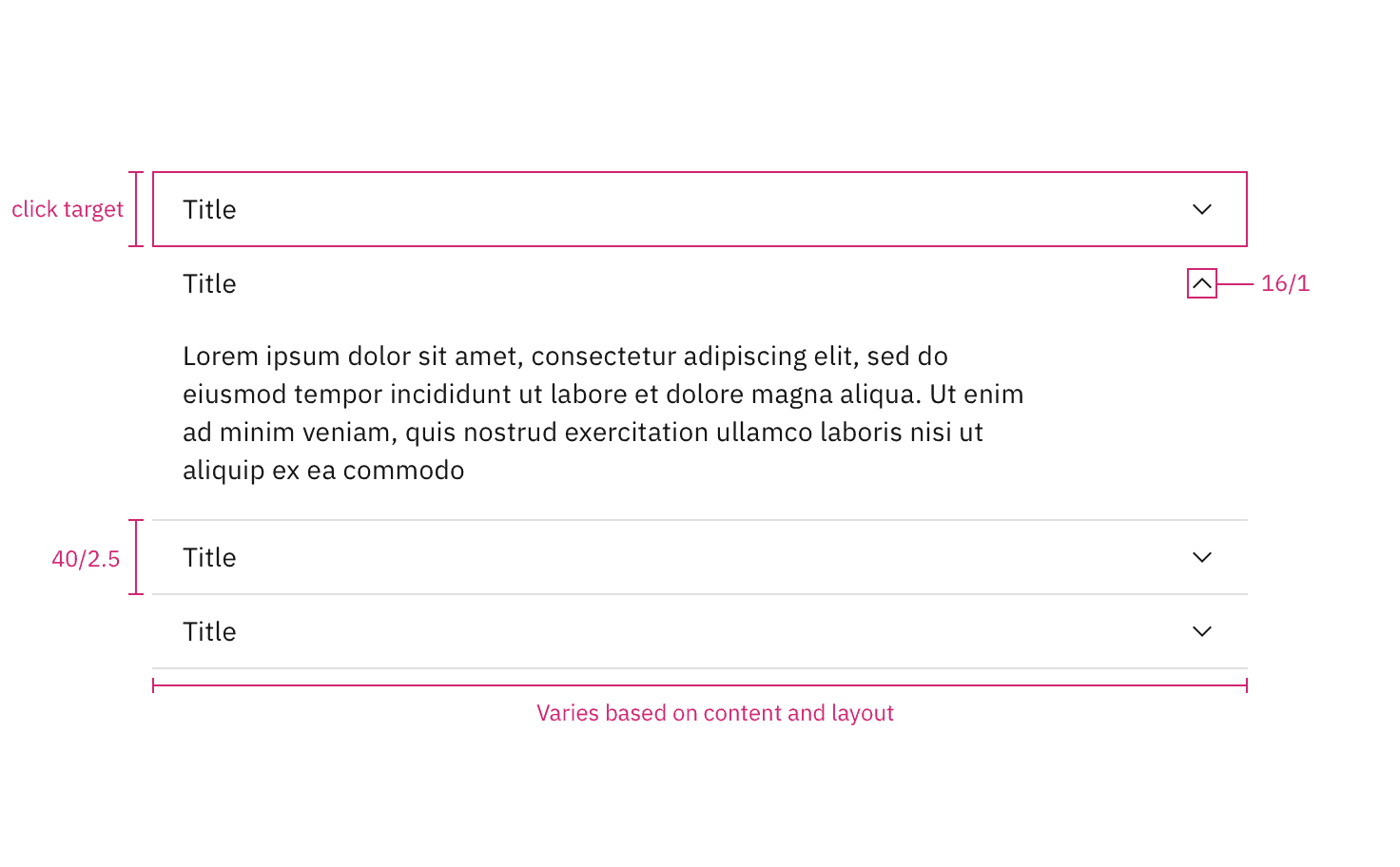
Structure measurements for default accordion alignment. | px / rem
Spacing measurements for default accordion alignment. | px / rem
Structure measurements for flush accordion alignment. | px / rem
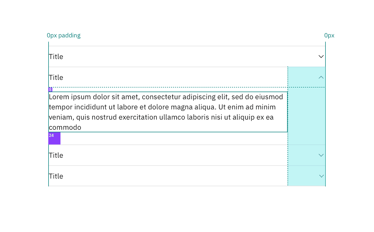
Spacing measurements for flush accordion alignment. | px / rem
Margin right
Accordions have a variable right margin that changes based on its width. Accordions that are 640px and wider have a margin-right: 25% with the percentage being based off the width of the container it is placed in. At smaller widths, the margin-right is a fixed size.
Body copy, including titles, in an accordion always follows the margin-right rules. However, inputs and other components may still expand to the full width of the accordion panel.
Accordion-width | Margin-right | Spacing token |
|---|---|---|
> 640 | 25% | – |
420-640px | 64px / 4rem |
|
< 420 | 16px / 1rem |
|
Feedback
Help us improve this component by providing feedback, asking questions, and leaving any other comments on GitHub.